Pure Animated Accordion in CSS
A Pure Animated Accordion in CSS refers to a user interface (UI) design element that allows you to organize and present content in a collapsible and expandable manner using only Cascading Style Sheets (CSS), without relying on JavaScript or other scripting languages. An accordion typically consists of a series of panels or sections, and only one panel is expanded or visible at a time. When a user clicks on a panel's header or trigger, it expands to reveal its content, and if another panel is already open, it collapses.
Source Code :
The provided code is an HTML document that creates a simple Pure CSS Accordion. Let's break down the code
- <div class="container">: Serves as the main container for the accordion.
- <input type="radio" id="ac1" name="accordion" checked />: Radio button used as a trigger for this accordion item. The name="accordion" ensures that only one radio button in the group can be selected.
- <label for="ac1">Lorem ipsum dolor sit amet.</label>: Label associated with the radio button, serving as the clickable header for the accordion item.
- <div class="ac">: Container for the content of the accordion item.
- The structure for Accordion Items 2, 3, and 4 is similar, with unique IDs (ac2, ac3, ac4) for radio buttons and corresponding labels.
<!DOCTYPE html>
<html lang="en">
  <head>
    <meta charset="UTF-8" />
    <meta name="viewport" content="width=device-width, initial-scale=1.0" />
    <title>Pure CSS Accordion</title>
    <link rel="stylesheet" href="css/style.css" />
  </head>
  <body>
    <div class="container">
      <div>
        <input type="radio" id="ac1" name="accordion" checked />
        <label for="ac1">Lorem ipsum dolor sit amet.</label>
        <div class="ac">
          <p>Lorem ipsum dolor sit amet consectetur, adipisicing elit. Quam itaque officiis, ratione accusantium temporibus adipisci. Fugiat ab dolorem quasi delectus voluptatibus recusandae error corrupti velit, magni consectetur aut ipsam fuga.</p>
        </div>
      </div>
      <div>
        <input type="radio" id="ac2" name="accordion" checked />
        <label for="ac2">Lorem ipsum dolor sit amet.</label>
        <div class="ac">
          <p>Lorem ipsum dolor sit amet consectetur, adipisicing elit. Quam itaque officiis, ratione accusantium temporibus adipisci. Fugiat ab dolorem quasi delectus voluptatibus recusandae error corrupti velit, magni consectetur aut ipsam fuga.</p>
        </div>
      </div>
      <div>
        <input type="radio" id="ac3" name="accordion" checked />
        <label for="ac3">Lorem ipsum dolor sit amet.</label>
        <div class="ac">
          <p>Lorem ipsum dolor sit amet consectetur, adipisicing elit. Quam itaque officiis, ratione accusantium temporibus adipisci. Fugiat ab dolorem quasi delectus voluptatibus recusandae error corrupti velit, magni consectetur aut ipsam fuga.</p>
        </div>
      </div>
      <div>
        <input type="radio" id="ac4" name="accordion" checked />
        <label for="ac4">Lorem ipsum dolor sit amet.</label>
        <div class="ac">
          <p>Lorem ipsum dolor sit amet consectetur, adipisicing elit. Quam itaque officiis, ratione accusantium temporibus adipisci. Fugiat ab dolorem quasi delectus voluptatibus recusandae error corrupti velit, magni consectetur aut ipsam fuga.</p>
        </div>
      </div>
    </div>
  </body>
</html>
This code implements a basic accordion using radio buttons and labels. However, there is a small mistake in the input elements. The checked attribute should be present only on one of the radio buttons to indicate the default open state. In the provided code, all radio buttons have checked, which may lead to unexpected behavior. Consider removing the checked attribute from all but one of the radio buttons.
css/style.css
@import url("https://fonts.googleapis.com/css2?family=Poppins:wght@300;400;500;600&display=swap");

* {
  margin: 0;
  padding: 0;
  box-sizing: border-box;
  font-family: "Poppins", sans-serif;
}

body {
  background-color: aliceblue;
  min-height: 100vh;
  display: grid;
  place-items: center;
}

.container {
  max-width: 600px;
  box-shadow: rgba(50, 50, 93, 0.25) 0px 2px 5px -1px, rgba(0, 0, 0, 0.3) 0px 1px 3px -1px;
}

.container input[type="radio"] {
  display: none;
}
.container label {
  cursor: pointer;
  height: 40px;
  line-height: 40px;
  display: block;
  background-color: #1b7f79;
  color: #fff;
  padding: 0px 10px;
  transition: background 0.5s;
}
.container input:checked + label,
.container label:hover {
  background-color: #ff4858;
}

.ac {
  background: rgba(255, 255, 255, 0.5);
  overflow: hidden;
  color: #333;
  transition: height 0.3s ease-in-out;
  height: 0;
}

.ac p {
  color: #777;
  padding: 20px;
  font-weight: 400;
}

.container input:checked ~ .ac {
  height: 150px;
}
- Container Styles: Styles for a container element with a maximum width of 600 pixels (max-width: 600px) and a box shadow for a subtle, elevated effect.
- Radio Button Styles: Hides the radio buttons inside the container.
- Label Styles: Styles for the labels associated with the radio buttons. They are styled as clickable elements with a background color of #1b7f79, white text color, and some padding. The background color transitions smoothly over 0.5 seconds when the label is hovered or when the associated radio button is checked.
- Checked Label Styles: Changes the background color to #ff4858 when the associated radio button is checked or when the label is hovered.
- Accordion Content Styles: Styles for the accordion content (.ac). It has a semi-transparent white background, hidden overflow, dark text color (#333), and a smooth transition effect for the height over 0.3 seconds.
- Paragraph Styles: Styles for paragraphs inside the accordion content. It sets a text color of #777, adds padding, and sets a font weight of 400.
- Show Accordion Content Styles: When a radio button inside the container is checked, it adjusts the height of the associated accordion content (.ac) to 150 pixels, revealing the content with a smooth transition effect.
Overall, this CSS code creates a visually appealing Pure CSS Accordion with a clean design and smooth transitions. The accordion allows users to click on the labels to expand and collapse the associated content.
Output
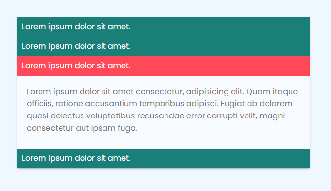
Live Preview
This simple example demonstrates the core concept of a Pure Animated Accordion in CSS. Adjust the styles and animations to suit your design preferences and project requirements. The idea is to create a user-friendly and visually appealing way to organize and present content on a webpage.
CSS Tutorial
Properties Reference
Cascading Style Sheet
Flexbox Tutorial
CSS Grid Tutorial
Transitions Properties
CSS Properties with Examples
CSS Selectors
CSS Pseudo Elements
CSS Attribute Selectors
Input Pseudo Classes
CSS Examples
CSS Animation Projects
Learn All in Tamil © Designed & Developed By Tutor Joes | Privacy Policy | Terms & Conditions