Gradient Background in CSS
While declaring the a solid color uses background-color property in CSS, gradients use background-image. The shorthand background property will know what you mean if you declare one or the other.
Type of Gradients
- linear-gradient
- repeating-linear-gradient
- radial-gradient
- repeating-radial-gradient
- conic-gradient
- repeating-conic-gradient
linear-gradient
The linear-gradient() creates an image consisting of a progressive transition between two or more colors along a straight line.
| Values | Method | Description |
|---|---|---|
| side-or-corner | to top, to bottom, to left, to right, angle | This values are equivalent to the angles 0deg, 180deg, 270deg, and 90deg, respectively. The other values are translated into an angle.The gradient line's angle of direction. A value of 0deg is equivalent to to top; increasing values rotate clockwise from there. |
| linear-color-stop | color values, percentage | A color-stop's color value, followed by one or two optional stop positions, (each being either a percentage or a length along the gradient's axis). |
repeating-linear-gradient
Its creates an image consisting of repeating linear gradients. It is similar to linear-gradient() and takes the same arguments, but it repeats the color stops infinitely in all directions so as to cover its entire container.
radial-gradient
creates an image consisting of a progressive transition between two or more colors that radiate from an origin. Its shape may be a circle or an ellipse.
| Values | Method | Description |
|---|---|---|
| position | red 0, blue, green 100% | The position of the gradient, interpreted in the same way as background-position or transform-origin. If unspecified, it defaults to center. |
| ending-shape | radial-gradient(circle at center, red 0, blue, green 100%) | The value can be circle or ellipse, If unspecified, it defaults to ellipse. |
| size | radial-gradient(closest-side, red 0, blue, green 100%) | It can be given explicitly or by keyword. For the purpose of the keyword definitions, consider the gradient box edges as extending infinitely in both directions, rather than being finite line segments. |
Keywords of radial-gradient
| closest-side | The gradient's ending shape meets the side of the box closest to its center |
|---|---|
| closest-corner | The gradient's ending shape is sized so that it exactly meets the closest corner of the box from its center. |
| farthest-side | Similar to closest-side, except the ending shape is sized to meet the side of the box farthest from its center |
| farthest-corner | The default value, the gradient's ending shape is sized so that it exactly meets the farthest corner of the box from its center. |
repeating-radial-gradient
creates an image consisting of repeating gradients that radiate from an origin. It is similar to radial-gradient() and takes the same arguments, but it repeats the color stops infinitely in all directions so as to cover its entire container, similar to repeating-linear-gradient().
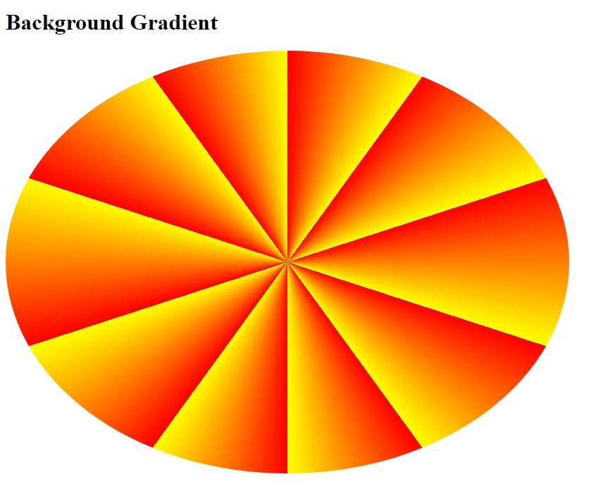
conic-gradient
creates an image consisting of a gradient with color transitions rotated around a center point.
Values
anglePreceded by the from keyterm, and taking an angle as its value, defines the gradient rotation in clockwise direction.
positionUsing the same length, order and keyterm values as the background-position property, the position defines center of the gradient.
angular-color-stopA color value, followed by one or two optional stop positions.
color-hintThe length defines at which point between two color stops the gradient color should reach the midpoint of the color transition.
repeating-conic-gradient
creates an image consisting of a repeating gradient with color transitions rotated around a center point.
Source Code :
<!DOCTYPE html>
<html lang="en">
<head>
  <meta charset="UTF-8">
  <meta http-equiv="X-UA-Compatible" content="IE=edge">
  <meta name="viewport" content="width=device-width, initial-scale=1.0">
  <title>Background Gradient</title>
  <style>
    div{
      height: 600px;
      width: 800px;
      background-color: red;
      background:linear-gradient(red,yellow);
      background: linear-gradient(red,yellow,orange);
      background: linear-gradient(#EA2027,#1B1464);

      background: linear-gradient(to right,#EA2027,#1B1464);
      background: linear-gradient(to left,#EA2027,#1B1464);
      background: linear-gradient(to top,#EA2027,#1B1464);
      background: linear-gradient(to bottom,#EA2027,#1B1464);

      background: linear-gradient(to bottom right,#EA2027,#1B1464);
      background: linear-gradient(to bottom left,#EA2027,#1B1464);
      background: linear-gradient(to top left,#EA2027,#1B1464);
      background: linear-gradient(to top right,#EA2027,#1B1464);

      background: linear-gradient(45deg,#EA2027,#1B1464);
      background: linear-gradient(-45deg,#EA2027,#1B1464);


      background:repeating-linear-gradient(#EA2027,#1B1464 10%,#009432 20%);
      background: repeating-linear-gradient(to right,#EA2027,#1B1464 10%,#009432 20%);

      background:radial-gradient(red,yellow);
      background:radial-gradient(red,yellow,green);
      background:radial-gradient(red 5%,yellow 15%,green 60%);
      background:radial-gradient(circle,red 5%,yellow 15%,green 60%);

      background:radial-gradient(closest-side at 50% 50%,red,yellow,green);
      background:radial-gradient(closest-side at 80% 50%,red,yellow,green);
      background:radial-gradient(closest-side at 80% 80%,red,yellow,green);

      background:radial-gradient(farthest-side at 80% 20%,red,yellow,green);
      background:radial-gradient(closest-corner at 10% 10%,red,yellow,green);
      background:radial-gradient(farthest-corner at 10% 10%,red,yellow,green);

      background:repeating-radial-gradient(red,yellow 10%,green 15%);

      background-image: conic-gradient(red, yellow, green);
      border-radius: 50%;
      background-image: conic-gradient(from 90deg, red, yellow, green);

      background-image: conic-gradient(red 0deg, red 90deg, yellow 90deg, yellow 180deg, green 180deg, green 270deg, blue 270deg);

      background-image: conic-gradient(at 60% 45%, red, yellow, green);

      background-image: repeating-conic-gradient(red 10%, yellow 20%);


    }
  </style>
</head>
<body>
  <h1>Background Gradient</h1>
  <div>

  </div>
</body>
</html>

<!--

  linear-gradient
  repeating-linear-gradient
  radial-gradient
  repeating-radial-gradient
  conic-gradient
  repeating-conic-gradient
-->
Output
Live Preview
CSS Tutorial
Properties Reference
Cascading Style Sheet
Flexbox Tutorial
CSS Grid Tutorial
Transitions Properties
CSS Properties with Examples
CSS Selectors
CSS Pseudo Elements
CSS Attribute Selectors
Input Pseudo Classes
CSS Examples
CSS Animation Projects
Learn All in Tamil © Designed & Developed By Tutor Joes | Privacy Policy | Terms & Conditions