Elevate Your Images with Photo Frame Hover Effects in CSS
A photo frame hover effect in CSS is a technique used to add interactive and visually appealing animations to images when a user hovers their mouse cursor over them. These effects can create a sense of interactivity and engagement, enhancing the overall user experience of a website. Let's break down how to create a basic photo frame hover effect using CSS:
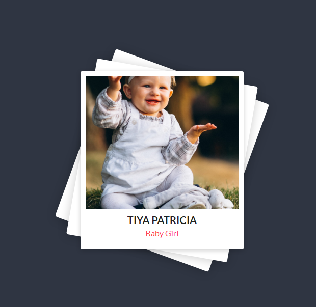
Here is an example
Source Code :
<!DOCTYPE html>
<html lang="en">
  <head>
    <meta charset="UTF-8" />
    <meta name="viewport" content="width=device-width, initial-scale=1.0" />
    <title>Project-1</title>
    <link rel="stylesheet" href="css/style.css" />
  </head>
  <body>
    <div class="card">
      <div class="img-box">
        <img src="images/img.jpg" alt="Baby" />
      </div>
      <div class="details">
        <h2>Tiya Patricia<br /><span>Baby Girl</span></h2>
      </div>
    </div>
  </body>
</html>
css/style.css
@import url("https://fonts.googleapis.com/css2?family=Lato:ital,wght@0,300;0,400;0,700;0,900;1,300;1,400;1,700;1,900&display=swap");

body {
  margin: 0;
  font-family: "Lato", sans-serif;
  background-color: #2f3542;
  height: 100vh;
  display: flex;
  justify-content: center;
  align-items: center;
}

.card {
  position: relative;
  width: 320px;
  height: 350px;
  background-color: #fff;
  border-radius: 3px;
  box-shadow: 0 2px 10px rgba(0, 0, 0, 0.2);
}

.card::before,
.card::after {
  content: "";
  position: absolute;
  top: 0;
  left: 0;
  width: 100%;
  height: 100%;
  background-color: #fff;
  border-radius: 4px;
  z-index: -1;
  transition: 0.5s;
}

.card:hover::before {
  transform: rotate(20deg);
  box-shadow: 0 2px 20px rgba(0, 0, 0, 0.2);
}

.card:hover::after {
  transform: rotate(10deg);
  box-shadow: 0 2px 20px rgba(0, 0, 0, 0.2);
}

.img-box {
  position: absolute;
  background: #2f3542;
  top: 10px;
  left: 10px;
  bottom: 10px;
  right: 10px;
  transition: 0.5s;
}

img {
  position: absolute;
  top: 0;
  left: 0;
  width: 100%;
  height: 100%;
  object-fit: cover;
  z-index: 2;
}

.card:hover .img-box {
  bottom: 80px;
}

.details {
  position: absolute;
  left: 10px;
  right: 10px;
  bottom: 10px;
  height: 60px;
  text-align: center;
}

h2 {
  margin: 0;
  padding: 0;
  font-weight: 600;
  font-size: 20px;
  color: #222;
  text-transform: uppercase;
}

h2 span {
  font-size: 16px;
  color: #ff4757;
  font-weight: 500;
  text-transform: capitalize;
}
.card: This is the container for the card. It defines the card's size, background color, border radius, and box shadow.
.card::before and .card::after: These are pseudo-elements that create two overlay layers on the card. They are used to give the card a shadow and rotation effect on hover.
.card:hover::before and .card:hover::after: These rules define the hover effect for the overlays. When the card is hovered over, the overlays rotate and change the box shadow, creating a subtle animation.
.img-box: This is the container for the image. It positions the image with padding around it.
img: This styles the image itself, making it cover the entire container while maintaining its aspect ratio.
.card:hover .img-box: This rule defines the hover effect for the image container. When the card is hovered over, the image container moves upwards slightly, creating an interactive effect.
Output
Live Preview
By combining the image scaling with the appearance of the frame overlay on hover, this code creates a simple yet effective photo frame hover effect. You can further customize the colors, border styles, and animations to match the visual style of your website. This is just one example of a photo frame hover effect; there are many creative variations and techniques you can explore to achieve different effects.
CSS Tutorial
Properties Reference
Cascading Style Sheet
Flexbox Tutorial
CSS Grid Tutorial
Transitions Properties
CSS Properties with Examples
CSS Selectors
CSS Pseudo Elements
CSS Attribute Selectors
Input Pseudo Classes
CSS Examples
CSS Animation Projects
Learn All in Tamil © Designed & Developed By Tutor Joes | Privacy Policy | Terms & Conditions