Using Flexbox Gap to Add Spacing between Flex Items in CSS
Gap
In CSS, the Flex Gap property (also known as gap) is a CSS property used to add spacing between flex items within a flex container. The Flex Gap property is a shorthand property that sets the values for the row-gap and column-gap properties, which are used to set the spacing between rows and columns of flex items.
The syntax for the Flex Gap property is as follows:
The possible values for row-gap and column-gap are lengths or percentages, as well as the keywords normal, which sets the default spacing value, and unset, which sets the value to the default, effectively unsetting the property.
You can also use the row-gapand column-gap properties individually if you want to set different gap values for rows and columns.
The Flex Gap property is a convenient way to add spacing between flex items without having to use margins or padding on each individual item. It is also flexible enough to allow different spacing values for rows and columns, making it a useful tool for creating complex and responsive layouts. However, it should be noted that Flex Gap is not supported in all browsers, so it is important to check for browser compatibility before using this property.
.container{
  display: flex;
  flex-wrap:wrap;
  gap:40px 20px;
  /* gap:40px; */
}
Output :
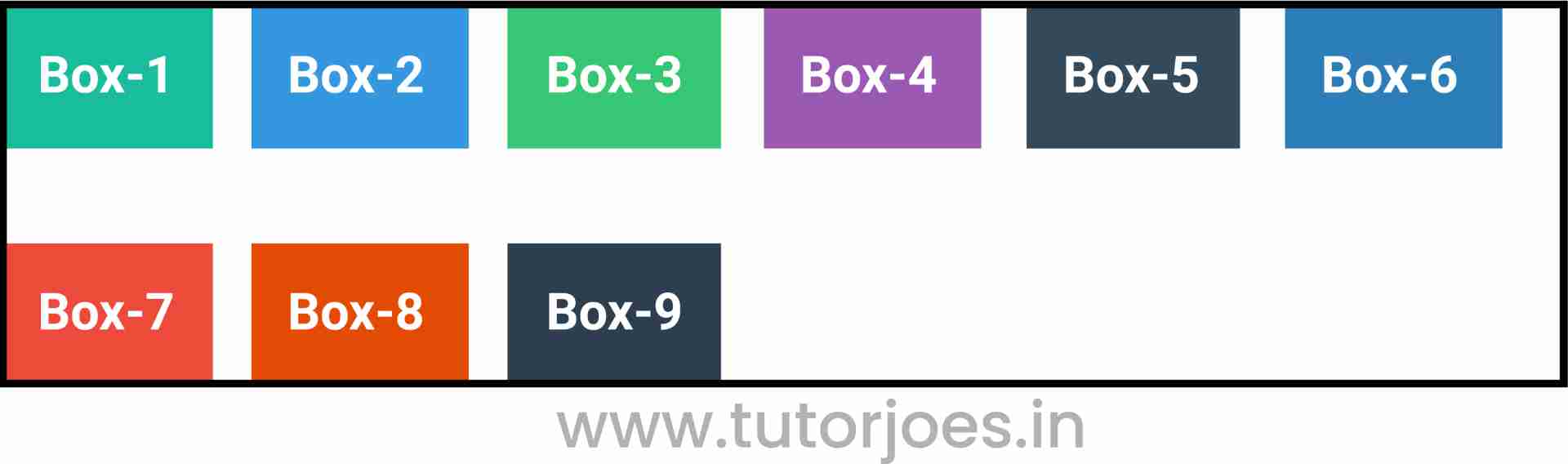
The given CSS code defines a class named .container that sets up a flex container using the display: flex property. The flex-wrap property is set to wrap to allow the flex items to wrap onto new lines when they cannot fit in a single line.
The gap property is then used to specify the gap between the flex items. In this code, gap:40px 20px sets the gap to 40 pixels vertically and 20 pixels horizontally. This means that there will be a 40-pixel gap between each row of flex items, and a 20-pixel gap between each column of flex items.
It is worth noting that the gap property is a shorthand property for the row-gap and column-gap properties. The first value in the gap property represents the row gap, and the second value represents the column gap. If only one value is provided, it is used for both the row and column gaps. In this code, gap:40px could be used to set the gap to 40 pixels both vertically and horizontally.
Using the gap property to add spacing between flex items can simplify the CSS code and make it easier to manage the layout. It is a more flexible alternative to using margins or padding on each individual item. However, it should be noted that the gap property is not supported by all browsers, so it is important to check for browser compatibility before using this property. If the browser does not support gap, then it may be necessary to use a fallback method, such as setting margins or padding on the flex items.
Row gapIn CSS, the row-gap property sets the size of the gap (or space) between rows of flex items within a flex container. It is a part of the Flexbox Layout module and is used along with the display: flex property to create flexible and responsive layouts.
The syntax for the row-gap property is as follows:
The possible values for row-gap are:
- <length>: This specifies the size of the gap between rows of flex items, and can be specified in any valid CSS length unit, such as pixels, ems, or percentages.
- normal: This is the default value and sets the gap between rows to the browser's default value, typically around 1em or the height of the font used.
- inherit: This specifies that the value of the row-gap property should be inherited from the parent element.
- initial: This specifies that the value of the row-gap property should be set to its default value.
- unset: This specifies that the value of the row-gap property should be set to the default value, effectively unsetting the property.
Here is an example of how to use the row-gap property in CSS:
.container{
  display: flex;
  flex-wrap:wrap;
  row-gap:20px;
}
Output :
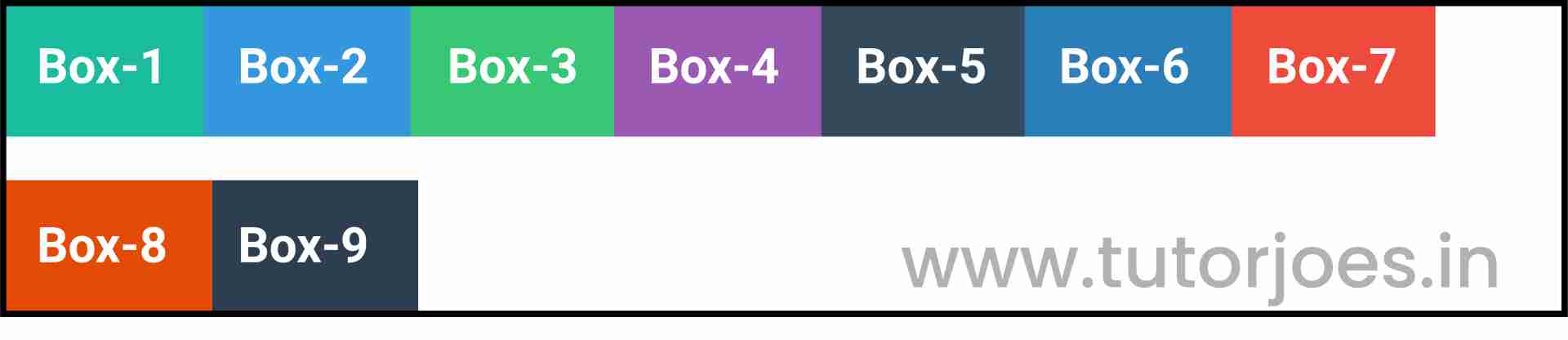
In this example, the row-gap property is used to set the gap between rows of flex items within a container with display: flex. The flex-wrap property is set to wrap to allow the flex items to wrap onto new lines when they cannot fit in a single row.
Using the row-gap property in CSS allows you to create flexible and responsive layouts with consistent spacing between rows of flex items. It is a useful tool for creating complex layouts and is a more efficient and flexible alternative to using margins or padding on each individual item. However, it should be noted that the row-gap property is not supported by all browsers, so it is important to check for browser compatibility before using this property. If the browser does not support row-gap, then it may be necessary to use a fallback method, such as setting margins or padding on the flex items.
Column gapIn CSS, the column-gap property sets the size of the gap (or space) between columns of flex items within a flex container. It is a part of the Flexbox Layout module and is used along with the display: flex property to create flexible and responsive layouts.
The syntax for the column-gap property is as follows:
The possible values for column-gap are:
- <length>: This specifies the size of the gap between columns of flex items, and can be specified in any valid CSS length unit, such as pixels, ems, or percentages.
- normal: This is the default value and sets the gap between columns to the browser's default value, typically around 1em or the width of the font used.
- inherit: This specifies that the value of the column-gap property should be inherited from the parent element.
- initial: This specifies that the value of the column-gap property should be set to its default value.
- unset: This specifies that the value of the column-gap property should be set to the default value, effectively unsetting the property.
Here is an example of how to use the column-gap property in CSS:
.container{
  display: flex;
  flex-wrap:wrap;
  column-gap:20px;
}
Output :

In this example, the column-gap property is used to set the gap between columns of flex items within a container with display: flex. The flex-wrap property is set to wrap to allow the flex items to wrap onto new columns when they cannot fit in a single column.
Using the column-gap property in CSS allows you to create flexible and responsive layouts with consistent spacing between columns of flex items. It is a useful tool for creating complex layouts and is a more efficient and flexible alternative to using margins or padding on each individual item. However, it should be noted that the column-gap property is not supported by all browsers, so it is important to check for browser compatibility before using this property. If the browser does not support column-gap, then it may be necessary to use a fallback method, such as setting margins or padding on the flex items.
Source Code :
<!DOCTYPE html>
<html lang="en">
<head>
  <meta charset="UTF-8">
  <meta http-equiv="X-UA-Compatible" content="IE=edge">
  <meta name="viewport" content="width=device-width, initial-scale=1.0">
  <title>Document</title>
  <link rel="stylesheet" href="flex-gap.css">
</head>
<body>
  <div class="container">
    <div class="flex-item box-1">Box-1</div>
    <div class="flex-item box-2">Box-2</div>
    <div class="flex-item box-3">Box-3</div>
    <div class="flex-item box-4">Box-4</div>
    <div class="flex-item box-5">Box-5</div>
    <div class="flex-item box-6">Box-6</div>
    <div class="flex-item box-7">Box-7</div>
    <div class="flex-item box-8">Box-8</div>
    <div class="flex-item box-9">Box-9</div>
  </div>
</body>
</html>
flex-gap.css :
@import url('https://fonts.googleapis.com/css2?family=Rubik:wght@300;400;500;600;700;900&display=swap');

*{
  margin: 0;
  padding: 0;
  font-family: 'Rubik', sans-serif;

}

.container{
  border:5px solid black;
}

.flex-item{
  color:white;
  font-size: 18px;
  padding: 16px;
  text-align: center;
}

.box-1{background-color: #1abc9c;}
.box-2{background-color:#3498db;}
.box-3{background-color: #2ecc71;}
.box-4{background-color: #9b59b6;}
.box-5{background-color:#34495e;}
.box-6{background-color:#2980b9;}
.box-7{background-color:#e74c3c;}
.box-8{background-color: #d35400;}
.box-9{background-color:#2c3e50;}

/*-----------------------------------*/

.container{
  display: flex;
  flex-wrap:wrap;
  column-gap:20px;
  row-gap:20px;
  gap:40px 20px;
  gap:40px;
}
Live Preview
This CSS code sets several properties for a container element with the class name .container. These properties are used to create flexible and responsive layouts using the Flexbox Layout module.
- display: flex;: This property sets the display mode of the container element to flex, which enables the use of flexbox properties to create flexible layouts.
- flex-wrap: wrap;: This property specifies whether the flex items should wrap or not when they exceed the container's width. In this case, the value wrap is used, which means that the items will wrap onto new lines if they cannot fit within a single row or column.
- column-gap: 20px;: This property sets the size of the gap between columns of flex items within the container to 20px.
- row-gap: 20px;: This property sets the size of the gap between rows of flex items within the container to 20px.
- gap: 40px 20px;: This property sets the size of the gap between columns and rows of flex items within the container to 40px horizontally and 20px vertically.
- gap: 40px;: This property sets the size of the gap between columns and rows of flex items within the container to 40px both horizontally and vertically.
It's important to note that column-gap and row-gap are newer CSS properties for managing gaps between grid or flexbox items, while gap is a shorthand property that can set both the column-gap and row-gap together. The gap property is preferred for its convenience, as it allows you to set both gaps at once.
Using these properties allows you to create flexible and responsive layouts with consistent spacing between rows and columns of flex items within the container. These properties are useful for creating complex layouts and are more efficient and flexible than using margins or padding on each individual item. However, it should be noted that some older browsers may not support these properties, so it is important to check for browser compatibility before using them.
CSS Tutorial
Properties Reference
Cascading Style Sheet
Flexbox Tutorial
CSS Grid Tutorial
Transitions Properties
CSS Properties with Examples
CSS Selectors
CSS Pseudo Elements
CSS Attribute Selectors
Input Pseudo Classes
CSS Examples
CSS Animation Projects
Learn All in Tamil © Designed & Developed By Tutor Joes | Privacy Policy | Terms & Conditions