Different Style of Search Box Design in CSS
This Project will discuss, design practices and will provide a selection of CSS search box designs.Most users use the search box as a last-ditch effort to find something before leaving a website. As a utilitarian element, the backend process of a search bar is essential.
A well-designed search bar can improve conversion rates and enhance user experience. In spite of its importance, the search bar is a simple element on a website.
Source Code :
<!DOCTYPE html>
<html lang="en">
<head>
  <meta charset="UTF-8">
  <meta http-equiv="X-UA-Compatible" content="IE=edge">
  <meta name="viewport" content="width=device-width, initial-scale=1.0">
  <title>Search Text</title>
  <link rel="stylesheet" href="https://cdnjs.cloudflare.com/ajax/libs/font-awesome/4.7.0/css/font-awesome.min.css">
  <link rel="stylesheet" href="css/style.css">
</head>
<body>
  <div class="form-group btn1">
    <button class="btn">
      <i class="fa fa-search"></i>
    </button>
    <input type="text" class="input" placeholder="Search Text..">
  </div>

  <div class="form-group  btn2">
    <button class="btn">
      <i class="fa fa-search"></i>
    </button>
    <input type="text" class="input" placeholder="Search Text..">
  </div>

  <div class="form-group  btn3">
    <button class="btn">
      <i class="fa fa-search"></i>
    </button>
    <input type="text" class="input" placeholder="Search Text..">
  </div>

  <div class="form-group  btn4">
    <button class="btn">
      <i class="fa fa-search"></i>
    </button>
    <input type="text" class="input" placeholder="Search Text..">
  </div>


  <div class="form-group  btn5">
    <button class="btn">
      <i class="fa fa-search"></i>
    </button>
    <input type="text" class="input" placeholder="Search Text..">
  </div>

  <div class="form-group  btn6">
    <button class="btn">
      <i class="fa fa-search"></i>
    </button>
    <input type="text" class="input" placeholder="Search Text..">
  </div>

</body>
</html>
css/style.css
@import url('https://fonts.googleapis.com/css2?family=Poppins:wght@300;400;500;700&display=swap');

*{
  padding: 0;
  margin: 0;
  box-sizing: border-box;
  font-family: 'Poppins', sans-serif;
}
body{
  width: 100vw;
  height: 100vh;
  background-color:#fca889;
  display: flex;
  flex-direction: column;
  justify-content: center;
  align-items: center;
  gap:30px;
}

.form-group{
	width: 500px;
	height: 60px;
  position: relative;
}

.form-group .input{
  width: 100%;
  height: 100%;
  position: absolute;
  top: 0;
	left: 0;
  font-size: 18px;
  padding: 10px 20px;
  border-radius: 3px;
  border: none;
  outline: none;
}
.form-group .input:focus{
  border: 2px solid orangered;
}
.form-group .btn{
    position: absolute;
    z-index: 1;
    top: 0;
    right: 0;
    width: 60px;
    height: 100%;
    cursor: pointer;
    border:none;
    background-color: orangered;
    font-size: 20px;
    color:white;
}

.form-group .btn:hover{
  background-color: rgb(248, 82, 21);
}

.btn1 .input{
  padding-right: 80px;
}
.btn1 .btn{
  border-top-right-radius: 3px;
	border-bottom-right-radius: 3px;
}

.btn2 .input{
  padding-left: 80px;
}
.btn2 .btn{
  left: 0;
  border-top-left-radius: 3px;
	border-bottom-left-radius: 3px;
}


.btn3 .input{
  border-radius: 50px;
  padding-right: 65px;
}
.btn3 .btn{
  border-radius: 50px;
}

.btn4 .input{
  border-radius: 50px;
  padding-left: 65px;
}
.btn4 .btn{
  left: 0;
  border-radius: 50px;
}

.btn5 .btn{
  width: 125px;
  height: 45px;
  top: 8px;
  right: 6px;
}

.btn5 .input{
  padding-right: 135px;
}

.btn6 .btn{
  width: 125px;
  height: 45px;
  top: 8px;
  right: 6px;
  border-radius: 25px;
}

.btn6 .input{
  padding-right: 135px;
}
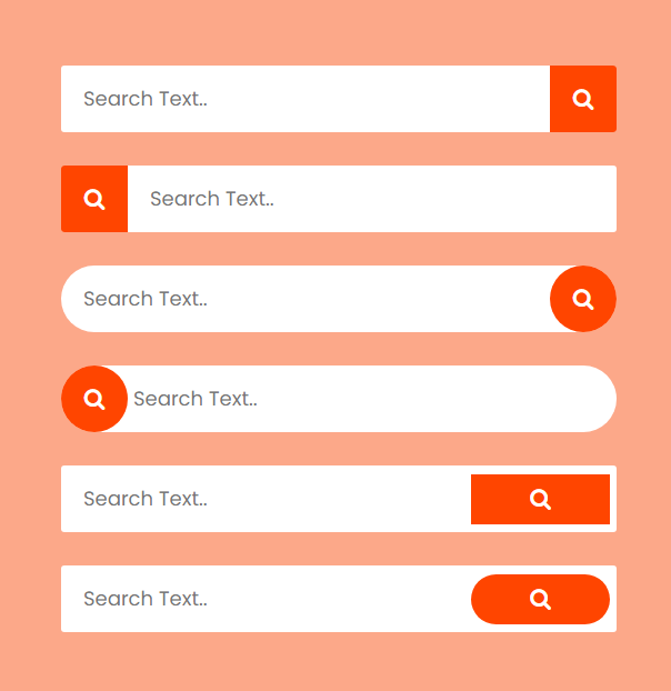
Output
Live Preview
CSS Tutorial
Properties Reference
Cascading Style Sheet
Flexbox Tutorial
CSS Grid Tutorial
Transitions Properties
CSS Properties with Examples
CSS Selectors
CSS Pseudo Elements
CSS Attribute Selectors
Input Pseudo Classes
CSS Examples
CSS Animation Projects
Learn All in Tamil © Designed & Developed By Tutor Joes | Privacy Policy | Terms & Conditions