Dynamic Colorful Rotating Balls Animation using CSS
A photo frame hover effect in CSS is a technique used to add interactive and visually appealing animations to images when a user hovers their mouse cursor over them. These effects can create a sense of interactivity and engagement, enhancing the overall user experience of a website. Let's break down how to create a basic photo frame hover effect using CSS:
Here is an example
Source Code :
<!DOCTYPE html>
<html lang="en">
  <head>
    <meta charset="UTF-8" />
    <meta name="viewport" content="width=device-width, initial-scale=1.0" />
    <title>Rotating Ball</title>
    <link rel="stylesheet" href="css/style.css" />
  </head>
  <body>
    <div class="container">
      <div style="--i: 1"><div class="ball"></div></div>
      <div style="--i: 2"><div class="ball"></div></div>
      <div style="--i: 3"><div class="ball"></div></div>
      <div style="--i: 4"><div class="ball"></div></div>
      <div style="--i: 5"><div class="ball"></div></div>
      <div style="--i: 6"><div class="ball"></div></div>
      <div style="--i: 7"><div class="ball"></div></div>
      <div style="--i: 8"><div class="ball"></div></div>
      <div style="--i: 9"><div class="ball"></div></div>
      <div style="--i: 10"><div class="ball"></div></div>
    </div>
  </body>
</html>
css/style.css
* {
  margin: 0;
  padding: 0;
  box-sizing: border-box;
}

body {
  min-height: 100vh;
  display: grid;
  place-items: center;
}

.container {
  width: 300px;
  height: 300px;
  position: relative;
}

.container > div {
  position: absolute;
  width: 100%;
  height: 100%;

  animation: rotation 5s linear infinite;
  animation-delay: calc(0.15s * var(--i));
}

@keyframes rotation {
  0% {
    transform: rotate(0deg);
  }
  100% {
    transform: rotate(720deg);
  }
}

.ball {
  position: absolute;
  width: 2px;
  height: 2px;
  background-color: #00a814;
  border-radius: 50%;
  animation: resize 2s linear infinite;
  animation-delay: calc(0.15s * var(--i));
}

@keyframes resize {
  0% {
    filter: hue-rotate(0deg);
  }
  90% {
    transform: scale(50);
    filter: hue-rotate(360deg);
  }
}
Animation-delay: calc(0.15s * var(--i)); introduces a delay to each ball's animation based on a variable --i.
@keyframes rotation:
- This animation defines the rotation effect for the balls.
- At 0%, the balls start with no rotation.
- At 100%, the balls complete 720 degrees of rotation (two full rotations).
.ball class:
- This class is used for the individual balls within the container.
- position: absolute; positions the balls absolutely within their parent container.
- width and height set the dimensions of each ball.
- background-color defines the initial color of the balls.
- border-radius: 50%; makes the balls circular.
- animation: resize 2s linear infinite; applies the resize animation with a 2-second duration, linear timing, and infinite loop.
- animation-delay: calc(0.15s * var(--i)); introduces a delay to each ball's animation based on a variable --i.
@keyframes resize
- This animation defines the resizing and color shift effect for the balls.
- At 0%, the balls start with no size change and no hue shift.
- At 90%, the balls scale up significantly and complete a full hue shift (360 degrees).
Output
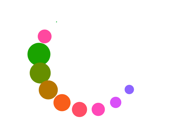
Live Preview
In summary, this code creates a visually appealing animation where a group of small balls rotates while simultaneously changing in size and color. The animation provides an engaging visual effect for web content.
CSS Tutorial
Properties Reference
Cascading Style Sheet
Flexbox Tutorial
CSS Grid Tutorial
Transitions Properties
CSS Properties with Examples
CSS Selectors
CSS Pseudo Elements
CSS Attribute Selectors
Input Pseudo Classes
CSS Examples
CSS Animation Projects
Learn All in Tamil © Designed & Developed By Tutor Joes | Privacy Policy | Terms & Conditions