Understanding the CSS flexbox justify-content property
justify-content is a CSS property that's used to control the horizontal alignment of flexbox items within a flex container. It determines how the extra space in the container is distributed among the flex items along the main axis (which is usually horizontal).
There are several values that you can use for justify-content
- flex-start: This value aligns the items to the start of the container. This is the default value if you don't specify anything.
- flex-end: This value aligns the items to the end of the container.
- center: This value centers the items within the container.
- space-between: This value evenly distributes the items along the main axis, with the first item aligned to the start of the container and the last item aligned to the end of the container.
- space-around: This value evenly distributes the items along the main axis, with equal space between each item.
- space-evenly: This value evenly distributes the items along the main axis, with equal space between them and at the start and end of the container.
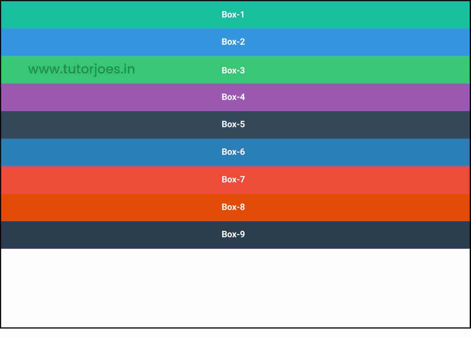
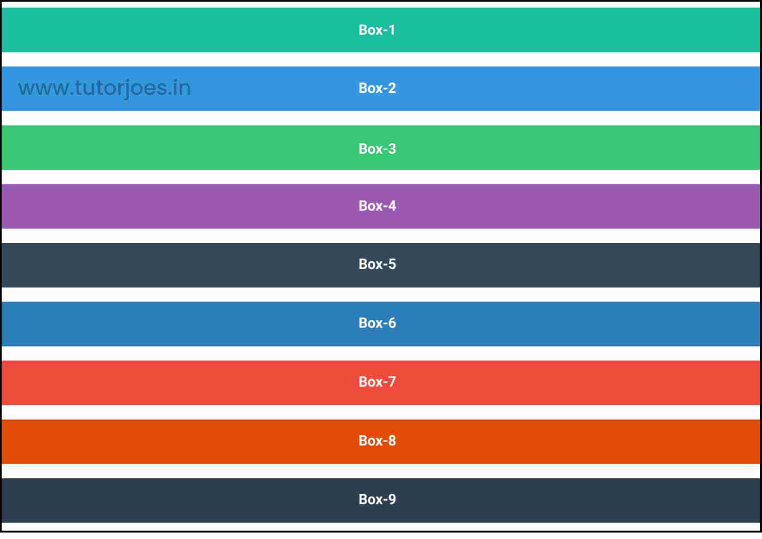
flex-start
Flex items are packed toward the start of the line. The main-start margin edge of the first flex item on the line is placed flush with the main-start edge of the line, and each subsequent flex item is placed flush with the preceding item.
flex-direction : row
flex-direction : column
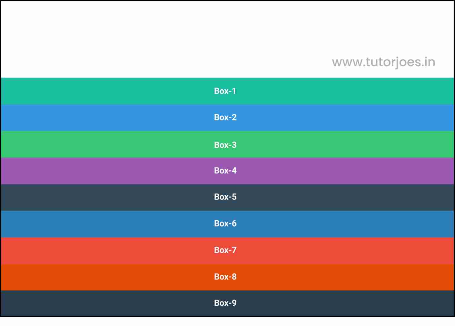
flex-end
Flex items are packed toward the end of the line. The main-end margin edge of the last flex item is placed flush with the main-end edge of the line, and each preceding flex item is placed flush with the subsequent item.
flex-direction : row
flex-direction : column
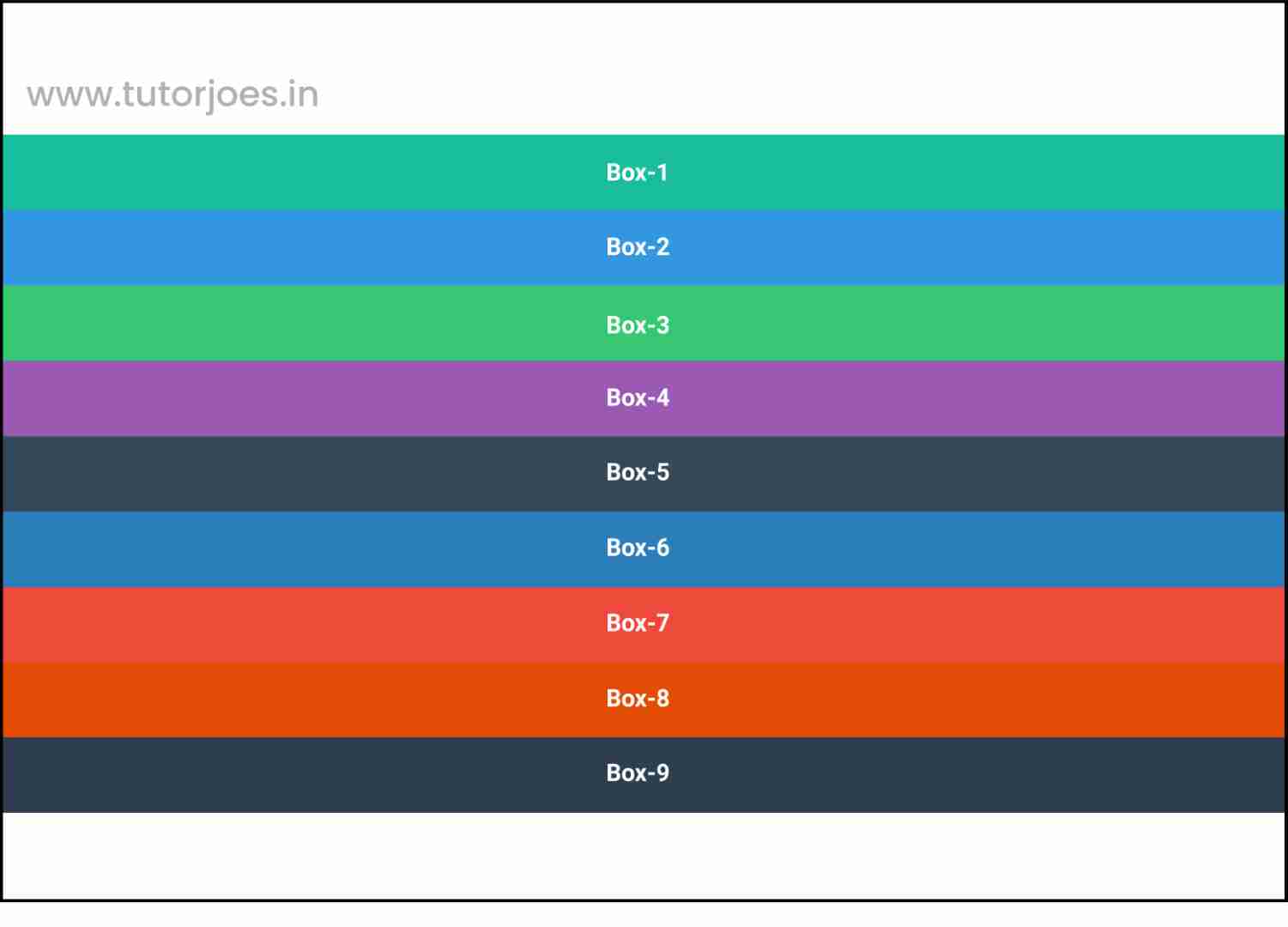
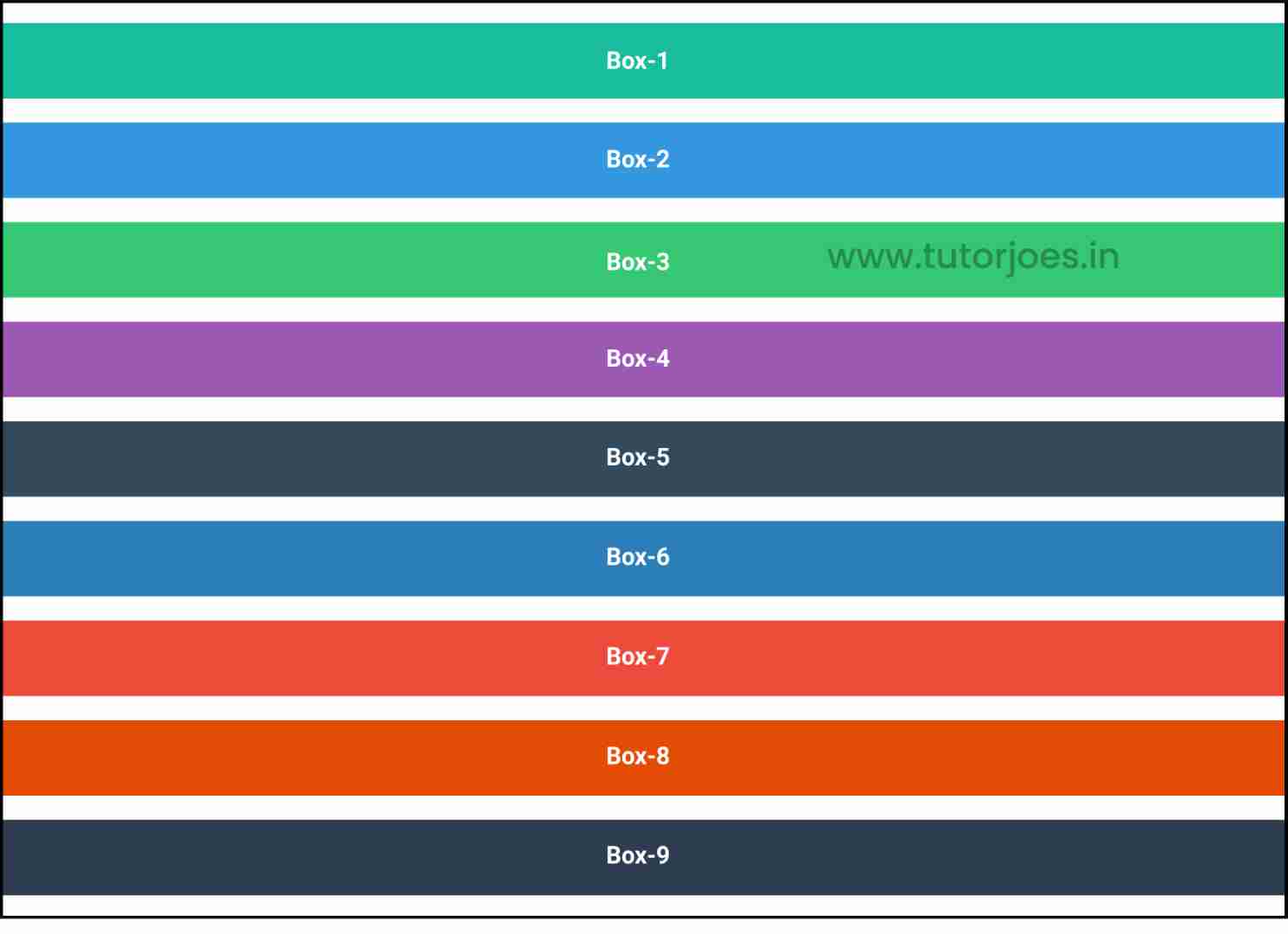
center
Flex items are packed toward the center of the line. The flex items on the line are placed flush with each other and aligned in the center of the line, with equal amounts of space between the main-start edge of the line and the first item on the line and between the main-end edge of the line and the last item on the line. (If the leftover free-space is negative, the flex items will overflow equally in both directions.)
flex-direction : row
flex-direction : column
space-between
Flex items are evenly distributed in the line. If the leftover free-space is negative or there is only a single flex item on the line, this value is identical to flex-start. Otherwise, the main-start margin edge of the first flex item on the line is placed flush with the main-start edge of the line, the main-end margin edge of the last flex item on the line is placed flush with the main-end edge of the line, and the remaining flex items on the line are distributed so that the spacing between any two adjacent items is the same.
flex-direction : row
flex-direction : column
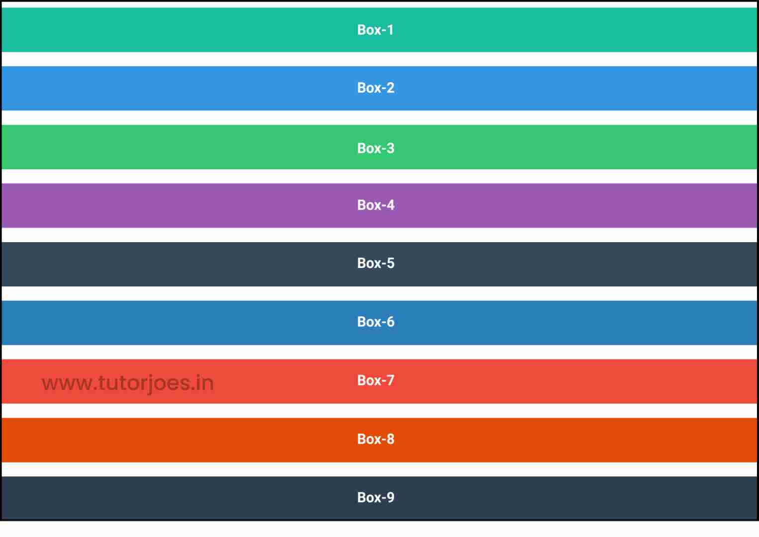
space-around
Flex items are evenly distributed in the line, with half-size spaces on either end. If the leftover free-space is negative or there is only a single flex item on the line, this value is identical to center. Otherwise, the flex items on the line are distributed such that the spacing between any two adjacent flex items on the line is the same, and the spacing between the first/last flex items and the flex container edges is half the size of the spacing between flex items.
flex-direction : row
flex-direction : column
space-evenly
The alignment subjects are evenly distributed in the alignment container, with a full-size space on either end. The alignment subjects are distributed so that the spacing between any two adjacent alignment subjects, before the first alignment subject, and after the last alignment subject is the same.
The default fallback alignment for this value is center.
flex-direction : row
flex-direction : column
Source Code :
<!DOCTYPE html>
<html lang="en">
<head>
  <meta charset="UTF-8">
  <meta http-equiv="X-UA-Compatible" content="IE=edge">
  <meta name="viewport" content="width=device-width, initial-scale=1.0">
  <title>Document</title>
  <link rel="stylesheet" href="justify_content.css">
</head>
<body>
  <div class="container">
    <div class="flex-item box-1">Box-1</div>
    <div class="flex-item box-2">Box-2</div>
    <div class="flex-item box-3">Box-3</div>
    <div class="flex-item box-4">Box-4</div>
    <div class="flex-item box-5">Box-5</div>
    <div class="flex-item box-6">Box-6</div>
    <div class="flex-item box-7">Box-7</div>
    <div class="flex-item box-8">Box-8</div>
    <div class="flex-item box-9">Box-9</div>
  </div>
</body>
</html>
justify_content.css :
@import url('https://fonts.googleapis.com/css2?family=Rubik:wght@300;400;500;600;700;900&display=swap');

*{
  margin: 0;
  padding: 0;
  font-family: 'Rubik', sans-serif;

}

.container{
  border:5px solid black;
}

.flex-item{
  color:white;
  font-size: 18px;
  padding: 16px;
  text-align: center;
}

.box-1{background-color: #1abc9c;}
.box-2{background-color:#3498db;}
.box-3{background-color: #2ecc71;}
.box-4{background-color: #9b59b6;}
.box-5{background-color:#34495e;}
.box-6{background-color:#2980b9;}
.box-7{background-color:#e74c3c;}
.box-8{background-color: #d35400;}
.box-9{background-color:#2c3e50;}

/*-----------------------------------*/
/*
  Justify-content => Main Axis Alignment
  row Main Axis => X
  column Main Axis => Y
*/
.container{
  display: flex;

  /*
  flex-direction: row;
 justify-content: flex-start;
 justify-content: flex-end;
 justify-content: center;
 justify-content: space-around;
 justify-content: space-evenly;
 justify-content: space-between;
 */
 flex-direction: column;
 height: 600px;
 justify-content: flex-start;
 justify-content: flex-end;
 justify-content: center;
 justify-content: space-around;
 justify-content: space-evenly;
 justify-content: space-between;
}
Live Preview
CSS Tutorial
Properties Reference
Cascading Style Sheet
Flexbox Tutorial
CSS Grid Tutorial
Transitions Properties
CSS Properties with Examples
CSS Selectors
CSS Pseudo Elements
CSS Attribute Selectors
Input Pseudo Classes
CSS Examples
CSS Animation Projects
Learn All in Tamil © Designed & Developed By Tutor Joes | Privacy Policy | Terms & Conditions