Understanding the "align-content" property in CSS
align-content is a CSS property used to set how multiple lines of items are aligned within a flex container when there is extra space on the cross-axis (vertical axis).
The align-content property can be used with the display: flex and display: grid properties. It controls the distribution of the extra space between multiple lines of items within a flex container.
Here are the possible values for the align-content property:
- flex-start: The items are packed to the start of the container.
- flex-end: The items are packed to the end of the container.
- center: The items are centered within the container.
- space-between: The items are evenly distributed in the container with equal space between them.
- space-around: The items are evenly distributed in the container with equal space around them.
- space-evenly: The items are evenly distributed in the container with equal space between and around them.
- stretch: The items are stretched to fit the container.
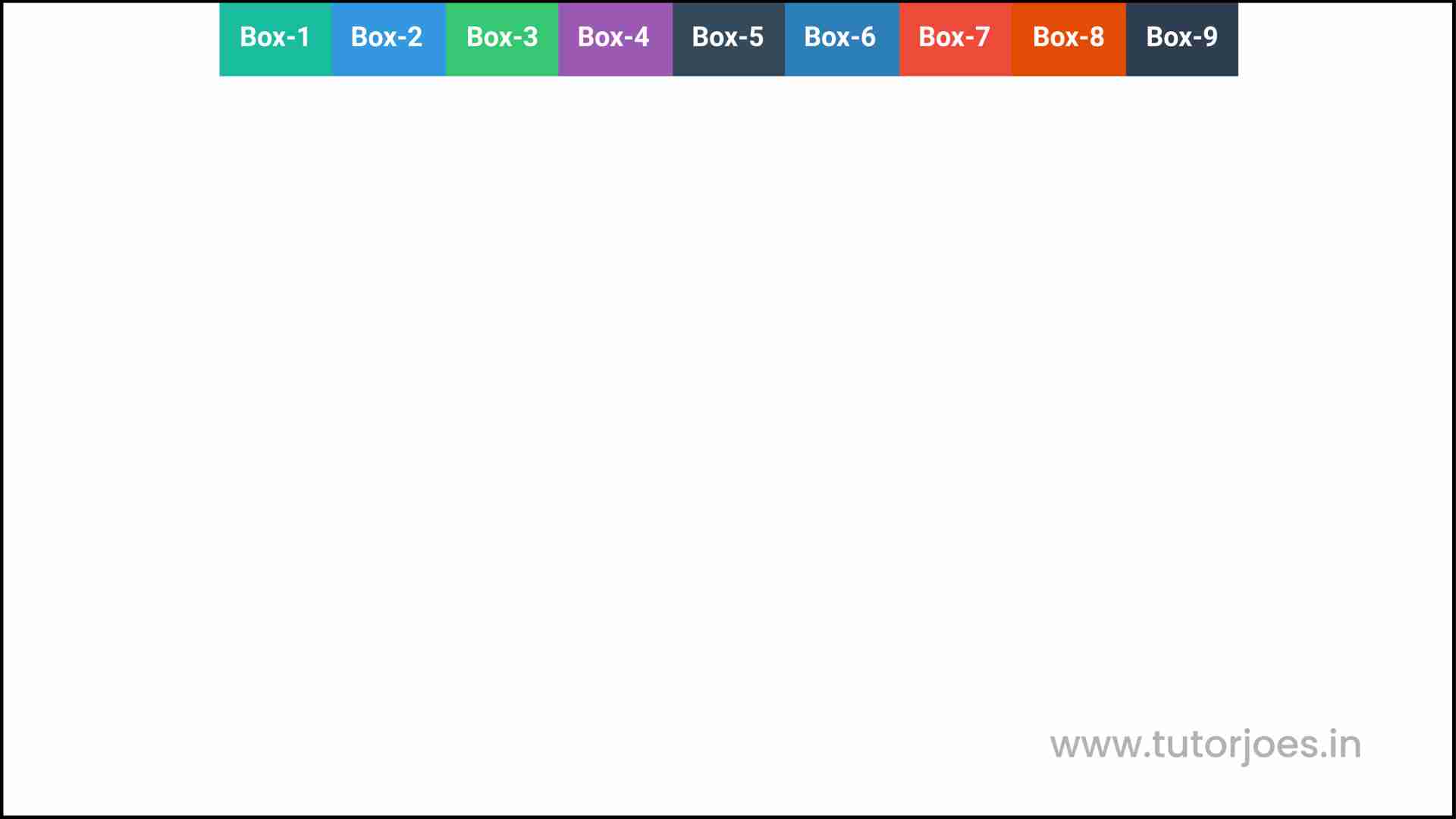
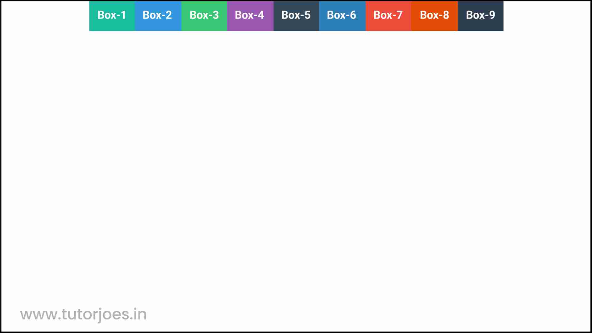
flex-start
align-content: flex-start is a CSS property used to align multiple lines of items at the start of the flex container on the cross-axis (vertical axis).
When align-content is set to flex-start, the first line of items in the container is aligned with the start of the container, and any additional lines of items are placed below the first line.
Here is an example of how to use align-content: flex-start in CSS:
.container {
  display: flex;
  flex-wrap: wrap;
  align-content: flex-start;
}
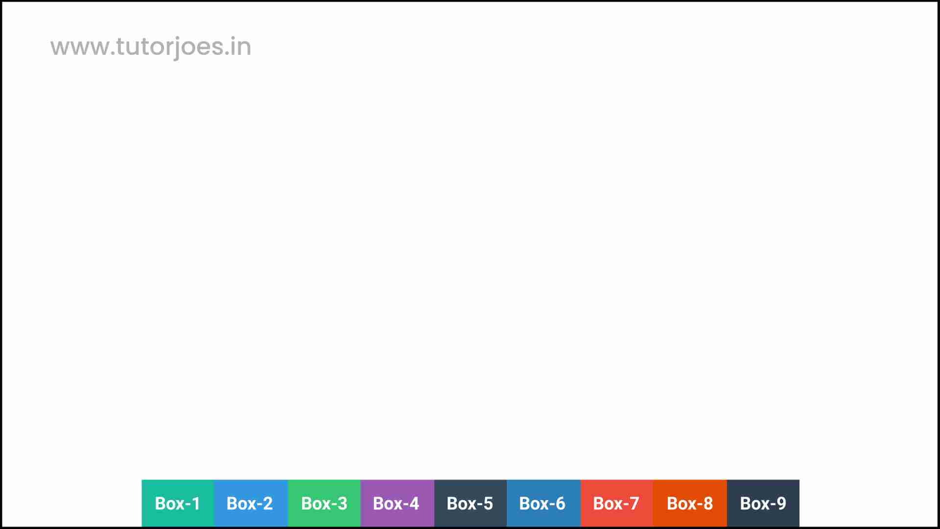
flex-end
align-content: flex-end is a CSS property used to align multiple lines of items at the end of the flex container on the cross-axis (vertical axis).
When align-content is set to flex-end, the last line of items in the container is aligned with the end of the container, and any additional lines of items are placed above the last line.
Here is an example of how to use align-content: flex-end in CSS:
.container {
  display: flex;
  flex-wrap: wrap;
  align-content: flex-end;
}
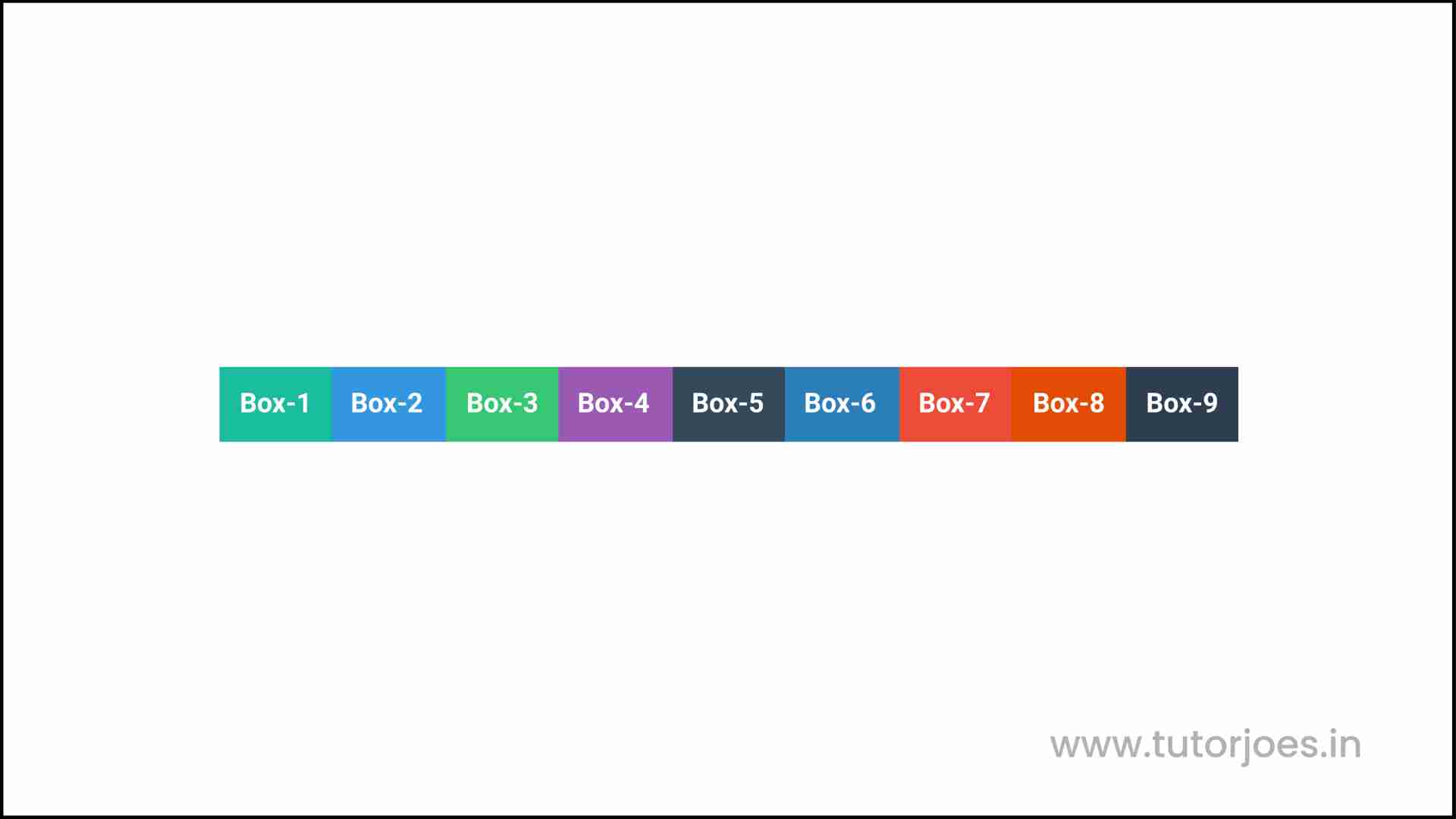
center
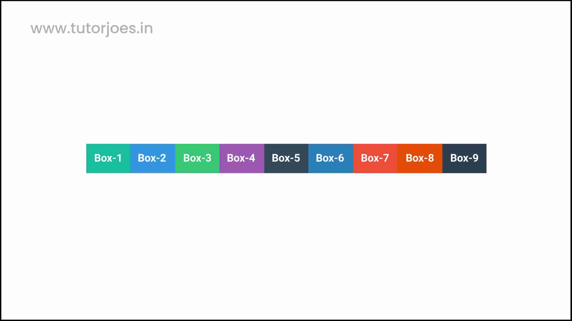
align-content: center is a CSS property used to center multiple lines of items within a flex container on the cross-axis (vertical axis).
When align-content is set to center, the multiple lines of items in the container are centered within the container.
Here is an example of how to use align-content: center in CSS:
.container {
  display: flex;
  flex-wrap: wrap;
  align-content: center;
}
space-between
align-content: space-between is a CSS property used to distribute multiple lines of items evenly within a flex container on the cross-axis (vertical axis), with equal space between the lines.
When align-content is set to space-between, the first line of items is aligned with the start of the container, and the last line of items is aligned with the end of the container. The remaining lines of items are evenly distributed between them, with equal space between each line.
Here is an example of how to use align-content: space-between in CSS:
.container {
  display: flex;
  flex-wrap: wrap;
  align-content: space-between;
}
space-around
align-content: space-around is a CSS property used to distribute multiple lines of items evenly within a flex container on the cross-axis (vertical axis), with equal space between the lines and half that amount of space at the beginning and end.
When align-content is set to space-around, the lines of items are distributed evenly within the container, with equal space between each line and half that amount of space at the beginning and end of the container.
Here is an example of how to use align-content: space-around in CSS:
.container {
  display: flex;
  flex-wrap: wrap;
  align-content: space-around;
}
stretch
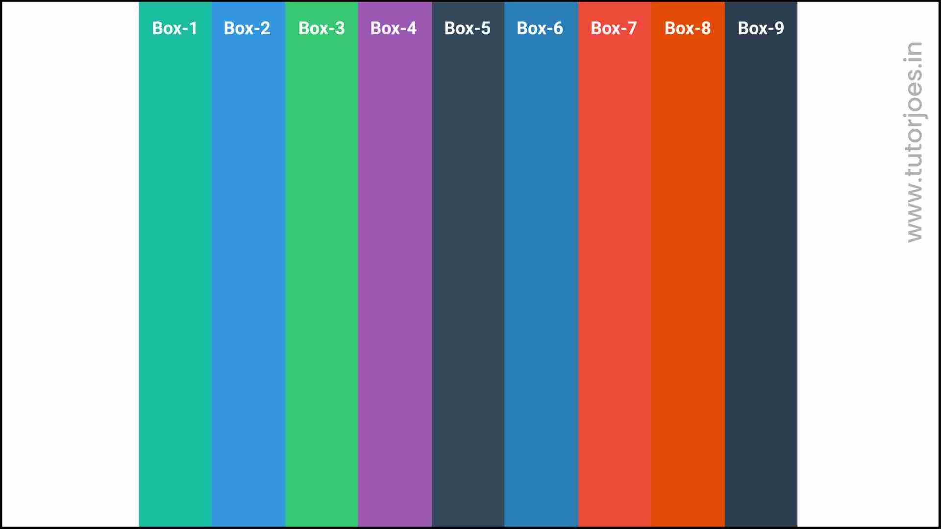
align-content: stretch is a CSS property used to stretch multiple lines of items within a flex container on the cross-axis (vertical axis), to fill the available space.
When align-content is set to stretch, the lines of items are stretched vertically to fill the available space within the container, regardless of their individual heights.
Here is an example of how to use align-content: stretch in CSS:
.container {
  display: flex;
  flex-wrap: wrap;
  align-content: stretch;
}
Here is an example of how to use the align-content property in CSS:
Source Code :
<!DOCTYPE html>
<html lang="en">
<head>
  <meta charset="UTF-8">
  <meta http-equiv="X-UA-Compatible" content="IE=edge">
  <meta name="viewport" content="width=device-width, initial-scale=1.0">
  <title>Document</title>
  <link rel="stylesheet" href="align_content.css">
</head>
<body>
  <div class="container">
    <div class="flex-item box-1">Box-1</div>
    <div class="flex-item box-2">Box-2</div>
    <div class="flex-item box-3">Box-3</div>
    <div class="flex-item box-4">Box-4</div>
    <div class="flex-item box-5">Box-5</div>
    <div class="flex-item box-6">Box-6</div>
    <div class="flex-item box-7">Box-7</div>
    <div class="flex-item box-8">Box-8</div>
    <div class="flex-item box-9">Box-9</div>
  </div>
</body>
</html>
align_content.css :
@import url('https://fonts.googleapis.com/css2?family=Rubik:wght@300;400;500;600;700;900&display=swap');

*{
  margin: 0;
  padding: 0;
  font-family: 'Rubik', sans-serif;

}

.container{
  border:5px solid black;
}

.flex-item{
  color:white;
  font-size: 18px;
  padding: 16px;
  text-align: center;
}

.box-1{background-color: #1abc9c;}
.box-2{background-color:#3498db;}
.box-3{background-color: #2ecc71;}
.box-4{background-color: #9b59b6;}
.box-5{background-color:#34495e;}
.box-6{background-color:#2980b9;}
.box-7{background-color:#e74c3c;}
.box-8{background-color: #d35400;}
.box-9{background-color:#2c3e50;}

/*-----------------------------------*/
/*
  Justify-content => Main Axis Alignment
  row Main Axis => X
  column Main Axis => Y

   align-items => Cross Axis Alignment
  row Cross Axis => Y
  column Cross Axis => X
*/

.container{
  display: flex;
  flex-direction: row;
  justify-content: center;
  flex-wrap: wrap;
  height: 600px;
  align-content: center;

 /* align-content: stretch;
  align-content:flex-start ;
  align-content:center;
  align-content:flex-end;
  align-content:space-between;
  align-content:space-around;*/
}
Live Preview
It's important to note that align-content only works when there are multiple lines of items within a flex container, and when flex-wrap is set to wrap or wrap-reverse. If there is only one line of items, align-items should be used instead.
CSS Tutorial
Properties Reference
Cascading Style Sheet
Flexbox Tutorial
CSS Grid Tutorial
Transitions Properties
CSS Properties with Examples
CSS Selectors
CSS Pseudo Elements
CSS Attribute Selectors
Input Pseudo Classes
CSS Examples
CSS Animation Projects
Learn All in Tamil © Designed & Developed By Tutor Joes | Privacy Policy | Terms & Conditions