Understanding the CSS Grid Justify-Content Property for Horizontal Alignment
The justify-content property in CSS Grid is used to control the horizontal alignment of grid items within the grid container. It allows you to distribute extra space in the grid container either by aligning items to the left, right, or center of the container, or by distributing the space evenly between the items.
The justify-content property in CSS Grid is used to control the horizontal alignment of grid items within the grid container. It allows you to distribute extra space in the grid container either by aligning items to the left, right, or center of the container, or by distributing the space evenly between the items.
- start: aligns items to the left of the grid container.
- end: aligns items to the right of the grid container.
- center: centers the items horizontally within the grid container.
- space-between: distributes the space between the items evenly, with no space at the beginning or end of the container.
- space-around: distributes the space around the items evenly, including space at the beginning and end of the container.
- space-evenly: distributes the space evenly between the items and at the beginning and end of the container.
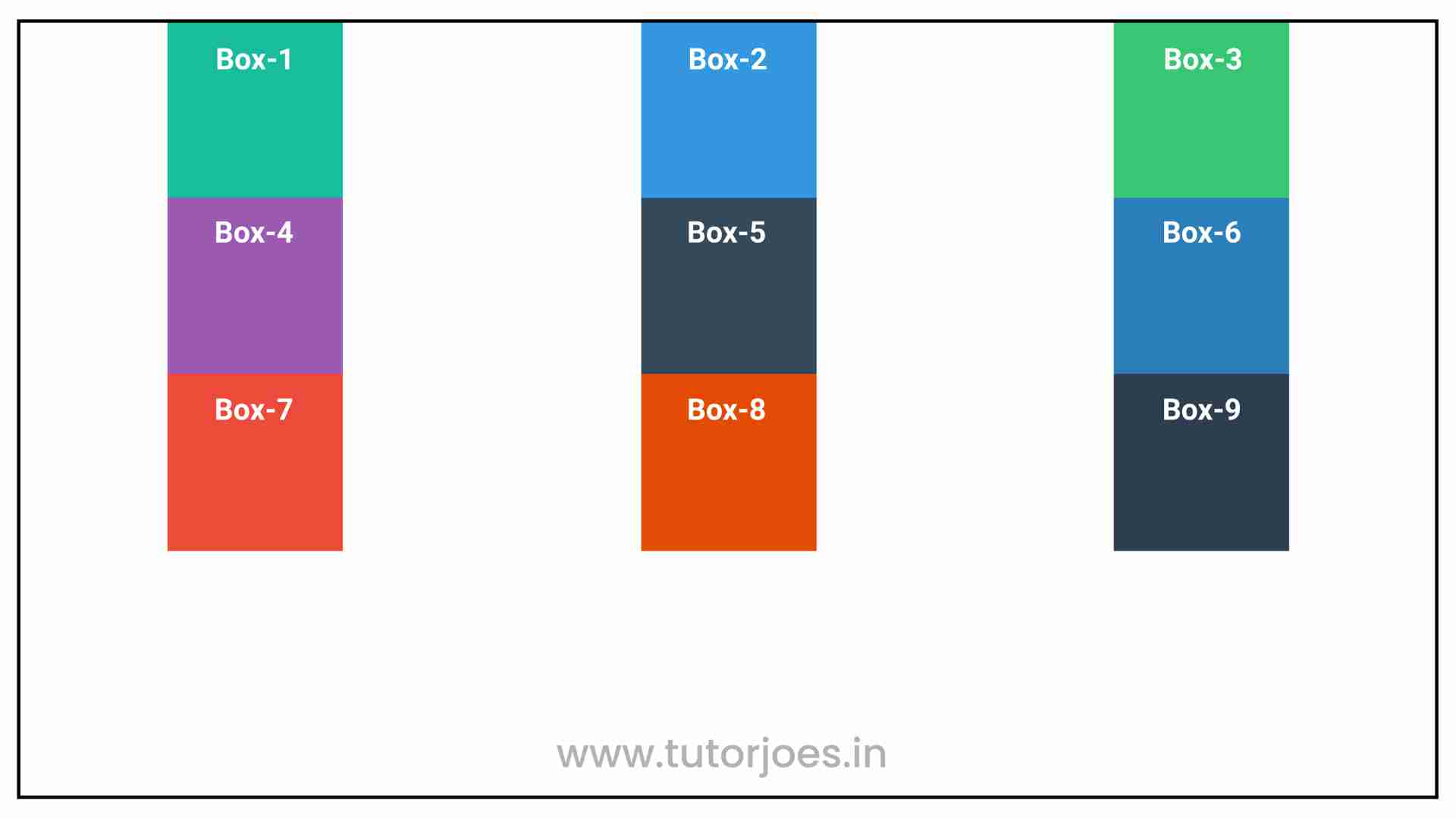
By default, the justify-content property is set to start, which aligns the items to the left of the grid container. However, you can change the alignment by setting the value to any of the other options.
justify-content: start
In CSS Grid, the justify-content: start property aligns grid items to the left of the grid container. This means that any extra space in the container will be positioned to the right of the items, resulting in a left-aligned layout.
When you use the start value for justify-content, all grid items will be positioned at the start of the row or column that they are in. This is the default value for justify-content, so if you don't explicitly set it to a different value, your grid items will be left-aligned by default.
Here's an example of how justify-content: start in CSS Grid:
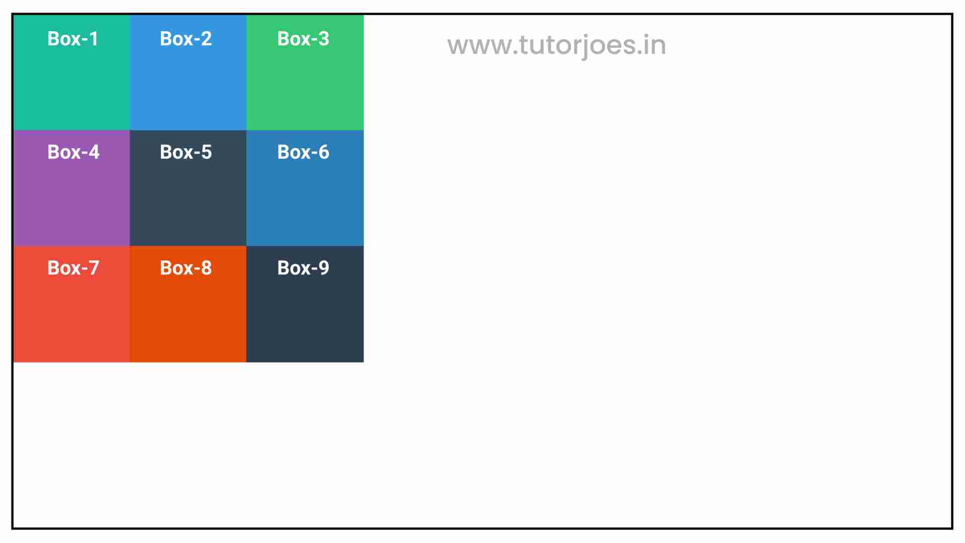
You can use justify-content: start to create left-aligned grid layouts, which can be useful for certain designs where left alignment is desired. However, keep in mind that you can always change the justify-content property to a different value if you want to center or right-align your grid items instead.
justify-content: center
In CSS Grid, the justify-content: center property aligns grid items to the center of the grid container. This means that any extra space in the container will be distributed evenly to both sides of the items, resulting in a horizontally centered layout.
When you use the center value for justify-content, all grid items will be positioned at the center of the row or column that they are in. This can be useful for creating balanced and symmetrical layouts.
Here's an example of how justify-content: center in CSS Grid:
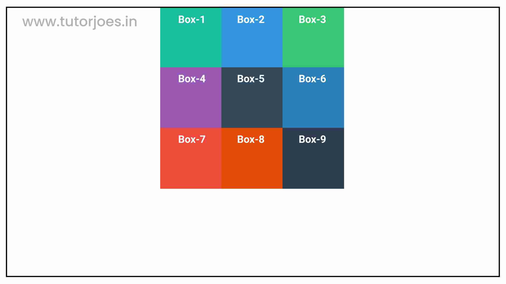
You can use justify-content: center to create horizontally centered grid layouts, which can be useful for certain designs where balance and symmetry are desired. However, keep in mind that you can always change the justify-content property to a different value if you want to left-align or right-align your grid items instead.
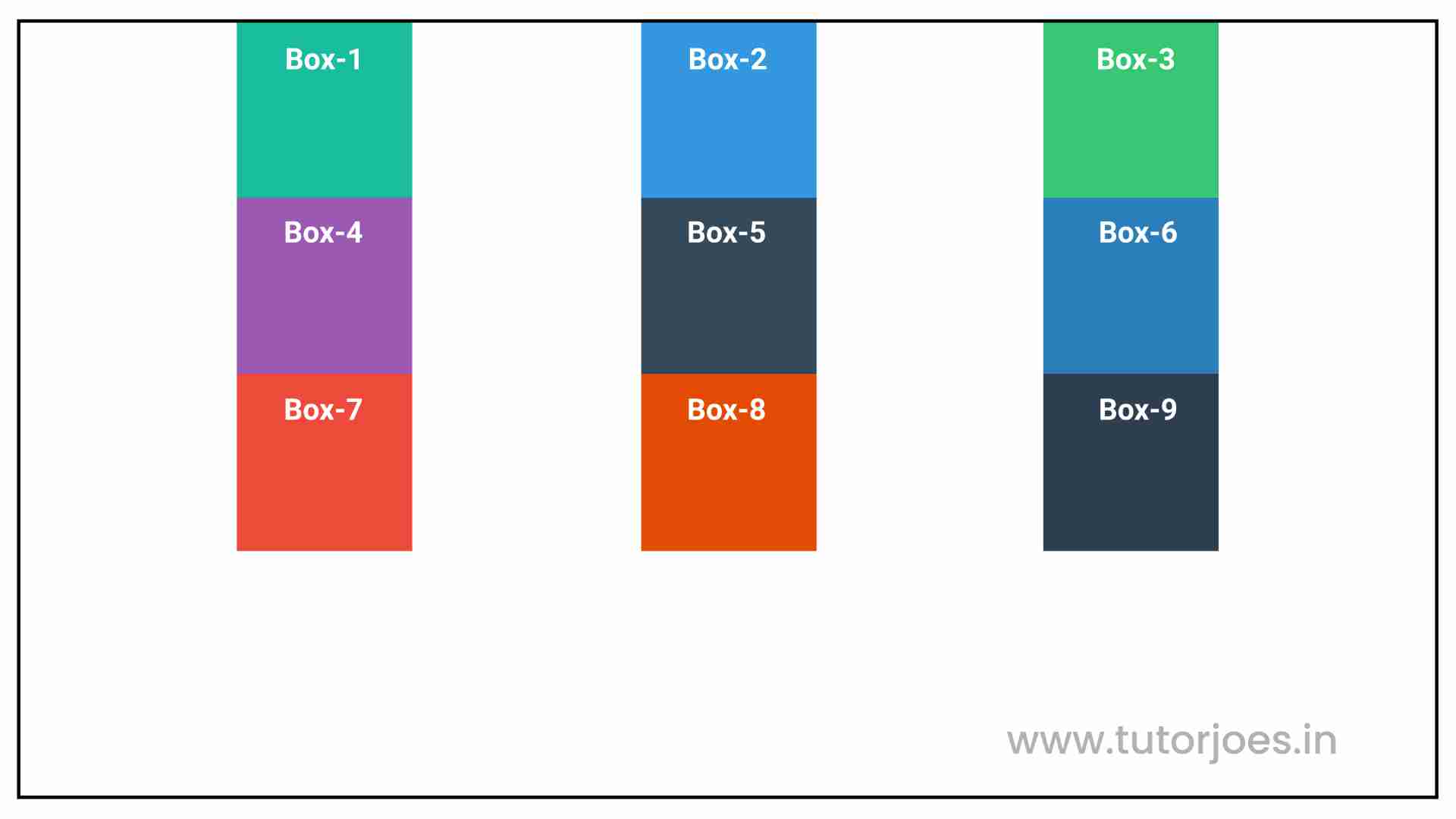
justify-content: end
In CSS Grid, the justify-content: end property aligns grid items to the end of the grid container. This means that any extra space in the container will be distributed to the left or right of the items, depending on the direction of the layout (LTR or RTL).
When you use the end value for justify-content, all grid items will be positioned at the end of the row or column that they are in. This can be useful for creating layouts where you want the content to be aligned to the right or left side of the container.
Here's an example of how justify-content: end in CSS Grid:
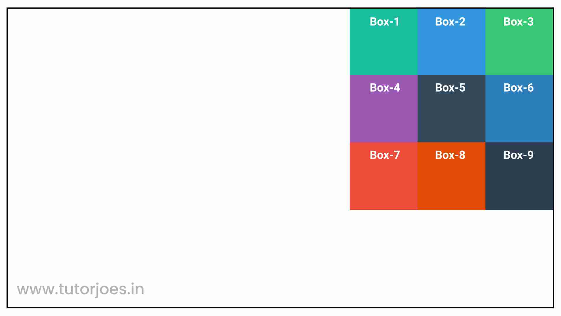
When you use the end value for justify-content, all grid items will be positioned at the end of the row or column that they are in. This can be useful for creating layouts where you want the content to be aligned to the right or left side of the container.
justify-content: space-between
In CSS Grid, the justify-content: space-between property distributes the grid items evenly along the row or column axis, with the first item aligned to the start edge and the last item aligned to the end edge. Any extra space is evenly distributed between the grid items.
When you use space-between, the grid items are evenly spaced, with the first item aligned to the start edge of the container and the last item aligned to the end edge of the container. Any extra space is evenly distributed between the grid items.
Here's an example of how justify-content: space-between in CSS Grid:
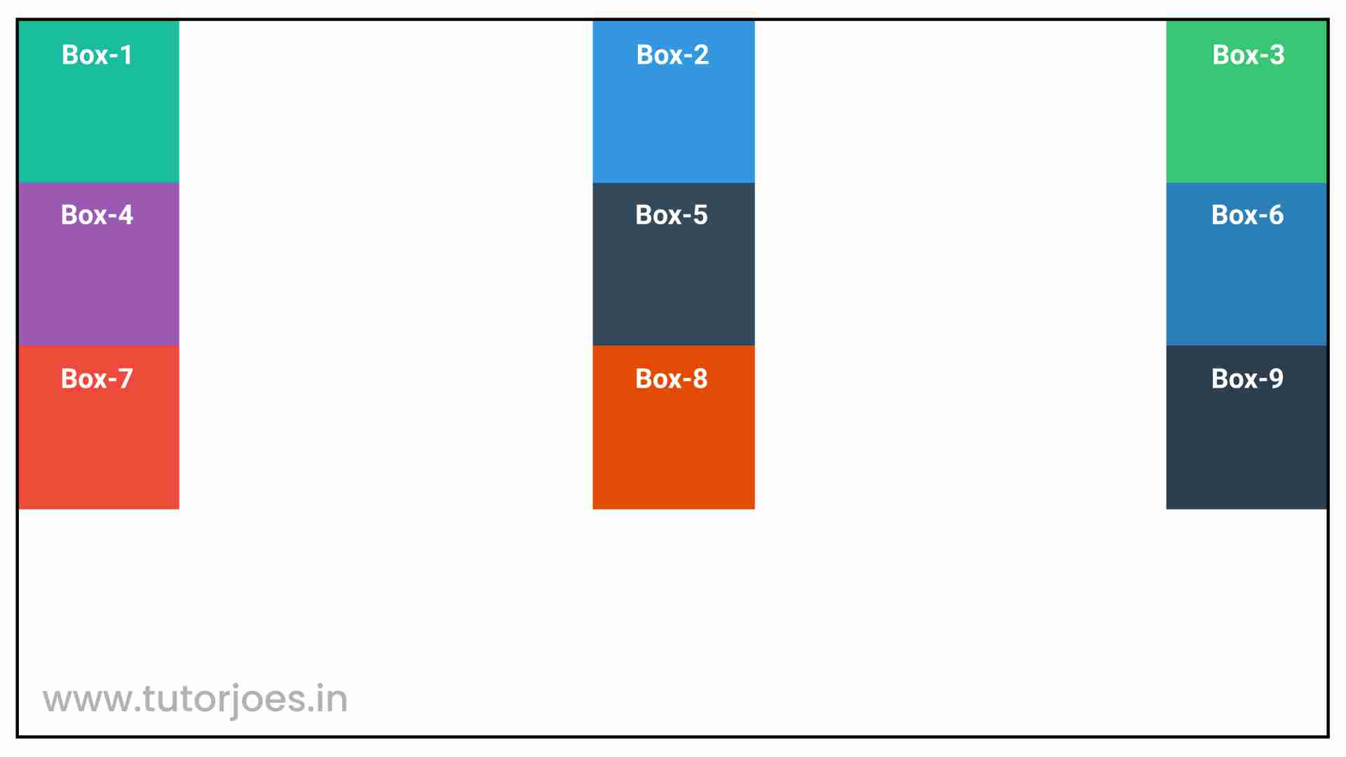
You can use justify-content: space-between to create layouts where you want the grid items to be evenly spaced with equal spacing between them. However, keep in mind that you can always change the justify-content property to a different value if you want to align or distribute your grid items in a different way.
justify-content: space-around
In CSS Grid, the justify-content: space-around property distributes the grid items evenly along the row or column axis, with equal space around them. This means that the space between each pair of adjacent items will be equal, as well as the space between the first and last items and the container edges.
When you use space-around, the grid items are evenly spaced, with equal space between them and the container edges. Any extra space is evenly distributed between the grid items.
Here's an example of how justify-content: space-around in CSS Grid:
You can use justify-content: space-around to create layouts where you want the grid items to be evenly spaced with equal spacing between them and the container edges. However, keep in mind that you can always change the justify-content property to a different value if you want to align or distribute your grid items in a different way.
justify-content: space-evenly
In CSS Grid, the justify-content: space-evenly property distributes the grid items evenly along the row or column axis, with equal space between them and the container edges. This is similar to justify-content: space-around, but it also adds equal space between each pair of adjacent items, which means that the space between each item and its neighbors will be the same.
Here's an example of how justify-content: space-evenly in CSS Grid:
You can use justify-content: space-evenly to create layouts where you want the grid items to be evenly spaced with equal spacing between them and the container edges, as well as between each pair of adjacent items. However, keep in mind that you can always change the justify-content property to a different value if you want to align or distribute your grid items in a different way.
Here's an example:
Source Code :
<!DOCTYPE html>
<html lang="en">
<head>
  <meta charset="UTF-8">
  <meta http-equiv="X-UA-Compatible" content="IE=edge">
  <meta name="viewport" content="width=device-width, initial-scale=1.0">
  <title>Document</title>
  <link rel="stylesheet" href="justify-content.css">
</head>
<body>
  <div class="container">
    <div class="grid-item box-1">Box-1</div>
    <div class="grid-item box-2">Box-2</div>
    <div class="grid-item box-3">Box-3</div>
    <div class="grid-item box-4">Box-4</div>
    <div class="grid-item box-5">Box-5</div>
    <div class="grid-item box-6">Box-6</div>
    <div class="grid-item box-7">Box-7</div>
    <div class="grid-item box-8">Box-8</div>
    <div class="grid-item box-9">Box-9</div>
  </div>
</body>
</html>
justify-content.css :
@import url('https://fonts.googleapis.com/css2?family=Rubik:wght@300;400;500;600;700;900&display=swap');

*{
  margin: 0;
  padding: 0;
  font-family: 'Rubik', sans-serif;
  box-sizing: border-box;
}

.container{
  border:5px solid black;
  margin: 20px;
}

.grid-item{
  color:white;
  font-size: 18px;
  padding: 16px;
  text-align: center;
}

.box-1{background-color: #1abc9c;}
.box-2{background-color:#3498db;}
.box-3{background-color: #2ecc71;}
.box-4{background-color: #9b59b6;}
.box-5{background-color:#34495e;}
.box-6{background-color:#2980b9;}
.box-7{background-color:#e74c3c;}
.box-8{background-color: #d35400;}
.box-9{background-color:#2c3e50;}

/**-----------------------------------------------*/

.container{
  display: grid;
  height: 800px;
  grid-template: repeat(3,200px) / repeat(3,200px);
  justify-content: start;
  justify-content: center;
  justify-content: end;
  justify-content: space-between;
  justify-content: space-around;
  justify-content: space-evenly;

}
Live Preview
The justify-content property is useful for creating flexible grid layouts that can adjust to different screen sizes and layouts. By controlling the horizontal alignment of grid items, you can create visually appealing designs that are easy to read and navigate.
CSS Tutorial
Properties Reference
Cascading Style Sheet
Flexbox Tutorial
CSS Grid Tutorial
Transitions Properties
CSS Properties with Examples
CSS Selectors
CSS Pseudo Elements
CSS Attribute Selectors
Input Pseudo Classes
CSS Examples
CSS Animation Projects
Learn All in Tamil © Designed & Developed By Tutor Joes | Privacy Policy | Terms & Conditions