Vertical Centering with CSS Flexbox: The Complete Guide
In CSS Flexbox, vertical centering refers to the technique of vertically aligning an element within its parent container. This is achieved by using the align-items property, which controls the vertical alignment of the items within the flex container.
By default, the align-items property is set to stretch, which means that the items will stretch to fill the full height of the container. However, by setting the align-items property to center, we can vertically center the items within the container.
Here's an example of how to vertically center an element within its parent container using CSS Flexbox:
This is a CSS code that demonstrates how to center a box element vertically and horizontally using CSS Flexbox. Let me explain each part of the code in detail:
* {
  margin: 0;
  padding: 0;
}
This sets the margin and padding of all elements to zero, which is a common technique to remove any unwanted space around the elements.
.container {
  background-color: aliceblue;
  height: 100vh;
  width: 100vw;
  display: flex;
  justify-content: center;
  align-items: center;
}
This creates a container element with a background color of "aliceblue", and sets its height and width to 100% of the viewport height and width using the "vh" and "vw" units. It also sets the display property to "flex", which enables Flexbox layout, and sets the justify-content and align-items properties to "center", which centers the child elements horizontally and vertically within the container.
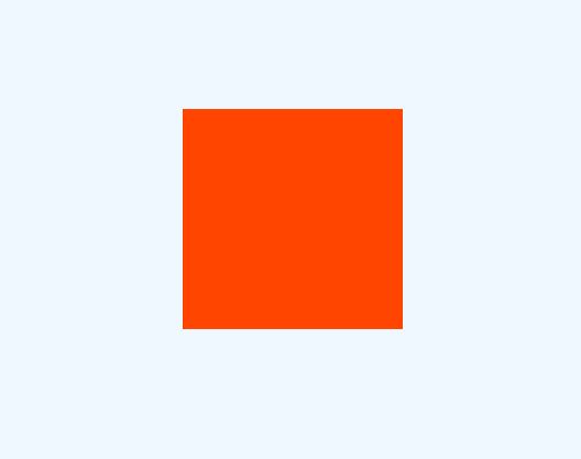
.box {
  width: 200px;
  height: 200px;
  background-color: orangered;
}
This creates a box element with a width and height of 200 pixels, and a background color of "orangered". This is the element that we want to center within the container.
The code also includes some commented-out lines that demonstrate an alternative method of centering the box element. These lines use absolute positioning and the "transform" property to center the box element. However, using CSS Flexbox is generally considered to be a more modern and flexible way of creating layouts.
Source Code :
<!DOCTYPE html>
<html lang="en">
<head>
  <meta charset="UTF-8">
  <meta http-equiv="X-UA-Compatible" content="IE=edge">
  <meta name="viewport" content="width=device-width, initial-scale=1.0">
  <title>Document</title>
  <link rel="stylesheet" href="style.css">
</head>
<body>
  <div class="container">
    <div class="box"></div>
  </div>
</body>
</html>
css/style.css
*{
  margin: 0;
  padding: 0;
}

.container{
  background-color: aliceblue;
  height: 100vh;
  width: 100vw;
  /*
  position: relative;
  */
  display: flex;
  justify-content: center;
  align-items: center;
}

.box{
  width: 200px;
  height: 200px;
  background-color:orangered;
  /*
  position: absolute;
  top: 50%;
  left: 50%;
  transform: translate(-50%,-50%);
  */
}
Output
Live Preview
CSS Tutorial
Properties Reference
Cascading Style Sheet
Flexbox Tutorial
CSS Grid Tutorial
Transitions Properties
CSS Properties with Examples
CSS Selectors
CSS Pseudo Elements
CSS Attribute Selectors
Input Pseudo Classes
CSS Examples
CSS Animation Projects
Learn All in Tamil © Designed & Developed By Tutor Joes | Privacy Policy | Terms & Conditions