Create a Animated Glowing Text in CSS
Neon text can add a nice, futuristic touch to any website. I’ve always loved the magic of neon signs, and wanted to recreate them using CSS.
we're going to take a look at how to add glowing effects to text. We’ll also take a look at various ways to animate the neon signs, all using CSS and keyframes.
Source Code :
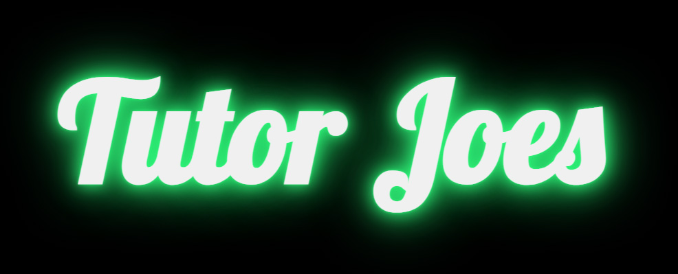
<!DOCTYPE html>
<html lang="en">
<head>
  <meta charset="UTF-8">
  <meta http-equiv="X-UA-Compatible" content="IE=edge">
  <meta name="viewport" content="width=device-width, initial-scale=1.0">
  <title>Neon Light Text</title>
  <link rel="stylesheet" href="css/style.css">
</head>
<body>
  <h1>Tutor Joes</h1>
</body>
</html>
css/style.css
@import url('https://fonts.googleapis.com/css2?family=Lobster&display=swap');


*{
  padding: 0;
  margin: 0;

}
body{
  width: 100vw;
  height: 100vh;
  font-family: 'Lobster', cursive;
  display: flex;
  justify-content: center;
  align-items: center;
  background-color:black;
}
/*
h1{
  color:grey;
  font-size: 200px;
  cursor: pointer;
  transition: 0.5s;
}

h1:hover{
color:white;
text-shadow:
0 0 5px #ff3838,
0 0 25px #ff3838,
0 0 50px #ff3838,
0 0 100px #ff3838;
}
*/

h1{
  color:grey;
  font-size: 200px;
  cursor: pointer;
  animation: glow 1s ease infinite;
}

@keyframes glow {
  from{
    color:grey;
  }
  to{
    color:white;
    text-shadow:
0 0 5px #32ff7e,
0 0 25px #32ff7e,
0 0 50px #32ff7e,
0 0 100px #32ff7e;
  }
}
Output
Live Preview
CSS Tutorial
Properties Reference
Cascading Style Sheet
Flexbox Tutorial
CSS Grid Tutorial
Transitions Properties
CSS Properties with Examples
CSS Selectors
CSS Pseudo Elements
CSS Attribute Selectors
Input Pseudo Classes
CSS Examples
CSS Animation Projects
Learn All in Tamil © Designed & Developed By Tutor Joes | Privacy Policy | Terms & Conditions