Understanding CSS Grid Template Areas
The grid-template-areas property in CSS Grid layout allows you to define named grid areas within a grid container. It enables you to create a grid layout by specifying the placement of grid items in relation to these named grid areas.
The grid-template-areas property uses a grid area naming syntax to define the layout of the grid container. The grid area naming syntax consists of a series of strings enclosed in quotation marks, where each string represents a row of the grid. Each string is made up of space-separated names that represent the names of the grid areas within that row.
- <number>: Specifies the grid row number that the grid item starts at.
- span <number>: Specifies the number of rows that the grid item will span.
- <name>: Specifies a named grid line to start or end the grid item at.
- span <name>: Specifies the number of rows that the grid item will span using named grid lines.
Here's an example:
Source Code :
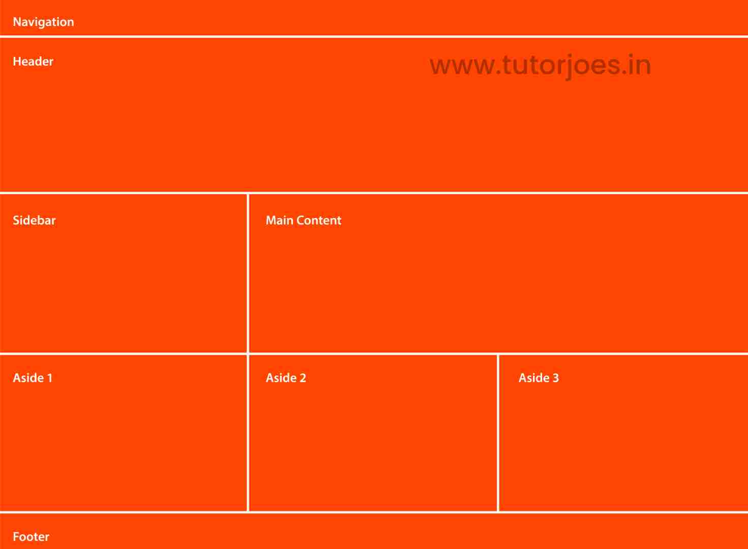
<!DOCTYPE html>
<html lang="en">
<head>
  <meta charset="UTF-8">
  <meta http-equiv="X-UA-Compatible" content="IE=edge">
  <meta name="viewport" content="width=device-width, initial-scale=1.0">
  <title>Document</title>
  <link rel="stylesheet" href="style.css">
</head>
<body>
  <div id="nav">Navigation</div>
  <div id="header">Header</div>
  <div id="sidebar">Sidebar</div>
  <div id="main">Main Content</div>
  <div id="aside1">Aside 1</div>
  <div id="aside2">Aside 2</div>
  <div id="aside3">Aside 3</div>
  <div id="footer">Footer</div>

</body>
</html>
style.css :
@import url('https://fonts.googleapis.com/css2?family=Rubik:wght@300;400;500;600;700;900&display=swap');

*{
  margin: 0;
  padding: 0;
  font-family: 'Rubik', sans-serif;
  box-sizing: border-box;
}
body{
  width: 100vw;
  height: 100vh;
  display: grid;
  grid-template-areas:
    'nav nav nav'
    'head head head'
    'sidebar content content'
    'aside1 aside2 aside3'
    'footer footer footer'
  ;
  grid-template-rows: 50px 200px 1fr 200px 50px;
  grid-template-columns:1fr 1fr 1fr ;
}

#nav,
#header,
#sidebar,
#main,
#aside1,
#aside2,
#aside3,
#footer
{
  background-color: orangered;
  color:white;
  padding: 20px;
  border:1px solid white;
}
#nav{
  grid-area: nav;
}
#header{
  grid-area: head;
}
#sidebar{
  grid-area: sidebar;
}

#main{
  grid-area: content;
}

#aside1{ grid-area: aside1;}
#aside2{ grid-area: aside2;}
#aside3{ grid-area: aside3;}

#footer{
  grid-area: footer;
}
The * selector sets all margins and padding to 0, sets the font family to Rubik, and sets the box-sizing property to border-box, which includes padding and border in the total width and height of an element.
The body element is set to full width and height of the viewport using width: 100vw and height: 100vh. It is also set to display as a grid container using display: grid.
The grid-template-areas property specifies the layout of the grid. In this example, the grid is divided into five rows and three columns. Each row has a specific height defined using grid-template-rows, and each column has an equal width defined using grid-template-columns.
The #nav, #header, #sidebar, #main, #aside1, #aside2, #aside3, and #footer selectors set the background color to orangered, the text color to white, and add padding and a white border to each of the grid items. They also assign the corresponding grid areas to each of these elements using the grid-area property.
Overall, this code creates a basic layout with a navigation bar at the top, a header section, a sidebar and content section, three additional sections at the bottom, and a footer at the bottom. The layout is created using CSS Grid, and each section is assigned to a specific grid area using the grid-area property.
Live Preview
Overall, this example creates a three-row, three-column grid layout with named grid areas for the header, main content, sidebar, and footer sections.
CSS Tutorial
Properties Reference
Cascading Style Sheet
Flexbox Tutorial
CSS Grid Tutorial
Transitions Properties
CSS Properties with Examples
CSS Selectors
CSS Pseudo Elements
CSS Attribute Selectors
Input Pseudo Classes
CSS Examples
CSS Animation Projects
Learn All in Tamil © Designed & Developed By Tutor Joes | Privacy Policy | Terms & Conditions