A Comprehensive Guide to CSS Align Items Property
align-items is a CSS property that's used to control the vertical alignment of flexbox items or grid cells within a container. It determines how the extra space in the container is distributed among the flex items or grid cells along the cross axis (which is usually vertical).
There are several values that you can use for align-items
- stretch: This value stretches the items to fill the container vertically. This is the default value if you don't specify anything.
- flex-start: This value aligns the items to the start of the container.
- flex-end: This value aligns the items to the end of the container.
- center: This value centers the items vertically within the container.
- baseline: This value aligns the items such that their baselines are aligned.
You can set the align-items property on a flex container using the following syntax:
.container {
  display: flex;
  align-items: value;
}
Where .container is the class or ID of the container element, and value is one of the values listed above.
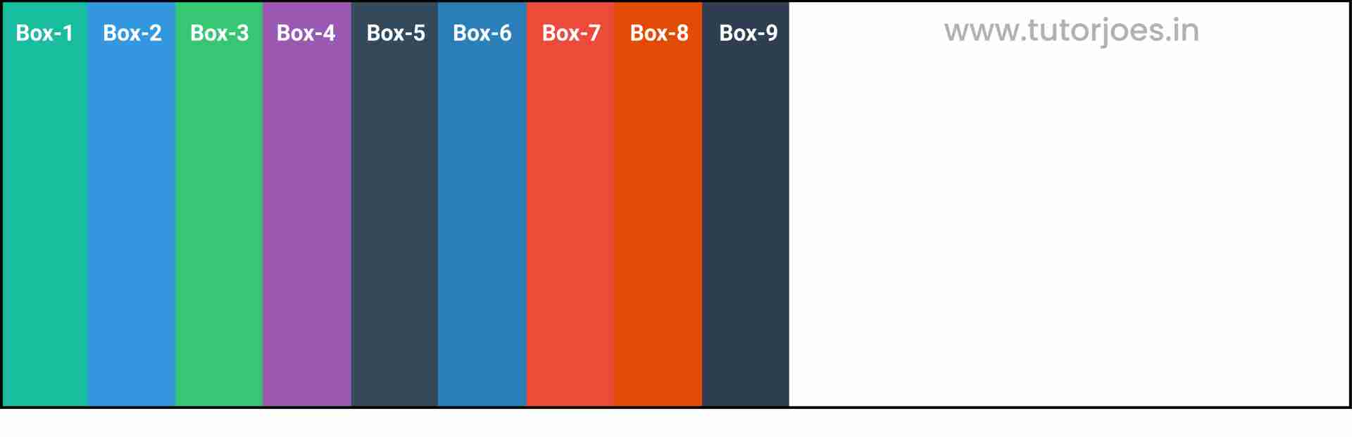
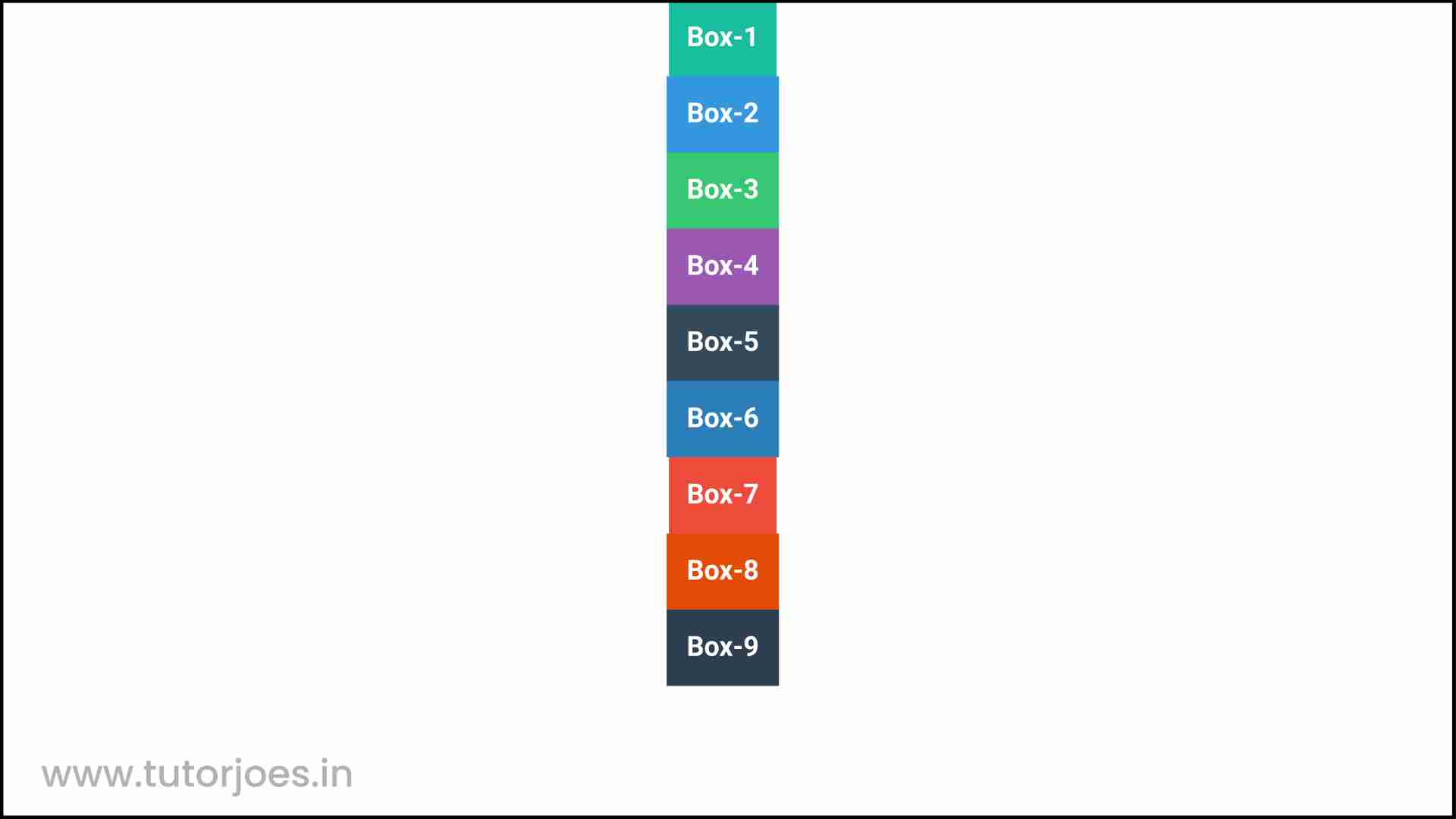
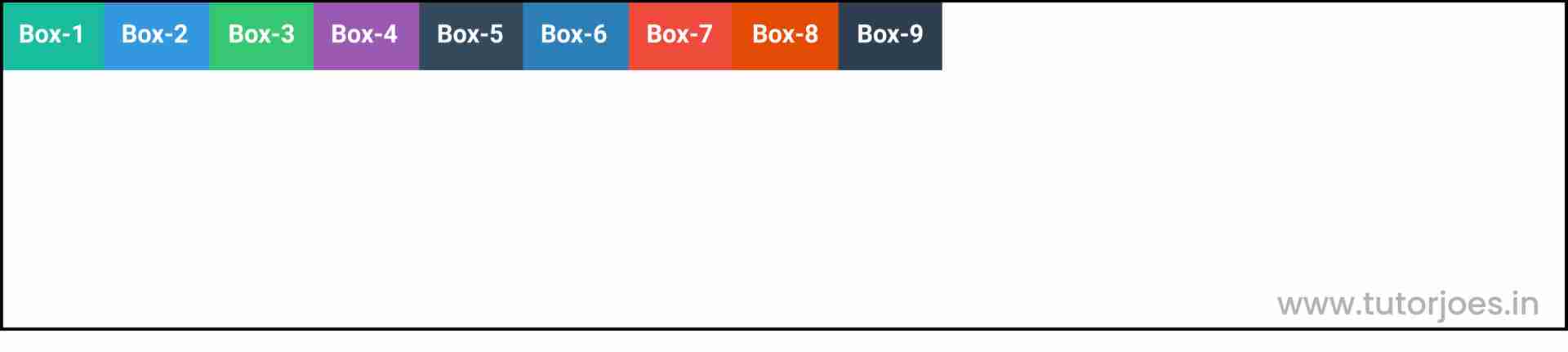
stretch
align-items: stretch is a CSS property that stretches the flexbox items or grid cells to fill the container vertically, along the cross axis. This is the default value if you don't specify anything.
When you set align-items to stretch, each item is stretched vertically to fill the entire height of the container along the cross axis, regardless of its individual height. This can be useful when you want to create a layout where all the items have the same height.
Here's an example of how to use align-items: stretch in CSS:
.container {
  display: flex;
  align-items: stretch;
}
flex-direction : row
flex-direction : column
In the above example, .container is the class or ID of the container element, and display: flex sets the container to be a flex container. align-items: stretch sets the vertical alignment of the items to stretch, so they fill the entire height of the container along the cross axis.
Note that if you set a fixed height on the container or any of the flex items, the stretch value will have no effect, as the items will not be able to stretch beyond their fixed height. In such cases, you might want to use other values for align-items, such as center or flex-start.
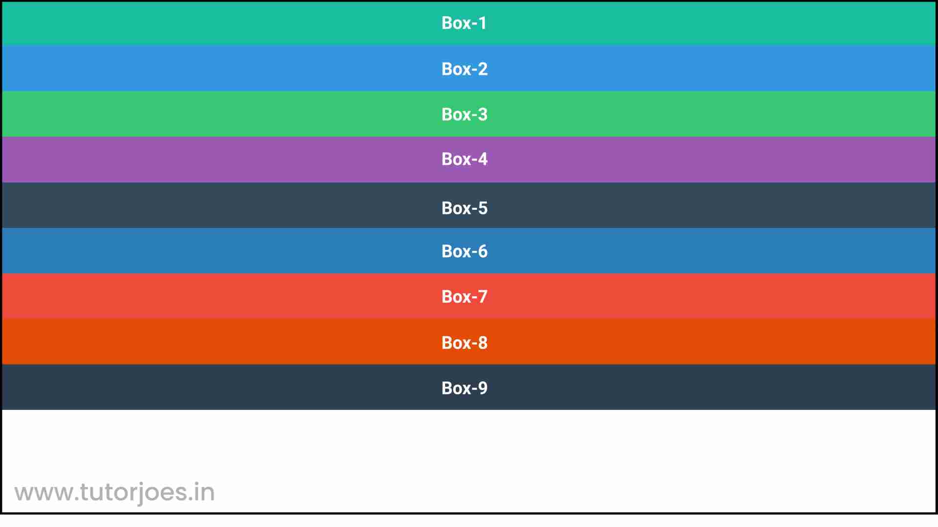
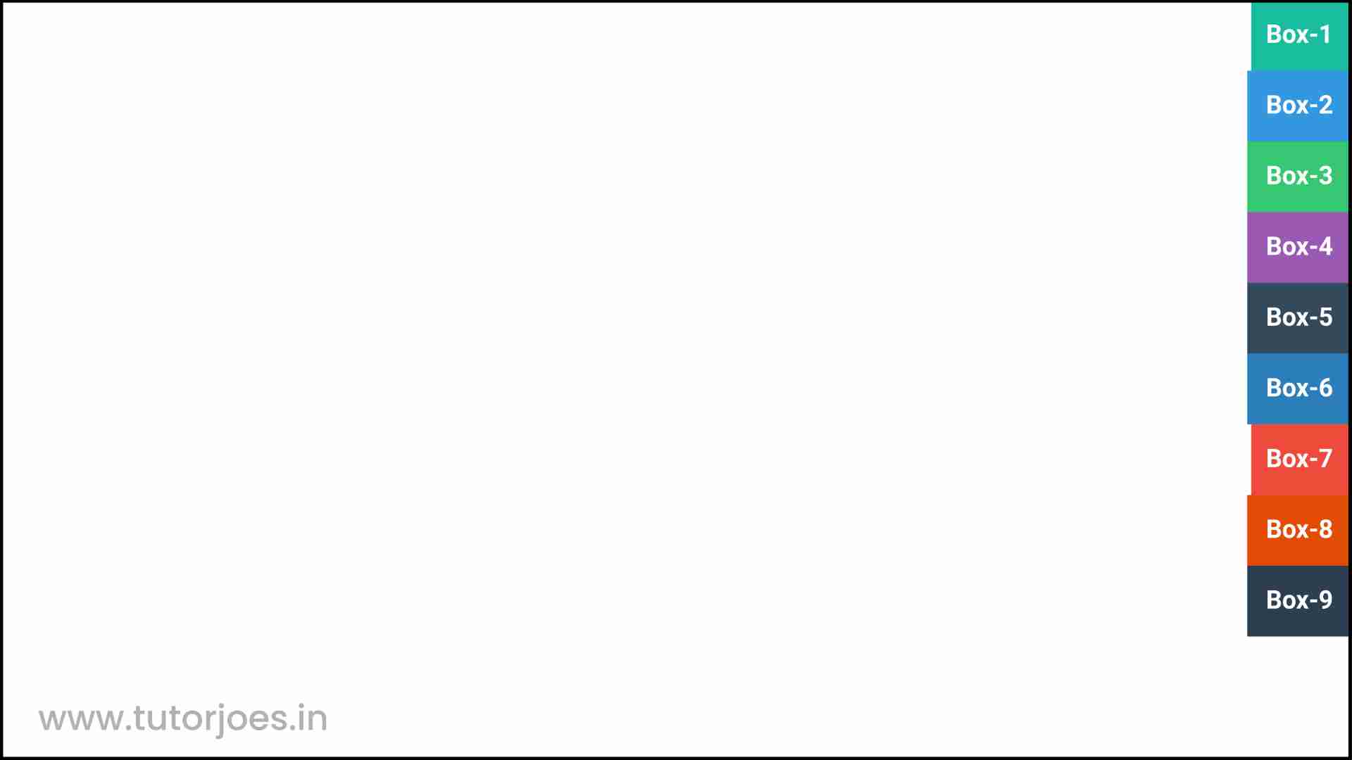
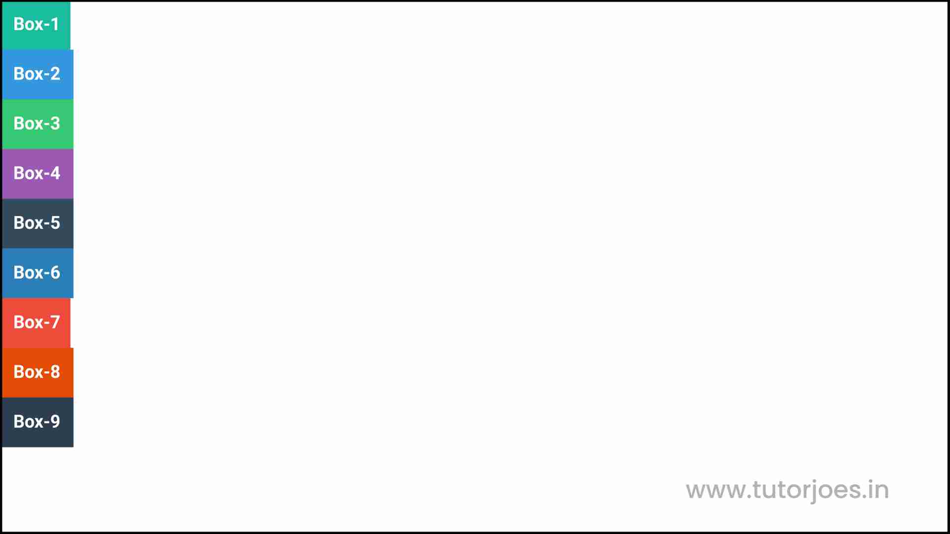
flex-start
align-items: flex-start is a CSS property that is used to align items along the cross axis (vertical axis) of a flex container, when the items have different heights.
When you set align-items: flex-start, the items are aligned at the top of the flex container, meaning that the tops of the items will be aligned with each other.
Here is an example of how align-items: flex-start can be used in CSS:
.container {
  display: flex;
  align-items: flex-start;
}
flex-direction : row
flex-direction : column

In the above example, the align-items: flex-start property is applied to a container element with the class .container. This will align the items within the container at the top.
It is important to note that align-items applies to all items within a container, so if you want to align a specific item differently, you should use thealign-self property instead.
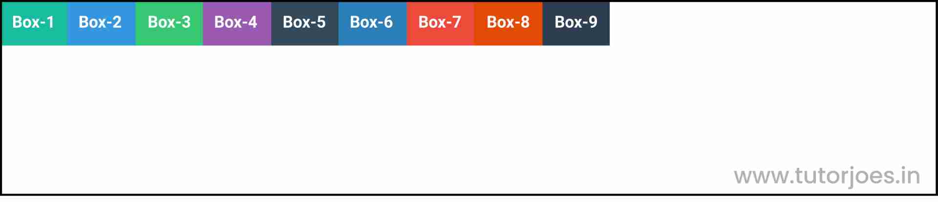
flex-end
align-items: flex-end is a CSS property that is used to align items along the cross axis (vertical axis) of a flex container, when the items have different heights.
When you set align-items: flex-end, the items are aligned at the bottom of the flex container, meaning that the bottoms of the items will be aligned with each other.
Here is an example of how align-items: flex-end can be used in CSS:
.container {
  display: flex;
  align-items: flex-end;
}
flex-direction : row
flex-direction : column
In the above example, the align-items: flex-end property is applied to a container element with the class .container. This will align the items within the container at the bottom.
It is important to note that align-items applies to all items within a container, so if you want to align a specific item differently, you should use the align-self property instead.
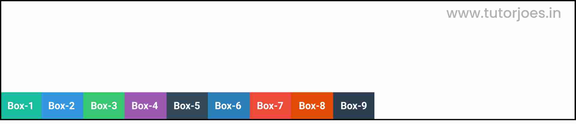
center
align-items: center is a CSS property that is used to align items along the cross axis (vertical axis) of a flex container, when the items have different heights.
When you set align-items: center, the items are aligned at the vertical center of the flex container, meaning that the centers of the items will be aligned with each other.
Here is an example of how align-items: center can be used in CSS:
.container {
  display: flex;
  align-items: center;
}
flex-direction : row
flex-direction : column
In the above example, the align-items: center property is applied to a container element with the class .container. This will align the items within the container at the vertical center.
It is important to note that align-items applies to all items within a container, so if you want to align a specific item differently, you should use the align-self property instead.
baseline
align-items: baseline is a CSS property that is used to align items along the baseline of the flex container. The baseline is an imaginary line upon which the text in the items sits.
When you set align-items: baseline, the items are aligned along their baselines, meaning that the baselines of the items will be aligned with each other.
Here is an example of how align-items: baseline can be used in CSS:
.container {
  display: flex;
  align-items: baseline;
}
flex-direction : row
flex-direction : column
In the above example, the align-items: baseline property is applied to a container element with the class .container. This will align the items within the container along their baselines.
It is important to note that align-items applies to all items within a container, so if you want to align a specific item differently, you should use the align-self property instead. Additionally,align-items: baseline works best when all the items in the container have text content. If not, it may not align properly.
Source Code :
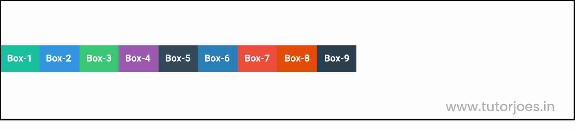
<!DOCTYPE html>
<html lang="en">
<head>
  <meta charset="UTF-8">
  <meta http-equiv="X-UA-Compatible" content="IE=edge">
  <meta name="viewport" content="width=device-width, initial-scale=1.0">
  <title>Document</title>
  <link rel="stylesheet" href="align-items.css">
</head>
<body>
  <div class="container">
    <div class="flex-item box-1">Box-1</div>
    <div class="flex-item box-2">Box-2</div>
    <div class="flex-item box-3">Box-3</div>
    <div class="flex-item box-4">Box-4</div>
    <div class="flex-item box-5">Box-5</div>
    <div class="flex-item box-6">Box-6</div>
    <div class="flex-item box-7">Box-7</div>
    <div class="flex-item box-8">Box-8</div>
    <div class="flex-item box-9">Box-9</div>
  </div>
</body>
</html>
align-items.css :
@import url('https://fonts.googleapis.com/css2?family=Rubik:wght@300;400;500;600;700;900&display=swap');

*{
  margin: 0;
  padding: 0;
  font-family: 'Rubik', sans-serif;

}

.container{
  border:5px solid black;
}

.flex-item{
  color:white;
  font-size: 18px;
  padding: 16px;
  text-align: center;
}

.box-1{background-color: #1abc9c;}
.box-2{background-color:#3498db;}
.box-3{background-color: #2ecc71;}
.box-4{background-color: #9b59b6;}
.box-5{background-color:#34495e;}
.box-6{background-color:#2980b9;}
.box-7{background-color:#e74c3c;}
.box-8{background-color: #d35400;}
.box-9{background-color:#2c3e50;}

/*-----------------------------------*/
/*
  Justify-content => Main Axis Alignment
  row Main Axis => X
  column Main Axis => Y
   align-items => Cross Axis Alignment
  row Cross Axis => Y
  column Cross Axis => X
*/
/*
.box-1{
  font-size: 45px;
}
*/
.container{
  display: flex;
 flex-direction: row;
 height: 350px;

 align-items: stretch;
 align-items: flex-start;
 align-items: flex-end;
 align-items: center;
 align-items: baseline;
}

.container{
  display: flex;
 flex-direction: column;
 height: 600px;
 align-items: stretch;
 align-items: flex-start;
 align-items: flex-end;
 align-items: center;
 align-items: baseline;
}
Live Preview
CSS Tutorial
Properties Reference
Cascading Style Sheet
Flexbox Tutorial
CSS Grid Tutorial
Transitions Properties
CSS Properties with Examples
CSS Selectors
CSS Pseudo Elements
CSS Attribute Selectors
Input Pseudo Classes
CSS Examples
CSS Animation Projects
Learn All in Tamil © Designed & Developed By Tutor Joes | Privacy Policy | Terms & Conditions