Understanding the place-content property in CSS Grid
The place-content property is used in CSS Grid to align the grid within the container both horizontally and vertically. It sets both the align-content and justify-content properties at the same time.
The place-content property accepts values that define how the grid should be positioned in the grid container, which can be one or two values. If two values are specified, the first value represents the vertical alignment and the second value represents the horizontal alignment.
Here are the possible values for place-content
- start: aligns the grid to the start of the container, both horizontally and vertically.
- end: aligns the grid to the end of the container, both horizontally and vertically.
- center: centers the grid within the container, both horizontally and vertically.
- stretch: stretches the grid to fill the container, both horizontally and vertically.
- space-between: evenly distributes the grid items with equal spacing between them, both horizontally and vertically.
- space-around: evenly distributes the grid items with equal spacing around them, both horizontally and vertically.
- space-evenly: evenly distributes the grid items with equal spacing around and between them, both horizontally and vertically.
It is important to note that place-content only works when there is extra space in the container, meaning the grid items are not taking up all the available space.
place-content: end center;
place-content: center;
Here's an example:
Source Code :
<!DOCTYPE html>
<html lang="en">
<head>
  <meta charset="UTF-8">
  <meta http-equiv="X-UA-Compatible" content="IE=edge">
  <meta name="viewport" content="width=device-width, initial-scale=1.0">
  <title>Document</title>
  <link rel="stylesheet" href="place-content.css">
</head>
<body>
  <div class="container">
    <div class="grid-item box-1">Box-1</div>
    <div class="grid-item box-2">Box-2</div>
    <div class="grid-item box-3">Box-3</div>
    <div class="grid-item box-4">Box-4</div>
    <div class="grid-item box-5">Box-5</div>
    <div class="grid-item box-6">Box-6</div>
    <div class="grid-item box-7">Box-7</div>
    <div class="grid-item box-8">Box-8</div>
    <div class="grid-item box-9">Box-9</div>
  </div>
</body>
</html>
place-content.css :
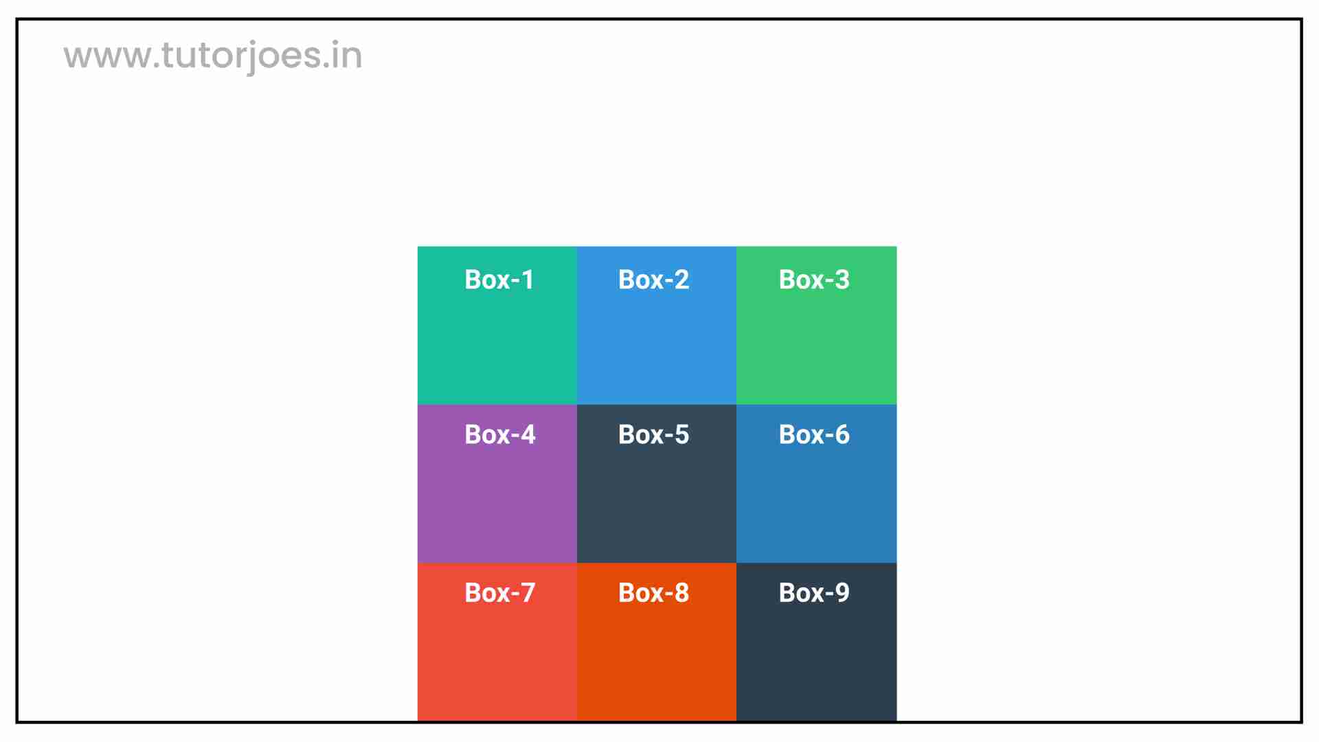
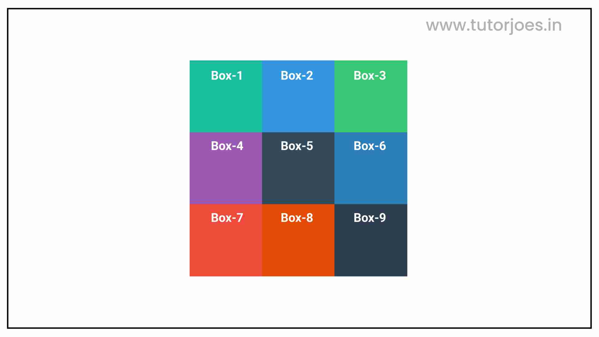
@import url('https://fonts.googleapis.com/css2?family=Rubik:wght@300;400;500;600;700;900&display=swap');

*{
  margin: 0;
  padding: 0;
  font-family: 'Rubik', sans-serif;
  box-sizing: border-box;
}

.container{
  border:5px solid black;
  margin: 20px;
}

.grid-item{
  color:white;
  font-size: 18px;
  padding: 16px;
  text-align: center;
}

.box-1{background-color: #1abc9c;}
.box-2{background-color:#3498db;}
.box-3{background-color: #2ecc71;}
.box-4{background-color: #9b59b6;}
.box-5{background-color:#34495e;}
.box-6{background-color:#2980b9;}
.box-7{background-color:#e74c3c;}
.box-8{background-color: #d35400;}
.box-9{background-color:#2c3e50;}

/**-----------------------------------------------*/

.container{
  display: grid;
  height: 800px;
  grid-template: repeat(3,200px) / repeat(3,200px);
 /*align-content , justify-content */
 place-content: end center;
 place-content: center;
}
The container class sets the display property to grid and sets the grid-template to repeat 3 rows with a height of 200px, and 3 columns with a width of 200px. It also uses the place-content property to vertically align the grid items to the end and horizontally center them, and then centers them both vertically and horizontally.
Live PreviewCSS Tutorial
Properties Reference
Cascading Style Sheet
Flexbox Tutorial
CSS Grid Tutorial
Transitions Properties
CSS Properties with Examples
CSS Selectors
CSS Pseudo Elements
CSS Attribute Selectors
Input Pseudo Classes
CSS Examples
CSS Animation Projects
Learn All in Tamil © Designed & Developed By Tutor Joes | Privacy Policy | Terms & Conditions