Using CSS Grid Place-Items Property for Grid Layout
The place-items property in CSS Grid is a shorthand property that allows you to set both justify-items and align-items properties in a single declaration. It is used to position grid items within their grid cells, both horizontally and vertically.
The place-items property accepts two values, the first one defines the horizontal alignment (i.e., justify-items), and the second one defines the vertical alignment (i.e., align-items). The values that can be used for place-items are the same as those for justify-items and align-items.
Some common values for the place-items property include:
- start: aligns the items to the start of the grid cell.
- end: aligns the items to the end of the grid cell.
- center: centers the items horizontally and vertically within the grid cell.
- stretch: stretches the items to fill the entire height and width of the grid cell.
Using the place-items property can simplify your CSS code and make it easier to create complex grid layouts. It can also help you create responsive web designs by allowing you to adjust the horizontal and vertical alignment of grid items based on the size of the viewport.
For example, you could use place-items: center center to center all grid items both horizontally and vertically within their cells. Or, you could use place-items: start stretch to align all items to the start of their cells horizontally and stretch them to fill the entire height of their cells vertically.
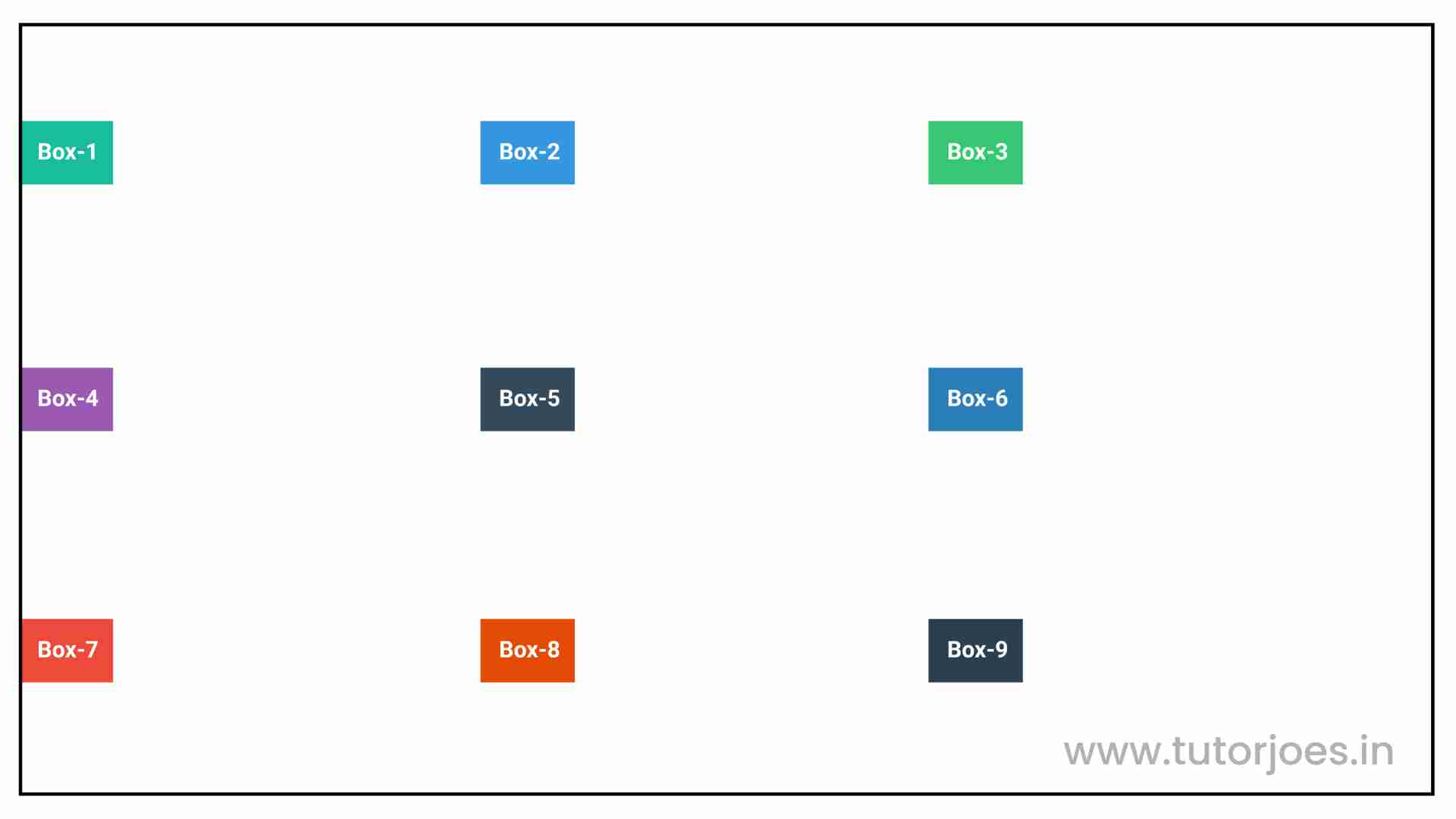
place-items:center start;
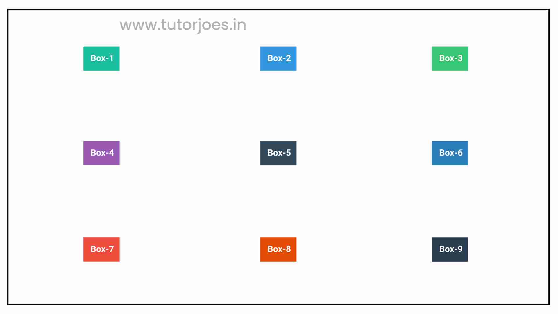
place-items:center;
Here's an example:
Source Code :
<!DOCTYPE html>
<html lang="en">
<head>
  <meta charset="UTF-8">
  <meta http-equiv="X-UA-Compatible" content="IE=edge">
  <meta name="viewport" content="width=device-width, initial-scale=1.0">
  <title>Document</title>
  <link rel="stylesheet" href="place-items.css">
</head>
<body>
  <div class="container">
    <div class="grid-item box-1">Box-1</div>
    <div class="grid-item box-2">Box-2</div>
    <div class="grid-item box-3">Box-3</div>
    <div class="grid-item box-4">Box-4</div>
    <div class="grid-item box-5">Box-5</div>
    <div class="grid-item box-6">Box-6</div>
    <div class="grid-item box-7">Box-7</div>
    <div class="grid-item box-8">Box-8</div>
    <div class="grid-item box-9">Box-9</div>
  </div>
</body>
</html>
place-items.css :
@import url('https://fonts.googleapis.com/css2?family=Rubik:wght@300;400;500;600;700;900&display=swap');

*{
  margin: 0;
  padding: 0;
  font-family: 'Rubik', sans-serif;
  box-sizing: border-box;
}

.container{
  border:5px solid black;
  margin: 20px;
}

.grid-item{
  color:white;
  font-size: 18px;
  padding: 16px;
  text-align: center;
}

.box-1{background-color: #1abc9c;}
.box-2{background-color:#3498db;}
.box-3{background-color: #2ecc71;}
.box-4{background-color: #9b59b6;}
.box-5{background-color:#34495e;}
.box-6{background-color:#2980b9;}
.box-7{background-color:#e74c3c;}
.box-8{background-color: #d35400;}
.box-9{background-color:#2c3e50;}

/**-----------------------------------------------*/
/*
   justify-items - Horizonal Axis Align
   align-items - vertical Axis Align

*/
.container{
  display: grid;
  height: 600px;
  grid-template: repeat(3,1fr) / repeat(3,1fr);
  /* align-items justify-items */
  place-items: center start;
  place-items: center;

}
Live Preview
Overall, the place-items property in CSS Grid provides a convenient and flexible way to position grid items within their cells, making it easier to create visually appealing and responsive web designs.
CSS Tutorial
Properties Reference
Cascading Style Sheet
Flexbox Tutorial
CSS Grid Tutorial
Transitions Properties
CSS Properties with Examples
CSS Selectors
CSS Pseudo Elements
CSS Attribute Selectors
Input Pseudo Classes
CSS Examples
CSS Animation Projects
Learn All in Tamil © Designed & Developed By Tutor Joes | Privacy Policy | Terms & Conditions