Wanderlust Web: Crafting a CSS-Animated Tourist Card
An animated tourist card in CSS is a visually appealing and interactive web design element typically used on travel and tourism websites to present information about destinations, attractions, or travel packages. This element combines HTML and CSS to create a card-like container that not only displays static content but also incorporates animations and interactive features to engage users. Below, I'll explain the key components and features of an animated tourist card in CSS.
Interactive Elements
To make the tourist card interactive, you can use CSS animations and transitions. For example, you can apply hover effects to certain elements within the card to create animations when users interact with them, such as changing colors, scaling elements, or rotating images.
Card Flip Animation
A popular animation effect for tourist cards is the card flip. This effect allows users to click or hover over the card, causing it to flip and reveal additional information or images on the back of the card. This is often achieved using CSS 3D transforms.
Content Presentation
Inside the card, you can present various types of content related to a tourist destination. This may include images, text descriptions, maps, links to related articles or booking pages, and more. CSS can be used to style and position these elements within the card.
Source Code :
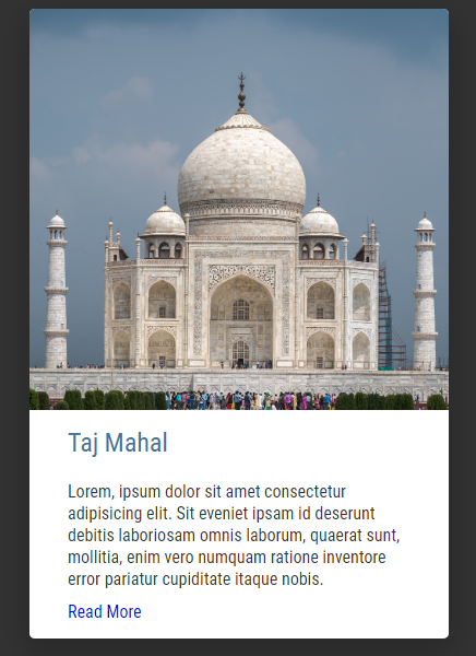
<!DOCTYPE html>
<html lang="en">
  <head>
    <meta charset="UTF-8" />
    <meta name="viewport" content="width=device-width, initial-scale=1.0" />
    <title>Tourist Card in CSS</title>
    <link rel="stylesheet" href="css/style.css" />
  </head>
  <body>
    <main>
      <div class="card">
        <img src="images/Taj.jpg" alt="Taj Mahal" />
        <div class="card-content">
          <h2>Taj Mahal</h2>
          <p>Lorem, ipsum dolor sit amet consectetur adipisicing elit. Sit eveniet ipsam id deserunt debitis laboriosam omnis laborum, quaerat sunt, mollitia, enim vero numquam ratione inventore error pariatur cupiditate itaque nobis.</p>
          <a href="#">Read More</a>
        </div>
      </div>
    </main>
  </body>
</html>
css/style.css
@import url("https://fonts.googleapis.com/css2?family=Roboto+Condensed:wght@300;400;700&display=swap");

* {
  margin: 0;
  padding: 0;
  box-sizing: border-box;
  font-family: "Roboto Condensed", sans-serif;
}

body {
  background-color: #333;
}

main {
  min-height: 100vh;
  display: flex;
  justify-content: center;
  align-items: center;
}

.card {
  width: 24rem;
  height: 36rem;
  background-color: #fff;
  border-radius: 5px;
  overflow: hidden;
  cursor: pointer;
  position: relative;
  box-shadow: 0 10px 30px 5px rgba(0, 0, 0, 0.2);
}

.card img {
  position: absolute;
  object-fit: cover;
  width: 100%;
  height: 100%;
}

.card-content {
  position: absolute;
  bottom: -50px;
  left: 0px;
  padding: 15px 35px;
  background-color: #fff;
  color: #333;
  transition: bottom 0.3s ease-in-out;
}
.card:hover .card-content {
  bottom: 0;
}

.card-content h2 {
  min-height: 50px;
  color: #40739e;
  font-weight: 400;
}

.card-content p {
  max-height: 0;
  overflow: hidden;
  margin-bottom: 10px;
  transition: max-height 0.3s ease-in-out;
  line-height: 20px;
}

.card:hover .card-content p {
  max-height: 150px;
}

.card-content a {
  text-decoration: none;
}
.card-content a:hover {
  text-decoration: underline;
}
This rule styles the <p> elements within .card-content:
- max-height: 0 initially hides the paragraphs by setting their maximum height to zero.
- overflow: hidden ensures that any content exceeding the maximum height is hidden.
- margin-bottom: 10px adds spacing below each paragraph.
- transition applies a smooth transition effect to the max-height property with a duration of 0.3 seconds.
- line-height: 20px sets the line height for paragraphs.
This rule activates when the .card element is hovered over. It expands the maximum height of the paragraphs to 150 pixels, revealing the hidden content and creating a sliding-down animation effect.
These rules style anchor links (<a>) within .card-content. They remove the default text decoration (underlining) and add underlining back when the link is hovered over, providing a visual indication of interactivity.
In summary, this CSS code sets the styling and interactive behavior for a tourist card component. When implemented in conjunction with HTML, it creates a card with an image, a title, and expandable content that animates when hovered over, providing an engaging user experience for presenting tourist information on a webpage.
Output
Live Preview
An animated tourist card in CSS enhances user engagement and provides an attractive way to showcase travel destinations and related information on a website. When properly designed and implemented, it can create a memorable and immersive user experience, encouraging visitors to explore and learn more about the featured locations or travel options.
CSS Tutorial
Properties Reference
Cascading Style Sheet
Flexbox Tutorial
CSS Grid Tutorial
Transitions Properties
CSS Properties with Examples
CSS Selectors
CSS Pseudo Elements
CSS Attribute Selectors
Input Pseudo Classes
CSS Examples
CSS Animation Projects
Learn All in Tamil © Designed & Developed By Tutor Joes | Privacy Policy | Terms & Conditions