Enchanting Motion: An Animated Photo Gallery with CSS
An animated photo gallery created using CSS involves using Cascading Style Sheets (CSS) to add visual effects and animations to a collection of images displayed on a webpage. This technique allows you to showcase images in a more engaging and dynamic manner, enhancing the user experience and making your website visually appealing. Here's how it works:
Advanced Animations
More advanced animations can be achieved using keyframes and animation properties in CSS. You can create intricate animations that move images across the screen, fade in and out, or perform other dynamic effects.
Here is an example
Source Code :
<!DOCTYPE html>
<html lang="en">
  <head>
    <meta charset="UTF-8" />
    <meta name="viewport" content="width=device-width, initial-scale=1.0" />
    <title>Card With Photo Animation</title>
    <link rel="stylesheet" href="css/style.css" />
  </head>
  <body>
    <div class="container">
      <img src="images/11.jpg" alt="Flowers" />
      <img src="images/22.jpg" alt="Flowers" />
      <img src="images/33.jpg" alt="Flowers" />
    </div>
  </body>
</html>
css/style.css
* {
  margin: 0;
  padding: 0;
  box-sizing: border-box;
}

body {
  width: 100%;
  height: 100vh;
  background-color: #222;
  display: grid;
  place-items: center;
}

img {
  width: 30%;
  height: 100%;
  object-fit: cover;

  transform: perspective(800px) rotateY(25deg);
  transition: 0.5s;
}

.container {
  max-width: 800px;
  max-height: 350px;
  display: flex;
  justify-content: center;
  align-items: center;
  gap: 20px;
  cursor: pointer;
}

.container:hover img {
  opacity: 0.5;
}

.container img:hover {
  transform: perspective(800px) rotateY(0deg) scale(1.2);
  z-index: 99;
  opacity: 1;
}
This block styles the img elements within the gallery. The images have a width of 30% of their containing element and a height of 100% to maintain their aspect ratio. The object-fit: cover; property ensures that the image covers the entire container while maintaining its aspect ratio.
The transform property with perspective and rotateY values adds a slight 3D rotation effect to the images. The transition: 0.5s; property adds a smooth transition effect when properties change.
The .container class styles the div that wraps each image. It limits the maximum width and height of the container, centers its contents both horizontally and vertically using flexbox (justify-content: center; align-items: center;) , adds a gap between images, and changes the cursor to a pointer when hovering over the container.
This rule targets the images within a container when the container is hovered over. It reduces the opacity of the images to 0.5, creating a fading effect.
This rule targets an image when it is hovered over. It removes the rotation effect, scales the image to 1.2 times its original size, increases its opacity to 1, and places it above other elements using z-index.
In summary, this code creates an animated photo gallery where images have a 3D rotation effect on hover, and they slightly enlarge and gain focus when individually hovered over. The gallery layout centers itself on the page, and the images have responsive dimensions.
Output
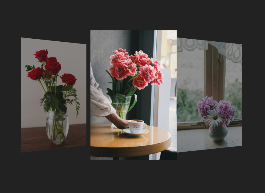
Live Preview
By combining these techniques, you can create a visually appealing and interactive animated photo gallery using only CSS. Remember that this is just a basic overview, and there are countless creative possibilities for designing your animated gallery based on your preferences and the specific needs of your website.
CSS Tutorial
Properties Reference
Cascading Style Sheet
Flexbox Tutorial
CSS Grid Tutorial
Transitions Properties
CSS Properties with Examples
CSS Selectors
CSS Pseudo Elements
CSS Attribute Selectors
Input Pseudo Classes
CSS Examples
CSS Animation Projects
Learn All in Tamil © Designed & Developed By Tutor Joes | Privacy Policy | Terms & Conditions