Custom Checkbox Creation in HTML CSS
This checkbox element is generally used on every website, but without styling them, they look similar on every website. So, styling them will make our site different and attractive. We have to hide the original checkbox in order to style the checkbox. Styling the checkboxes using CSS is an interesting and creative task, which will provide a new and attractive look to the default checkbox.
Source Code :
<!DOCTYPE html>
<html lang="en">
<head>
  <meta charset="UTF-8">
  <meta http-equiv="X-UA-Compatible" content="IE=edge">
  <meta name="viewport" content="width=device-width, initial-scale=1.0">
  <title>Document</title>
  <link rel="stylesheet" href="style.css">
</head>
<body>


  <div class="container">
    <h3>Custom Checkbox</h3>
    <div class="form-checkbox">


      <div class="input-checkbox correct-checkbox">
        <input type="checkbox" name="" id="correct" checked>
        <label for="correct">Correct Answer</label>
      </div>
      <div class="input-checkbox wrong-checkbox">
        <input type="checkbox" name="" id="wrong">
        <label for="wrong">Wrong Answer</label>
      </div>


    </div>


  </div>

</body>
</html>
css/style.css
@import url('https://fonts.googleapis.com/css2?family=Poppins:wght@100;200;300;400;500;600;700;800&display=swap');

*{
  margin: 0;
  padding: 0;
  font-family: 'Poppins', sans-serif;
  box-sizing: border-box;
}


:root{
  --wrong:rgba(250, 151, 114, 0.376);
  --correct:rgba(111, 238, 111, 0.376);
  --wrong-text:rgb(255, 49, 34);
  --correct-text:rgb(4, 105, 4);
}

.container{
  width: 100vw;
  height: 100vh;
  display: flex;
  align-items: center;
  justify-content: center;
  flex-direction: column;
  gap: 10px;
}

h3{
  font-size: 30px;
  text-transform:uppercase ;
}

.form-checkbox{
  display: block;
  user-select: none;
}

.input-checkbox input[type="checkbox"]{
  appearance: none;
  -webkit-appearance: none;
  height: 30px;
  width: 30px;
  border-radius: 3px;
  border:2px solid #342168;
}

.input-checkbox label{
  font-size: 20px;
  margin-left: 12px;
  font-weight: 600;
}


.input-checkbox{
  display: flex;
  align-items: center;
  margin: 20px 0;
}


.input-checkbox input[type="checkbox"]:checked::before{
  font-weight: 700;
  font-size: 26px;
  height: 100%;
  display: flex;
  align-items: center;
  justify-content: center;
}


.wrong-checkbox input[type="checkbox"]:checked{
  background-color: var(--wrong);
  border: 2px solid var(--wrong);
}

.correct-checkbox input[type="checkbox"]:checked{
  background-color: var(--correct);
  border: 2px solid var(--correct);
}


.wrong-checkbox input[type="checkbox"]:checked::before{
  content: '\2715';
  color: var(--wrong-text);
}

.correct-checkbox input[type="checkbox"]:checked::before{
  content: '\2713';
  color:var(--correct-text);
}

.correct-checkbox input[type="checkbox"]:checked+label{
  color:var(--correct-text);
}


.wrong-checkbox input[type="checkbox"]:checked+label{
  color:var(--wrong-text);
}
Output
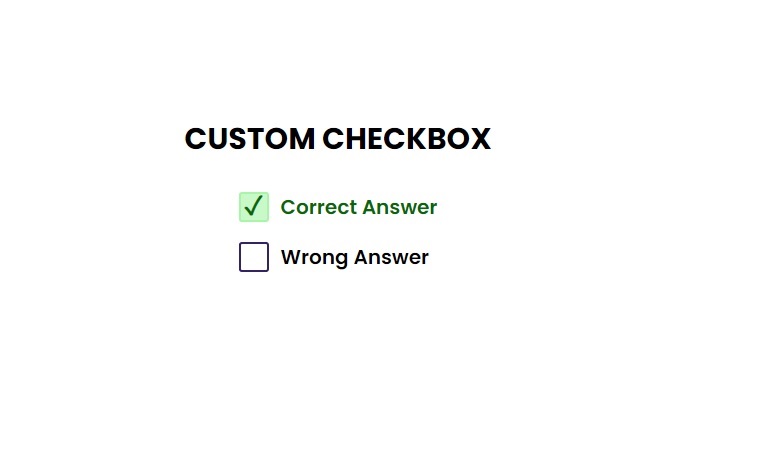
Live Preview
CSS Tutorial
Properties Reference
Cascading Style Sheet
Flexbox Tutorial
CSS Grid Tutorial
Transitions Properties
CSS Properties with Examples
CSS Selectors
CSS Pseudo Elements
CSS Attribute Selectors
Input Pseudo Classes
CSS Examples
CSS Animation Projects
Learn All in Tamil © Designed & Developed By Tutor Joes | Privacy Policy | Terms & Conditions