Understanding Flex Shrink in CSS
Flex Shrink is a property in CSS that controls the ability of a flex item to shrink if necessary. When the available space in the flex container is smaller than the combined size of its flex items, the flex items will shrink to fit the available space.
The Flex Shrink property sets the shrink factor for a flex item, which determines how much the item should shrink relative to other flex items. It takes a non-negative value as its input. The default value for Flex Shrink is 1, which means that all the items will shrink equally if necessary.
For example, if a flex container has two flex items with Flex Shrink values of 1 and 2 respectively, and the available space is not enough to accommodate both items, the second item will shrink twice as much as the first item.
However, if the Flex Shrink value for an item is set to 0, the item will not shrink, even if there is not enough space in the container. This can be useful for preventing certain items from becoming too small.
flex-shrink
That flex-shrink only applies when there is not enough space for all the elements, and it is used in conjunction with the flex-grow property, which specifies how much an element can grow to fill the available space.
Example
.container{
  display: flex;

}
.box-4{
  flex-shrink: 3;
}
This code defines a CSS rule for a container element with the class name "container" and a child element with the class name "box-4".
The display: flex property set on the container element specifies that its children will be laid out as flexible boxes in a single row (by default).
The flex-shrink: 3 property set on the "box-4" child element specifies that it should be allowed to shrink by a factor of 3 if there is not enough space to fit all the elements in the container.
This means that if the total width of all the elements in the container exceeds the width of the container, the "box-4" element will shrink more than the other elements to make space for the others to fit.
Using flex shrink in all Elements
The flex-shrink property controls the ability of a flex item to shrink when there is not enough space available on the screen. When the total width of the flex items exceeds the width of the container, the flex items shrink proportionally to fit into the available space. The flex-shrink property specifies the factor by which the item can shrink compared to the other items in the container.
.container{
  display: flex;

}

.flex-item{
   flex-shrink: 1;
  width: 100px;
}
In this code, all the flex items have a flex-shrink value of 1, which means they can all shrink by the same factor. The width property sets the initial width of the items to 100px. If the container becomes smaller than the total width of the items, they will shrink proportionally based on their flex-shrink value.
Here is an example of how to use the flex-shrink property in CSS:
Source Code :
<!DOCTYPE html>
<html lang="en">
<head>
  <meta charset="UTF-8">
  <meta http-equiv="X-UA-Compatible" content="IE=edge">
  <meta name="viewport" content="width=device-width, initial-scale=1.0">
  <title>Document</title>
  <link rel="stylesheet" href="flex-shrink.css">
</head>
<body>
  <div class="container">
    <div class="flex-item box-1">Box-1</div>
    <div class="flex-item box-2">Box-2</div>
    <div class="flex-item box-3">Box-3</div>
    <div class="flex-item box-4">Box-4</div>
    <div class="flex-item box-5">Box-5</div>
  </div>
</body>
</html>
flex-shrink.css :
@import url('https://fonts.googleapis.com/css2?family=Rubik:wght@300;400;500;600;700;900&display=swap');

*{
  margin: 0;
  padding: 0;
  font-family: 'Rubik', sans-serif;

}

.container{
  border:5px solid black;
}

.flex-item{
  color:white;
  font-size: 18px;
  padding: 16px;
  text-align: center;
}

.box-1{background-color: #1abc9c;}
.box-2{background-color:#3498db;}
.box-3{background-color: #2ecc71;}
.box-4{background-color: #9b59b6;}
.box-5{background-color:#34495e;}
.box-6{background-color:#2980b9;}
.box-7{background-color:#e74c3c;}
.box-8{background-color: #d35400;}
.box-9{background-color:#2c3e50;}

/*-----------------------------------*/

.container{
  display: flex;

}

.flex-item{
   /*flex-shrink: 1; */
  width: 100px;
}

.box-4{
  flex-shrink: 3;
}
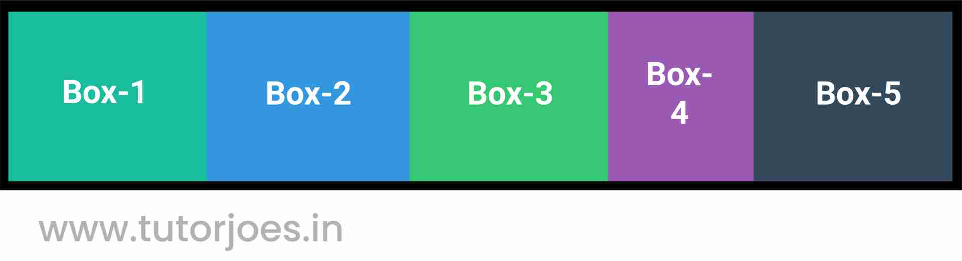
The display: flex property set on the container element specifies that its children will be laid out as flexible boxes in a single row (by default).
The flex-shrink: 3 property set on the .box-4 child element specifies that it should be allowed to shrink by a factor of 3 if there is not enough space to fit all the elements in the container. This means that if the total width of all the elements in the container exceeds the width of the container, the .box-4 element will shrink more than the other elements to make space for the others to fit.
Note that the flex-shrink property only applies when there is not enough space for all the elements, and it is used in conjunction with the flex-grow property, which specifies how much an element can grow to fill the available space. In this code, the flex-grow property is not specified, so the flex items will not grow to fill the available space.
Live PreviewFlex Shrink is an important property in creating responsive designs with Flexbox, as it allows the flex items to adjust their size dynamically based on the available space. It works in conjunction with other Flexbox properties like Flex Grow and Flex Basis to create flexible layouts.
CSS Tutorial
Properties Reference
Cascading Style Sheet
Flexbox Tutorial
CSS Grid Tutorial
Transitions Properties
CSS Properties with Examples
CSS Selectors
CSS Pseudo Elements
CSS Attribute Selectors
Input Pseudo Classes
CSS Examples
CSS Animation Projects
Learn All in Tamil © Designed & Developed By Tutor Joes | Privacy Policy | Terms & Conditions