Basic CSS Grid Code for Creating Responsive Layouts
Creating a layout in CSS involves defining the structure and positioning of elements on a webpage. There are several ways to create a layout in CSS, including using float, flexbox, and grid.
- Float layout: In float layout, elements are floated left or right within a container. This approach can be useful for creating simple layouts, but it has some drawbacks, such as the need to clear floats and the potential for layout issues when elements have different heights.
- Flexbox layout: Flexbox is a CSS layout mode that provides a more flexible way to arrange and align elements within a container. It allows you to specify how elements should grow, shrink, and align with each other along a single axis (either horizontally or vertically).
- Grid layout: CSS Grid is a two-dimensional layout system that allows you to create complex, responsive layouts with a high degree of control over the placement and sizing of elements. It allows you to define columns and rows, and then place elements within those columns and rows, which makes it ideal for creating complex layouts.
When creating a layout in CSS, it's important to consider the overall design and functionality of the webpage, as well as the needs of the user. You should aim to create a layout that is visually appealing, easy to navigate, and responsive across different devices and screen sizes.
To create a layout in CSS, you can use a combination of positioning, margins, padding, and other CSS properties. It can be helpful to use a CSS framework, such as Bootstrap or Foundation, which provides pre-designed CSS classes for common layout patterns and components.
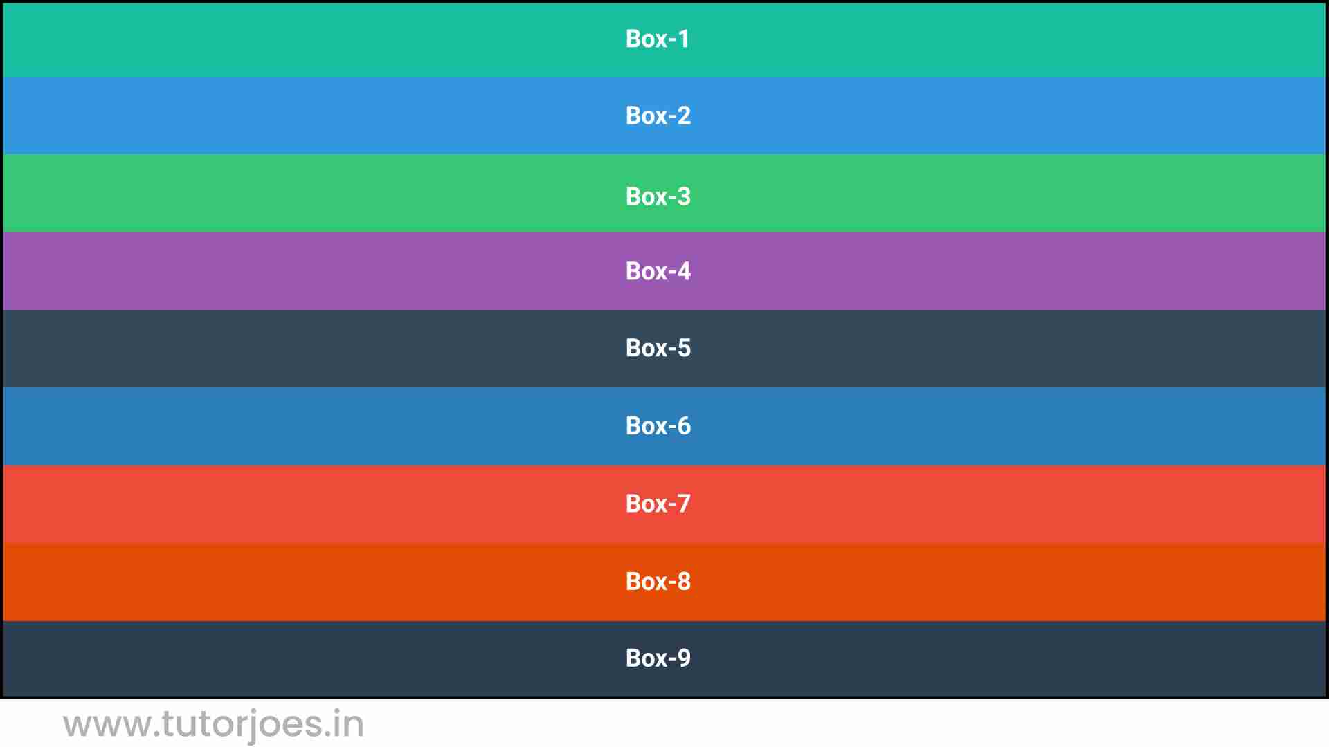
Here's an example of how to use Layout in CSS:
Source Code :
<!DOCTYPE html>
<html lang="en">
<head>
  <meta charset="UTF-8">
  <meta http-equiv="X-UA-Compatible" content="IE=edge">
  <meta name="viewport" content="width=device-width, initial-scale=1.0">
  <title>Document</title>
  <link rel="stylesheet" href="style.css">
</head>
<body>
  <div class="container">
    <div class="grid-item box-1">Box-1</div>
    <div class="grid-item box-2">Box-2</div>
    <div class="grid-item box-3">Box-3</div>
    <div class="grid-item box-4">Box-4</div>
    <div class="grid-item box-5">Box-5</div>
    <div class="grid-item box-6">Box-6</div>
    <div class="grid-item box-7">Box-7</div>
    <div class="grid-item box-8">Box-8</div>
    <div class="grid-item box-9">Box-9</div>
  </div>
</body>
</html>
style.css :
@import url('https://fonts.googleapis.com/css2?family=Rubik:wght@300;400;500;600;700;900&display=swap');

*{
  margin: 0;
  padding: 0;
  font-family: 'Rubik', sans-serif;

}

.container{
  border:5px solid black;
}

.grid-item{
  color:white;
  font-size: 18px;
  padding: 16px;
  text-align: center;
}

.box-1{background-color: #1abc9c;}
.box-2{background-color:#3498db;}
.box-3{background-color: #2ecc71;}
.box-4{background-color: #9b59b6;}
.box-5{background-color:#34495e;}
.box-6{background-color:#2980b9;}
.box-7{background-color:#e74c3c;}
.box-8{background-color: #d35400;}
.box-9{background-color:#2c3e50;}

/*-----------------------------------*/
Live Preview
CSS Tutorial
Properties Reference
Cascading Style Sheet
Flexbox Tutorial
CSS Grid Tutorial
Transitions Properties
CSS Properties with Examples
CSS Selectors
CSS Pseudo Elements
CSS Attribute Selectors
Input Pseudo Classes
CSS Examples
CSS Animation Projects
Learn All in Tamil © Designed & Developed By Tutor Joes | Privacy Policy | Terms & Conditions