Understanding Grid Gap in CSS: Creating Spacing Between Grid Items
The CSS grid-gap property is used to create space between grid items in a CSS Grid layout. It allows you to specify the amount of space between rows and columns in the grid, as well as the size of the gap.
The grid-gap property is shorthand for the grid-row-gap and grid-column-gap properties, which control the size of the gap between rows and columns, respectively. You can also use the gap property as shorthand for both row and column gaps.
column-gap
The CSS column-gap property is used to create space between columns in a multi-column layout. It allows you to specify the amount of space between columns, as well as the size of the gap.
The column-gap property is part of the CSS Multi-column Layout Module, which provides a way to create multiple columns of content within a single container. It can be used in conjunction with the column-count or column-width properties to control the layout of the columns.
Here's an example:
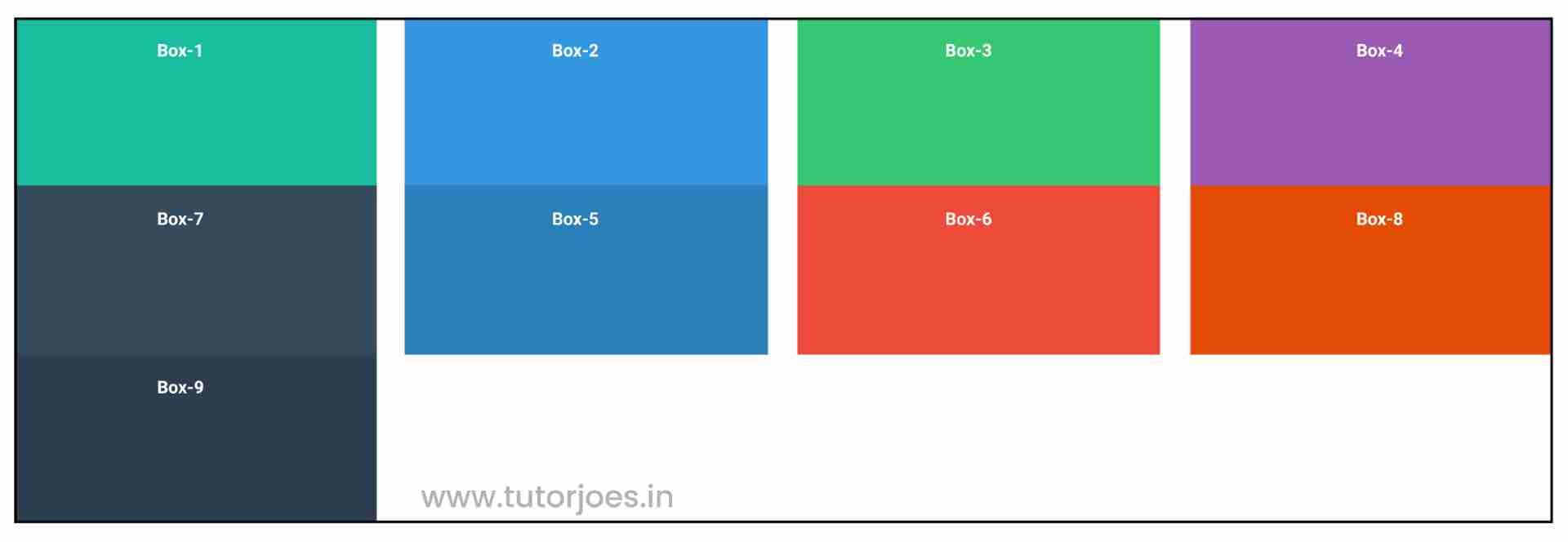
.container{
  display: grid;
  height: 600px;
  grid-template: repeat(3,1fr) / repeat(4,1fr);
  column-gap: 20px;
}
row-gap
The CSS grid-row-gap property is used to create space between rows in a CSS Grid layout. It allows you to specify the amount of space between rows, as well as the size of the gap.
The grid-row-gap property is part of the CSS Grid Layout Module, which provides a way to create grid-based layouts for web pages. It can be used in conjunction with the grid-template-rows property to control the layout of the rows.
Here's an example:
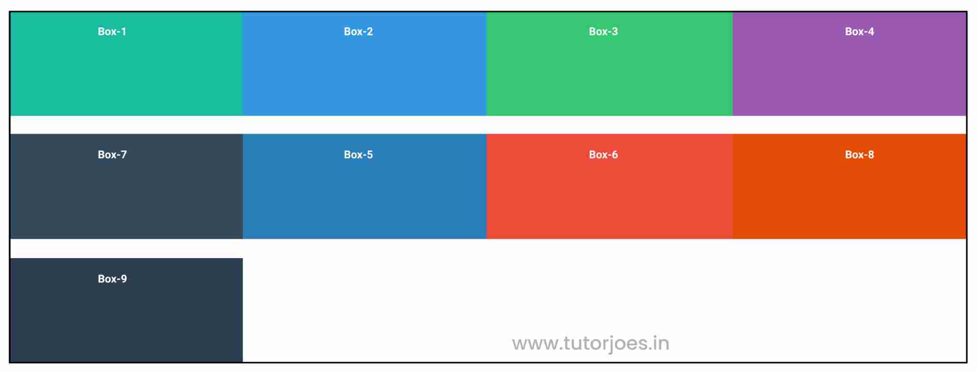
.container{
  display: grid;
  height: 600px;
  grid-template: repeat(3,1fr) / repeat(4,1fr);
  row-gap: 20px;
}
gap
The CSS gap property is a shorthand property that is used to set the size of the gap between rows and columns in a CSS Grid layout. It allows you to specify both the row gap and the column gap at the same time, using a single property.
Here's an example:
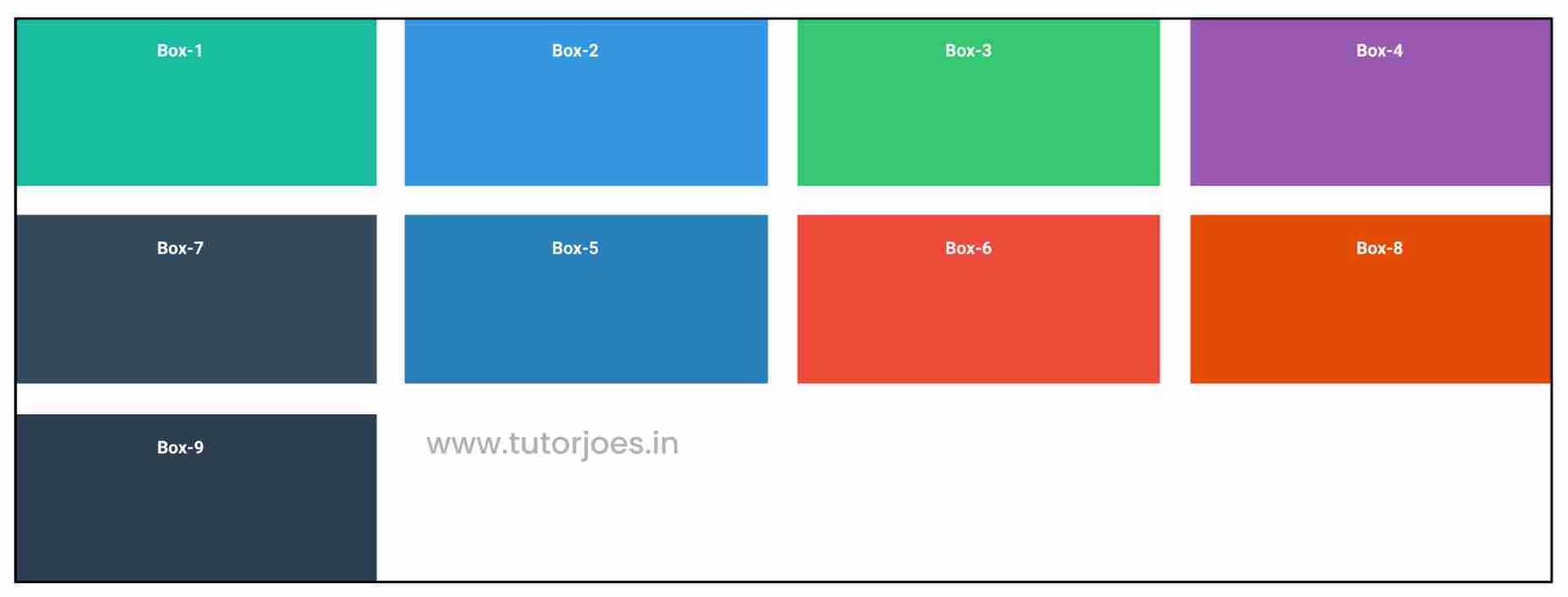
.container{
  display: grid;
  height: 600px;
  grid-template: repeat(3,1fr) / repeat(4,1fr);
  gap:20px;
}
This code creates a grid with Four columns and three rows, each of which is 1fr high. The gap property is used to create a 20-pixel gap between rows and columns in the grid.
Source Code :
<!DOCTYPE html>
<html lang="en">
<head>
  <meta charset="UTF-8">
  <meta http-equiv="X-UA-Compatible" content="IE=edge">
  <meta name="viewport" content="width=device-width, initial-scale=1.0">
  <title>Document</title>
  <link rel="stylesheet" href="grid_template.css">
</head>
<body>
  <div class="container">
    <div class="grid-item box-1">Box-1</div>
    <div class="grid-item box-2">Box-2</div>
    <div class="grid-item box-3">Box-3</div>
    <div class="grid-item box-4">Box-4</div>
    <div class="grid-item box-5">Box-5</div>
    <div class="grid-item box-6">Box-6</div>
    <div class="grid-item box-7">Box-7</div>
    <div class="grid-item box-8">Box-8</div>
    <div class="grid-item box-9">Box-9</div>
  </div>
</body>
</html>
style.css :
@import url('https://fonts.googleapis.com/css2?family=Rubik:wght@300;400;500;600;700;900&display=swap');

*{
  margin: 0;
  padding: 0;
  font-family: 'Rubik', sans-serif;
  box-sizing: border-box;
}

.container{
  border:5px solid black;
  margin: 20px;
}

.grid-item{
  color:white;
  font-size: 18px;
  padding: 16px;
  text-align: center;
}

.box-1{background-color: #1abc9c;}
.box-2{background-color:#3498db;}
.box-3{background-color: #2ecc71;}
.box-4{background-color: #9b59b6;}
.box-5{background-color:#34495e;}
.box-6{background-color:#2980b9;}
.box-7{background-color:#e74c3c;}
.box-8{background-color: #d35400;}
.box-9{background-color:#2c3e50;}

/**-----------------------------------------------*/

.container{
  display: grid;
  height: 600px;
  grid-template: repeat(3,1fr) / repeat(4,1fr);
  column-gap: 20px;
  row-gap: 20px;
  gap:40px 20px; /* row ,column */
  gap:20px;
}
Live Preview
CSS Tutorial
Properties Reference
Cascading Style Sheet
Flexbox Tutorial
CSS Grid Tutorial
Transitions Properties
CSS Properties with Examples
CSS Selectors
CSS Pseudo Elements
CSS Attribute Selectors
Input Pseudo Classes
CSS Examples
CSS Animation Projects
Learn All in Tamil © Designed & Developed By Tutor Joes | Privacy Policy | Terms & Conditions