Mastering Typewriter Text Animation with CSS
Typewriter text animation in CSS is a popular technique used to create an effect where text appears to be typed out, character by character, just like an old-fashioned typewriter. This animation adds a nostalgic and engaging touch to web designs, making the text feel as if it's being written in real-time.
To achieve the typewriter text effect in CSS, you'll typically use a combination of CSS properties like @keyframes, animation, and possibly some JavaScript for more advanced interactions. Here's a step-by-step explanation of how to create this effect:
CSS Styling:
Apply basic styling to your text container, such as font family, font size, color, and positioning. You'll also want to hide the text initially so that it can be revealed with the animation.
Keyframes Animation:
Define the animation using @keyframes. You'll define different steps of the animation to gradually reveal the text.
Apply Animation:
Apply the animation to your text container. You can control the duration, timing function, and other animation properties.
Here is an example
Source Code :
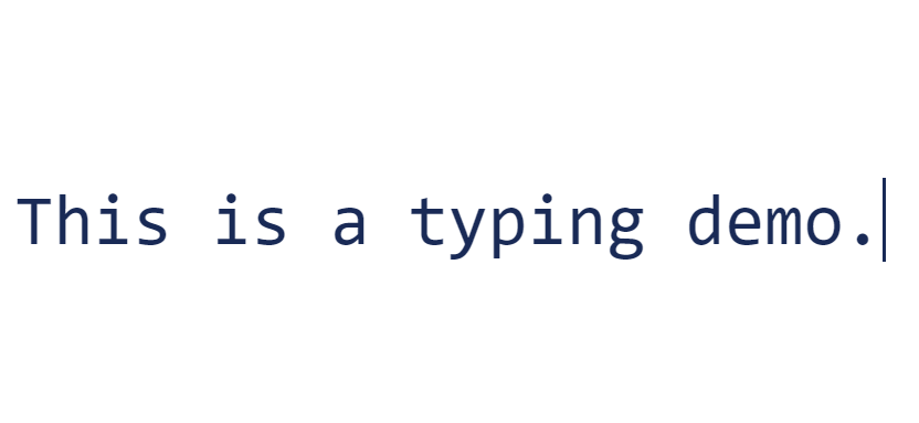
<!DOCTYPE html>
<html lang="en">
  <head>
    <meta charset="UTF-8" />
    <meta name="viewport" content="width=device-width, initial-scale=1.0" />
    <title>Typing Writing Effect</title>
    <link rel="stylesheet" href="style.css" />
  </head>
  <body>
    <div class="container">
      <div class="typing-text">This is a typing demo.</div>
    </div>
  </body>
</html>
css/style.css
.container {
  height: 100vh;
  display: grid;
  place-items: center;
}

.typing-text {
  font-family: monospace;
  font-size: 5em;
  color: #192a56;
  border-right: 3px solid;
  width: 22ch;
  white-space: nowrap;
  overflow: hidden;
  animation: typing 3s steps(22), blink 0.5s step-end infinite alternate;
}

@keyframes typing {
  from {
    width: 0;
  }
}

@keyframes blink {
  50% {
    border-color: transparent;
  }
}
The .typing-text class styles the element that will display the typewriter text.
animation: Combines two animations:
- typing: This animation uses the typing keyframes animation that gradually increases the width of the text container from 0 to its full width (22ch) over a duration of 3s.
- blink: This animation uses the blink keyframes animation to make the cursor blink. It alternates between showing and hiding the cursor by changing its border color to transparent. This animation is applied infinitely and is set to a duration of 0.5s.
This @keyframes animation named typing defines a single step from 0% to 100%, where the width of the text container goes from 0 to its full width (22ch). This animates the text appearing as if it's being typed out.
This @keyframes animation named blink defines a single step at 50% where the border color of the cursor changes to transparent, creating the blinking effect.
In summary, this code creates a typewriter text effect with a blinking cursor using CSS animations. The text gradually appears character by character as if being typed out, and a blinking cursor adds a touch of realism to the effect. The container is centered in the viewport using CSS Grid.
Output
Live Preview
CSS Tutorial
Properties Reference
Cascading Style Sheet
Flexbox Tutorial
CSS Grid Tutorial
Transitions Properties
CSS Properties with Examples
CSS Selectors
CSS Pseudo Elements
CSS Attribute Selectors
Input Pseudo Classes
CSS Examples
CSS Animation Projects
Learn All in Tamil © Designed & Developed By Tutor Joes | Privacy Policy | Terms & Conditions