Understanding CSS Grid and Inline Grid
In CSS, Grid and Inline Grid are two different display modes for creating grid layouts.
display:grid
CSS Grid is a powerful layout system that allows you to create complex grid layouts with relative ease. It works by dividing a container into a grid of rows and columns, and then placing content within those areas. It provides a lot of flexibility when it comes to defining the size and placement of grid items, making it an ideal tool for creating complex, responsive layouts.
Here a syntax for using grid :
.container{
  display:grid;
}
To use Grid, you first need to define a container element and set its display property to "grid". This turns the element into a grid container, which you can then populate with grid items. Grid items are any direct children of the grid container that you want to be placed within the grid.
Once you have a grid container, you can start defining the grid itself. You do this by setting the grid-template-rows and grid-template-columns properties, which define the size and position of the rows and columns within the grid. These properties take a list of values, separated by spaces or slashes, that define the size of each row or column. You can use various length units, such as pixels, ems, or percentages, as well as the "auto" keyword to allow the grid to automatically size rows or columns.In addition to defining the size and position of rows and columns, you can also use a variety of grid layout properties to control the placement and sizing of grid items within the grid.
Grid also provides a number of alignment and positioning properties that allow you to control the placement of grid items within the grid. For example, you can use the justify-items and align-items properties to align items along the horizontal and vertical axes of the grid, respectively. You can also use the justify-content and align-content properties to control the alignment of rows and columns within the grid.
Finally, Grid also provides a number of features that make it ideal for creating responsive layouts. For example, you can use the grid-template-areas property to define named areas within the grid, and then use media queries to change the layout of the grid based on the size of the viewport. You can also use the repeat() function to create repeating patterns of rows or columns within the grid, making it easier to create complex layouts with a minimal amount of CSS code.
display:inline-grid
Inline Grid, on the other hand, is similar to Grid but it's meant to be used with inline-level elements such as <span> or <a> tags. It allows you to create a grid within the inline context. To create an inline grid, you first need to define the inline grid container by setting its display property to "inline-grid".
Here a syntax for using inline grid :
.container{
  display:inline-grid;
}
To use Inline Grid, you first need to define an inline-level container element and set its display property to "inline-grid". This turns the element into an inline grid container, which you can then populate with inline grid items. Inline grid items are any direct children of the inline grid container that you want to be placed within the inline grid.
Once you have an inline grid container, you can start defining the grid itself. You do this by setting the grid-template-rows and grid-template-columns properties, which define the size and position of the rows and columns within the grid, similar to CSS Grid. These properties take a list of values, separated by spaces or slashes, that define the size of each row or column.In addition to defining the size and position of rows and columns, you can also use a variety of inline grid layout properties to control the placement and sizing of inline grid items within the grid.
For example, you can use the grid-row and grid-column properties to specify the row and column that an inline grid item should occupy, and the grid-row-span and grid-column-span properties to specify how many rows or columns it should span. You can also use the grid-area property to specify the row, column, and span of an inline grid item all at once.
Just like CSS Grid, Inline Grid also provides a number of alignment and positioning properties that allow you to control the placement of inline grid items within the grid. For example, you can use the justify-items and align-items properties to align items along the horizontal and vertical axes of the grid, respectively. You can also use the justify-content and align-content properties to control the alignment of rows and columns within the grid.
One benefit of using Inline Grid is that it allows you to create compact and responsive layouts within a single line of text. For example, you can use it to create navigation menus or icon grids that are displayed inline with other text content. You can also use it in combination with other CSS layout techniques, such as flexbox, to create more complex layouts.
Both Grid and Inline Grid are very powerful tools for creating complex layouts in CSS. Grid is best suited for creating larger layouts that span multiple columns and rows, while Inline Grid is ideal for creating smaller, more compact layouts that are contained within a single line of text.
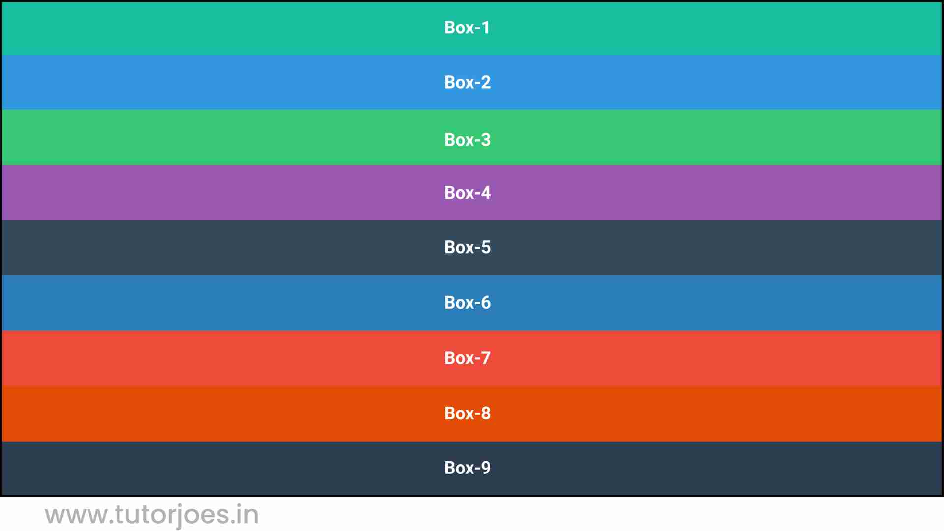
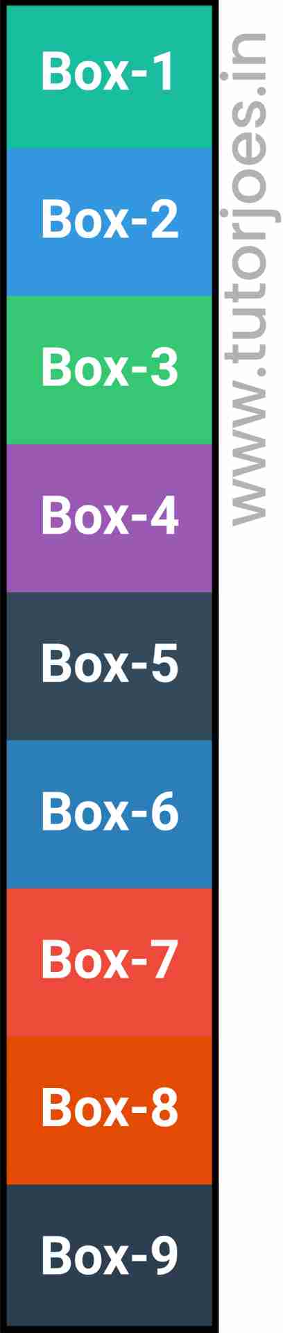
Here's an example of how to use Layout in CSS:
Source Code :
<!DOCTYPE html>
<html lang="en">
<head>
  <meta charset="UTF-8">
  <meta http-equiv="X-UA-Compatible" content="IE=edge">
  <meta name="viewport" content="width=device-width, initial-scale=1.0">
  <title>Document</title>
  <link rel="stylesheet" href="style.css">
</head>
<body>
  <div class="container">
    <div class="grid-item box-1">Box-1</div>
    <div class="grid-item box-2">Box-2</div>
    <div class="grid-item box-3">Box-3</div>
    <div class="grid-item box-4">Box-4</div>
    <div class="grid-item box-5">Box-5</div>
    <div class="grid-item box-6">Box-6</div>
    <div class="grid-item box-7">Box-7</div>
    <div class="grid-item box-8">Box-8</div>
    <div class="grid-item box-9">Box-9</div>
  </div>
</body>
</html>
style.css :
@import url('https://fonts.googleapis.com/css2?family=Rubik:wght@300;400;500;600;700;900&display=swap');

*{
  margin: 0;
  padding: 0;
  font-family: 'Rubik', sans-serif;

}

.container{
  border:5px solid black;
}

.grid-item{
  color:white;
  font-size: 18px;
  padding: 16px;
  text-align: center;
}

.box-1{background-color: #1abc9c;}
.box-2{background-color:#3498db;}
.box-3{background-color: #2ecc71;}
.box-4{background-color: #9b59b6;}
.box-5{background-color:#34495e;}
.box-6{background-color:#2980b9;}
.box-7{background-color:#e74c3c;}
.box-8{background-color: #d35400;}
.box-9{background-color:#2c3e50;}

/*-----------------------------------*/
.container{
  display:grid;
  display:inline-grid;
}
Live Preview
CSS Tutorial
Properties Reference
Cascading Style Sheet
Flexbox Tutorial
CSS Grid Tutorial
Transitions Properties
CSS Properties with Examples
CSS Selectors
CSS Pseudo Elements
CSS Attribute Selectors
Input Pseudo Classes
CSS Examples
CSS Animation Projects
Learn All in Tamil © Designed & Developed By Tutor Joes | Privacy Policy | Terms & Conditions