Understanding grid justify-self, align-self, and place-self in CSS
The align-self and justify-self properties in CSS Grid layout are used to align grid items along the vertical and horizontal axes respectively.
The align-self property is used to align a grid item along the vertical axis (i.e. from top to bottom). It can be applied to individual grid items and overrides any align-items value set on the parent grid container. The property accepts several values including start, end, center, stretch, and baseline.
The justify-self property is used to align a grid item along the horizontal axis (i.e. from left to right). It can be applied to individual grid items and overrides any justify-items value set on the parent grid container. The property accepts several values including start, end, center, stretch, and baseline.
align-self
In CSS Grid layout, the align-self property is used to align a single grid item along the vertical axis (i.e. from top to bottom) within its grid cell. It overrides the value of align-items property set on the parent grid container for that specific grid item.
The align-self property can accept several values, including:
- auto: This is the default value, and it means that the item will inherit the value of align-items property set on the grid container.
- start: This aligns the item to the top of the grid cell.
- end: This aligns the item to the bottom of the grid cell.
- center: This aligns the item to the center of the grid cell.
- stretch: This stretches the item to fill the entire height of the grid cell.
- baseline: This aligns the item to the baseline of the first line of text in the grid cell.
Here's an example:
.container{
  display: grid;
  grid-template: repeat(3,200px)/ repeat(3,200px);
}


.box-1{
  grid-column: 1 / span 2;
  grid-row: 1 / span 2;
}

.box-2{
  align-self: stretch;
  align-self: start;
  align-self: end;
  align-self: center;
}
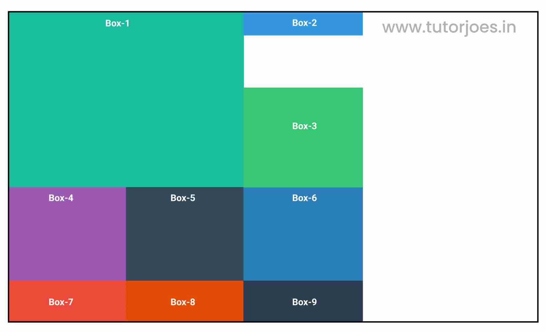
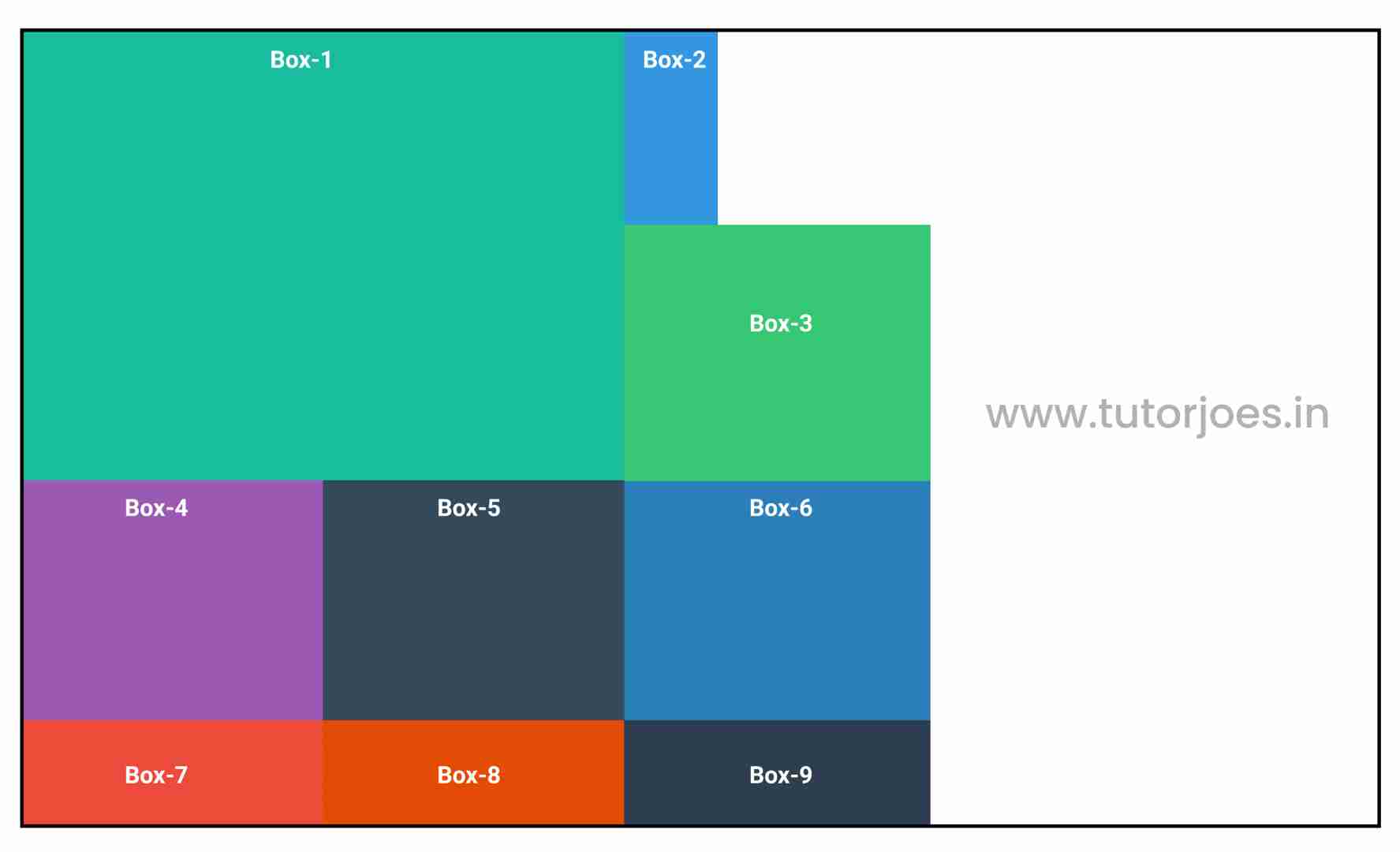
align-self: stretch;
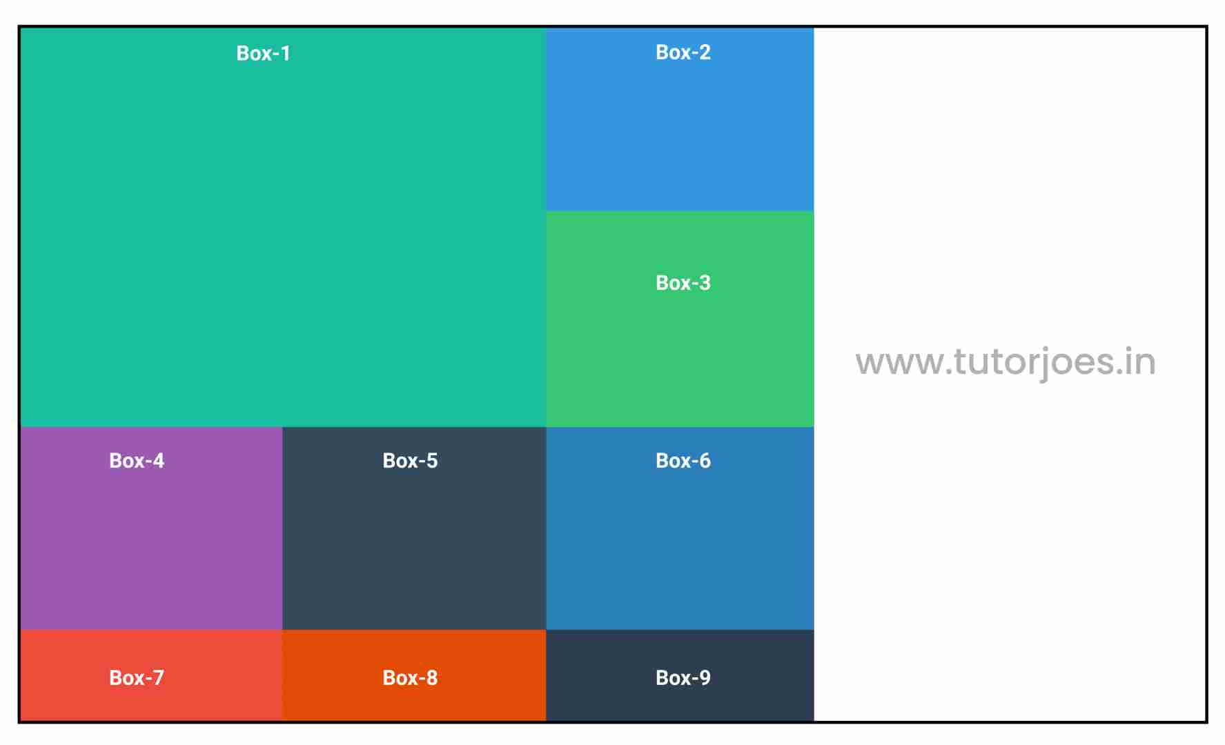
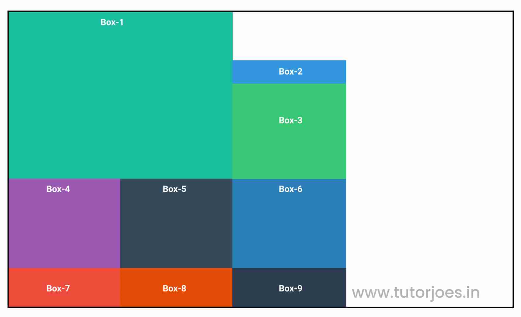
align-self: start;
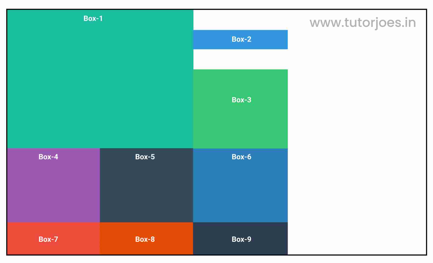
align-self: end;
align-self: center;
justify-self
The justify-self property in CSS Grid layout is used to align a single grid item along the horizontal axis (i.e. from left to right) within its grid cell. It overrides the value of justify-items property set on the parent grid container for that specific grid item.
The justify-self property can accept several values, including:
- auto: This is the default value, and it means that the item will inherit the value of justify-items property set on the grid container.
- start: This aligns the item to the left of the grid cell.
- end: This aligns the item to the right of the grid cell.
- center: This aligns the item to the center of the grid cell.
- stretch: This stretches the item to fill the entire width of the grid cell.
justify-self: stretch;
justify-self: start;
justify-self: end;
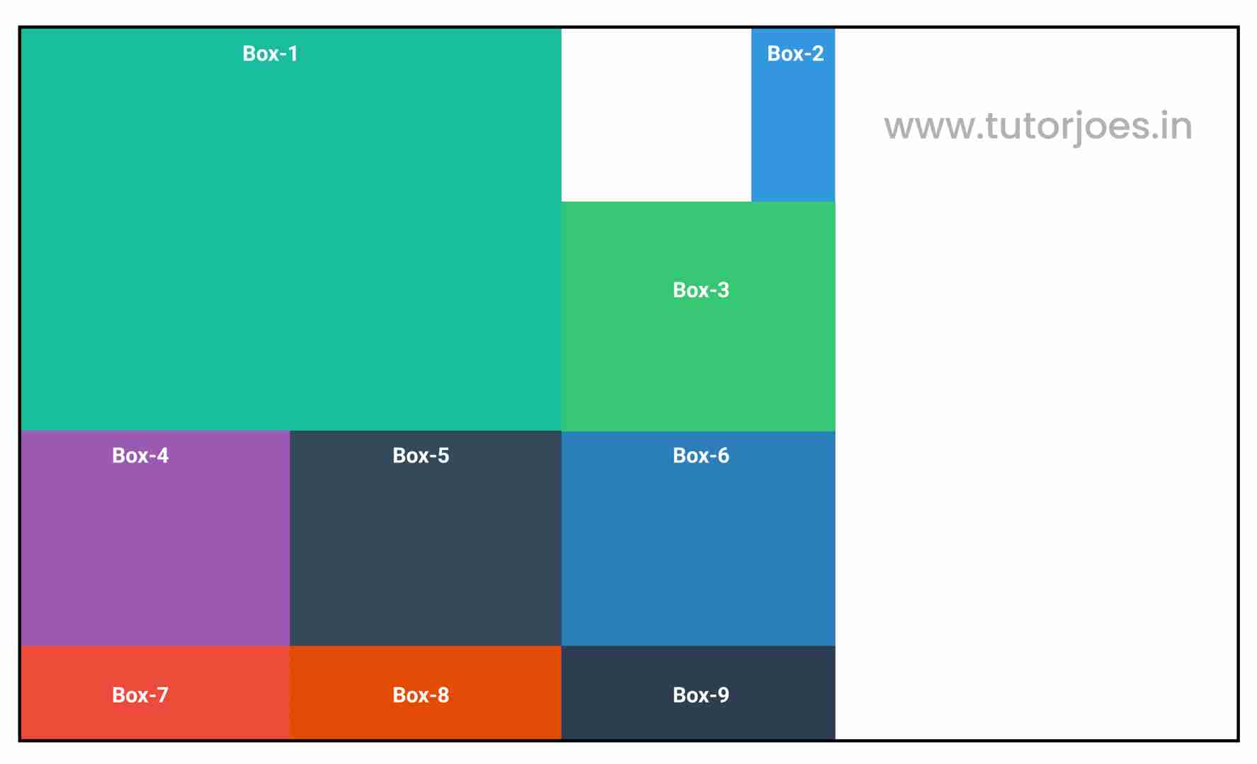
justify-self: center;
place-self
The place-self property in CSS Grid layout is a shorthand property that combines both the justify-self and align-self properties. It is used to align a single grid item both horizontally and vertically within its grid cell. It overrides the values of justify-items and align-items properties set on the parent grid container for that specific grid item.
The place-self property can accept several values, including:
- auto: This is the default value, and it means that the item will inherit the value of justify-items and align-items properties set on the grid container.
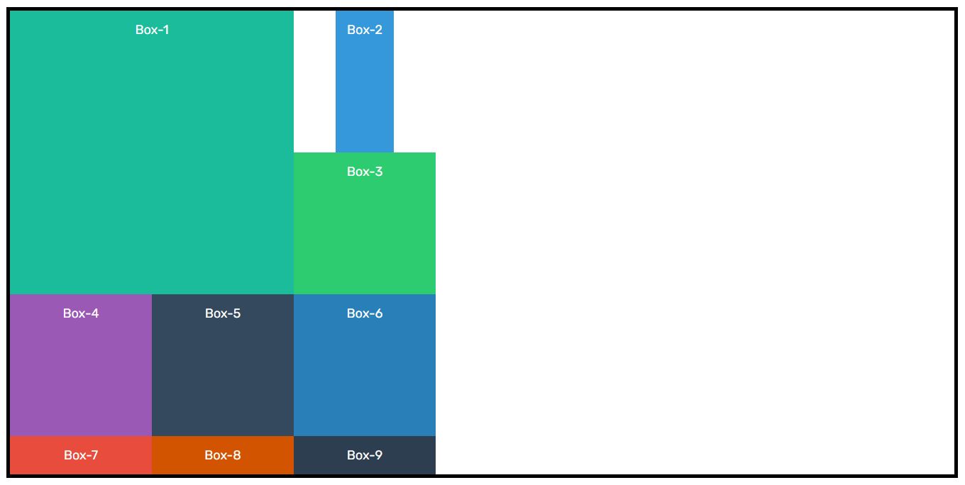
- start: This aligns the item to the left of the grid cell and to the top of the grid cell.
- end: This aligns the item to the right of the grid cell and to the bottom of the grid cell.
- center: This aligns the item to the center of the grid cell both horizontally and vertically.
- stretch: This stretches the item to fill the entire width and height of the grid cell.
Here's an example:
Source Code :
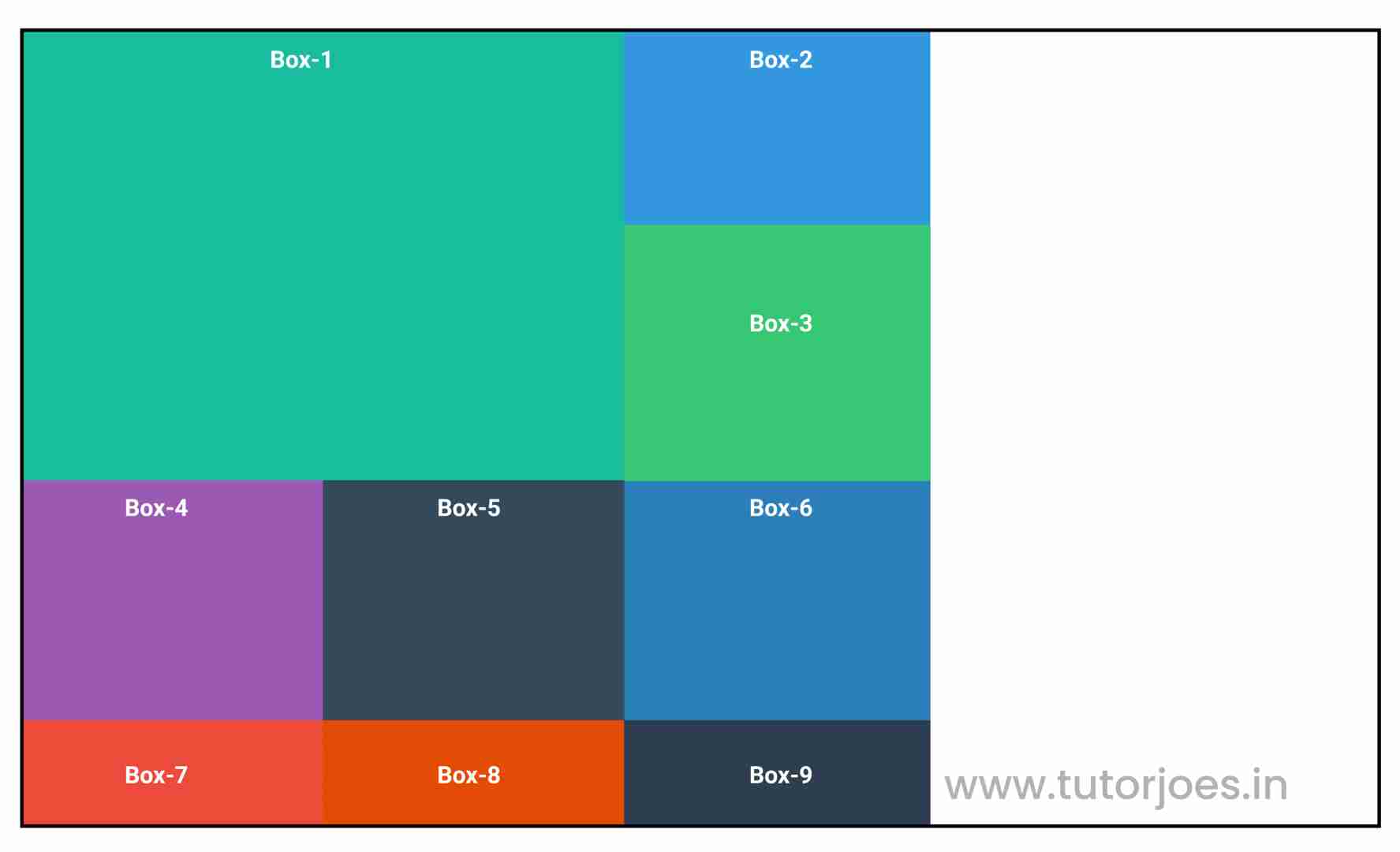
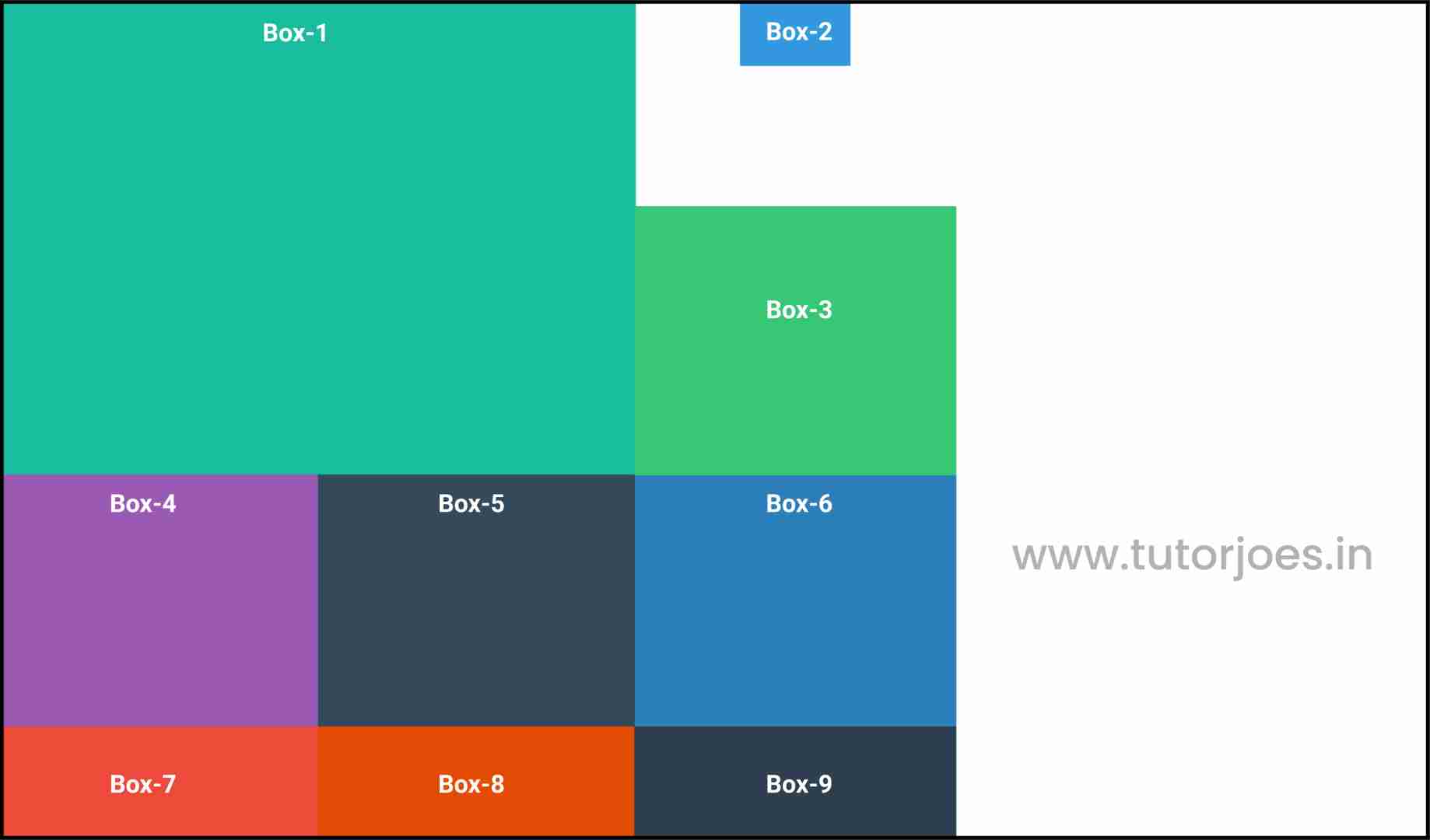
<!DOCTYPE html>
<html lang="en">
<head>
  <meta charset="UTF-8">
  <meta http-equiv="X-UA-Compatible" content="IE=edge">
  <meta name="viewport" content="width=device-width, initial-scale=1.0">
  <title>Document</title>
  <link rel="stylesheet" href="style.css">
</head>
<body>
  <div class="container">
    <div class="grid-item box-1">Box-1</div>
    <div class="grid-item box-2">Box-2</div>
    <div class="grid-item box-3">Box-3</div>
    <div class="grid-item box-4">Box-4</div>
    <div class="grid-item box-5">Box-5</div>
    <div class="grid-item box-6">Box-6</div>
    <div class="grid-item box-7">Box-7</div>
    <div class="grid-item box-8">Box-8</div>
    <div class="grid-item box-9">Box-9</div>
  </div>
</body>
</html>
style.css :
@import url('https://fonts.googleapis.com/css2?family=Rubik:wght@300;400;500;600;700;900&display=swap');

*{
  margin: 0;
  padding: 0;
  font-family: 'Rubik', sans-serif;
  box-sizing: border-box;
}

.container{
  border:5px solid black;
  margin: 20px;
}

.grid-item{
  color:white;
  font-size: 18px;
  padding: 16px;
  text-align: center;
}

.box-1{background-color: #1abc9c;}
.box-2{background-color:#3498db;}
.box-3{background-color: #2ecc71;}
.box-4{background-color: #9b59b6;}
.box-5{background-color:#34495e;}
.box-6{background-color:#2980b9;}
.box-7{background-color:#e74c3c;}
.box-8{background-color: #d35400;}
.box-9{background-color:#2c3e50;}

/**-----------------------------------------------*/
/*

 justify-items - Horizonal Axis Align
   align-items - vertical Axis Align

  Justify-items
  align-items
  place-items
*/


.container{
  display: grid;
  grid-template: repeat(3,200px)/ repeat(3,200px);
}


.box-1{
  grid-column: 1 / span 2;
  grid-row: 1 / span 2;
}

.box-2{
  justify-self: stretch;
  justify-self: start;
  justify-self: end;
  justify-self: center;

  align-self: stretch;
  align-self: start;
  align-self: end;
  align-self: center;

  /* align-self  justify-self*/
  place-self: start;
  place-self: start center;

}
Live Preview
CSS Tutorial
Properties Reference
Cascading Style Sheet
Flexbox Tutorial
CSS Grid Tutorial
Transitions Properties
CSS Properties with Examples
CSS Selectors
CSS Pseudo Elements
CSS Attribute Selectors
Input Pseudo Classes
CSS Examples
CSS Animation Projects
Learn All in Tamil © Designed & Developed By Tutor Joes | Privacy Policy | Terms & Conditions