Animated Button Design in CSS
Animated buttons are more than just real-eye-candy. They draw focus to a call-to-action, they grab attention and they emphasize action! Rather than using images or gifs, these are buttons built 100% with CSS/CSS3, meaning they’re super lightweight, quick to load, and highly adaptable.
Source Code :
<!DOCTYPE html>
<html lang="en">
<head>
  <meta charset="UTF-8">
  <meta http-equiv="X-UA-Compatible" content="IE=edge">
  <meta name="viewport" content="width=device-width, initial-scale=1.0">
  <title>Document</title>
  <link rel="stylesheet" href="css/style.css">
</head>
<body>
  <button class="btn">
    <span class="layer"></span>
    Click Me
  </button>
  <button class="btn">
    <span class="layer"></span>
    Click Me
  </button>
</body>
</html>
css/style.css
@import url('https://fonts.googleapis.com/css2?family=Poppins:wght@300;400;500;700&display=swap');

*{
  padding: 0;
  margin: 0;

}
body{
  width: 100vw;
  height: 100vh;
  font-family: 'Poppins', sans-serif;
  background-image: linear-gradient(to right bottom, #051937, #004d7a);
  display: flex;
  justify-content: center;
  align-items: center;
  gap: 10px;
}

.btn{
  width: 200px;
  padding: 15px 0;
  border-radius: 5px;
  border:1px solid #C4E538;
  background: transparent;
  color:#C4E538;
  font-weight: 500;
  cursor: pointer;
  position: relative;
}

.layer{
  background-color:#C4E538;
  height: 100%;
  width: 0%;
  border-radius: 5px;
  position: absolute;
  left: 0;
  bottom: 0;
  z-index: -1;
  transition: 0.2s;
}
.btn:hover{
  border: none;
  color:#051937;
}
.btn:hover .layer{
  width: 100%;
}
Output
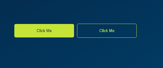
Live Preview
CSS Tutorial
Properties Reference
Cascading Style Sheet
Flexbox Tutorial
CSS Grid Tutorial
Transitions Properties
CSS Properties with Examples
CSS Selectors
CSS Pseudo Elements
CSS Attribute Selectors
Input Pseudo Classes
CSS Examples
CSS Animation Projects
Learn All in Tamil © Designed & Developed By Tutor Joes | Privacy Policy | Terms & Conditions