Exploring the Power of Grid Template Columns in CSS for Creating Custom Layouts
Grid Template Columns is a CSS property that allows you to define the size and position of columns within a CSS Grid layout. It is part of the Grid Layout module, which provides a powerful set of tools for creating complex and responsive layouts in CSS.
To use Grid Template Columns, you first need to define a grid container element and set its display property to "grid". This turns the element into a grid container, which you can then populate with grid items. Grid items are any direct children of the grid container that you want to be placed within the grid.
Once you have a grid container, you can start defining the grid itself using a combination of Grid Template Rows and Grid Template Columns. Grid Template Columns allows you to define the size and position of columns within the grid, while Grid Template Rows allows you to define the size and position of rows.
The Grid Template Columns property takes a list of values that define the size and position of each column within the grid. These values are separated by spaces or slashes, and can be defined using various CSS units, such as pixels, ems, or percentages.
Overall, Grid Template Columns is a powerful tool for creating custom layouts in CSS. It allows you to define the size, position, and alignment of columns within a grid, and provides a lot of flexibility when it comes to creating responsive designs.
For example,
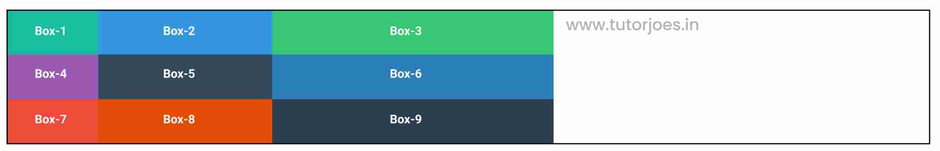
Method 1 : you can define columns of different sizes by setting the property to a combination of fixed and flexible values, such as "100px 200px 300px"
.container{
    display: grid;
    grid-template-columns: 100px 200px 300px;
}
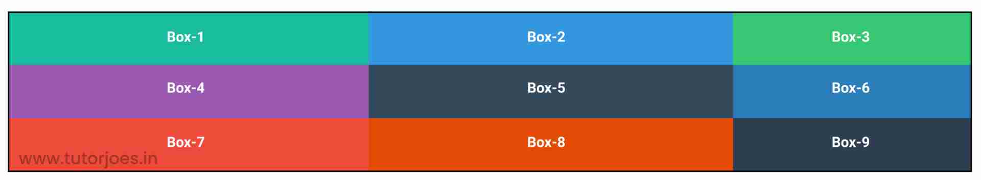
Method 2 : you can define three columns of equal width by setting the Grid Template Columns property to "2fr 2fr 1fr"
.container{
    display: grid;
    grid-template-columns: 2fr 2fr 1fr;
}
Method 3 : repeat function
The "repeat" function is a useful feature in CSS Grid that allows you to repeat a pattern of values when defining the size and position of columns or rows. This function can be used with the "grid-template-columns" and "grid-template-rows" properties to quickly create grids with repeated patterns of columns or rows.
The "repeat" function takes two arguments: the first argument specifies the number of times to repeat the pattern, and the second argument specifies the pattern itself. The pattern can be any combination of values that are valid for the "grid-template-columns" or "grid-template-rows" properties, such as fixed pixel values or flexible fractions using the "fr" unit.
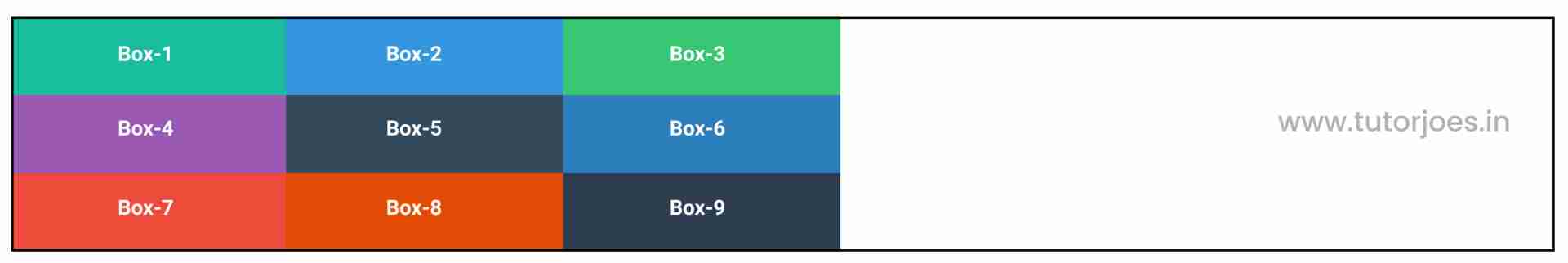
If you want to create a 3-column grid with columns of equal width. Instead of writing out "200px 200px 200px",you can use the "repeat" function like this:
.container{
    display: grid;
    grid-template-columns:repeat(3,200px);
}
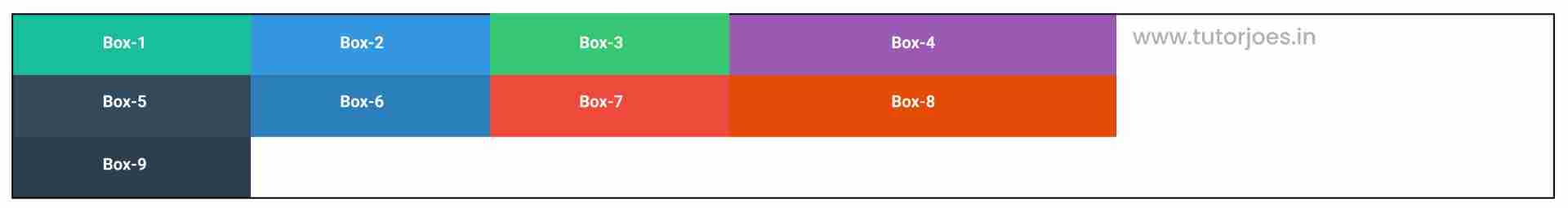
Method 4 :to create a grid with 4 columns, where the first 3 columns are 200 pixels wide and the last column are 300px width, you can use this code
.container{
    display: grid;
    grid-template-columns:repeat(3,200px) 300px;
}
Method 5 : repeat and minmax function
The "minmax" function takes two arguments: the first argument specifies the minimum size of the column or row, and the second argument specifies the maximum size. These sizes can be specified using any of the valid length units in CSS, such as pixels or percentages. For example, "minmax(100px, 1fr)" specifies a column that is at least 100 pixels wide, but can grow to fill any remaining space.
When combined with the "repeat" function, you can create grids with a flexible number of columns that all have a minimum and maximum size. For example, to create a grid with 3 columns that are each at least 200 pixels wide but can grow to fill any remaining space, you can use the following code:
.container{
    display: grid;
    grid-template-columns: repeat(3, minmax(200px, 1fr));
}
Source Code :
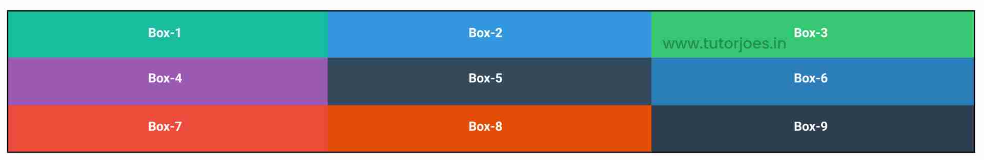
<!DOCTYPE html>
<html lang="en">
<head>
  <meta charset="UTF-8">
  <meta http-equiv="X-UA-Compatible" content="IE=edge">
  <meta name="viewport" content="width=device-width, initial-scale=1.0">
  <title>Document</title>
  <link rel="stylesheet" href="grid-template-column.css">
</head>
<body>
  <div class="container">
    <div class="grid-item box-1">Box-1</div>
    <div class="grid-item box-2">Box-2</div>
    <div class="grid-item box-3">Box-3</div>
    <div class="grid-item box-4">Box-4</div>
    <div class="grid-item box-5">Box-5</div>
    <div class="grid-item box-6">Box-6</div>
    <div class="grid-item box-7">Box-7</div>
    <div class="grid-item box-8">Box-8</div>
    <div class="grid-item box-9">Box-9</div>
  </div>
</body>
</html>
style.css :
@import url('https://fonts.googleapis.com/css2?family=Rubik:wght@300;400;500;600;700;900&display=swap');

*{
  margin: 0;
  padding: 0;
  font-family: 'Rubik', sans-serif;
  box-sizing: border-box;
}

.container{
  border:5px solid black;
  margin: 20px;
}

.grid-item{
  color:white;
  font-size: 18px;
  padding: 16px;
  text-align: center;
}

.box-1{background-color: #1abc9c;}
.box-2{background-color:#3498db;}
.box-3{background-color: #2ecc71;}
.box-4{background-color: #9b59b6;}
.box-5{background-color:#34495e;}
.box-6{background-color:#2980b9;}
.box-7{background-color:#e74c3c;}
.box-8{background-color: #d35400;}
.box-9{background-color:#2c3e50;}

/**-----------------------------------------------*/

.container{
display: grid;
grid-template-columns: 100px 200px 300px;
grid-template-columns: 200px 200px 200px 200px;
grid-template-columns: repeat(3,200px);
grid-template-columns: repeat(3,200px) 300px;
grid-template-columns: 2fr 2fr 1fr;
grid-template-columns: repeat(3,minmax(200px,1fr));
}
Live Preview
Overall, Grid Template Columns is a powerful tool for creating custom layouts in CSS. It allows you to define the size, position, and alignment of columns within a grid, and provides a lot of flexibility when it comes to creating responsive designs.
CSS Tutorial
Properties Reference
Cascading Style Sheet
Flexbox Tutorial
CSS Grid Tutorial
Transitions Properties
CSS Properties with Examples
CSS Selectors
CSS Pseudo Elements
CSS Attribute Selectors
Input Pseudo Classes
CSS Examples
CSS Animation Projects
Learn All in Tamil © Designed & Developed By Tutor Joes | Privacy Policy | Terms & Conditions