Creating Stunning Border Hover Animations with CSS
A border hover animation in CSS is a visual effect that occurs when a user hovers their mouse pointer over an HTML element, typically a container or an interactive element like a button or a link. This effect involves changing the appearance of an element's border in response to the hover action, creating an interactive and engaging user experience. CSS border hover animations are commonly used to add subtle feedback or visual cues to elements on a web page.
HTML Structure:
First, you need an HTML element that you want to apply the border hover animation to.
CSS Styling:
Next, you define the initial and hover styles for the element. You'll set the initial border style, color, and width using regular CSS. Then, you use CSS pseudo-classes like :hover to define the styles that should apply when the element is hovered over.
Source Code :
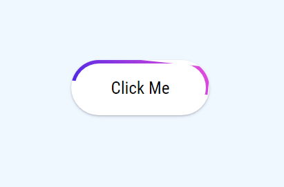
<!DOCTYPE html>
<html lang="en">
  <head>
    <meta charset="UTF-8" />
    <meta name="viewport" content="width=device-width, initial-scale=1.0" />
    <title>Animated Button</title>
    <link rel="stylesheet" href="css/style.css" />
  </head>
  <body>
    <div class="container">
      <div class="border"></div>
      <button>Click Me</button>
    </div>
  </body>
</html>
css/style.css
@import url("https://fonts.googleapis.com/css2?family=Roboto+Condensed:wght@300;400;700&display=swap");

* {
  margin: 0;
  padding: 0;
  box-sizing: border-box;
  font-family: "Roboto Condensed", sans-serif;
}

body {
  width: 100vw;
  height: 100vh;
  display: grid;
  place-items: center;
  background-color: aliceblue;
}

.container {
  width: 200px;
  height: 80px;
  background-color: #ffffff;
  box-shadow: rgba(50, 50, 93, 0.25) 0px 2px 5px -1px, rgba(0, 0, 0, 0.3) 0px 1px 3px -1px;
  border-radius: 100px;
  overflow: hidden;
  position: relative;
  cursor: pointer;
}

.border {
  width: 200px;
  height: 40px;
  background: linear-gradient(45deg, #e94cdc, #4c28e4);
  animation-name: rotate;
  animation-duration: 2s;
  animation-iteration-count: infinite;
  animation-timing-function: linear;
  animation-play-state: paused;
}

@keyframes rotate {
  from {
    transform: rotate(0deg);
  }
  to {
    transform: rotate(360deg);
  }
}

button {
  position: absolute;
  top: 50%;
  left: 50%;
  transform: translate(-50%, -50%);
  width: 190px;
  height: 70px;
  border-radius: 100px;
  border: none;
  background-color: #fff;
  font-size: 25px;
}

.container:hover .border {
  animation-play-state: running;
}
This code snippet creates a CSS animation and applies it to a button element within a container.
.border CSS Class:
- This class is applied to an element with a width of 200px and a height of 40px.
- It has a background created using a linear gradient from #e94cdc to #4c28e4, giving it a diagonal color transition.
- An animation is applied to this element using the animation-name, animation-duration, animation-iteration-count, animation-timing-function, and animation-play-state properties.
@keyframes rotate:
- This is a CSS animation defined using keyframes.
- It rotates the element from 0 degrees to 360 degrees, creating a full rotation.
button CSS Styling
- This styles a button element, positioning it in the center of its parent container both vertically and horizontally.
- It gives the button a width of 190px, a height of 70px, and a border-radius of 100px, creating a circular button.
- The button has no border, a white background, and a font size of 25px.
.container:hover .border
- This selector applies a style to elements with the .border class when a parent element with the class .container is hovered over.
- It sets the animation-play-state property to "running," which means that the animation defined by the @keyframes rotate will start running when the container is hovered over.
In summary, this code creates a button inside a container. When you hover over the container, it triggers a rotation animation on the element with the .border class. The button itself doesn't have the animation but serves as a trigger when its parent container is hovered over. This code would create a visually appealing interaction where the button appears to spin when the container is hovered, thanks to the @keyframes animation.
When a user hovers their mouse over the "Click me" element, the border color will smoothly transition from gray to blue, creating a visually pleasing hover animation.
You can customize the animation by adjusting properties such as the border color, width, and style. More complex border animations can be achieved by combining CSS transitions with other properties like border-radius, box-shadow, or even CSS animations for more elaborate effects.
Overall, border hover animations in CSS are a simple yet effective way to enhance the interactivity and visual appeal of elements on your website, providing users with instant feedback as they interact with your content.
Output
Live Preview
CSS Tutorial
Properties Reference
Cascading Style Sheet
Flexbox Tutorial
CSS Grid Tutorial
Transitions Properties
CSS Properties with Examples
CSS Selectors
CSS Pseudo Elements
CSS Attribute Selectors
Input Pseudo Classes
CSS Examples
CSS Animation Projects
Learn All in Tamil © Designed & Developed By Tutor Joes | Privacy Policy | Terms & Conditions