Understanding align-self property in CSS Flexbox
In a Flexbox layout, there are two main axes: the main axis and the cross-axis. The main axis is the axis along which the flex items are arranged, while the cross-axis is the perpendicular axis. The main axis is defined by the flex-direction property, which can be set to row or column, and the cross-axis is determined by the opposite direction.
The align-self property is used to align a single flex item along the cross-axis, overriding the default alignment set by the flex container with the justify-content property. It only applies to a single flex item, and not to all the flex items in the container.
The align-self property accepts the following values:
- auto (default): The item is aligned according to the flex container's align-items property.
- flex-start: The item is aligned at the start of the cross-axis.
- flex-end: The item is aligned at the end of the cross-axis.
- center: The item is centered along the cross-axis.
- baseline: The item is aligned so that its baseline aligns with the baseline of the other flex items.
- stretch: The item is stretched to fill the container along the cross-axis.
Here's an example of how to use the align-self property:
Source Code :
<!DOCTYPE html>
<html lang="en">
<head>
  <meta charset="UTF-8">
  <meta http-equiv="X-UA-Compatible" content="IE=edge">
  <meta name="viewport" content="width=device-width, initial-scale=1.0">
  <title>Document</title>
  <link rel="stylesheet" href="style.css">
</head>
<body>
  <div class="container">
    <div class="flex-item box-1">Box-1</div>
    <div class="flex-item box-2">Box-2</div>
    <div class="flex-item box-3">Box-3</div>
    <div class="flex-item box-4">Box-4</div>
    <div class="flex-item box-5">Box-5</div>
  </div>
</body>
</html>
style.css :
@import url('https://fonts.googleapis.com/css2?family=Rubik:wght@300;400;500;600;700;900&display=swap');

*{
  margin: 0;
  padding: 0;
  font-family: 'Rubik', sans-serif;

}

.container{
  border:5px solid black;
}

.flex-item{
  color:white;
  font-size: 18px;
  padding: 16px;
  text-align: center;
}

.box-1{background-color: #1abc9c;}
.box-2{background-color:#3498db;}
.box-3{background-color: #2ecc71;}
.box-4{background-color: #9b59b6;}
.box-5{background-color:#34495e;}

/*-----------------------------------*/

.container{
  display: flex;
  height: 600px;
  flex-direction: column;
  align-items: stretch;

}


.box-1{
  align-self: auto;
}
.box-2{
  align-self: flex-start;
}
.box-3{
  align-self: flex-end;
}
.box-4{
  align-self: center;
}
.box-5{
  align-self: stretch;
}
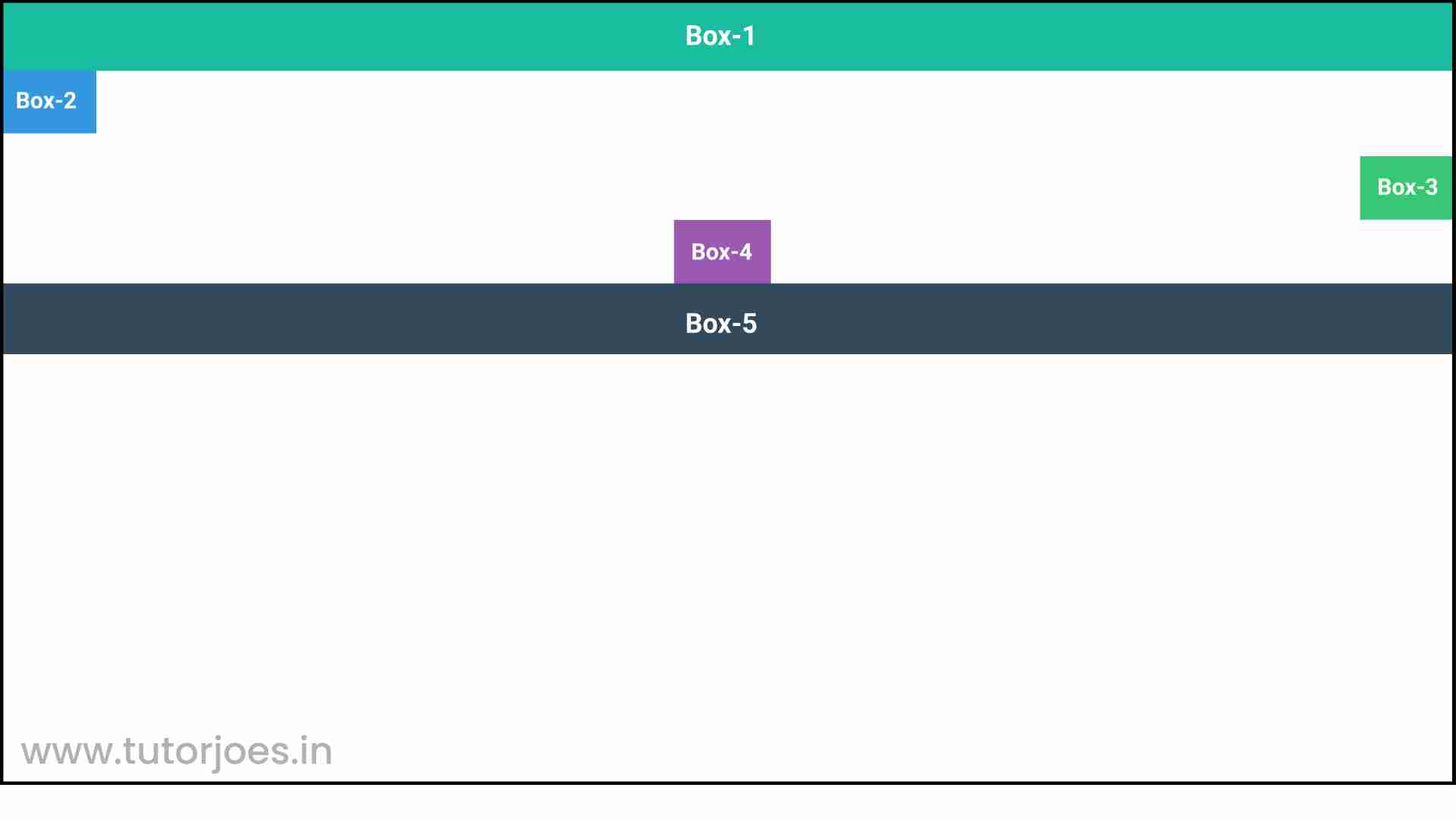
There is a container div with a 5px black border, and five child divs with different background colors (box-1 through box-5). Each child div has a class of flex-item which applies some common styles such as white text color, 18px font size, and 16px padding.
This sets the container to use Flexbox layout, with a height of 600px, a column direction, and align-items property set to stretch. This means that the child divs will be stretched to fill the cross-axis of the container.
Each child div then has its own align-self property set to a different value:
- box-1 has an align-self value of auto, which means that it will use the default alignment of the container.
- box-2 has an align-self value of flex-start, which aligns it to the start of the cross-axis.
- box-3 has an align-self value of flex-end, which aligns it to the end of the cross-axis.
- box-4 has an align-self value of center, which centers it along the cross-axis.
- box-5 has an align-self value of stretch, which stretches it to fill the cross-axis.
Live Preview
Overall, this code demonstrates how the align-self property can be used to override the default alignment of a Flexbox layout for individual flex items.
CSS Tutorial
Properties Reference
Cascading Style Sheet
Flexbox Tutorial
CSS Grid Tutorial
Transitions Properties
CSS Properties with Examples
CSS Selectors
CSS Pseudo Elements
CSS Attribute Selectors
Input Pseudo Classes
CSS Examples
CSS Animation Projects
Learn All in Tamil © Designed & Developed By Tutor Joes | Privacy Policy | Terms & Conditions