Mastering CSS Gradients: A Comprehensive Guide to Creating Stunning Background Effects
CSS gradients are a powerful tool in web design that allow you to create smooth transitions between two or more colors, resulting in visually appealing background effects. Gradients are a popular technique for adding depth, dimension, and visual interest to various elements on a webpage, such as backgrounds, buttons, or text.
CSS provides two types of gradients: linear gradients and radial gradients.
- Linear Gradients: A linear gradient creates a color transition along a straight line. You can control the direction and angle of the gradient to achieve different effects. It typically starts from one point and ends at another, smoothly blending the colors in between.
- Radial Gradients: A radial gradient creates a color transition that radiates from a central point outward. It allows you to define the position of the center and control the shape of the gradient, whether it's circular, elliptical, or custom-shaped.
Both types of gradients are defined using CSS properties, such as background-image or background combined with the linear-gradient() or radial-gradient() function. You specify the colors and their positions within the gradient using color stops.
Color stops determine where and how the colors transition within the gradient. You can set precise color stops by specifying a percentage or using keywords like to top, to right, to bottom, or to left to define the direction. Additionally, you can control the blending between color stops by using keywords like linear, ease, ease-in, ease-out, or ease-in-out.
CSS gradients provide great flexibility and control over the appearance of your webpage. You can create simple gradients with two colors or complex gradients with multiple color stops. There are also online gradient generators available that can help you experiment with different gradient styles and produce the CSS code to use in your projects.
By leveraging CSS gradients, you can enhance the visual aesthetics of your website, add depth and texture, and create engaging user experiences.
div{
  height: 200px;
  width: 200px;
  float:left;
  margin:10px;
  color: #fff;
}
Linear Gradients
Linear gradients offer numerous possibilities, allowing you to create stunning visual effects for backgrounds, borders, and other CSS properties. Remember to consider browser compatibility and provide fallback options for older browsers that may not support gradients.
* linear gradient */
/*
    background-image:linear-gradient(direction,color1,colors2....)
*/
.box{
    background-image: linear-gradient(#9c88ff,#0097e6);
}
.box1{
    background-image: linear-gradient(to right,#9c88ff,#0097e6);
}
.box2{
    background-image: linear-gradient(to left,#9c88ff,#0097e6);
}

.box3{
    background-image: linear-gradient(to bottom right,#9c88ff,#0097e6,#8c7ae6);
}
/* linear gradient */
/*
    background-image:linear-gradient(angel,color1,colors2....)
*/

.box4{
    background-image: linear-gradient(146deg,#c23616,#fbc531,rgba(109, 33, 79,0.8));
}

.box5{

    background: -webkit-linear-gradient(rgba(44, 58, 71,0.7),rgba(44, 58, 71,0.9)), url(flower.jpg);
    background: -moz-linear-gradient(rgba(44, 58, 71,0.7),rgba(44, 58, 71,0.9)), url(flower.jpg);
    background: -o-linear-gradient(rgba(44, 58, 71,0.7),rgba(44, 58, 71,0.9)), url(flower.jpg);
    background: -ms-linear-gradient(rgba(44, 58, 71,0.7),rgba(44, 58, 71,0.9)), url(flower.jpg);

    background: linear-gradient(rgba(44, 58, 71,0.7),rgba(44, 58, 71,0.9)), url(flower.jpg);

}

.box6{
    background-image: repeating-linear-gradient(green,pink 10%,yellow 20%);
}
Output
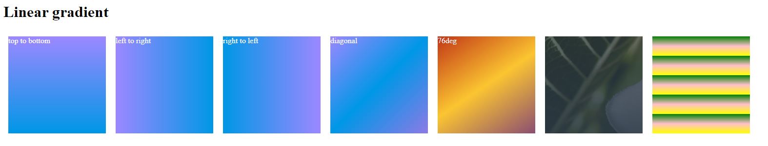
- .box element having a linear gradient background. The gradient starts with the color #9c88ff and transitions to the color #0097e6. The gradient direction is not specified, so it uses the default top to bottom direction.
- .box1 element sets a linear gradient background.The gradient starts with the color #9c88ff on the left side and transitions to the color #0097e6 on the right side. The gradient goes from left to right.
- .box2 element sets a linear gradient background.The gradient starts with the color #9c88ff on the right side and transitions to the color #0097e6 on the left side. The gradient goes from right to left.
- .box3 element sets a linear gradient background. The gradient starts with the color #9c88ff on the top left and transitions to the color #0097e6 in the middle and then to the color #8c7ae6 on the bottom right. The gradient goes from the top left to the bottom right.
- .box4 element having a linear gradient background.The gradient starts with the color #c23616 and transitions to the color #fbc531, and then transitions to the color rgba(109, 33, 79, 0.8). The gradient angle is set to 146 degrees.
- .box5 element having a linear gradient background.The linear gradient is created using vendor-prefixed properties (-webkit-linear-gradient, -moz-linear-gradient, -o-linear-gradient, -ms-linear-gradient) to ensure browser compatibility. The gradient starts with the color rgba(44, 58, 71, 0.7) and transitions to the color rgba(44, 58, 71, 0.9). The url(flower.jpg) sets the image flower.jpg as the background image.
- .box6 element having a linear gradient background.The linear gradient is created using vendor-prefixed properties (-webkit-linear-gradient, -moz-linear-gradient, -o-linear-gradient, -ms-linear-gradient) to ensure browser compatibility. The gradient starts with the color green, then repeats the pattern with the color pink at 10% of the gradient length, and finally with the color yellow at 20% of the gradient length. This creates a repeating gradient effect with the specified colors and stops.
These examples demonstrate different ways to use linear gradients in CSS to create beautiful and customizable backgrounds for elements. The syntax allows you to control the direction, colors, and stops of the gradients to achieve the desired visual effects.
Radial Gradients
The radial-gradient() function in CSS is used to create radial gradients, which transition colors in a circular pattern radiating from a central point. Here's an explanation of how to use it
The basic syntax for radial-gradient() is as follows:
background: radial-gradient(shape size at position, color-stop1, color-stop2, ...);
- shape: Specifies the shape of the gradient. It can be one of the following values:
- circle: Creates a circular gradient.
- ellipse: Creates an elliptical gradient.
- size: Specifies the size of the gradient. It can be defined using various values:
- closest-side: The gradient reaches the boundary closest to the center.
- closest-corner: The gradient reaches the corner closest to the center.
- farthest-side: The gradient reaches the boundary farthest from the center.
- farthest-corner: The gradient reaches the corner farthest from the center.
/* radial gradient */
/*
    background-image:radial-gradient(position,color1,colors2....)
*/

.rbox{
    background-image: radial-gradient(#0000ff,#0097e6,#0c4d94);
}

.rbox1{
    width:600px;
    background-image: radial-gradient(#0000ff 5%,#0097e6 15%,#0c4d94 65%);
}


.rbox2{
    background-image: radial-gradient(circle,#0000ff,#0097e6,#0c4d94);
}

.rbox3{
    background-image: radial-gradient(closest-side at 60% 55%,#0000ff,#0097e6,#0c4d94);
}

.rbox4{
    background-image: radial-gradient(farthest-side at 60% 55%,#0000ff,#0097e6,#0c4d94);
}

.rbox5{
    background-image: radial-gradient(closest-corner at 60% 55%,#0000ff,#0097e6,#0c4d94);
}
.rbox6{
    background-image: radial-gradient(farthest-corner at 60% 55%,#0000ff,#0097e6,#0c4d94);
}

.rbox7{
    background-image: repeating-radial-gradient(#0000ff,#0097e6 10%,#0c4d94 25%);
    width:700px;
}
Output
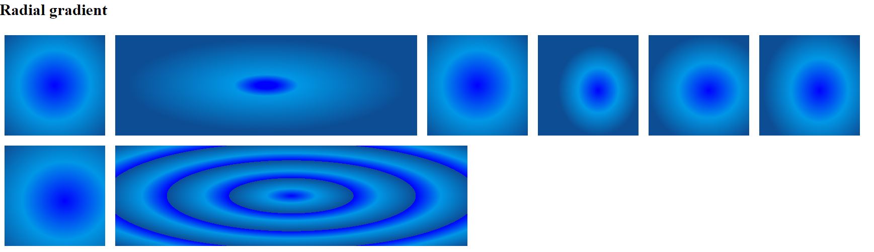
- .rbox elements sets a radial gradient background. The gradient starts with the color #0000ff, transitions to #0097e6, and then transitions to #0c4d94.
- .rbox1 elements sets a radial gradient background. The gradient starts with the color #0000ff at 5% of the radial length, transitions to #0097e6 at 15%, and then transitions to #0c4d94 at 65% of the radial length. Additionally, the width of the element is set to 600 pixels.
- .rbox2 elements sets a radial gradient background. The gradient is circular (circle) and transitions from #0000ff to #0097e6 to #0c4d94.
- .rbox3 elements sets a radial gradient background. The gradient starts at the side closest to the center (closest-side) at a position of 60% horizontally and 55% vertically. It transitions from #0000ff to #0097e6 to #0c4d94.
- .rbox4 elements sets a radial gradient background. The gradient starts at the side farthest from the center ((farthest-side) at a position of 60% horizontally and 55% vertically. It transitions from #0000ff to #0097e6 to #0c4d94
- .rbox5 elements sets a radial gradient background. The gradient starts at the side closest to the center (closest-corner) at a position of 60% horizontally and 55% vertically. It transitions from #0000ff to #0097e6 to #0c4d94.
- .rbox6 elements sets a radial gradient background. The gradient starts at the side closest to the center (farthest-corner) at a position of 60% horizontally and 55% vertically. It transitions from #0000ff to #0097e6 to #0c4d94.
- .rbox7 elements sets a radial gradient background. The gradient starts with #0000ff, then repeats the pattern with #0097e6 at 10% of the radial length, and finally with #0c4d94 at 25% of the radial length. Additionally, the width of the element is set to 700 pixels.
These examples demonstrate different ways to use radial gradients in CSS to create visually appealing backgrounds for elements. The syntax allows you to control the position, shape, colors, and stops of the gradients to achieve the desired visual effects.
Source Code
<!DOCTYPE html>
<html lang="en">
<head>
    <meta charset="UTF-8">
    <meta http-equiv="X-UA-Compatible" content="IE=edge">
    <meta name="viewport" content="width=device-width, initial-scale=1.0">
    <title>Document</title>
   <link rel="stylesheet" href="gradient.css">
</head>
<body>
    <ul>
        <li>linear gradient (up,down,left,right,diagonal)</li>
        <li>radial gradient</li>
        <li>conic gradient</li>
    </ul>
<h1>Linear gradient</h1>
   <div class="box"> top to bottom</div>
    <div class="box1">left to right</div>
    <div class="box2">right to left</div>
    <div class="box3">diagonal</div>

    <div class="box4"> 76deg</div>
    <div class="box5"> </div>
    <div class="box6"> </div>
<br style="clear:both;">
    <h1>radial gradient</h1>
    <div class="rbox"> </div>
    <div class="rbox1"> </div>
    <div class="rbox2"> </div>
    <div class="rbox3"> </div>
    <div class="rbox4"> </div>
    <div class="rbox5"> </div>
    <div class="rbox6"> </div>
    <div class="rbox7"> </div>
    <br style="clear:both;">
    <h1>conic gradient</h1>
    <div class="cbox"></div>
    <div class="cbox1"></div>
    <div class="cbox2"></div>
    <div class="cbox3"></div>
    <div class="cbox4"></div>
</body>
</html>
gradient.css
span class="line_wrapper">div{
  height: 200px;
  width: 200px;
  float:left;
  margin:10px;
  color: #fff;
}

/* linear gradient */
/*
    background-image:linear-gradient(direction,color1,colors2....)
*/
.box{
    background-image: linear-gradient(#9c88ff,#0097e6);
}
.box1{
    background-image: linear-gradient(to right,#9c88ff,#0097e6);
}
.box2{
    background-image: linear-gradient(to left,#9c88ff,#0097e6);
}

.box3{
    background-image: linear-gradient(to bottom right,#9c88ff,#0097e6,#8c7ae6);
}
/* linear gradient */
/*
    background-image:linear-gradient(angel,color1,colors2....)
*/

.box4{
    background-image: linear-gradient(146deg,#c23616,#fbc531,rgba(109, 33, 79,0.8));
}

.box5{

    background: -webkit-linear-gradient(rgba(44, 58, 71,0.7),rgba(44, 58, 71,0.9)), url(flower.jpg);
    background: -moz-linear-gradient(rgba(44, 58, 71,0.7),rgba(44, 58, 71,0.9)), url(flower.jpg);
    background: -o-linear-gradient(rgba(44, 58, 71,0.7),rgba(44, 58, 71,0.9)), url(flower.jpg);
    background: -ms-linear-gradient(rgba(44, 58, 71,0.7),rgba(44, 58, 71,0.9)), url(flower.jpg);

    background: linear-gradient(rgba(44, 58, 71,0.7),rgba(44, 58, 71,0.9)), url(flower.jpg);

}

.box6{
    background-image: repeating-linear-gradient(green,pink 10%,yellow 20%);
}

/* radial gradient */
/*
    background-image:radial-gradient(position,color1,colors2....)
*/

.rbox{
    background-image: radial-gradient(#0000ff,#0097e6,#0c4d94);
}

.rbox1{
    width:600px;
    background-image: radial-gradient(#0000ff 5%,#0097e6 15%,#0c4d94 65%);
}


.rbox2{
    background-image: radial-gradient(circle,#0000ff,#0097e6,#0c4d94);
}

.rbox3{
    background-image: radial-gradient(closest-side at 60% 55%,#0000ff,#0097e6,#0c4d94);
}

.rbox4{
    background-image: radial-gradient(farthest-side at 60% 55%,#0000ff,#0097e6,#0c4d94);
}

.rbox5{
    background-image: radial-gradient(closest-corner at 60% 55%,#0000ff,#0097e6,#0c4d94);
}
.rbox6{
    background-image: radial-gradient(farthest-corner at 60% 55%,#0000ff,#0097e6,#0c4d94);
}

.rbox7{
    background-image: repeating-radial-gradient(#0000ff,#0097e6 10%,#0c4d94 25%);
    width:700px;
}


/* conic gradient */
/*
    background-image:conic-gradient([from angle][ to position],color1 [degree],colors2....)
*/
.cbox{
    background-image: conic-gradient(#0000ff,#0097e6,#0c4d94);
}

.cbox1{
    background-image: conic-gradient(#0000ff 45deg,#0097e6 180deg,#0c4d94 220deg);
}

.cbox2{
    background-image: conic-gradient(from 120deg,#0000ff,#0097e6,#0c4d94);
}
.cbox3{
    background-image: conic-gradient(at 60% 30%,#0000ff,#0097e6,#0c4d94);
    border-radius: 50%;
}
.cbox4{
    background-image: repeating-conic-gradient(#0000ff 10%,#0097e6 20%);
    border-radius: 50%;
}
Live Preview
CSS Tutorial
Properties Reference
Cascading Style Sheet
Flexbox Tutorial
CSS Grid Tutorial
Transitions Properties
CSS Properties with Examples
CSS Selectors
CSS Pseudo Elements
CSS Attribute Selectors
Input Pseudo Classes
CSS Examples
CSS Animation Projects
Learn All in Tamil © Designed & Developed By Tutor Joes | Privacy Policy | Terms & Conditions