Understanding Grid System in CSS: A Comprehensive Guide
In CSS, a grid is a powerful layout system that allows you to arrange elements in rows and columns, creating a grid-like structure. The grid system consists of a series of rows and columns, which are defined using CSS properties
What is CSS Grid
A grid system in CSS is a layout system that allows web developers to create complex web page layouts with ease. It is a powerful tool that enables designers to structure web content into rows and columns, making it easier to create responsive and flexible web designs.
In a grid system, the page is divided into a series of equal-sized columns, and content is placed within these columns. The grid system allows developers to specify the layout of a page by defining the width of the columns, the spacing between them, and the placement of content within each column.
CSS grid systems can be created using various approaches, including using CSS frameworks like Bootstrap or Foundation, or by creating custom CSS rules. The most common way to create a grid system in CSS is by using the display: grid property, which creates a grid container, and the grid-template-columns and grid-template-rows properties, which define the layout of the grid.
Using a grid system in CSS makes it easier to create a responsive design that adapts to different screen sizes and devices. It allows designers to easily create multi-column layouts, as well as align and position content on the page. Additionally, a grid system helps maintain consistency across the website, making it easier for users to navigate and understand the content.
Flexbox VS CSS Grids
Flexbox and Grid are two powerful layout systems in CSS that allow designers and developers to create complex and responsive web page layouts. While they share some similarities, there are some significant differences between the two.
Flexbox is a one-dimensional layout system that is primarily used to create flexible and responsive layouts. It is ideal for laying out items in a single row or column and can be used to create both vertical and horizontal alignments. Flexbox works by aligning items along the main axis and distributing space along the cross axis.
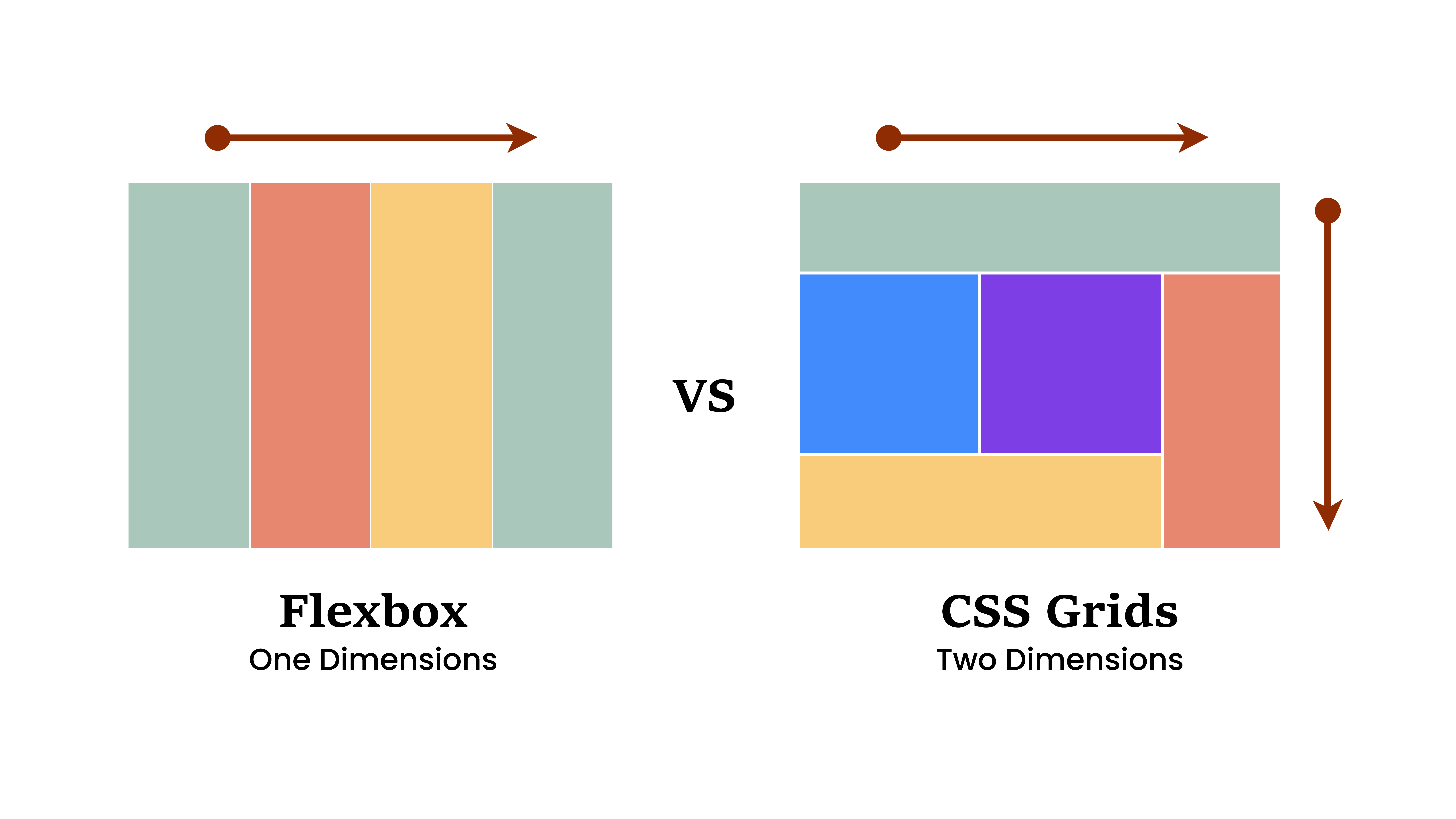
Grid, on the other hand, is a two-dimensional layout system that allows designers to create more complex layouts than what is possible with Flexbox. Grid is ideal for laying out items in rows and columns and can be used to create intricate and precise layouts. Grid works by dividing the layout into a series of rows and columns and then placing items into those cells.
Difference Between Flexbox and CSS Grids
The primary difference between Flexbox and Grid is that Flexbox is ideal for laying out items in a single row or column, while Grid is better suited for complex, two-dimensional layouts. Additionally, Grid offers more control over the placement of items on the page, while Flexbox is better suited for simpler layouts.
When deciding which layout system to use, designers and developers should consider the complexity of the layout they need to create. If they need to create a simple, one-dimensional layout, Flexbox is the best choice. If they need to create a more complex, two-dimensional layout, Grid is the better option. In some cases, both systems can be used together to create even more complex and responsive layouts.
CSS Grids Terminology
CSS Grid is a powerful layout system that allows web developers to create complex and responsive layouts with ease. Here are some of the key terms you need to know when working with CSS Grid:
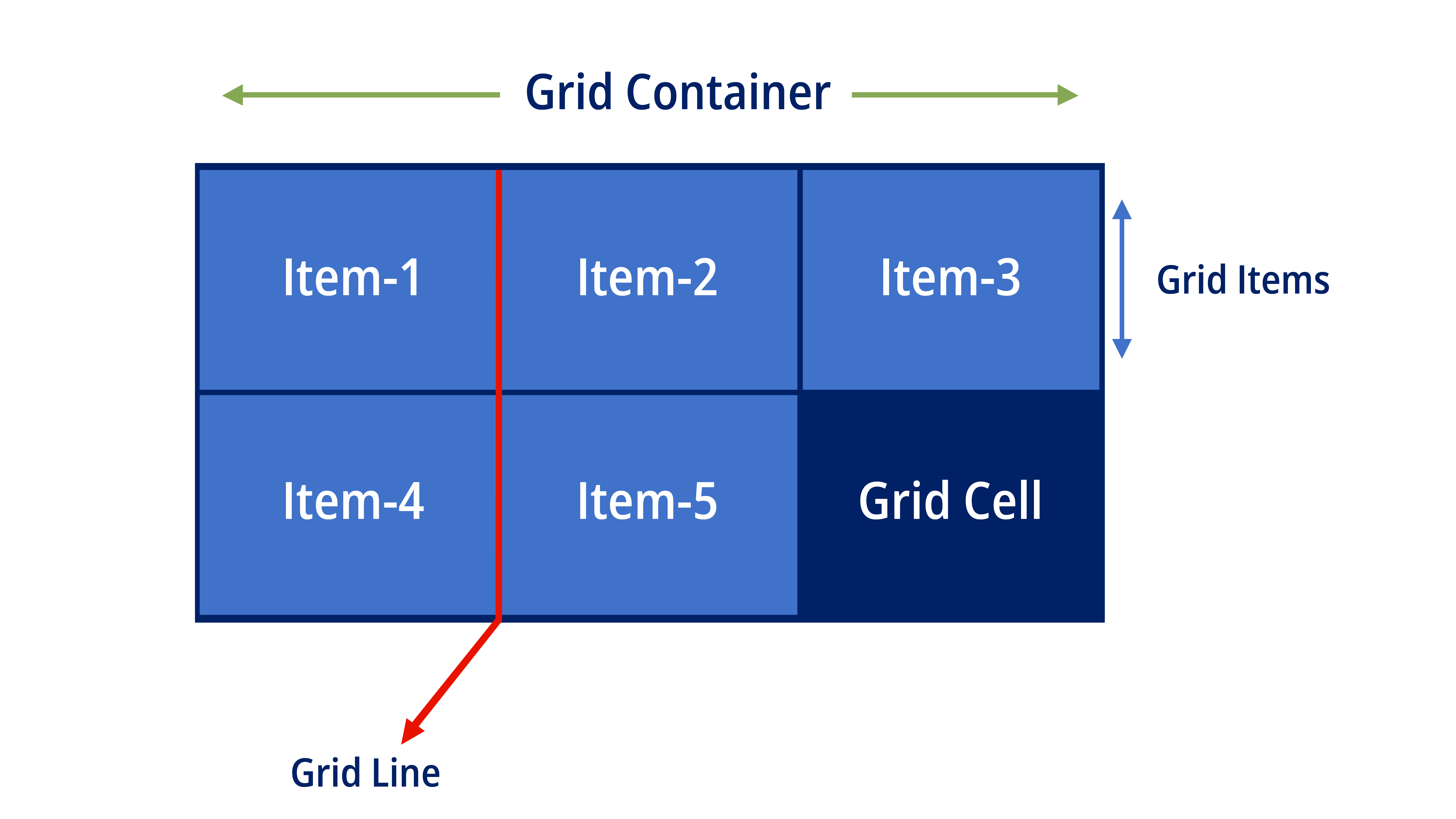
- Grid Container: The element that contains all the items being placed in the grid. It's typically defined by setting the display property to grid or inline-grid.
- Grid Cell: The intersection of a row and a column, where a grid item is placed.
- Grid Item: The individual element that is placed within a grid cell.
- Grid Line: The horizontal or vertical line that separates the grid cells. Grid lines can be referred to by their number, starting from 1 or by their name.
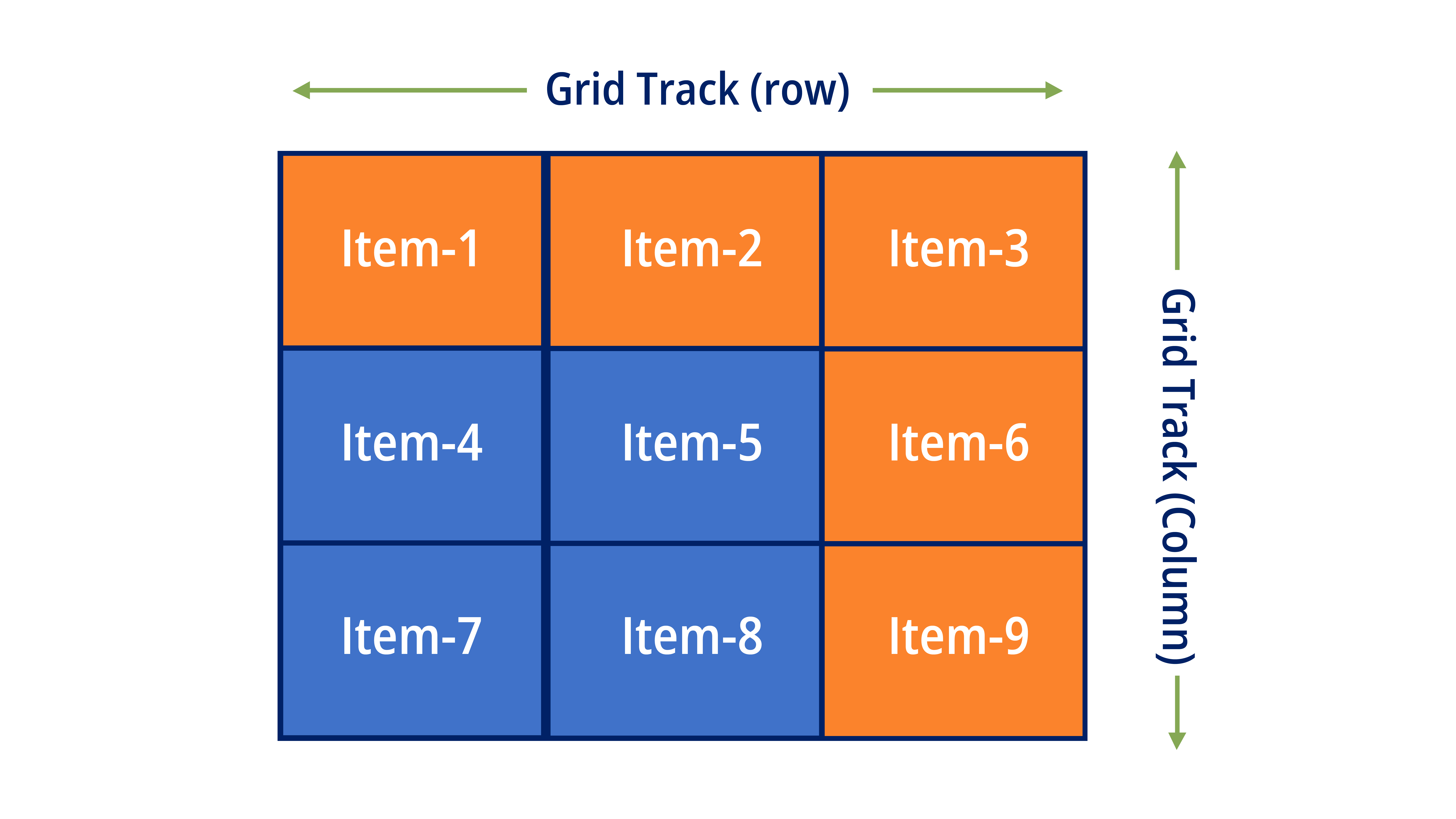
- Grid Track: The space between two adjacent grid lines, either horizontal or vertical.
- Grid Template: Defines the structure of the grid by specifying the number of rows and columns, the size of the grid tracks, and the placement of grid items.
- Grid Template Rows/Columns: Specifies the number and size of rows or columns in the grid. You can use fixed sizes like px or relative sizes like fr to create flexible layouts.
- Grid Gap: The space between two adjacent grid tracks. It can be set using the grid-gap property.
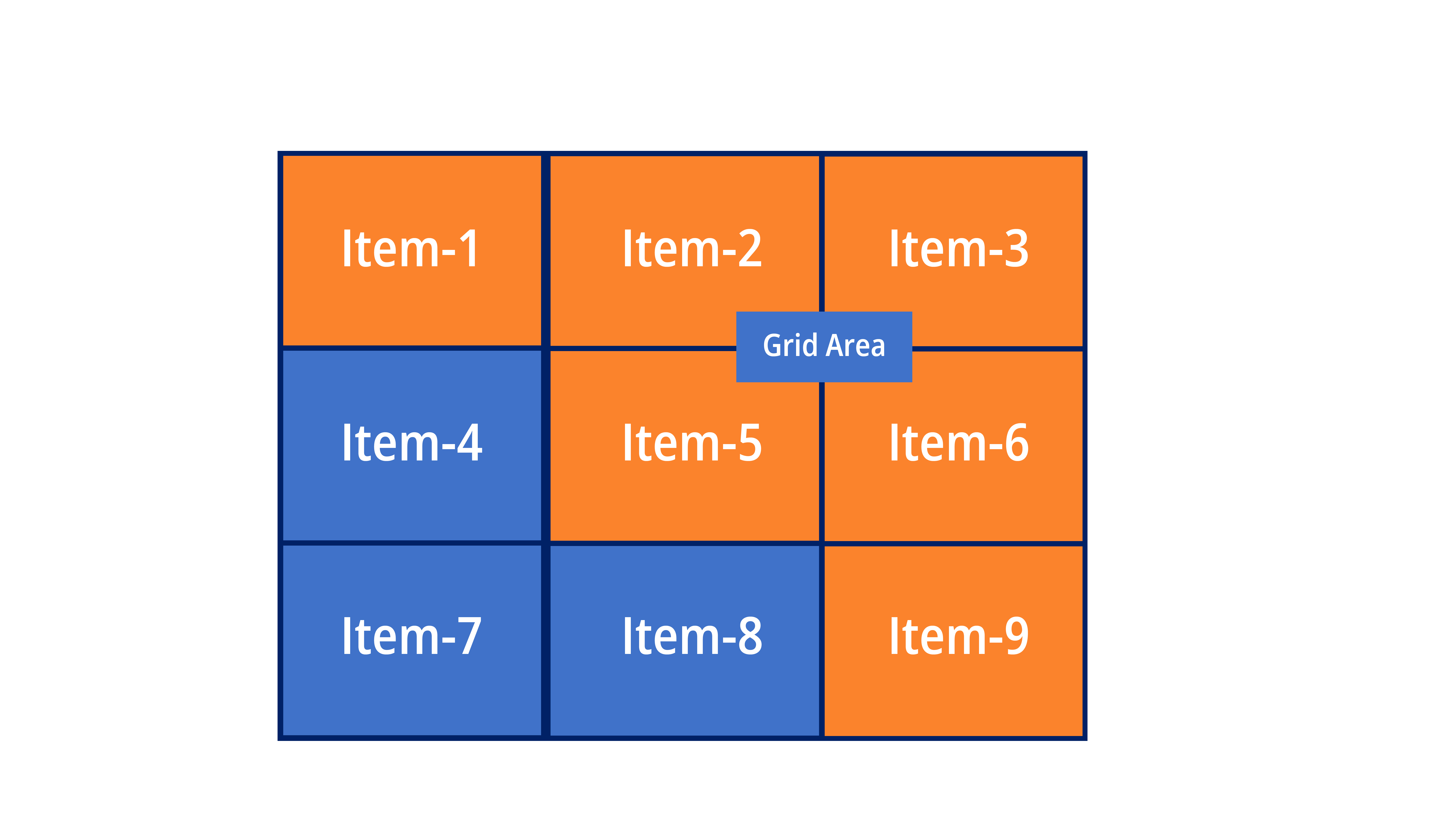
- Grid Area: The total space covered by a grid item, spanning one or more cells.
- Grid Auto Placement: Specifies how items are placed on the grid when their location is not explicitly defined. It can be set to dense or sparse.
These are just a few of the key terms used in CSS Grid. Learning these terms will help you understand and use CSS Grid more effectively in your web development projects.
CSS Tutorial
Properties Reference
Cascading Style Sheet
Flexbox Tutorial
CSS Grid Tutorial
Transitions Properties
CSS Properties with Examples
CSS Selectors
CSS Pseudo Elements
CSS Attribute Selectors
Input Pseudo Classes
CSS Examples
CSS Animation Projects
Learn All in Tamil © Designed & Developed By Tutor Joes | Privacy Policy | Terms & Conditions