Creating an Animated Contact Form with CSS
An animated contact form in CSS is a user interface element typically found on websites that allows users to submit messages, queries, or other types of information to the website owner or administrator. What makes it "animated" is the incorporation of visual effects and transitions using Cascading Style Sheets (CSS) to create a more engaging and visually appealing user experience.
Source Code :
<!DOCTYPE html>
<html lang="en">
  <head>
    <meta charset="UTF-8" />
    <meta name="viewport" content="width=device-width, initial-scale=1.0" />
    <title>Document</title>
    <link rel="stylesheet" href="css/style.css" />
  </head>
  <body>
    <div class="container">
      <div class="title">Contact Us</div>
      <form action="#">
        <div class="row">
          <div class="form-group">
            <input type="text" required id="firstname" />
            <div class="underline"></div>
            <label for="firstname">First Name</label>
          </div>
          <div class="form-group">
            <input type="text" required id="lastname" />
            <div class="underline"></div>
            <label for="lastname">Last Name</label>
          </div>
        </div>
        <div class="row">
          <div class="form-group">
            <input type="text" required id="email" />
            <div class="underline"></div>
            <label for="email">Email</label>
          </div>
          <div class="form-group">
            <input type="text" required id="contact" />
            <div class="underline"></div>
            <label for="contact">Contact No</label>
          </div>
        </div>
        <div class="row">
          <div class="form-group textarea">
            <textarea required></textarea>
            <div class="underline"></div>
            <label for="">Write your message</label>
          </div>
        </div>
        <div class="row">
          <div class="form-group">
            <input type="submit" value="Send Message" />
          </div>
        </div>
      </form>
    </div>
  </body>
</html>
css/style.css
@import url("https://fonts.googleapis.com/css?family=Poppins:400,500,600,700&display=swap");

* {
  margin: 0;
  padding: 0;
  box-sizing: border-box;
  font-family: "Poppins", sans-serif;
}

:root {
  --bgcolor: #20bf6b;
  --red: #eb3b5a;
  --purple: #8854d0;
}

body {
  height: 100vh;
  width: 100%;
  display: flex;
  justify-content: center;
  align-items: center;
  background-color: var(--bgcolor);
}

.container {
  width: 800px;
  background: #fff;
  padding: 25px 40px 10px 40px;
  box-shadow: 0px 0px 5px rgba(0, 0, 0, 0.5);
}

.title {
  text-align: center;
  font-size: 25px;
  font-weight: 600;
  text-transform: uppercase;
  color: var(--red);
}

.container form {
  padding: 30px 0;
}

.row {
  display: flex;
  margin: 32px 0;
}

.form-group {
  /* background-color: red; */
  width: 100%;
  margin: 0 20px;
  height: 40px;
  position: relative;
}

.textarea {
  height: 70px;
}

.form-group input,
.form-group textarea {
  display: block;
  width: 100%;
  height: 100%;
  border: none;
  font-size: 17px;
  outline: none;
  border-bottom: 2px solid rgba(0, 0, 0, 0.12);
}

.form-group textarea {
  resize: none;
  padding-top: 10px;
}

.form-group label {
  position: absolute;
  font-size: 16px;
  bottom: 10px;
  pointer-events: none;
  transition: 0.3s ease;
}

.form-group input:focus ~ label,
.form-group input:valid ~ label {
  transform: translateY(-20px);
  color: var(--purple);
  font-size: 14px;
}
.form-group textarea:focus ~ label,
.form-group textarea:valid ~ label {
  transform: translateY(-50px);
  color: var(--purple);
  font-size: 14px;
}
.underline {
  width: 100%;
  height: 2px;
  background: var(--purple);
  position: absolute;
  bottom: 0;
  transform: scaleX(0);
  transition: 0.3s ease;
}

.form-group input:focus ~ .underline,
.form-group input:valid ~ .underline,
.form-group textarea:focus ~ .underline,
.form-group textarea:valid ~ .underline {
  transform: scaleX(1);
}

input[type="submit"] {
  background-color: var(--red);
  color: #fff;
}
Styling the Form Container:
CSS rule targets a form element within an element with the class container and adds padding to it.
Styling Rows:
CSS rule targets elements with the class row and sets them to display as a flex container. It also adds margin space above and below these elements.
Styling Form Groups:
Targets elements with the class form-group and sets their width to 100%, adds horizontal margin, sets a fixed height, and positions them relatively within their container. These are likely the individual form field containers.
Styling Labels and Their Interaction:
style labels within elements with the class form-group. They set the position, font size, and define a transition effect for labels. The transition effect is triggered when the input fields are focused or contain valid input.
Adding an Underline:
Target elements with the class underline and creates an underline effect for input fields when they are focused or contain valid input.
The provided code seems to be a part of a larger HTML/CSS form design, focusing on input fields, labels, and their interactions. To fully implement this form, you would need to combine it with appropriate HTML structure and possibly some JavaScript to handle form submission and validation.
Output
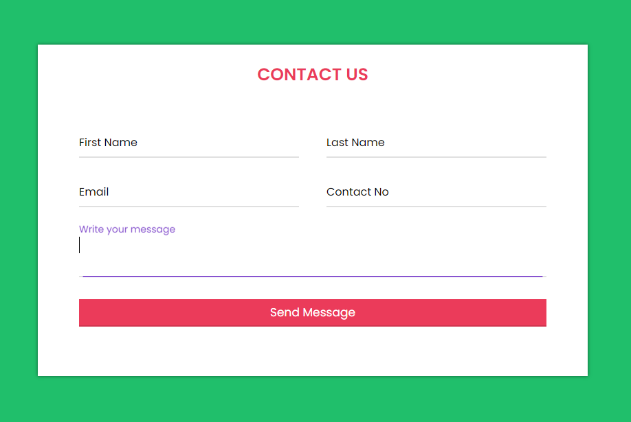
Live Preview
Creating an animated contact form in CSS can add a visually appealing and engaging element to your website, making it more attractive and user-friendly. However, it's crucial to strike a balance between aesthetics and usability, ensuring that the form remains easy to use and accessible for all visitors.
CSS Tutorial
Properties Reference
Cascading Style Sheet
Flexbox Tutorial
CSS Grid Tutorial
Transitions Properties
CSS Properties with Examples
CSS Selectors
CSS Pseudo Elements
CSS Attribute Selectors
Input Pseudo Classes
CSS Examples
CSS Animation Projects
Learn All in Tamil © Designed & Developed By Tutor Joes | Privacy Policy | Terms & Conditions