A Comprehensive Guide to Using the CSS Display Flex Property
CSS display flex Property
This property is a powerful and flexible way to layout and align items within a container. It is part of the CSS Flexible Box Layout (or "Flexbox") module, and it allows you to easily manipulate the layout and alignment of elements on a web page.
When you set the display:flex property on a container element, it turns that element into a "flex container". This means that any child elements inside the container become "flex items", and you can use a range of properties to control their layout and alignment.
Here is an example for display:flex in css
Source Code :
<!DOCTYPE html>
<html lang="en">
<head>
  <meta charset="UTF-8">
  <meta http-equiv="X-UA-Compatible" content="IE=edge">
  <meta name="viewport" content="width=device-width, initial-scale=1.0">
  <title>Document</title>
  <link rel="stylesheet" href="style.css">
</head>
<body>
  <div class="container">
    <div class="flex-item box-1">Box-1</div>
    <div class="flex-item box-2">Box-2</div>
    <div class="flex-item box-3">Box-3</div>
    <div class="flex-item box-4">Box-4</div>
    <div class="flex-item box-5">Box-5</div>
    <div class="flex-item box-6">Box-6</div>
    <div class="flex-item box-7">Box-7</div>
    <div class="flex-item box-8">Box-8</div>
    <div class="flex-item box-9">Box-9</div>
  </div>
</body>
</html>
style.css :
@import url('https://fonts.googleapis.com/css2?family=Rubik:wght@300;400;500;600;700;900&display=swap');

*{
  margin: 0;
  padding: 0;
  font-family: 'Rubik', sans-serif;

}

.container{
  border:5px solid black;
}

.flex-item{
  color:white;
  font-size: 18px;
  padding: 16px;
  text-align: center;
}

.box-1{background-color: #1abc9c;}
.box-2{background-color:#3498db;}
.box-3{background-color: #2ecc71;}
.box-4{background-color: #9b59b6;}
.box-5{background-color:#34495e;}
.box-6{background-color:#2980b9;}
.box-7{background-color:#e74c3c;}
.box-8{background-color: #d35400;}
.box-9{background-color:#2c3e50;}

/*-----------------------------------*/
.container{
  display: flex;
}
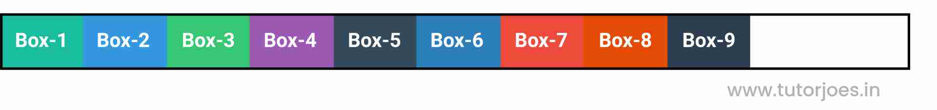
This code sets the display property of the .container element to flex. This means that the .container element becomes a flex container, and any child elements of the container become flex items.
By setting the display property to flex, the container gains access to a range of flexbox properties that can be used to control the layout and alignment of its child elements.
This code alone does not specify any particular layout or alignment for the flex items, it just sets up the container as a flex container ready for additional styling. Additional properties can be used to manipulate the layout and appearance of the container and its child elements.
Output
Live Preview
Overall, the display:flex property offers a flexible and intuitive way to create complex layouts and alignments in CSS, and it is widely supported by modern web browsers.
CSS display inline-flex Property
The display:inline-flex property in CSS is similar to display:flex, but it allows you to create a flex container that behaves like an inline element. This means that the container will not force a line break, and it can be positioned alongside other inline elements on a web page.
When you set the display:inline-flex property on a container element, it turns that element into an "inline-flex container". This means that any child elements inside the container become "inline-flex items", and you can use a range of properties to control their layout and alignment.
The display:inline-flex property shares many of the same properties as display:flex, including:
By using display:inline-flex, you can create a flexible and responsive layout that behaves like an inline element, which can be useful for creating menus, toolbars, or other UI elements that need to be positioned alongside other inline elements on a web page.
Source Code :
<!DOCTYPE html>
<html lang="en">
<head>
  <meta charset="UTF-8">
  <meta http-equiv="X-UA-Compatible" content="IE=edge">
  <meta name="viewport" content="width=device-width, initial-scale=1.0">
  <title>Document</title>
  <link rel="stylesheet" href="style.css">
</head>
<body>
  <div class="container">
    <div class="flex-item box-1">Box-1</div>
    <div class="flex-item box-2">Box-2</div>
    <div class="flex-item box-3">Box-3</div>
    <div class="flex-item box-4">Box-4</div>
    <div class="flex-item box-5">Box-5</div>
    <div class="flex-item box-6">Box-6</div>
    <div class="flex-item box-7">Box-7</div>
    <div class="flex-item box-8">Box-8</div>
    <div class="flex-item box-9">Box-9</div>
  </div>
</body>
</html>
style.css :
@import url('https://fonts.googleapis.com/css2?family=Rubik:wght@300;400;500;600;700;900&display=swap');

*{
  margin: 0;
  padding: 0;
  font-family: 'Rubik', sans-serif;

}

.container{
  border:5px solid black;
}

.flex-item{
  color:white;
  font-size: 18px;
  padding: 16px;
  text-align: center;
}

.box-1{background-color: #1abc9c;}
.box-2{background-color:#3498db;}
.box-3{background-color: #2ecc71;}
.box-4{background-color: #9b59b6;}
.box-5{background-color:#34495e;}
.box-6{background-color:#2980b9;}
.box-7{background-color:#e74c3c;}
.box-8{background-color: #d35400;}
.box-9{background-color:#2c3e50;}

/*-----------------------------------*/
.container{
  display: inline-flex;
}
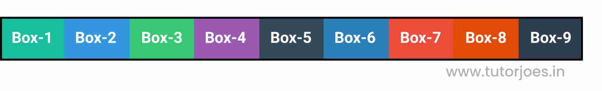
This code sets the display property of the .container element to inline-flex. This means that the .container element becomes an inline-flex container, and any child elements of the container become inline-flex items.
By setting the display property to inline-flex, the container gains access to a range of flexbox properties that can be used to control the layout and alignment of its child elements.
The key difference between display and display:inline-flex is that the latter creates a flex container that behaves like an inline element. This means that the container will not force a line break and can be positioned alongside other inline elements on a web page.
This code alone does not specify any particular layout or alignment for the inline-flex items, it just sets up the container as an inline-flex container ready for additional styling. Additional properties can be used to manipulate the layout and appearance of the container and its child elements, such as justify-content, align-items, and flex-direction.
Output
Live Preview
CSS Tutorial
Properties Reference
Cascading Style Sheet
Flexbox Tutorial
CSS Grid Tutorial
Transitions Properties
CSS Properties with Examples
CSS Selectors
CSS Pseudo Elements
CSS Attribute Selectors
Input Pseudo Classes
CSS Examples
CSS Animation Projects
Learn All in Tamil © Designed & Developed By Tutor Joes | Privacy Policy | Terms & Conditions