Exploring CSS Grid Align-Items Property
The align-items property in CSS Grid is used to align grid items within their grid cell along the block (vertical) axis. It defines the default alignment for all items in a grid container, unless overridden by align-self property on the individual items.
ou can also set the align-items property to other values, such as start, end, stretch or baseline. Here's what each value does:
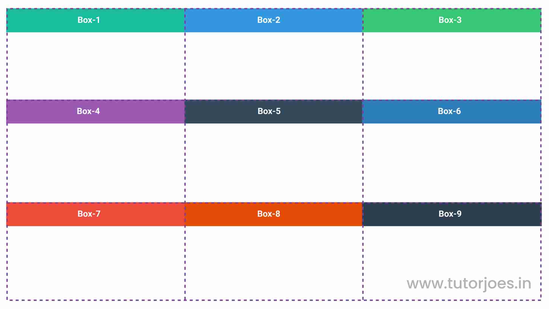
- start: aligns grid items to the start of their grid cell (top-aligned for ltr languages)
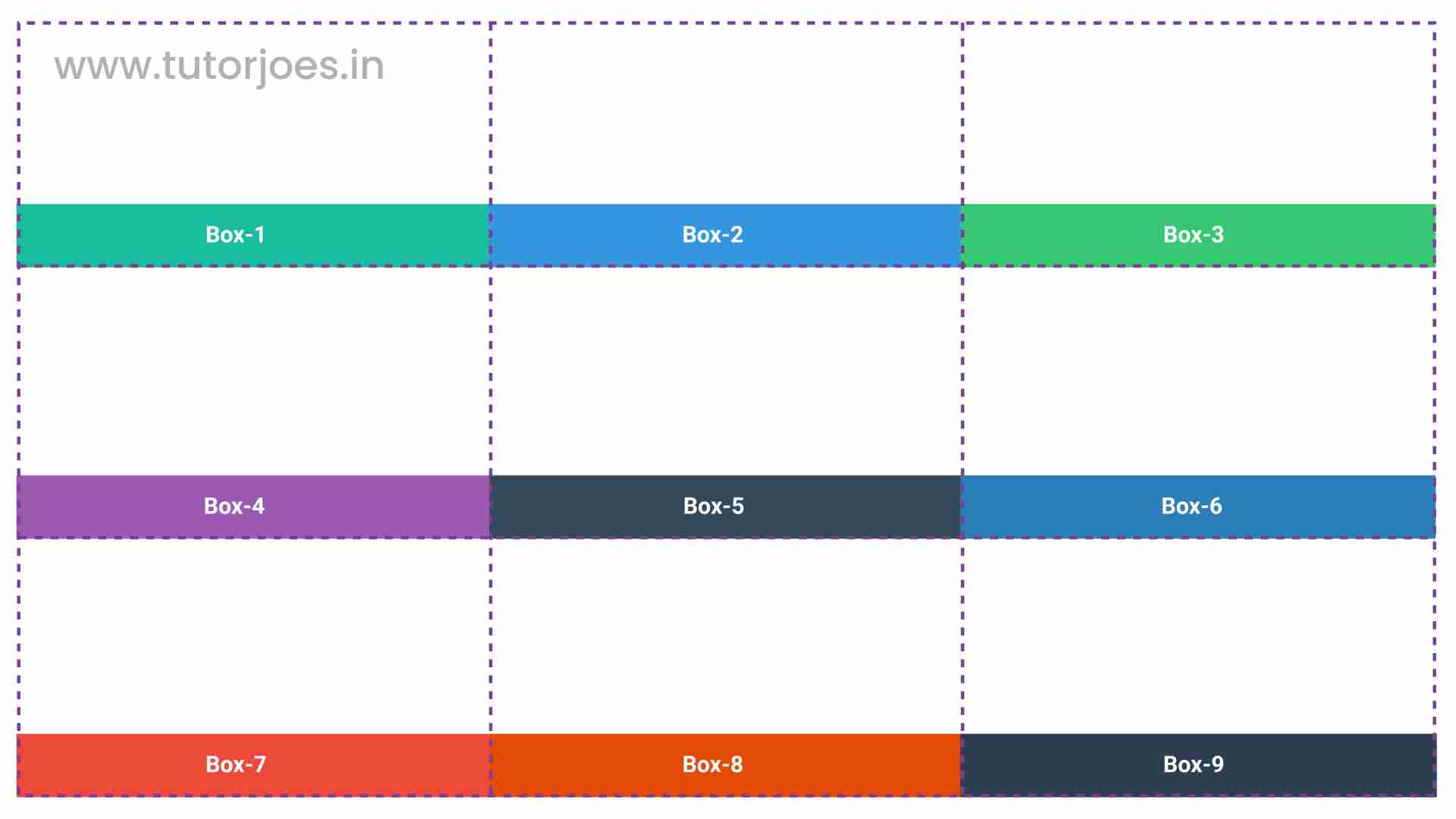
- end: aligns grid items to the end of their grid cell (bottom-aligned for ltr languages)
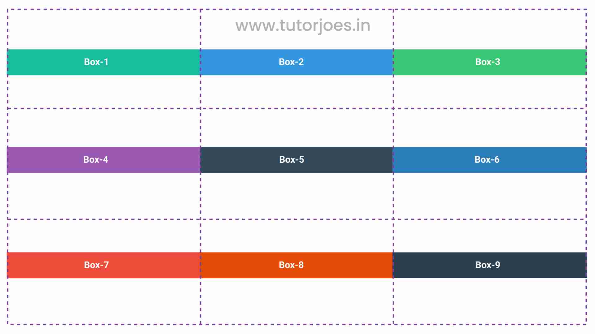
- center: aligns grid items to the center of their grid cell
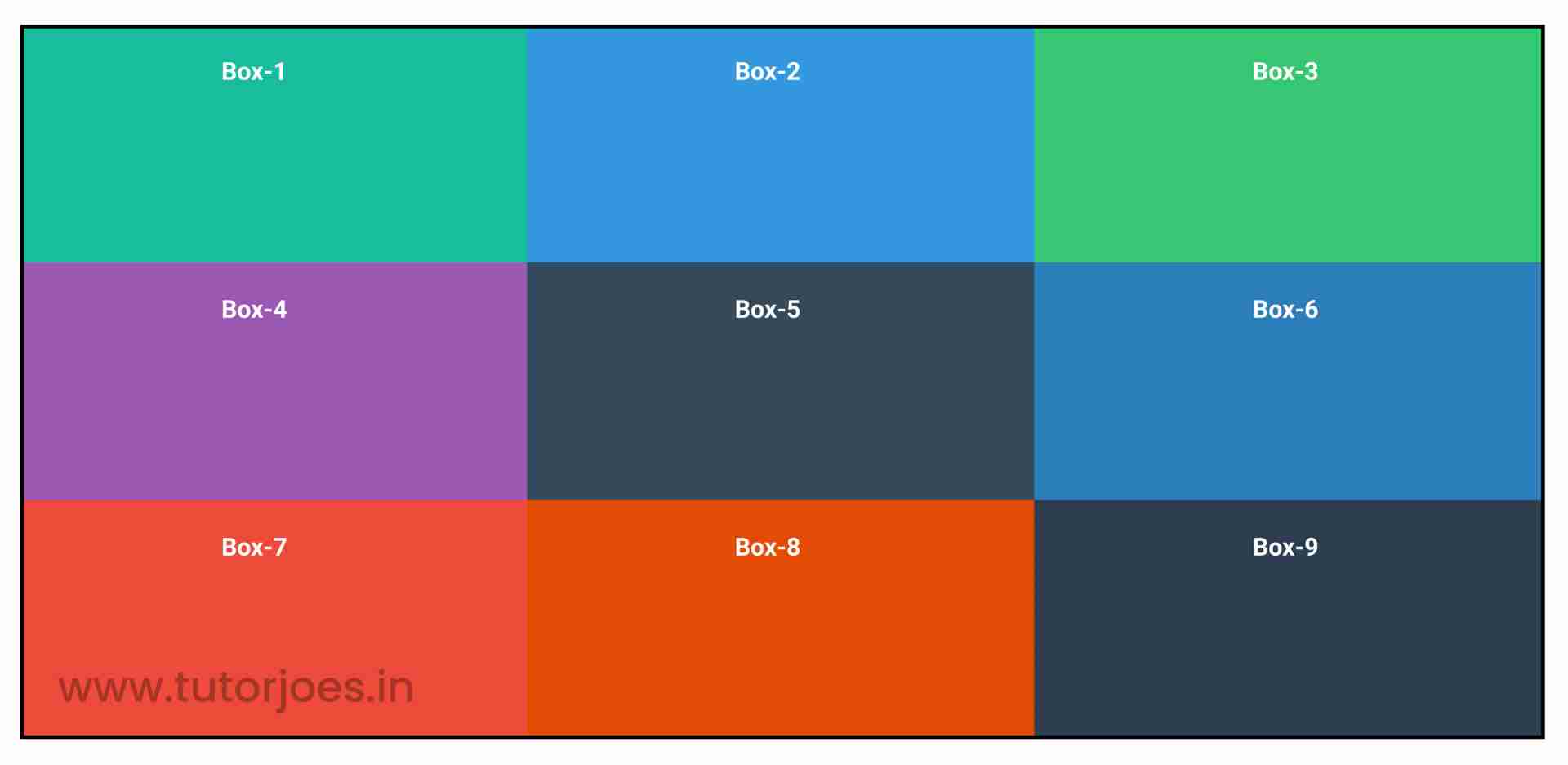
- stretch: stretches grid items to fill the entire height of their grid cell
- baseline: aligns grid items such that their baselines align with each other
align-items:start;
align-items:end;
align-items:center;
align-items:stretch; or align-items:baseline;
Here's an example:
Source Code :
<!DOCTYPE html>
<html lang="en">
<head>
  <meta charset="UTF-8">
  <meta http-equiv="X-UA-Compatible" content="IE=edge">
  <meta name="viewport" content="width=device-width, initial-scale=1.0">
  <title>Document</title>
  <link rel="stylesheet" href="align-items.css">
</head>
<body>
  <div class="container">
    <div class="grid-item box-1">Box-1</div>
    <div class="grid-item box-2">Box-2</div>
    <div class="grid-item box-3">Box-3</div>
    <div class="grid-item box-4">Box-4</div>
    <div class="grid-item box-5">Box-5</div>
    <div class="grid-item box-6">Box-6</div>
    <div class="grid-item box-7">Box-7</div>
    <div class="grid-item box-8">Box-8</div>
    <div class="grid-item box-9">Box-9</div>
  </div>
</body>
</html>
align-items.css :
@import url('https://fonts.googleapis.com/css2?family=Rubik:wght@300;400;500;600;700;900&display=swap');

*{
  margin: 0;
  padding: 0;
  font-family: 'Rubik', sans-serif;
  box-sizing: border-box;
}

.container{
  border:5px solid black;
  margin: 20px;
}

.grid-item{
  color:white;
  font-size: 18px;
  padding: 16px;
  text-align: center;
}

.box-1{background-color: #1abc9c;}
.box-2{background-color:#3498db;}
.box-3{background-color: #2ecc71;}
.box-4{background-color: #9b59b6;}
.box-5{background-color:#34495e;}
.box-6{background-color:#2980b9;}
.box-7{background-color:#e74c3c;}
.box-8{background-color: #d35400;}
.box-9{background-color:#2c3e50;}

/**-----------------------------------------------*/
/*
   justify-items - Horizonal Axis Align
   align-items - vertical Axis Align

*/
.container{
  display: grid;
  height: 600px;
  grid-template: repeat(3,1fr) / repeat(3,1fr);

  align-items: stretch;
  align-items: start;
  align-items: end;
  align-items: center;
}
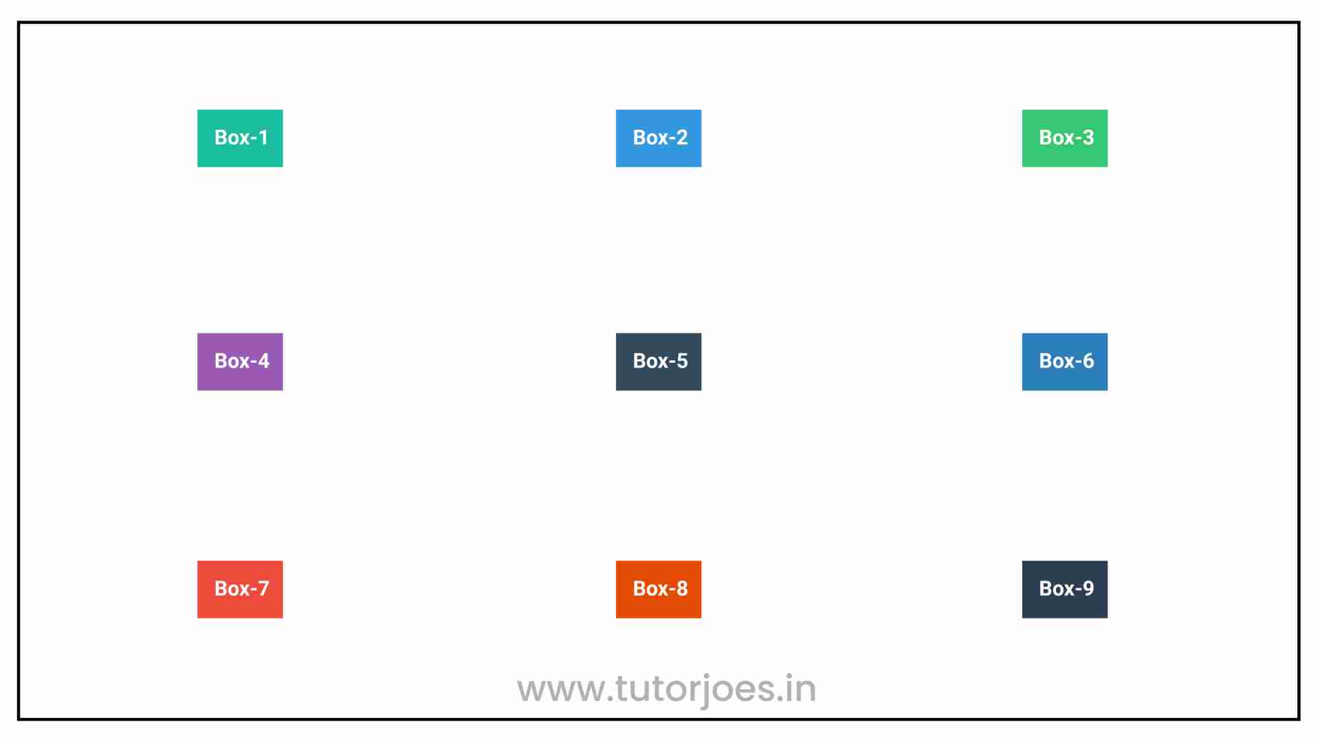
This code sets up a basic grid layout using CSS Grid. The container class represents the grid container, and it has a border and margin applied to it for visual clarity.
The grid container is set to display: grid to indicate that it should use CSS Grid, and it has a height of 600px. The grid-template property is used to define the rows and columns of the grid. In this case, the grid has 3 rows (repeat(3,1fr)) and 3 columns (repeat(3,1fr)). The 1fr unit is used to indicate that each row and column should take up an equal amount of available space.
The justify-items property is used to horizontally align the grid items within their respective cells. It is set to center, which means that the items will be centered horizontally within their cells.
The align-items property is used to vertically align the grid items within their respective cells. It is initially set to stretch, which means that the items will stretch to fill the entire height of their cells. However, it is then set to start, end, and center to demonstrate the different options available for vertical alignment.
Each grid item is represented by a separate class (box-1 through box-9) and has a different background color. The grid-item class is applied to all items and sets the font size, text color, padding, and text alignment.
Overall, this code demonstrates how to use the justify-items and align-items properties in CSS Grid to align grid items horizontally and vertically within their cells. By using these properties in combination with the grid-template property, you can create complex and visually appealing grid-based layouts for your web pages.
Live PreviewCSS Tutorial
Properties Reference
Cascading Style Sheet
Flexbox Tutorial
CSS Grid Tutorial
Transitions Properties
CSS Properties with Examples
CSS Selectors
CSS Pseudo Elements
CSS Attribute Selectors
Input Pseudo Classes
CSS Examples
CSS Animation Projects
Learn All in Tamil © Designed & Developed By Tutor Joes | Privacy Policy | Terms & Conditions