Understanding the CSS Flex Direction Property
The flex-direction property in CSS is used to set the direction in which flex items are laid out within a flex container. It determines whether the flex items are laid out in a row or a column, and whether they are arranged from left to right, right to left, top to bottom, or bottom to top.
The flex-direction property can be set to one of four values:
- row: This is the default value, and it arranges the flex items in a horizontal row, starting from the left and going towards the right.
- column: This arranges the flex items in a vertical column, starting from the top and going towards the bottom.
- row-reverse: This arranges the flex items in a horizontal row, starting from the right and going towards the left.
- column-reverse: This arranges the flex items in a vertical column, starting from the bottom and going towards the top.
The flex-direction property affects both the main axis and the cross axis of the flex container. The main axis is the axis along which the flex items are laid out, and it is determined by the value of flex-direction. The cross axis is the perpendicular axis, and it is determined by the opposite value of flex-direction.
For example, if flex-direction: row, the main axis is horizontal, and the cross axis is vertical. If flex-direction: column, the main axis is vertical, and the cross axis is horizontal.
By using the flex-direction property, you can create flexible and responsive layouts for your web pages, allowing you to arrange elements in a way that best suits the content and design of your website. Additionally, you can use other flexbox properties such as justify-content, align-items, and flex-wrap to further control the layout and alignment of your flex items within the container.
flex-direction: row;
The flex-direction: row property value in CSS is used to arrange the flex items within a flex container in a horizontal row, from left to right. It is the default value for the flex-direction property.
.container{
  display: flex;
  flex-direction: row;
}
Output
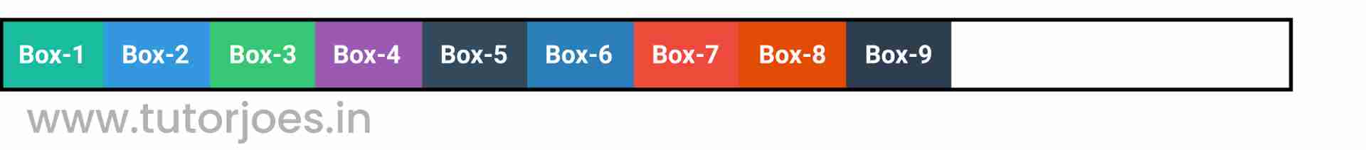
When flex-direction is set to row, the main axis of the flex container is horizontal, and the cross axis is vertical. The flex items are arranged along the main axis, which is from left to right in this case.
Here are some key points to keep in mind when using flex-direction: row:
- The default value of flex-direction is row, so if you don't specify a value, your flex container will use this property value.
- Flex items within a row container are positioned in a horizontal row, from left to right.
- The first item within the row starts at the left edge of the container, and subsequent items are positioned to the right of the previous item, with any remaining space distributed equally between the items.
- You can use additional flexbox properties such as justify-content, align-items, and flex-wrap to further control the layout and alignment of your flex items within the container.
flex-direction: row-reverse;
The flex-direction: row-reverse property value in CSS is used to arrange the flex items within a flex container in a horizontal row, from right to left.
.container{
  display: flex;
  flex-direction: row-reverse;
}
Output

When flex-direction is set to row-reverse, the main axis of the flex container is horizontal, and the cross axis is vertical. The flex items are arranged along the main axis, which is from right to left in this case.
Here are some key points to keep in mind when using flex-direction: row-reverse:
- The row-reverse value for the flex-direction property arranges the flex items within a container in a horizontal row, from right to left.
- The first item within the row starts at the right edge of the container, and subsequent items are positioned to the left of the previous item, with any remaining space distributed equally between the items.
- The order of the flex items is reversed compared to flex-direction: row. The last item becomes the first item, and vice versa.
- You can use additional flexbox properties such as justify-content, align-items, and flex-wrap to further control the layout and alignment of your flex items within the container.
Overall,flex-direction: row-reverse is a powerful tool in CSS for creating horizontal layouts that are flexible and responsive, allowing you to arrange elements in a way that best suits the content and design of your website, but in the opposite direction of flex-direction: row.
flex-direction: column;
The flex-direction: column property value in CSS is used to arrange the flex items within a flex container in a vertical column, from top to bottom.
.container{
  display: flex;
  flex-direction: column;
}
Output
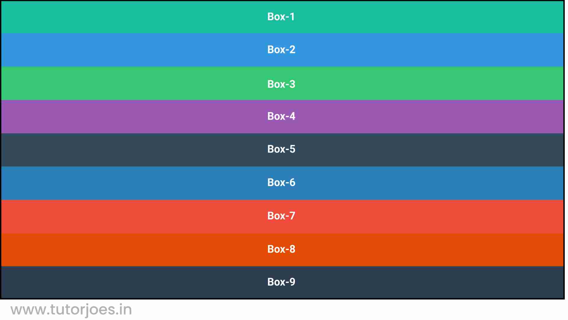
When flex-direction is set to column, the main axis of the flex container is vertical, and the cross axis is horizontal. The flex items are arranged along the main axis, which is from top to bottom in this case.
Here are some key points to keep in mind when using flex-direction: column;
- The column value for the flex-direction property arranges the flex items within a container in a vertical column, from top to bottom.
- The first item within the column starts at the top edge of the container, and subsequent items are positioned below the previous item, with any remaining space distributed equally between the items.
- You can use additional flexbox properties such as justify-content, align-items, and flex-wrap to further control the layout and alignment of your flex items within the container.
- The default value of the flex-direction property is row, so you will need to set this property to column to create a vertical layout.
Overall, flex-direction: column is a powerful tool in CSS for creating vertical layouts that are flexible and responsive, allowing you to arrange elements in a way that best suits the content and design of your website.
flex-direction: column-reverse;
The flex-direction: column-reverse property value in CSS is used to arrange the flex items within a flex container in a vertical column, from bottom to top.
.container{
  display: flex;
  flex-direction: column-reverse;
}
Output
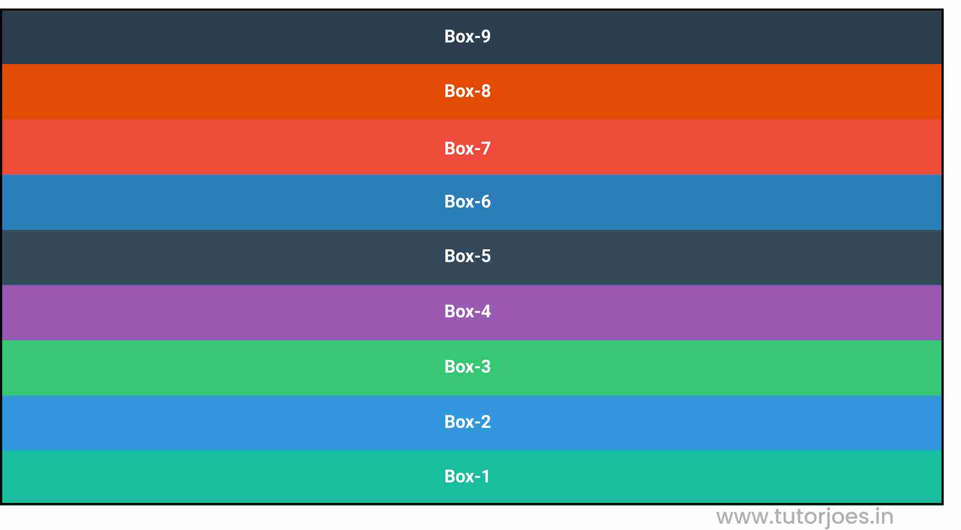
When flex-direction is set to column-reverse, the main axis of the flex container is vertical, and the cross axis is horizontal. The flex items are arranged along the main axis, which is from bottom to top in this case.
Here are some key points to keep in mind when using flex-direction: column-reverse:
- The column-reverse value for the flex-direction property arranges the flex items within a container in a vertical column, from bottom to top.
- The first item within the column starts at the bottom edge of the container, and subsequent items are positioned above the previous item, with any remaining space distributed equally between the items.
- The order of the flex items is reversed compared to flex-direction: column. The last item becomes the first item, and vice versa.
- You can use additional flexbox properties such as justify-content, align-items, and flex-wrap to further control the layout and alignment of your flex items within the container.
Overall, flex-direction: column-reverse is a powerful tool in CSS for creating vertical layouts that are flexible and responsive, allowing you to arrange elements in a way that best suits the content and design of your website, but in the opposite direction of flex-direction: column.
Source Code :
<!DOCTYPE html>
<html lang="en">
<head>
  <meta charset="UTF-8">
  <meta http-equiv="X-UA-Compatible" content="IE=edge">
  <meta name="viewport" content="width=device-width, initial-scale=1.0">
  <title>Document</title>
  <link rel="stylesheet" href="flex-direction.css">
</head>
<body>
  <div class="container">
    <div class="flex-item box-1">Box-1</div>
    <div class="flex-item box-2">Box-2</div>
    <div class="flex-item box-3">Box-3</div>
    <div class="flex-item box-4">Box-4</div>
    <div class="flex-item box-5">Box-5</div>
    <div class="flex-item box-6">Box-6</div>
    <div class="flex-item box-7">Box-7</div>
    <div class="flex-item box-8">Box-8</div>
    <div class="flex-item box-9">Box-9</div>
  </div>
</body>
</html>
flex-direction.css :
@import url('https://fonts.googleapis.com/css2?family=Rubik:wght@300;400;500;600;700;900&display=swap');

*{
  margin: 0;
  padding: 0;
  font-family: 'Rubik', sans-serif;

}

.container{
  border:5px solid black;
}

.flex-item{
  color:white;
  font-size: 18px;
  padding: 16px;
  text-align: center;
}

.box-1{background-color: #1abc9c;}
.box-2{background-color:#3498db;}
.box-3{background-color: #2ecc71;}
.box-4{background-color: #9b59b6;}
.box-5{background-color:#34495e;}
.box-6{background-color:#2980b9;}
.box-7{background-color:#e74c3c;}
.box-8{background-color: #d35400;}
.box-9{background-color:#2c3e50;}

/*-----------------------------------*/

.container{
  display: flex;
  flex-direction: row;
  flex-direction: row-reverse;
  flex-direction: column;
  flex-direction: column-reverse;
}
Live Preview
CSS Tutorial
Properties Reference
Cascading Style Sheet
Flexbox Tutorial
CSS Grid Tutorial
Transitions Properties
CSS Properties with Examples
CSS Selectors
CSS Pseudo Elements
CSS Attribute Selectors
Input Pseudo Classes
CSS Examples
CSS Animation Projects
Learn All in Tamil © Designed & Developed By Tutor Joes | Privacy Policy | Terms & Conditions