Understanding the flex-wrap property in CSS
Flex wrap in rows
In CSS flexbox, the flex-wrap property allows you to control how flex items are positioned within a flex container when they cannot fit on a single line. By default, flex items will try to fit in a single line, but when there is not enough space, they will overflow the container or be shrunk to fit. The flex-wrap property lets you change this behavior and define whether flex items should wrap onto multiple lines or remain on a single line.
There are three values that you can set for the flex-wrap property:
- nowrap: This is the default value, and it means that flex items will not wrap onto a new line. They will instead overflow the container or be shrunk to fit.
- wrap: This value allows flex items to wrap onto new lines when there is not enough space on a single line.
- wrap-reverse: This value is similar to wrap, but it causes flex items to wrap in reverse order on new lines.
It's important to note that the flex-wrap property only affects flex items that don't fit on the main axis of the flex container. It does not affect the alignment of flex items on the cross-axis.
Overall, the flex-wrap property is a useful tool for creating flexible layouts that adapt to different screen sizes and device orientations.
flex-wrap: nowrap;
The flex-wrap: nowrap property value in CSS flexbox is used to prevent flex items from wrapping to the next line when there is not enough space available on the current line.
By default, the flex container tries to fit all of the flex items onto one line. This can cause the items to overflow outside of the container or be resized to fit, which may not always be desirable.
Using flex-wrap: nowrap, you can prevent this default behavior and ensure that all of the flex items stay on a single line, regardless of how much space is available. This can be useful in cases where you have a fixed width container or want to create a horizontal scrolling container.
Here's an example:
.container{
  display: flex;
  flex-direction: row;
  flex-wrap: nowrap;
}
Output
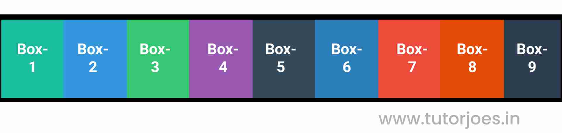
All of the flex items will stay on a single line, even if the container width is less than the total width of the items. If there is not enough space to fit all of the items, they will overflow outside of the container.
Overall, flex-wrap: nowrap is a useful property value for creating horizontal layouts that don't require wrapping of the flex items.
flex-wrap: wrap;
The flex-wrap: wrap property value in CSS flexbox is used to allow flex items to wrap to the next line when there is not enough space available on the current line.
By default, the flex container tries to fit all of the flex items onto one line. This can cause the items to overflow outside of the container or be resized to fit, which may not always be desirable.
Using flex-wrap: wrap, you can change this default behavior and allow the flex items to wrap onto the next line when there is not enough space available. This can be useful in cases where you want to create a responsive layout that adapts to different screen sizes or want to avoid overflow issues.
Here's an example:
.container{
  display: flex;
  flex-direction: row;
  flex-wrap: wrap;
}
Output
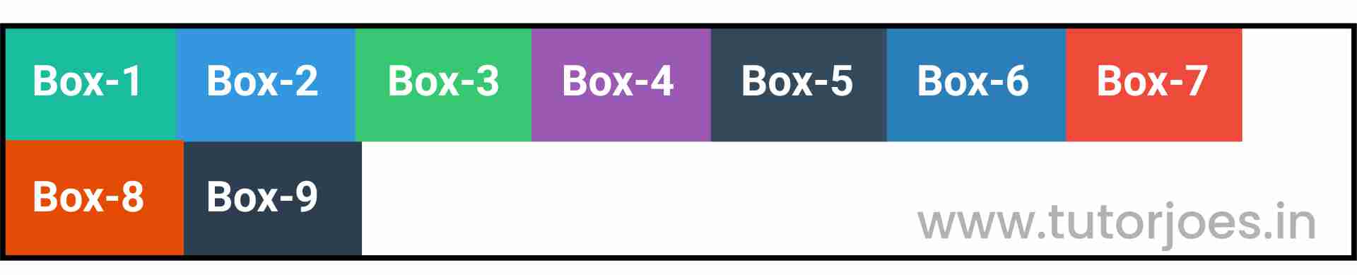
In this example, we've set the flex-wrap property to wrap on the .container class, which is our flex container.
Because of the flex-wrap: wrap property value, if there is not enough space to fit all of the items on a single line, they will wrap to the next line. In addition, we've also set the justify-content property to center, which centers the items along the main axis of the container.
Overall, flex-wrap: wrap is a useful property value for creating flexible layouts that adapt to different screen sizes and allow for wrapping of the flex items.
flex-wrap: wrap-reverse;
The flex-wrap: wrap-reverse property value in CSS flexbox is used to allow flex items to wrap to the next line when there is not enough space available on the current line, but in reverse order from how they appear in the source code.
By default, the flex container tries to fit all of the flex items onto one line. This can cause the items to overflow outside of the container or be resized to fit, which may not always be desirable.
Using flex-wrap: wrap-reverse, you can change this default behavior and allow the flex items to wrap onto the next line when there is not enough space available, but in reverse order from how they appear in the source code. This can be useful in cases where you want to create a responsive layout that adapts to different screen sizes or want to avoid overflow issues, but also want to maintain a specific visual order of the flex items.
Here's an example:
.container{
  display: flex;
  flex-direction: row;
  flex-wrap: wrap-reverse;
}
Output
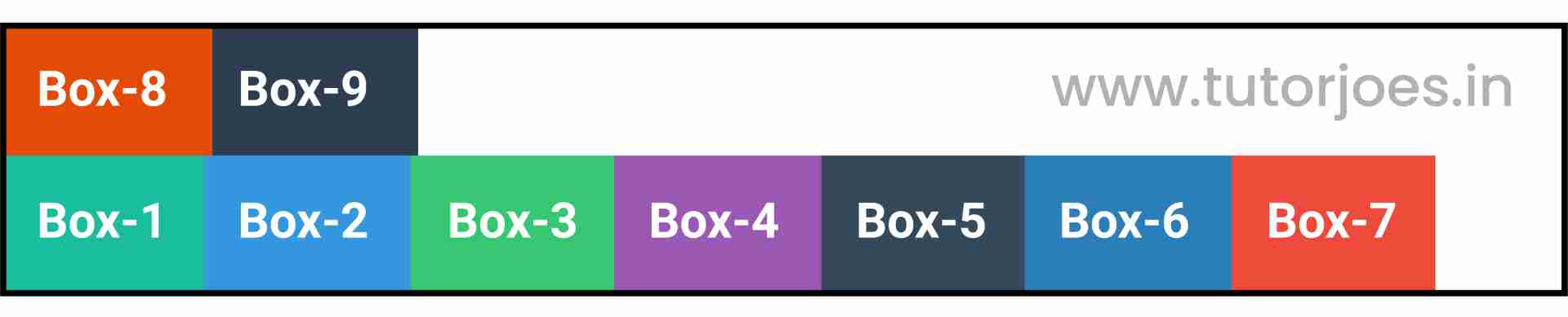
In this example, we've set the flex-wrap property to wrap-reverse on the .container class, which is our flex container.
Because of the flex-wrap: wrap-reverse property value, if there is not enough space to fit all of the items on a single line, they will wrap to the next line, but in reverse order from how they appear in the source code. In addition, we've also set the justify-content property to center, which centers the items along the main axis of the container.
Overall, flex-wrap: wrap-reverse is a useful property value for creating flexible layouts that adapt to different screen sizes, allow for wrapping of the flex items, and maintain a specific visual order of the items.
Flex wrap in Columns
flex-wrap : nowrapThis is a CSS code snippet that defines a flex container with the class name .container.
Here's an example:
.container{
  display: flex;
  height: 400px;
  flex-direction: column;
  flex-wrap: nowrap;
}
Output
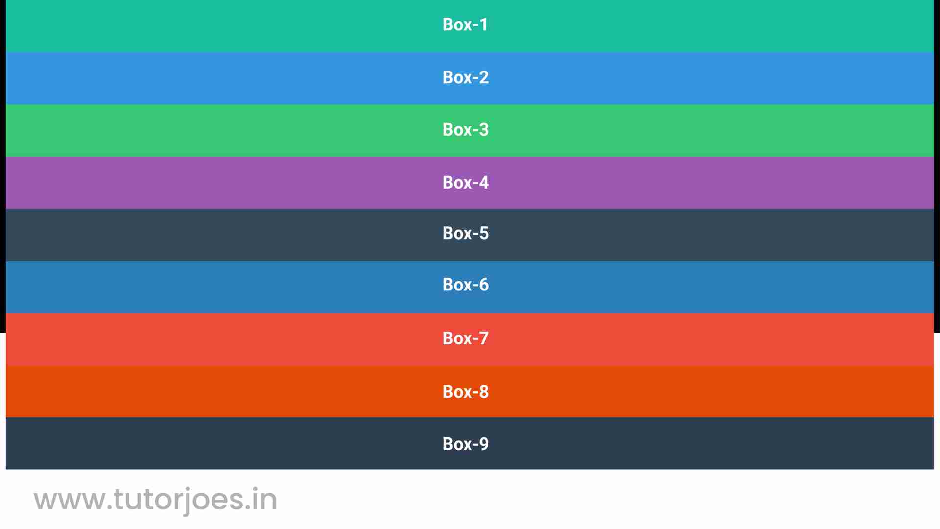
Here's what each of the properties in this code snippet do
- display: flex: This property tells the browser to create a flex container and turn its child elements into flex items. This is the starting point for any flexbox layout.
- height: 400px: This property sets the height of the .container element to 400px. This can be useful in cases where you want to create a fixed height container that holds a vertically-oriented layout of items.
- flex-direction: column: This property sets the direction of the main axis of the flex container to be vertical (from top to bottom), instead of the default horizontal direction (from left to right).
- flex-wrap: nowrap: This property tells the flex container to prevent the flex items from wrapping onto multiple lines. This means that all of the flex items will stay on a single line, even if there is not enough space available.
This property tells the flex container to prevent the flex items from wrapping onto multiple lines. This means that all of the flex items will stay on a single line, even if there is not enough space available.
Here's an example:
.container{
  display: flex;
  height: 400px;
  flex-direction: column;
  flex-wrap: wrap;
}
Output
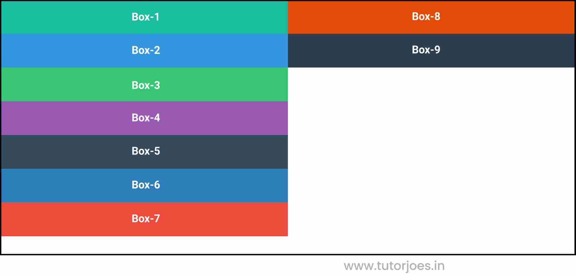
flex-wrap : wrap-reverse
This property tells the flex container to allow the flex items to wrap onto multiple lines if there is not enough space available, but in reverse order from how they appear in the source code.
.container{
  display: flex;
  height: 400px;
  flex-direction: column;
  flex-wrap: wrap-reverse;
}
Output
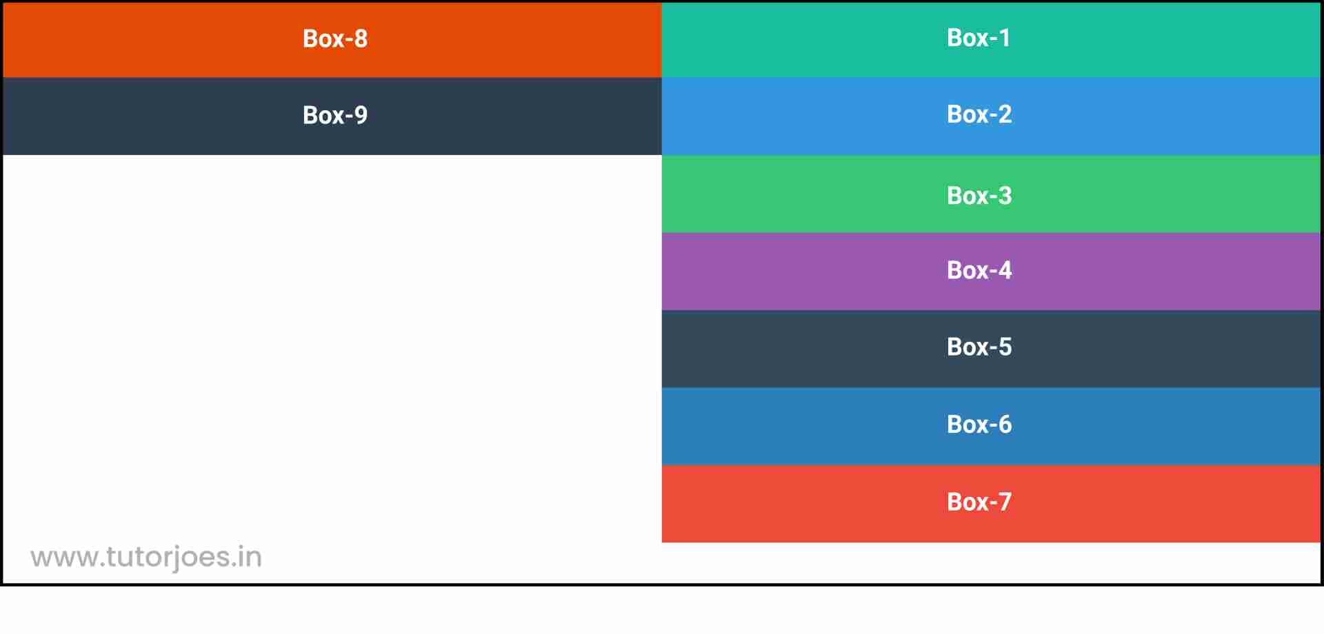
So, with this code, you're creating a vertical flex container that is 400px in height and allows the flex items to wrap onto multiple lines if there is not enough space available, but in reverse order from how they appear in the source code. This layout can be useful in cases where you have a fixed height container and want to create a vertical layout of items that can wrap onto multiple lines, but want to maintain a specific visual order of the items. For example, if you have a list of items that you want to display vertically, but want the most recent item to appear at the top of the list, you could use flex-wrap: wrap-reverse to achieve this layout.
Source Code :
<!DOCTYPE html>
<html lang="en">
<head>
  <meta charset="UTF-8">
  <meta http-equiv="X-UA-Compatible" content="IE=edge">
  <meta name="viewport" content="width=device-width, initial-scale=1.0">
  <title>Document</title>
  <link rel="stylesheet" href="flex-wrap.css">
</head>
<body>
  <div class="container">
    <div class="flex-item box-1">Box-1</div>
    <div class="flex-item box-2">Box-2</div>
    <div class="flex-item box-3">Box-3</div>
    <div class="flex-item box-4">Box-4</div>
    <div class="flex-item box-5">Box-5</div>
    <div class="flex-item box-6">Box-6</div>
    <div class="flex-item box-7">Box-7</div>
    <div class="flex-item box-8">Box-8</div>
    <div class="flex-item box-9">Box-9</div>
  </div>
</body>
</html>
flex-wrap.css :
@import url('https://fonts.googleapis.com/css2?family=Rubik:wght@300;400;500;600;700;900&display=swap');

*{
  margin: 0;
  padding: 0;
  font-family: 'Rubik', sans-serif;

}

.container{
  border:5px solid black;
}

.flex-item{
  color:white;
  font-size: 18px;
  padding: 16px;
  text-align: center;
}

.box-1{background-color: #1abc9c;}
.box-2{background-color:#3498db;}
.box-3{background-color: #2ecc71;}
.box-4{background-color: #9b59b6;}
.box-5{background-color:#34495e;}
.box-6{background-color:#2980b9;}
.box-7{background-color:#e74c3c;}
.box-8{background-color: #d35400;}
.box-9{background-color:#2c3e50;}

/*-----------------------------------*/

.container{
  display: flex;
  /*flex-direction: row;
  flex-wrap: nowrap;
  flex-wrap: wrap;
  flex-wrap: wrap-reverse;*/
  height: 400px;
  flex-direction: column;
  flex-wrap: nowrap;
  flex-wrap: wrap;
  flex-wrap: wrap-reverse;
}
Live Preview
CSS Tutorial
Properties Reference
Cascading Style Sheet
Flexbox Tutorial
CSS Grid Tutorial
Transitions Properties
CSS Properties with Examples
CSS Selectors
CSS Pseudo Elements
CSS Attribute Selectors
Input Pseudo Classes
CSS Examples
CSS Animation Projects
Learn All in Tamil © Designed & Developed By Tutor Joes | Privacy Policy | Terms & Conditions