A Guide to the CSS Grid Align-Content Property
In CSS Grid, the align-content property controls how the grid tracks are aligned within the grid container on the vertical axis, when there's extra space left over after the grid items have been laid out.
The align-content property accepts the following values:
- stretch: This is the default value, which stretches the grid tracks to fill the height of the grid container.
- start: This aligns the tracks to the start of the container.
- end: This aligns the tracks to the end of the container.
- center: This centers the tracks vertically within the container.
- space-between: This distributes the tracks evenly with space between them, with the first track at the start and the last track at the end of the container.
- space-around: This distributes the tracks evenly with equal space before, between, and after the tracks.
- space-evenly: This distributes the tracks evenly with equal space before, between, and after the tracks, as well as at the edges of the container.
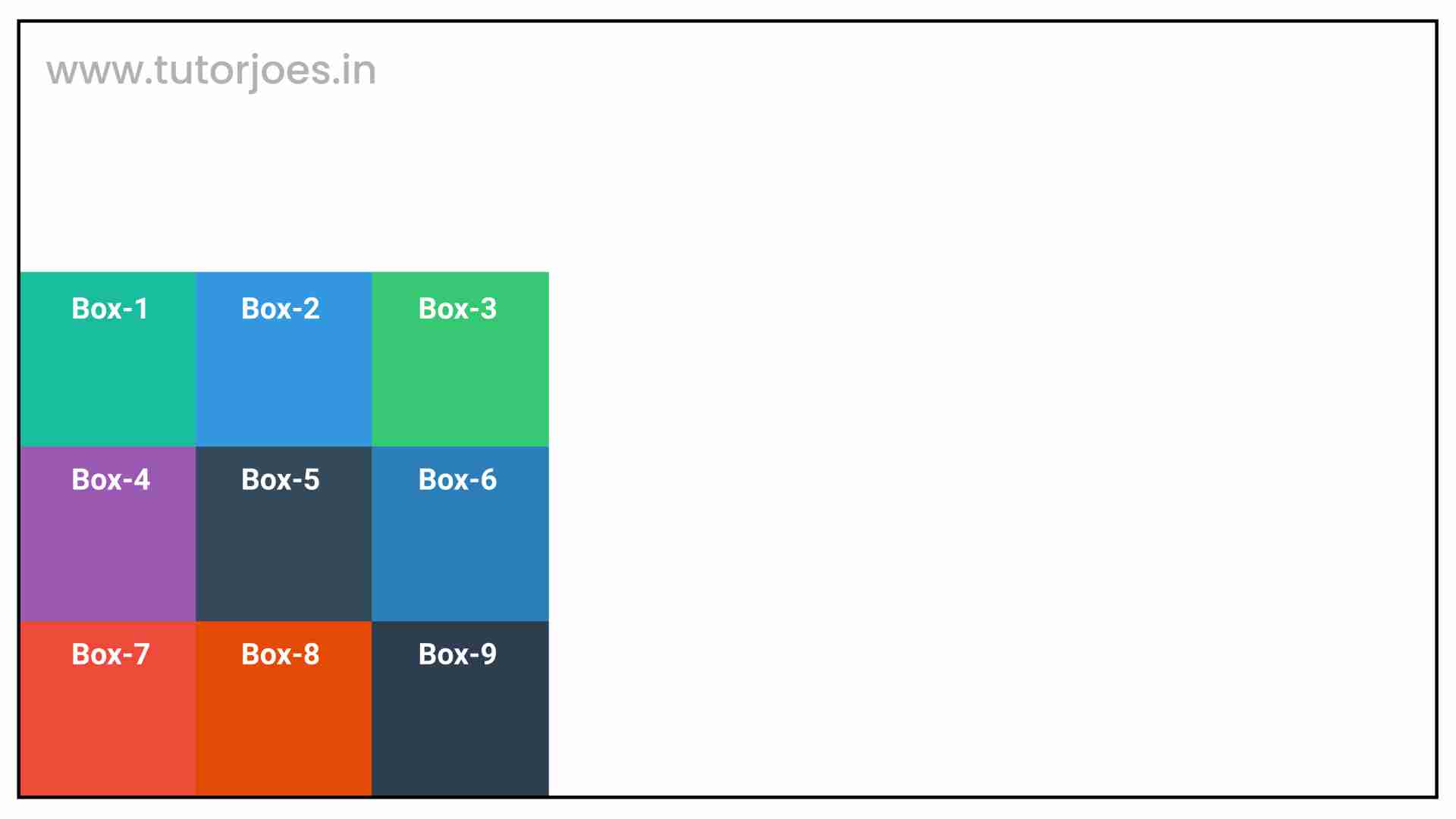
align-content: start
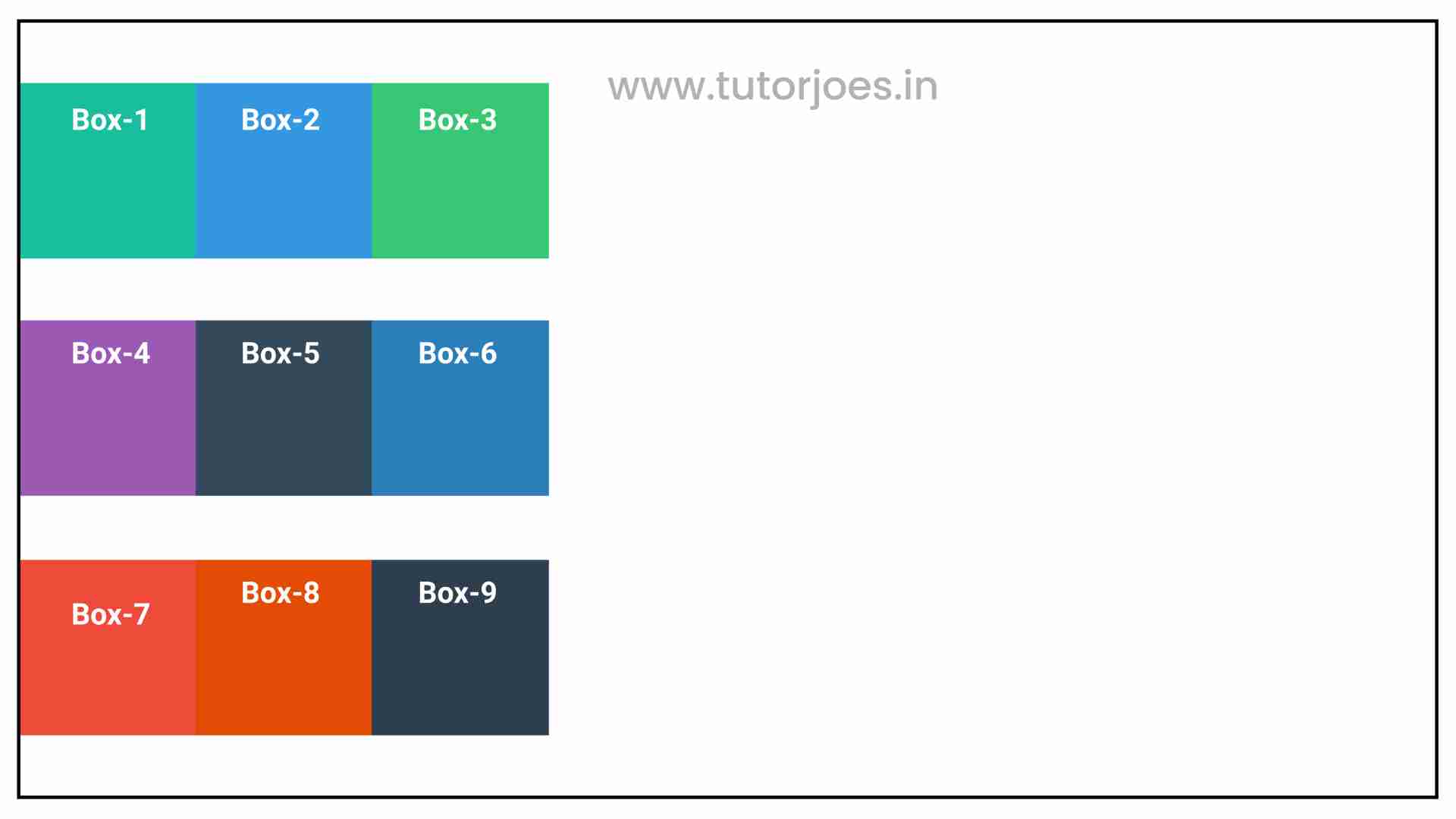
In CSS Grid, the align-content: start property is used to align the grid items to the top of the grid container along the vertical axis. This property aligns the grid tracks when the grid container is larger than the grid items, and there is free space available in the grid container.
When this property is applied, the grid items are aligned at the start of the grid container, leaving any extra space at the bottom of the grid container. This is useful when you want to align the items to the top of the container and have extra space at the bottom.
Here's an example of how align-content: start in CSS Grid:
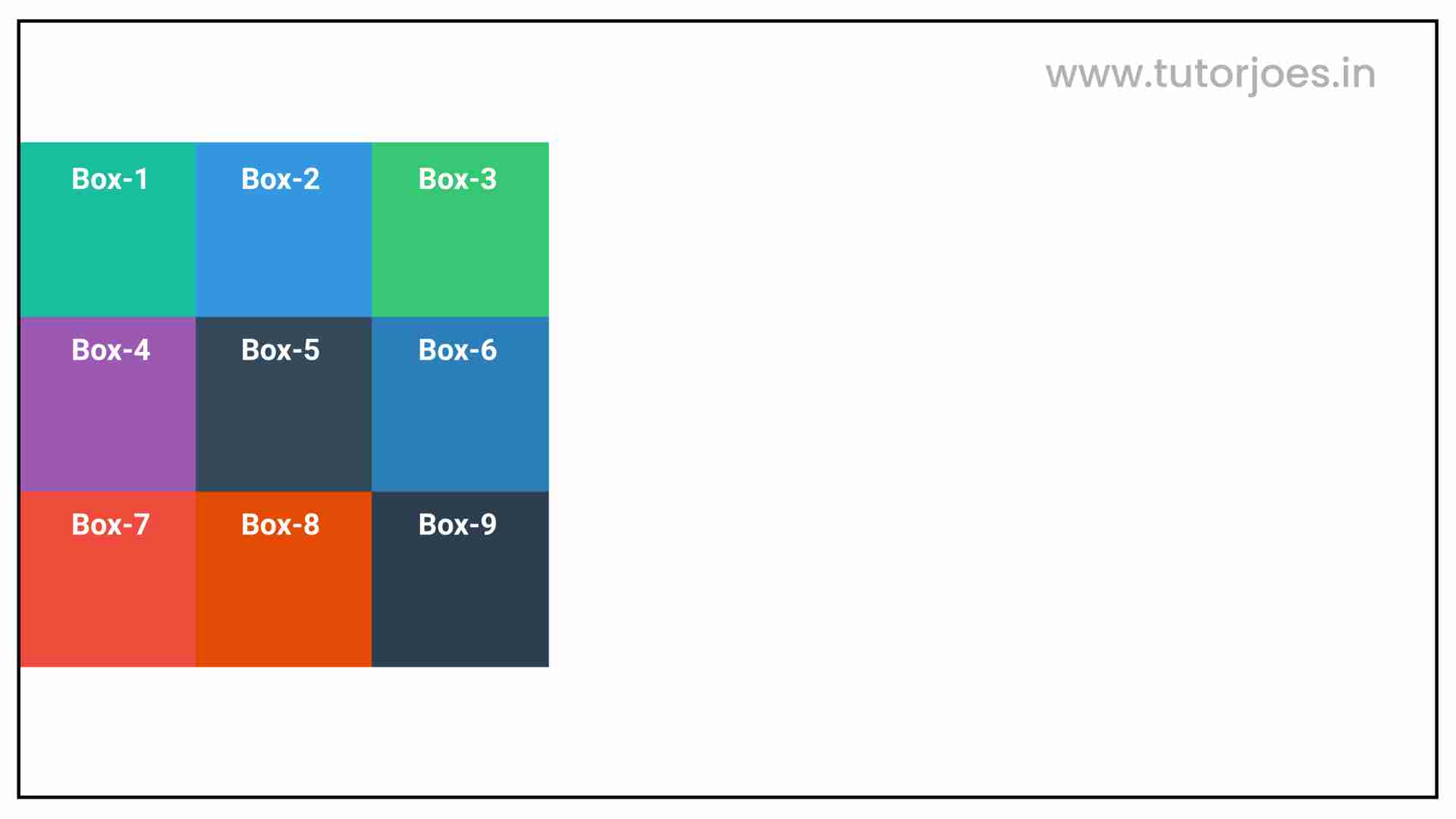
align-content: center
In CSS Grid, the align-content: center property is used to align the grid items to the center of the grid container along the vertical axis. This property aligns the grid tracks when the grid container is larger than the grid items, and there is free space available in the grid container.
When this property is applied, the grid items are centered vertically within the grid container. Any extra space will be distributed equally between the top and bottom of the grid container. This is useful when you want to center the items within the container vertically.
Here's an example of how align-content: center in CSS Grid:
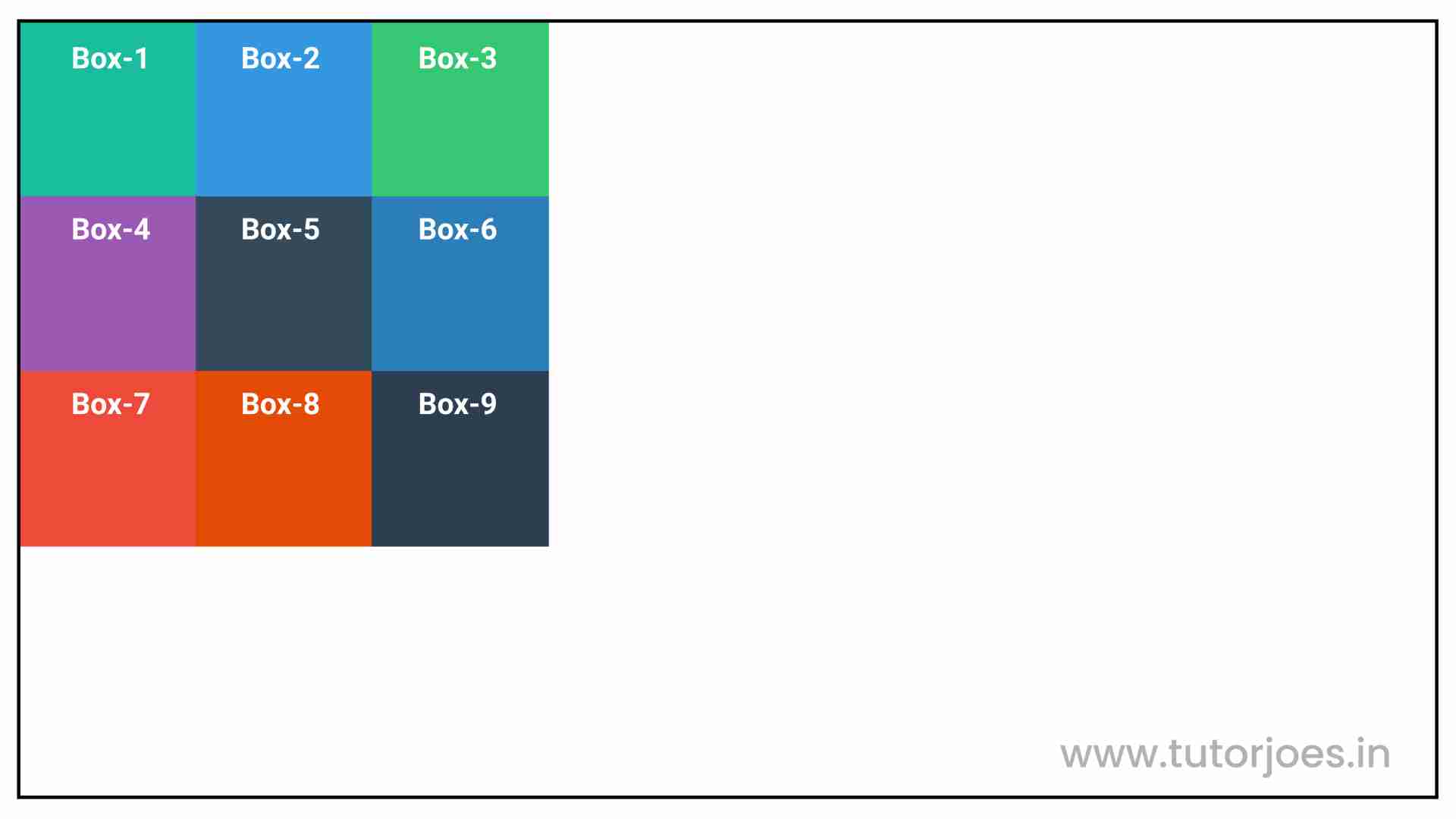
align-content: end
In CSS Grid, the align-content: end property is used to align the grid items to the end of the grid container along the vertical axis. This property aligns the grid tracks when the grid container is larger than the grid items, and there is free space available in the grid container.
When this property is applied, the grid items are aligned vertically to the end of the grid container. Any extra space will be placed at the top of the grid container. This is useful when you want to align the items to the bottom of the container.
Here's an example of how align-content: end in CSS Grid:
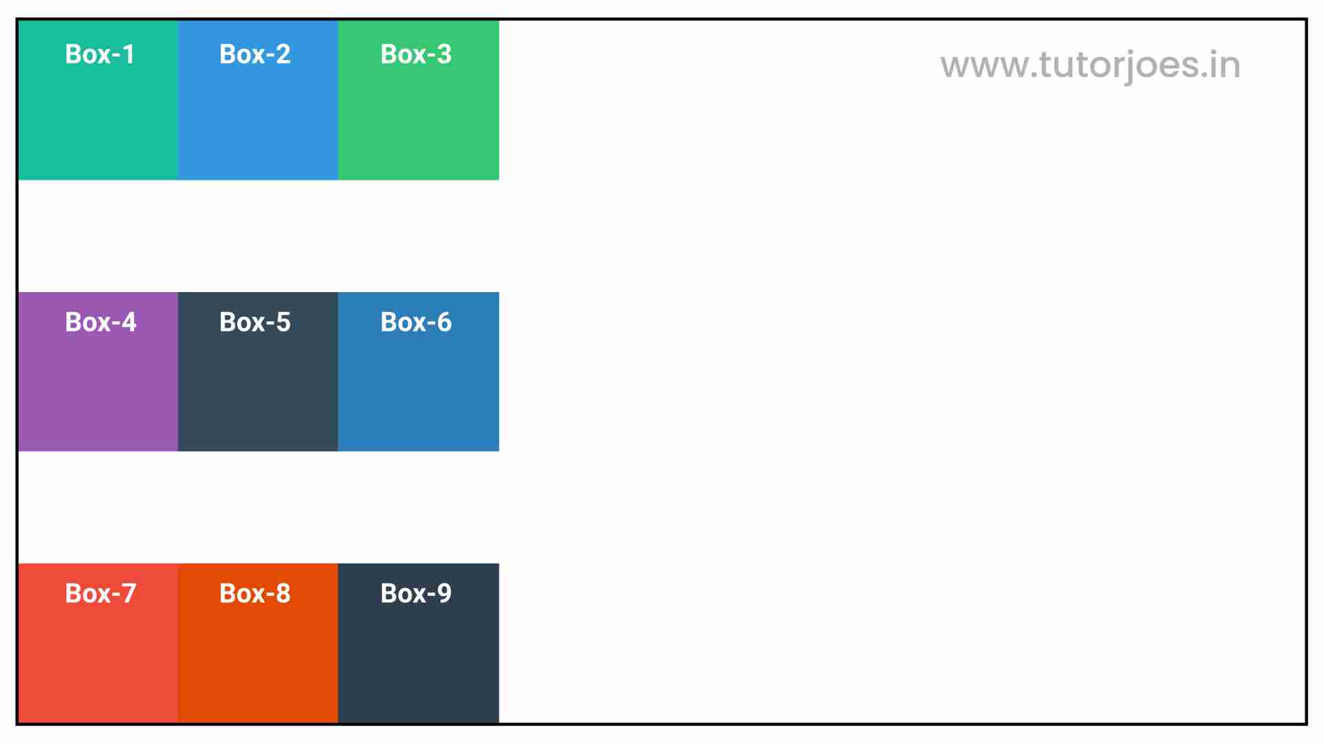
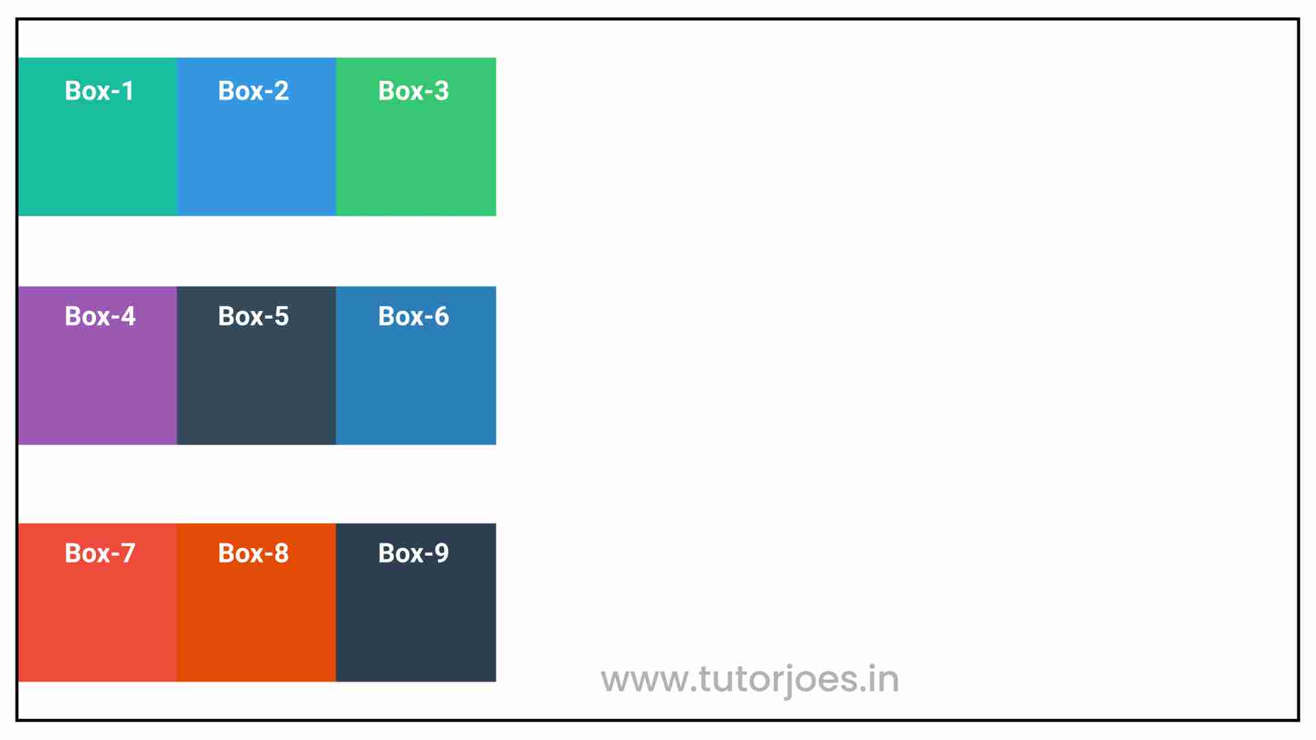
align-content: space-between
In CSS Grid, the align-content: space-between property is used to distribute the grid items evenly along the vertical axis, while creating equal spaces between them. The first grid item is aligned with the start edge of the grid container, and the last item is aligned with the end edge of the grid container, and the remaining items are distributed evenly in the remaining space between them.
Here's an example of how align-content: space-between in CSS Grid:
align-content: space-around
In CSS Grid, the align-content: space-around property is used to distribute extra vertical space evenly around each row of grid items. This property is applied to the grid container element and it aligns the whole grid along the block axis.
When there is extra space in the grid container, this property creates equal amounts of space between the rows and between the top and bottom of the grid container. The space between rows is calculated as half the size of the gap specified by the row-gap property.
Here's an example of how align-content: space-around in CSS Grid:
The align-content: space-around property is used to distribute extra space evenly around the rows. This creates equal space between the rows and between the top and bottom of the grid container.
align-content: space-evenly
The space-evenly value of the align-content property specifies that the space between the grid tracks should be distributed evenly, with the same amount of space between each track and at the edges of the grid container.
This property is useful when you want to distribute space evenly between grid tracks, such as rows or columns, in a grid container. It helps to create a more balanced and visually appealing layout.
Here's an example of how align-content: space-evenly in CSS Grid:
Here's an example:
Source Code :
<!DOCTYPE html>
<html lang="en">
<head>
  <meta charset="UTF-8">
  <meta http-equiv="X-UA-Compatible" content="IE=edge">
  <meta name="viewport" content="width=device-width, initial-scale=1.0">
  <title>Document</title>
  <link rel="stylesheet" href="align_content.css">
</head>
<body>
  <div class="container">
    <div class="grid-item box-1">Box-1</div>
    <div class="grid-item box-2">Box-2</div>
    <div class="grid-item box-3">Box-3</div>
    <div class="grid-item box-4">Box-4</div>
    <div class="grid-item box-5">Box-5</div>
    <div class="grid-item box-6">Box-6</div>
    <div class="grid-item box-7">Box-7</div>
    <div class="grid-item box-8">Box-8</div>
    <div class="grid-item box-9">Box-9</div>
  </div>
</body>
</html>
align_content.css :
@import url('https://fonts.googleapis.com/css2?family=Rubik:wght@300;400;500;600;700;900&display=swap');

*{
  margin: 0;
  padding: 0;
  font-family: 'Rubik', sans-serif;
  box-sizing: border-box;
}

.container{
  border:5px solid black;
  margin: 20px;
}

.grid-item{
  color:white;
  font-size: 18px;
  padding: 16px;
  text-align: center;
}

.box-1{background-color: #1abc9c;}
.box-2{background-color:#3498db;}
.box-3{background-color: #2ecc71;}
.box-4{background-color: #9b59b6;}
.box-5{background-color:#34495e;}
.box-6{background-color:#2980b9;}
.box-7{background-color:#e74c3c;}
.box-8{background-color: #d35400;}
.box-9{background-color:#2c3e50;}

/**-----------------------------------------------*/

.container{
  display: grid;
  height: 800px;
  grid-template: repeat(3,200px) / repeat(3,200px);
  align-content: start;
  align-content: center;
  align-content: end;
  align-content: space-between;
  align-content: space-around;
  align-content: space-evenly;

}
Live Preview
You can use align-content to control how the grid tracks are aligned on the vertical axis within the grid container, and choose the value that best suits your layout requirements. Keep in mind that align-content only works when there's extra space left over after laying out the grid items, and that you may also need to use align-items to control the alignment of individual items within their grid areas.
CSS Tutorial
Properties Reference
Cascading Style Sheet
Flexbox Tutorial
CSS Grid Tutorial
Transitions Properties
CSS Properties with Examples
CSS Selectors
CSS Pseudo Elements
CSS Attribute Selectors
Input Pseudo Classes
CSS Examples
CSS Animation Projects
Learn All in Tamil © Designed & Developed By Tutor Joes | Privacy Policy | Terms & Conditions