Creating Engaging CSS Animated Hover Buttons
Animated hover buttons in CSS are interactive web elements designed to capture the user's attention and encourage engagement with a website or application. These buttons are programmed to respond dynamically to user interaction, typically when the user hovers their mouse pointer over the button. The animations can range from subtle transitions to eye-catching effects, making the buttons more visually appealing and intuitive to use.
Transitions and Animations
CSS transitions and animations are applied to create smooth and visually pleasing effects. These animations can change properties like background color, text color, border radius, and shadow, gradually transitioning from the default state to the hover state.
Timing and Easing
Timing functions (easing) are used to control the speed and acceleration of animations. Common timing functions include ease-in, ease-out, andease-in-out, which determine how quickly the button transitions between states.
Effects
Various effects can be applied to animated hover buttons, depending on the desired user experience and visual impact. Some examples of effects include:
- Color transitions: Changing the background color or text color on hover.
- Scaling: Enlarging or shrinking the button size.
- Shadow effects: Adding or modifying shadows for depth and dimension.
- Border animations: Adjusting border properties like width, radius, or color.
- Icon or text animations: Animating the content within the button, such as moving icons or changing text.
Overall, animated hover buttons in CSS are a creative way to enhance the user interface and user experience of a website or application. When implemented effectively, they can make interactions more engaging and user-friendly, ultimately contributing to improved user engagement and conversion rates.
Source Code :
<!DOCTYPE html>
<html lang="en">
  <head>
    <meta charset="UTF-8" />
    <meta name="viewport" content="width=device-width, initial-scale=1.0" />
    <title>Document</title>
    <link rel="stylesheet" href="css/style.css" />
  </head>
  <body>
    <button class="btn btn-1">Button</button>
    <button class="btn btn-2">Button</button>
    <button class="btn btn-3">Button</button>
    <button class="btn btn-4">Button</button>
    <button class="btn btn-5">Button</button>
    <button class="btn btn-6">Button</button>
    <button class="btn btn-7">Button</button>
    <button class="btn btn-8">Button</button>
  </body>
</html>
css/style.css
@import url("https://fonts.googleapis.com/css2?family=Roboto+Condensed:wght@300;400;700&display=swap");

* {
  font-family: "Roboto Condensed", sans-serif;
}
body {
  background-color: #333;
}

.btn {
  background: transparent;
  font-size: 20px;
  color: #fff;
  border: 2px solid #d35400;
  margin: 20px;
  padding: 15px 30px;
  text-transform: uppercase;
  font-weight: 400;
  position: relative;
  overflow: hidden;
  border-radius: 5px;
  cursor: pointer;
}

.btn::before {
  content: "";
  position: absolute;
  top: 0;
  left: 0;
  z-index: -1;
  width: 100%;
  height: 100%;
  background-color: #d35400;
  transition: 0.5s all ease-in-out;
}

.btn-1::before {
  height: 0;
}

.btn-1:hover::before {
  top: unset;
  bottom: 0;
  height: 100%;
}

.btn-2::before {
  top: unset;
  bottom: 0;
  height: 0;
}
.btn-2:hover::before {
  bottom: unset;
  top: 0;
  height: 100%;
}

.btn-3::before {
  left: unset;
  width: 0;
  right: 0;
}
.btn-3:hover::before {
  right: unset;
  left: 0;
  width: 100%;
}

.btn-4::before {
  right: unset;
  width: 0;
  left: 0;
}
.btn-4:hover::before {
  left: unset;
  right: 0;
  width: 100%;
}

.btn-5::before,
.btn-6::before,
.btn-7::before,
.btn-8::before {
  top: 50%;
  left: 50%;
  transform: translate(-50%, -50%);
}

.btn-5::before {
  height: 0;
}
.btn-5:hover::before {
  height: 100%;
}

.btn-6::before {
  width: 0;
}
.btn-6:hover::before {
  width: 100%;
}

.btn-7::before {
  height: 0;
  transform: translate(-50%, -50%) rotate(45deg);
}
.btn-7:hover::before {
  height: 380%;
}

.btn-8::before {
  height: 0;
  transform: translate(-50%, -50%) rotate(-45deg);
}
.btn-8:hover::before {
  height: 380%;
}
This rule styles the pseudo-element ::before of the buttons. This pseudo-element is used to create the animated background effect. Here's what each property does:
- content: "" inserts an empty content box.
- position: absolute positions the pseudo-element absolutely within the button.
- top: 0 and left: 0 position it at the top-left corner of the button.
- z-index: -1 places it behind the button content.
- width: 100% and height: 100% make it cover the entire button.
- background-color: #d35400 sets the background color to orange.
- transition: 0.5s all ease-in-out defines a smooth transition for all properties over 0.5 seconds with an ease-in-out timing function.
Output
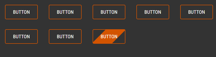
Live Preview
CSS Tutorial
Properties Reference
Cascading Style Sheet
Flexbox Tutorial
CSS Grid Tutorial
Transitions Properties
CSS Properties with Examples
CSS Selectors
CSS Pseudo Elements
CSS Attribute Selectors
Input Pseudo Classes
CSS Examples
CSS Animation Projects
Learn All in Tamil © Designed & Developed By Tutor Joes | Privacy Policy | Terms & Conditions