CSS Units for Responsive Designs
CSS Units - em
Source Code
<!DOCTYPE html>
<html lang="en">
<head>
  <meta charset="UTF-8">
  <meta http-equiv="X-UA-Compatible" content="IE=edge">
  <meta name="viewport" content="width=device-width, initial-scale=1.0">
  <title>Document</title>
  <link rel="stylesheet" href="css/style.css">
</head>
<body>
<div>
 <h1 class="absolute">Tutor Joes</h1>
</div>
<div>
 <h1 class="relative">Tutor Joes</h1>
</div>

</body>
</html>
style.css
div{
  font-size: 20px;
}
.absolute{
  color:red;
  font-size: 32px;
}

.relative{
  color:blue;
  font-size: 2em;
}
Output

Live Preview
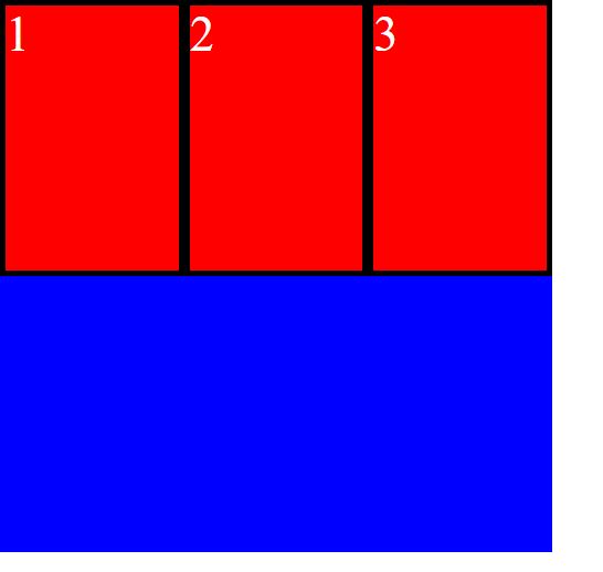
CSS Units - Percentage
Source Code
<!DOCTYPE html>
<html lang="en">
<head>
  <meta charset="UTF-8">
  <meta http-equiv="X-UA-Compatible" content="IE=edge">
  <meta name="viewport" content="width=device-width, initial-scale=1.0">
  <title>Document</title>
  <link rel="stylesheet" href="css/style.css">
</head>
<body>
  <div class="main">
    <div class="box">1</div>
    <div class="box">2</div>
    <div class="box">3</div>
  </div>
</body>
</html>
style.css
*{
  margin: 0;
  padding: 0;
  box-sizing: border-box;
}
.main{
  width: 500px;
  height: 500px;
  background-color: blue;
}
.box{
  width: 33.33%;
  height: 50%;
  background-color: red;
  float: left;
  font-size: 45px;
  color:white;
  border: 5px solid black;
}
Output
Live Preview
CSS Units - rem
Source Code
<!DOCTYPE html>
<html lang="en">
<head>
  <meta charset="UTF-8">
  <meta http-equiv="X-UA-Compatible" content="IE=edge">
  <meta name="viewport" content="width=device-width, initial-scale=1.0">
  <title>Document</title>
  <link rel="stylesheet" href="css/style.css">
</head>
<body>
<div>
 <h1 class="absolute">Tutor Joes</h1>
</div>
<div>
 <h1 class="relative">Tutor Joes</h1>
</div>

</body>
</html>
style.css
html{
  font-size: 30px;
}
.absolute{
  color:red;
  font-size: 32px;
}

.relative{
  color:blue;
  font-size: 2rem;
}
Output

Live Preview
CSS Units - viewport
Source Code
<!DOCTYPE html>
<html lang="en">
<head>
  <meta charset="UTF-8">
  <meta http-equiv="X-UA-Compatible" content="IE=edge">
  <meta name="viewport" content="width=device-width, initial-scale=1.0">
  <title>Document</title>
  <link rel="stylesheet" href="css/style.css">
</head>
<body>

</body>
</html>
style.css
*{
  padding: 0;
  margin: 0;
}
body{
  background-color:orangered;
  height: 100vh;
  width: 100vw;
}
Output

Live Preview
To download raw file Click Here
Web Development
Learn All in Tamil © Designed & Developed By Tutor Joes | Privacy Policy | Terms & Conditions