Animation Properties Examples Part-2 in CSS
Example 5 :
Source Code
<!DOCTYPE html>
<html lang="en">
<head>
  <meta charset="UTF-8">
  <meta http-equiv="X-UA-Compatible" content="IE=edge">
  <meta name="viewport" content="width=device-width, initial-scale=1.0">
  <title>Document</title>
  <link rel="stylesheet" href="css/style.css">
  <link rel="stylesheet" href="https://maxst.icons8.com/vue-static/landings/line-awesome/line-awesome/1.3.0/css/line-awesome.min.css">
</head>
<body>
 <button class="btn">
  <i class="las la-arrow-circle-down"></i>
  Download
</button>
</body>
</html>
style.css
@import url('https://fonts.googleapis.com/css2?family=Poppins:wght@300;400;500;700&display=swap');
:root {
  --bgcolor:#C4E538;
}
*{
  margin: 0;
  padding: 0;
  font-family: 'Poppins', sans-serif;
  box-sizing: border-box;
}

body{
  width: 100vw;
  height: 100vh;
  display: flex;
  justify-content: center;
  align-items: center;
  background-color: #2f3640;
}

.btn{
  background-color: var(--bgcolor);
  border: none;
  padding: 20px 30px;
  font-size: 30px;
  color:#2f3640;
  font-weight: 500;
  border-radius: 5px;
  width: 300px;
  position: relative;
  cursor: pointer;
}
.btn::after,
.btn::before{
  content: '';
  width: 25px;
  position: absolute;
  transition:  0.5s;
}
.btn::before{
  border-top: 8px solid var(--bgcolor);
  top: -15px;
  left: 0;
}
.btn::after{
  border-bottom: 8px solid var(--bgcolor);
  bottom: -15px;
  right: 0;
}
.btn:hover::after,
.btn:hover::before{
  width: 100%;
}
Output

Live Preview
Example 6 :
Source Code
<!DOCTYPE html>
<html lang="en">
<head>
  <meta charset="UTF-8">
  <meta http-equiv="X-UA-Compatible" content="IE=edge">
  <meta name="viewport" content="width=device-width, initial-scale=1.0">
  <title>Document</title>
  <link rel="stylesheet" href="css/style.css">
</head>
<body>
  <div class="loader">
    <div></div>
    <div></div>
  </div>
</body>
</html>
style.css
@import url('https://fonts.googleapis.com/css2?family=Poppins:wght@300;400;500;700&display=swap');

*{
  margin: 0;
  padding: 0;
  font-family: 'Poppins', sans-serif;
  box-sizing: border-box;
}

body{
  width: 100vw;
  height: 100vh;
  display: flex;
  justify-content: center;
  align-items: center;
  background-color: #1B1464;
}

.loader{
  height: 64px;
  width: 64px;
  position: relative;
}
.loader div{
  position: absolute;
  border:4px solid aliceblue;
  border-radius: 50%;
  animation: waves 2s ease-out infinite;
}

.loader div:nth-child(2){
  animation-duration: 0.5s;
}

@keyframes waves {
  0%{
    top:32px;
    left: 32px;
    width: 0;
    height: 0;
    opacity: 1;
  }
  100%{
    top:0;
    left: 0;
    width:64px;
    height:64px;
    opacity: 0;
  }

}
Output

Live Preview
Example 7 :
Source Code
<!DOCTYPE html>
<html lang="en">
<head>
  <meta charset="UTF-8">
  <meta http-equiv="X-UA-Compatible" content="IE=edge">
  <meta name="viewport" content="width=device-width, initial-scale=1.0">
  <title>Document</title>
  <link rel="stylesheet" href="css/style.css">
</head>
<body>
 <div class="loader"></div>
</body>
</html>
style.css
@import url('https://fonts.googleapis.com/css2?family=Poppins:wght@300;400;500;700&display=swap');

*{
  margin: 0;
  padding: 0;
  font-family: 'Poppins', sans-serif;
  box-sizing: border-box;
}

body{
  width: 100vw;
  height: 100vh;
  display: flex;
  justify-content: center;
  align-items: center;
  background-color: #ED4C67;
}

.loader{
  width: 100px;
  height: 100px;
  border:10px dotted rgba(0,0,0,0.1);
  border-top-color:white ;
  border-left-color:white ;
  border-radius: 50%;
  animation: rotate 2s linear infinite;
}


@keyframes rotate{
  0%{
    transform: rotate(0deg);
  }
  100%{
    transform: rotate(360deg);
  }
}
Output

Live Preview
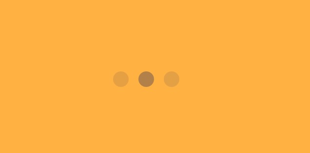
Example 8 :
Source Code
<!DOCTYPE html>
<html lang="en">
<head>
  <meta charset="UTF-8">
  <meta http-equiv="X-UA-Compatible" content="IE=edge">
  <meta name="viewport" content="width=device-width, initial-scale=1.0">
  <title>Document</title>
  <link rel="stylesheet" href="css/style.css">

</head>
<body>
 <div class="loader">
  <div></div>
  <div></div>
  <div></div>
 </div>
</body>
</html>
style.css
@import url('https://fonts.googleapis.com/css2?family=Poppins:wght@300;400;500;700&display=swap');

*{
  margin: 0;
  padding: 0;
  font-family: 'Poppins', sans-serif;
  box-sizing: border-box;
}

body{
  width: 100vw;
  height: 100vh;
  display: flex;
  justify-content: center;
  align-items: center;
  background-color: #ffb142;
}

.loader{
  display: flex;
  justify-content: center;
}
.loader div{
  width: 32px;
  height: 32px;
  margin: 32px 10px;
  background-color: #2c2c54;
  border-radius: 50%;
  animation: snake_dance 0.6s infinite alternate;
}


@keyframes snake_dance {
to{
  opacity: 0.1;
  transform: translate3d(0,-16,0);
}

}

.loader>div:nth-child(2){
  animation-duration: 0.2s;
}

.loader>div:nth-child(3){
  animation-duration: 0.4s;
}
Output
Live Preview
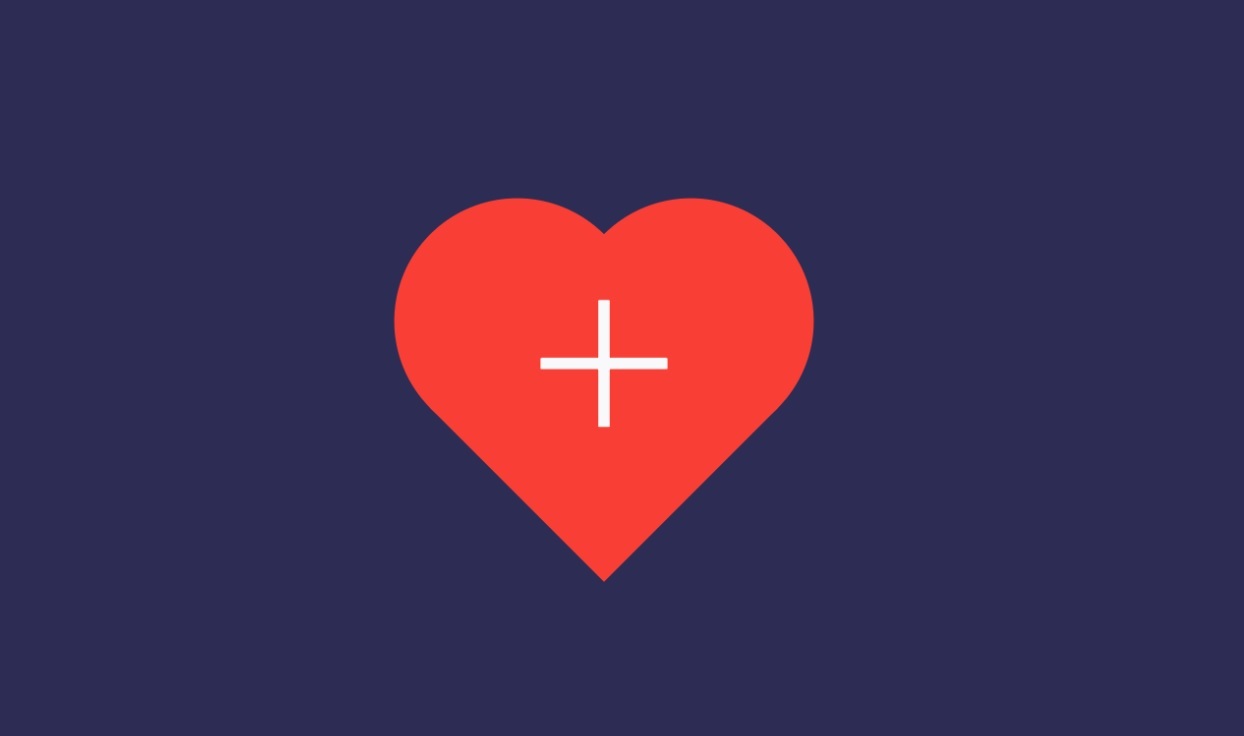
Example 9:
Source Code
<!DOCTYPE html>
<html lang="en">
<head>
  <meta charset="UTF-8">
  <meta http-equiv="X-UA-Compatible" content="IE=edge">
  <meta name="viewport" content="width=device-width, initial-scale=1.0">
  <title>Document</title>
  <link rel="stylesheet" href="css/style.css">
  <link rel="stylesheet" href="https://maxst.icons8.com/vue-static/landings/line-awesome/line-awesome/1.3.0/css/line-awesome.min.css">
</head>
<body>
<div class="box">
  <div class="heart"><i class="las la-plus"></i></div>
</div>
</body>
</html>
style.css
@import url('https://fonts.googleapis.com/css2?family=Poppins:wght@300;400;500;700&display=swap');

*{
  margin: 0;
  padding: 0;
  font-family: 'Poppins', sans-serif;
  box-sizing: border-box;
}

body{
  width: 100vw;
  height: 100vh;
  display: flex;
  justify-content: center;
  align-items: center;
  background-color: #2c2c54;
}


.heart{
  width: 200px;
  height: 200px;
  background-color: #ff3f34;
  transform: rotate(45deg);
  position: relative;
  color:white;
}
.las{
  transform: rotate(-45deg);
  font-size: 150px;
  position: absolute;
  z-index: 99;
  bottom:50px;
  right:50px;
}

.heart::before,
.heart::after{
  content: '';
  width: 200px;
  height: 200px;
  background-color:#ff3f34;
  position: absolute;
  border-radius: 50%;
}
.heart::before{
  bottom: 0;
  left: -100px;
}

.heart::after{
  top: -100px;
 right: 0;
}


.box{
animation: blink 1s infinite;
}

@keyframes blink {
  0%{
    opacity: 0;
    transform: scale(0.5);
  }
  50%{
    opacity: 0.5;
    transform: scale(0.7);
  }
  100%{
    opacity: 1;
    transform: scale(1);
  }

}
Output
Live Preview
To download raw file Click Here
Web Development
Learn All in Tamil © Designed & Developed By Tutor Joes | Privacy Policy | Terms & Conditions