Creating Cards using HTML & CSS
Creating Simple Card design using HTML and CSS
Source Code
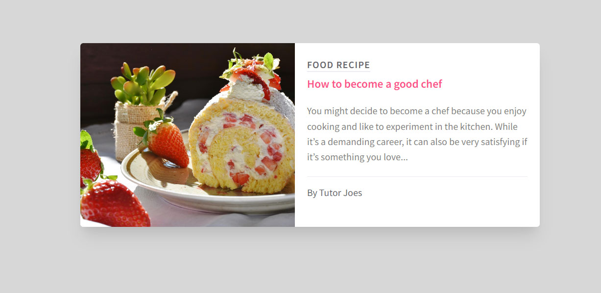
<!DOCTYPE html>
<html lang="en">
<head>
  <meta charset="UTF-8">
  <meta http-equiv="X-UA-Compatible" content="IE=edge">
  <meta name="viewport" content="width=device-width, initial-scale=1.0">
  <title>Day-1 Card Design</title>
  <link rel="stylesheet" href="css/style.css">
</head>
<body>
  <div class="main">
    <div class="card">
      <div class="img-holder">
        <img src="images/strawberry.jpg" alt="Food Recipe">
      </div>
      <div class="content">
        <span class="title">Food Recipe</span>
        <h3>How to become a good chef</h3>
        <p>You might decide to become a chef because you enjoy cooking and like to experiment in the kitchen. While it’s a demanding career, it can also be very satisfying if it’s something you love...</p>
        <span class="footer">By Tutor Joes</span>
      </div>
    </div>
  </div>
</body>
</html>
style.css
@import url('https://fonts.googleapis.com/css2?family=Source+Sans+Pro:wght@400;600&display=swap');

*{
  margin: 0;
  padding: 0;
}
body{
  font-family: 'Source Sans Pro', sans-serif;
}

.main{
  background-color: #D7D7D7;
  width: 100vw;
  height: 100vh;
  display: flex;
  justify-content: center;
  align-items: center;
}

.card{
  width: 750px;
  height: 300px;
  background: white;
  box-shadow: rgba(0, 0, 0, 0.1) 0px 20px 25px -5px, rgba(0, 0, 0, 0.04) 0px 10px 10px -5px;
  display: flex;
  border-radius: 5px;
}

.img-holder{
  min-width: 350px;
  height: 100%;
  overflow: hidden;
}
img{
  width: 100%;
  height: 100%;
  object-fit: cover;
  border-top-left-radius: 5px;
  border-bottom-left-radius: 5px;
  transition: transform 0.5s ease-in-out;
}
img:hover{
  transform: scale(1.5);
}
.content{
  padding: 25px 20px;
  transition-property: transform;
  animation-name: joes;
  animation-duration: 0.5s;
  animation-timing-function: ease-in-out;
}

@keyframes joes {
  from {
    transform:translateX(-20px);
  }

  to {
    transform: translateX(0px);
  }
}

.title{
  color:#66656a;
  font-weight: bold;
  text-transform: uppercase;
  letter-spacing: 1px;
  text-decoration: underline;
  text-underline-offset:5px;
  text-decoration-color: #ecebf3;
}

.content h3{
  color:#FF4E8A;
  margin-top:10px;
  margin-bottom:20px;
}

.content p{
  color:#7F7E84;
  line-height: 25px;
}

.footer{
  color:#66656a;
  display: block;
  margin-top: 20px;
  height: 50px;
  line-height: 50px;
  border-top: 1px solid #ecebf3;
}
Output
Live Preview
To download raw file Click Here
Web Development
Learn All in Tamil © Designed & Developed By Tutor Joes | Privacy Policy | Terms & Conditions