Animated Navbar in CSS
Design- 1
Source Code
<!DOCTYPE html>
<html lang="en">
<head>
  <meta charset="UTF-8">
  <meta http-equiv="X-UA-Compatible" content="IE=edge">
  <meta name="viewport" content="width=device-width, initial-scale=1.0">
  <title>Document</title>
  <link rel="stylesheet" href="css/style.css">
</head>
<body>
  <nav>
    <a href="">Home</a>
    <a href="">Product</a>
    <a href="">Download</a>
    <a href="">Contact</a>
    <a href="">About</a>
    <div class="animate"></div>
  </nav>
</body>
</html>
style.css
@import url('https://fonts.googleapis.com/css2?family=Poppins:wght@300;400;500;700&display=swap');

*{
padding: 0;
margin: 0;
box-sizing: border-box;
font-family: 'Poppins', sans-serif;
}

body{
  width: 100vw;
  height: 100vh;
  display: flex;
  justify-content: center;
  align-items: center;
  background-color: #ecf0f1;
}
nav{
  width: 800px;
  height: 50px;
  background: #b71540;
  border-radius: 4px;
  box-shadow: rgba(0, 0, 0, 0.18) 0px 2px 4px;
  display: flex;
  position: relative;
}
nav a{
  text-decoration: none;
  color:white;
  text-transform: uppercase;
  line-height: 50px;
  width: 100px;
  text-align: center;
  z-index: 1;
}

nav .animate{
  background-color: #16a085;
  position: absolute;
  height: 100%;
  width: 100px;
  top:0;
  left: 0;
  border-radius: 5px;
  opacity: 0;
  transition: 0.2s;
}

nav:hover .animate{
  opacity: 1;
}

nav a:nth-child(1):hover~.animate{
  left: 0;
}
nav a:nth-child(2):hover~.animate{
  left: 100px;
}
nav a:nth-child(3):hover~.animate{
  left: 200px;
}
nav a:nth-child(4):hover~.animate{
  left:300px;
}
nav a:nth-child(5):hover~.animate{
  left: 400px;
}
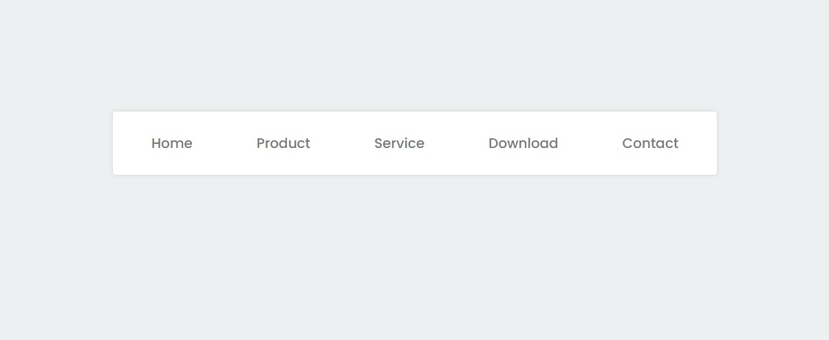
Design - 2
Source Code
<!DOCTYPE html>
<html lang="en">
<head>
  <meta charset="UTF-8">
  <meta http-equiv="X-UA-Compatible" content="IE=edge">
  <meta name="viewport" content="width=device-width, initial-scale=1.0">
  <title>Document</title>
  <link rel="stylesheet" href="css/style.css">
</head>
<body>
  <nav>
    <ul>
      <li><a href="#">Home</a></li>
      <li><a href="#">Product</a></li>
      <li><a href="#">Service</a></li>
      <li><a href="#">Download</a></li>
      <li><a href="#">Contact</a></li>
    </ul>
  </nav>
</body>
</html>
style.css
@import url('https://fonts.googleapis.com/css2?family=Poppins:wght@300;400;500;700&display=swap');

*{
padding: 0;
margin: 0;
box-sizing: border-box;
font-family: 'Poppins', sans-serif;
}

body{
  width: 100vw;
  height: 100vh;
  display: flex;
  justify-content: center;
  align-items: center;
  background-color: #ecf0f1;
}

nav{
  background-color: white;
  border-radius: 3px;
  padding: 10px;
  box-shadow: rgba(0, 0, 0, 0.1) 0px 0px 5px 0px, rgba(0, 0, 0, 0.1) 0px 0px 1px 0px;
}

nav ul li{
  list-style: none;
  display: inline-block;
  padding: 15px 35px;
  font-size: 16px;
  cursor: pointer;
  position: relative;
  z-index: 2;
}

ul li a{
  text-decoration: none;
  color:#777;
  font-weight: 500;
}
ul li::after{
  position: absolute;
  content: '';
  height: 100%;
  width: 100%;
  background-color: #e74c3c;
  border-radius: 3px;
  top: 100%;
  left: 50%;
  transform: translate(-50%,-50%);
  z-index: -1;
  opacity: 0;
  transition: 0.5s;
}

nav ul li:hover::after{
  opacity: 1;
  top:50%;
}
nav ul li:hover a{
  color:white;
}
Output
Live Preview
To download raw file Click Here
Web Development
Learn All in Tamil © Designed & Developed By Tutor Joes | Privacy Policy | Terms & Conditions