Creating Modal in CSS
Source Code
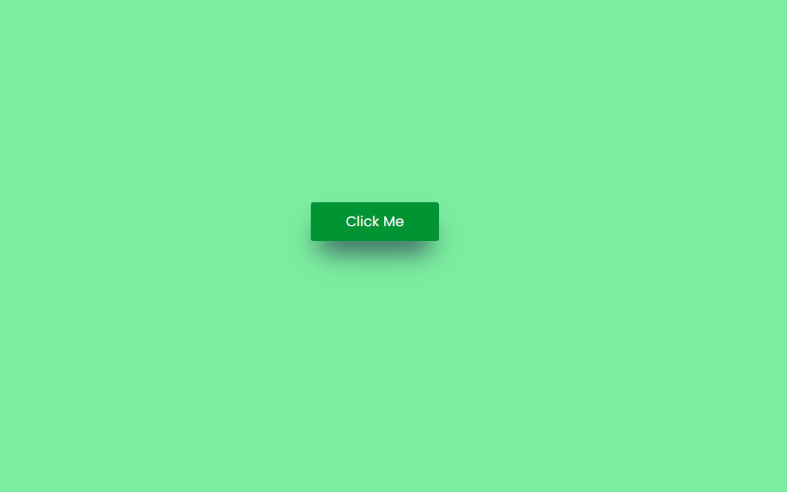
<!DOCTYPE html>
<html lang="en">
<head>
  <meta charset="UTF-8">
  <meta http-equiv="X-UA-Compatible" content="IE=edge">
  <meta name="viewport" content="width=device-width, initial-scale=1.0">
  <title>Document</title>
  <link rel="stylesheet" href="css/style.css">
  <link rel="stylesheet" href="https://cdnjs.cloudflare.com/ajax/libs/font-awesome/4.7.0/css/font-awesome.min.css">

</head>
<body>
  <button class="btnOpen">
    Click Me
  </button>

  <div class="modal-container">
    <div class="modal">
      <span class="btnClose">
        <i class="fa fa-close"></i>
      </span>
      <h1>This is Modal Title</h1>
      <p>Lorem ipsum dolor sit amet consectetur, adipisicing elit. At, sequi magnam voluptate vitae provident earum. Totam vitae sed qui et ut earum, in error, perspiciatis quibusdam dolorem, molestiae odit repudiandae?</p>
      <button class="btnClose">Close</button>
    </div>
  </div>
  <script src="js/script.js"></script>
</body>
</html>
style.css
@import url('https://fonts.googleapis.com/css2?family=Poppins:wght@300;400;500;700&display=swap');

*{
  margin: 0;
  padding: 0;
  box-sizing: border-box;
  font-family: 'Poppins', sans-serif;
}
body{
  background-color: #7bed9f;
  height: 100vh;
  width: 100vw;
  display: flex;
  justify-content: center;
  align-items: center;
}
button{
  border:none;
  padding: 10px 40px;
  border-radius: 3px;
  font-size: 16px;
  cursor: pointer;
}
.btnOpen{
  box-shadow: rgb(38, 57, 77) 0px 20px 30px -10px;
  background-color: #009432;
  color:white;
}

.btnOpen:active{
  box-shadow: rgba(50, 50, 93, 0.25) 0px 2px 5px -1px, rgba(0, 0, 0, 0.3) 0px 1px 3px -1px;
}

.modal-container{
  position: fixed;
  top: 0;
  left: 0;
  width: 100%;
  height: 100vh;
  background-color: rgba(0,0,0,0.5);
  display: flex;
  justify-content: center;
  align-items: center;
  opacity: 0;
  transition: 0.5s;
  pointer-events: none;
}
.modal-container.show{
  opacity:1;
  pointer-events: auto;
}

.modal{
  background: #fff;
  width: 600px;
  padding: 30px 60px;
  border-radius: 3px;
  box-shadow: rgba(0, 0, 0, 0.19) 0px 10px 20px, rgba(0, 0, 0, 0.23) 0px 6px 6px;
  position: relative;
}

.modal h1{
  font-weight: 500;
  font-size: 20px;
  margin-bottom: 10px;
}
.modal p{
  line-height: 25px;
  opacity: 0.7;
  font-size: 14px;
  margin-bottom: 10px;
}

.btnClose{
  background-color: #EA2027;
  color:white;
}

.modal span{
  width: 25px;
  height: 25px;
  display: block;
  display: table;
  vertical-align: middle;
  text-align: center;
  border-radius: 50%;
  position: absolute;
  right: -10px;
  top: -10px;
}
Script.js
window.onload=function(){
  const btnOpen=document.querySelector(".btnOpen");
  const btnClose=document.querySelectorAll(".btnClose");
  const container=document.querySelector(".modal-container");

  btnOpen.addEventListener('click',function(){
    container.classList.add('show');
  });
/*
  for(let i=0;i<btnClose.length;i++){
    btnClose[i].addEventListener('click',function(){
      container.classList.remove('show');
    });
  }
*/

btnClose.forEach(btn=>{
  btn.addEventListener('click',function(){
    container.classList.remove('show');
  });
});


}
Output
Live Preview
To download raw file Click Here
Web Development
Learn All in Tamil © Designed & Developed By Tutor Joes | Privacy Policy | Terms & Conditions