Animated Sticky Notes in HTML & CSS
Source Code
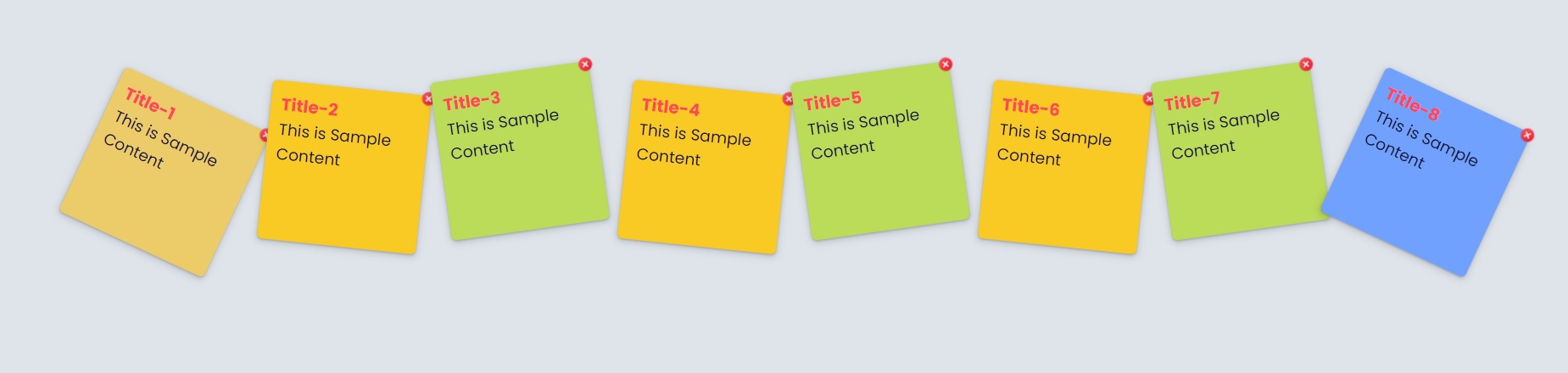
<!DOCTYPE html>
<html lang="en">
<head>
  <meta charset="UTF-8">
  <meta http-equiv="X-UA-Compatible" content="IE=edge">
  <meta name="viewport" content="width=device-width, initial-scale=1.0">
  <title>Document</title>
  <link rel="stylesheet" href="css/style.css">
</head>

<body>

  <ul>
    <li>
      <a href="#" contenteditable="true">
        <span></span>
        <h2>Title-1</h2>
        <p>This is Sample Content</p>
      </a>
    </li>

    <li>
      <a href="#" contenteditable="true">
        <span></span>
        <h2>Title-2</h2>
        <p>This is Sample Content</p>
      </a>
    </li>

    <li>
      <a href="#" contenteditable="true">
        <span></span>
        <h2>Title-3</h2>
        <p>This is Sample Content</p>
      </a>
    </li>
    <li>
      <a href="#" contenteditable="true">
        <span></span>
        <h2>Title-4</h2>
        <p>This is Sample Content</p>
      </a>
    </li>
    <li>
      <a href="#" contenteditable="true">
        <span></span>
        <h2>Title-5</h2>
        <p>This is Sample Content</p>
      </a>
    </li>
    <li>
      <a href="#" contenteditable="true">
        <span></span>
        <h2>Title-6</h2>
        <p>This is Sample Content</p>
      </a>
    </li>
    <li>
      <a href="#" contenteditable="true">
        <span></span>
        <h2>Title-7</h2>
        <p>This is Sample Content</p>
      </a>
    </li>
    <li>
      <a href="#" contenteditable="true">
        <span></span>
        <h2>Title-8</h2>
        <p>This is Sample Content</p>
      </a>
    </li>
  </ul>
</body>
</html>
style.css
@import url('https://fonts.googleapis.com/css2?family=Poppins:wght@100;300;400;500;700&display=swap');

*{
  margin:0;
  padding:0;
  box-sizing: border-box;
}


body{
  height: 100vh;
  width: 100vw;
  font-family: 'Poppins', sans-serif;
  background:#dfe4ea;
  padding: 30px;
}

ul li{
  list-style: none;
}

ul{
display: flex;
flex-wrap: wrap;
justify-content: center;
}

ul li a{
  text-decoration: none;
  color:#130f40;
  display: block;
  height: 150px;
  width: 150px;
  background-color:#badc58 ;
  padding: 10px;
  box-shadow: rgba(60, 64, 67, 0.3) 0px 1px 2px 0px, rgba(60, 64, 67, 0.15) 0px 2px 6px 2px;
  margin: 10px;
  transform: rotate(-8deg);
  transition: transform 0.2s linear;
  border-radius: 5px;
}


h2{font-size: 16px;color:#ff4757;}
p{font-size: 15px;}

ul li:nth-child(2n) a{
  position: relative;
  top:15px;
  left:5px;
  transform: rotate(6deg);
  background-color: #f9ca24;
}

ul li:nth-child(1) a{
  position: relative;
  top:20px;
  left:5px;
  transform: rotate(25deg);
  background-color: #eccc68;
}

ul li:nth-child(8n) a{
  position: relative;
  top:20px;
  left:5px;
  transform: rotate(25deg);
  background-color: #70a1ff;
}


ul li a:hover,ul li a:focus{
  transform: scale(1.25);
  z-index: 99;
  box-shadow: rgba(50, 50, 93, 0.25) 0px 50px 100px -20px, rgba(0, 0, 0, 0.3) 0px 30px 60px -30px;
  position: relative;
}

a span{
  width: 15px;
  height: 15px;
  display: block;
  position: absolute;
  right: -5px;
  top:-5px;
  background-image: url('../images/close.png');
  background-repeat: no-repeat;
  background-position: center;
}
/*

nth-child(2)
nth-child(3n)
nth-child(odd)
nth-child(even)
to top
to bottom
to left
to right

Degree
45deg

  linear-gradient(45deg,red,blue,orange);
  background: rgb(192,57,43);
  background: linear-gradient(45deg, rgba(192,57,43,1) 26%, rgba(211,84,0,1) 94%);

   li*6>a>h2{Title-$}
*/
Output
Live Preview
To download raw file Click Here
Web Development
Learn All in Tamil © Designed & Developed By Tutor Joes | Privacy Policy | Terms & Conditions