Stylish Button in CSS
Source Code
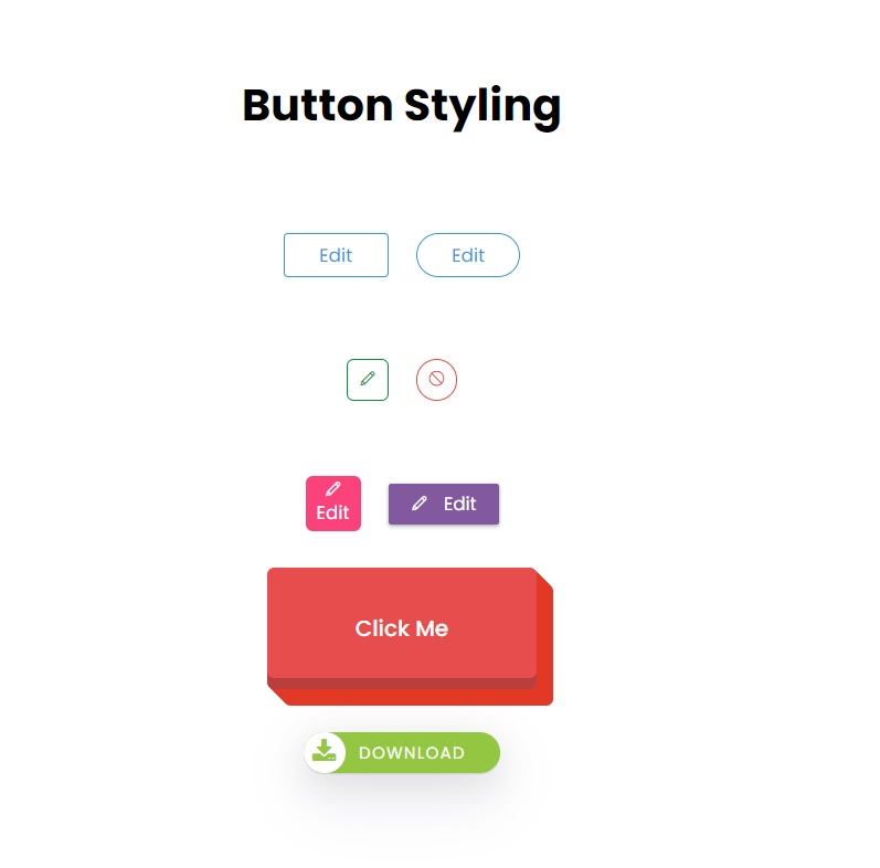
<!DOCTYPE html>
<html lang="en">
<head>
  <meta charset="UTF-8">
  <meta http-equiv="X-UA-Compatible" content="IE=edge">
  <meta name="viewport" content="width=device-width, initial-scale=1.0">
  <link rel="icon" type="image/ico" href="logo.png" />
  <title>Document</title>
  <link rel="stylesheet" href="https://maxst.icons8.com/vue-static/landings/line-awesome/line-awesome/1.3.0/css/line-awesome.min.css">
  <link rel="stylesheet" href="https://cdnjs.cloudflare.com/ajax/libs/font-awesome/4.7.0/css/font-awesome.min.css">


  <link rel="stylesheet" href="css/style.css">

</head>
<body>
  <h1>Button Styling</h1>

   <div class="btn-group">
    <button class="btn-1">Edit</button>
    <button class="btn-1 rounded">Edit</button>
   </div>
   <div class="btn-group">
    <button class="btn-2 green">
      <i class="las la-pen"></i>
    </button>
    <button class="btn-2">
      <i class="las la-ban"></i>
    </button>
   </div>

  <div class="btn-group">
    <button class="btn-3">
      <i class="las la-pen"></i>
      Edit
    </button>
    <button class="btn-4">
      <i class="las la-pen"></i>
      <span>Edit</span>
    </button>
  </div>

  <div class="btn-group">
    <button class="three-dim">Click Me</button>
  </div>
  <div class="btn-group">
    <button class="btn-img">
      <i class="fa fa-download"></i>
      Download
    </button>
  </div>
</body>
</html>
style.css
@import url('https://fonts.googleapis.com/css2?family=Poppins:wght@300;400;500;700&display=swap');
*{
  padding: 0;
  margin: 0;
  box-sizing: border-box;
  font-family: 'Poppins', sans-serif;

}
body{
  width: 100vw;
  height: 100vh;
  display: flex;
  justify-content: center;
  align-items: center;
  flex-direction: column;
  gap:20px;
}

h1{
  margin-bottom: 30px ;
}
.btn-group{
  width: 800px;
  height: 70px;
  display: flex;
  justify-content: center;
  align-items: center;
  gap:20px;
}

.btn-1{
padding: 5px 25px;
background-color: #fff;
border:1px solid #3498db;
border-radius: 3px;
color:#3498db;
transition: 0.2s ease-in-out;
}
.btn-1:hover{
  background-color: #3498db;
  color:white;
}

.btn-1.rounded{
  border-radius: 25px;
}

.btn-2{
width: 30px;
height: 30px;
background-color: #fff;
border:1px solid #e74c3c;
border-radius: 50%;
color:#e74c3c;
transition: 0.2s ease-in-out;
}
.btn-2:hover{
  background-color: #e74c3c;
  color:white;
}

.btn-2.green{
  border:1px solid #009432;
  color:#009432;
  border-radius: 5px;
}

.btn-2.green:hover{
  background-color: #009432;
  color:white;
}


.btn-3{
display: flex;
flex-direction: column;
justify-content: center;
align-items: center;
height: 40px;
width: 40px;
padding: 15px;
background: #FC427B;
color:white;
border:none;
border-radius:5px;
transition: 0.2s linear;
}
.btn-3:hover{
  color:#FC427B;
  border:1px solid #FC427B;
  background: #fff;
}

.btn-4{
  display: flex;
  align-items: center;
  flex-direction: row;
  justify-content: space-evenly;
  height: 30px;
  width: 80px;
  padding: 10px 5px;
  background-color: #82589F;
  color:white;
  border:none;
  border-radius: 2px;
  box-shadow: rgba(60, 64, 67, 0.3) 0px 1px 2px 0px, rgba(60, 64, 67, 0.15) 0px 1px 3px 1px;
  transition: transform 0.3s ease;
}
.btn-4:hover{
  transform:scale(0.7);
}

.three-dim{
  cursor: pointer;
  padding:32px 64px;
  border-radius: 5px;
  font-size: 16px;
  font-weight: 500;
  border: none;
  color:#fff;
  background-color: rgb(231, 77, 77);
  transition: all 0.3s ease-out;
  box-shadow:inset 0 -8px 0 0 rgba(0,0,0,.2),
  1px 1px 0 0 #e23926,
  2px 2px 0 0 #e23926,
  3px 3px 0 0 #e23926,
  4px 4px 0 0 #e23926,
  5px 5px 0 0 #e23926,
  6px 6px 0 0 #e23926,
  7px 7px 0 0 #e23926,
  8px 8px 0 0 #e23926,
  9px 9px 0 0 #e23926,
  10px 10px 0 0 #e23926,
  11px 11px 0 0 #e23926,
  12px 12px 0 0 #e23926;
}
.three-dim:hover{
  color: #444;
}

.three-dim:active{
  color:#222;
  box-shadow:inset 0 -4px 0 0 rgba(0,0,0,.2),
  1px 1px 0 0 #e23926,
  2px 2px 0 0 #e23926,
  3px 3px 0 0 #e23926,
  4px 4px 0 0 #e23926,
  5px 5px 0 0 #e23926;
}

.btn-img{
  text-transform: uppercase;
  font-size: 12px;
  margin-top: 20px;
  margin-bottom: 20px;
  padding: 5px 25px;
  height: 30px;
  padding-left:40px;
  position: relative;
  border: none;
  background-color: #93C741;
  border-radius: 20px;
  color:white;
  box-shadow: rgba(17, 17, 26, 0.1) 0px 1px 0px, rgba(17, 17, 26, 0.1) 0px 8px 24px, rgba(17, 17, 26, 0.1) 0px 16px 48px;
  letter-spacing: 1px;
}

.btn-img .fa{
position:absolute;
left: 0;
top: 0;
color:#93C741;;
background-color: #fff;
height: 30px;
width: 30px;
line-height: 30px;
border-radius: 50%;
font-size: 18px
}
Output
Live Preview
To download raw file Click Here
Web Development
Learn All in Tamil © Designed & Developed By Tutor Joes | Privacy Policy | Terms & Conditions