Animation Properties Examples Part-1 in CSS
Example 1 :
Source Code
<!DOCTYPE html>
<html lang="en">
<head>
  <meta charset="UTF-8">
  <meta http-equiv="X-UA-Compatible" content="IE=edge">
  <meta name="viewport" content="width=device-width, initial-scale=1.0">
  <title>Document</title>
  <link rel="stylesheet" href="css/style.css">
</head>
<body>
  <div>
    <h1 class="text">Tutor Joes</h1>
  <img src="images/pic.jpg" alt="">
  </div>
</body>
</html>
style.css
@import url('https://fonts.googleapis.com/css2?family=Poppins:wght@300;400;500;700&display=swap');

*{
  margin: 0;
  padding: 0;
  font-family: 'Poppins', sans-serif;
  box-sizing: border-box;
}

body{
  width: 100vw;
  height: 100vh;

}

div{
  position: relative;
}

img{
  width: 100%;
}
.text{
  position: absolute;
  top:0;
  left: 0;
  width: 100%;
  height: 100%;
  text-align: center;
  text-transform: uppercase;
  color:white;
  backdrop-filter: blur(15px) brightness(95%);
  letter-spacing: 2px;
}
Output
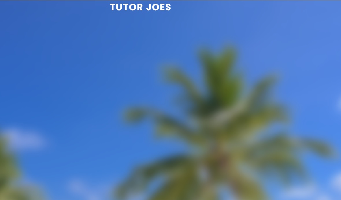
Live Preview
Example 2 :
Source Code
<!DOCTYPE html>
<html lang="en">
<head>
  <meta charset="UTF-8">
  <meta http-equiv="X-UA-Compatible" content="IE=edge">
  <meta name="viewport" content="width=device-width, initial-scale=1.0">
  <title>Document</title>
  <link rel="stylesheet" href="css/style.css">
</head>
<body>
<h1>Tutor Joes Software Solution</h1>
</body>
</html>
style.css
@import url('https://fonts.googleapis.com/css2?family=Poppins:wght@300;400;500;700&display=swap');

*{
  margin: 0;
  padding: 0;
  font-family: 'Poppins', sans-serif;
  box-sizing: border-box;
}

body{
  width: 100vw;
  height: 100vh;
display: flex;
justify-content: center;
align-items: center;
background-color: #2f3640;
}

h1{
  font-size: 45px;
  font-weight: 300;
  color:white;
  position: relative;
  cursor: pointer;
  user-select: none;
}

h1::after{
  content: '';
  position: absolute;
  bottom: 0;
  left: 0;
  width: 100%;
  height:5px;
  background-color: #4cd137;
 transform: scaleX(0);
  transform-origin: center;
  transform-origin:  bottom right;
  transition: transform 0.25s ease-in-out;
}

h1:hover::after{
  transform: scaleX(1);
  transform-origin: bottom left;
}
Output

Live Preview
Example 3 :
Source Code
<!DOCTYPE html>
<html lang="en">
<head>
  <meta charset="UTF-8">
  <meta http-equiv="X-UA-Compatible" content="IE=edge">
  <meta name="viewport" content="width=device-width, initial-scale=1.0">
  <title>Document</title>
  <link rel="stylesheet" href="css/style.css">
</head>
<body>
  <div class="card">

  <img src="images/pic.jpg" alt="">
   <div>
      <a href="#">Home</a>
      <a href="#">Service</a>
      <a href="#">Product</a>
      <a href="#">Contact</a>
      <a href="#">Download</a>
    </div>

  </div>
</body>
</html>
style.css
@import url('https://fonts.googleapis.com/css2?family=Poppins:wght@300;400;500;700&display=swap');

*{
  margin: 0;
  padding: 0;
  font-family: 'Poppins', sans-serif;
  box-sizing: border-box;
}

body{
  width: 100vw;
  height: 100vh;
  display: flex;
  justify-content: center;
  align-items: center;
  background-color: #2f3640;
}


.card{
  width: 800px;
  height: 500px;
  overflow: hidden;
  position: relative;
  background-color:aliceblue;
  border-radius:3px;
}

img{
  position: absolute;
  width: 100%;
  height: 100%;
  top: 0;
  right: 0;
  transition: 0.5s;
}


.card div{
  position: absolute;
  background-color: #333;
  left: -200px;
  width: 200px;
  height: 100%;
  padding: 8px 4px;
  transition: 0.5s;
}

.card div a{
  display: block;
  padding: 10px 20px;
  margin-bottom: 2px;
  text-decoration: none;
  color:white;
  transition: 1s ease;
}

.card div a:hover{
  background-color:#3870CD;
}

.card:hover img{
  right: -200px;
}

.card:hover div{
  left: 0;
}
Output
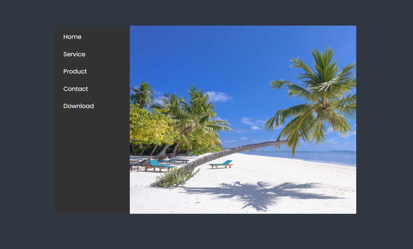
Live Preview
Example 4 :
Source Code
<!DOCTYPE html>
<html lang="en">
<head>
  <meta charset="UTF-8">
  <meta http-equiv="X-UA-Compatible" content="IE=edge">
  <meta name="viewport" content="width=device-width, initial-scale=1.0">
  <title>Document</title>
  <link rel="stylesheet" href="css/style.css">
  <link rel="stylesheet" href="https://maxst.icons8.com/vue-static/landings/line-awesome/line-awesome/1.3.0/css/line-awesome.min.css">
</head>
<body>
  <div class="card">
    <div class="btn-group">
      <i class="las la-cart-plus"></i>
      <i class="las la-heart"></i>
    </div>

      <img src="images/product.jpg" alt="">
  </div>
</body>
</html>
style.css
@import url('https://fonts.googleapis.com/css2?family=Poppins:wght@300;400;500;700&display=swap');

*{
  margin: 0;
  padding: 0;
  font-family: 'Poppins', sans-serif;
  box-sizing: border-box;
}

body{
  width: 100vw;
  height: 100vh;
  display: flex;
  justify-content: center;
  align-items: center;
  background-color: #2f3640;
}

.card{
  width: 400px;
  height: 600px;
  background-color: aliceblue;
  overflow: hidden;
  cursor: pointer;
  position: relative;
}
.card img{
  width: 100%;
  transition: 0.5s;
}

.card:hover img{
transform: scale(1.2) rotate(5deg);
}

.btn-group{
  position: absolute;
  z-index: 99;
  top:50%;
  left: 50%;
  transform: translate(-50%,-50%);
  width: 100px;
  height: 100px;
  background-color: #badc58;
  padding: 15px;
  border-radius: 50%;
  display: flex;
  flex-direction: column;
  justify-content: space-around;
  align-items: center;
  opacity: 0;
  transition: 0.5s;
}
.las{
  color:white;
  font-size: 30px;
}

.las:hover{
  color:#2A4704;
}
.card:hover .btn-group{
  opacity: 1;
  }f1c40f
Output
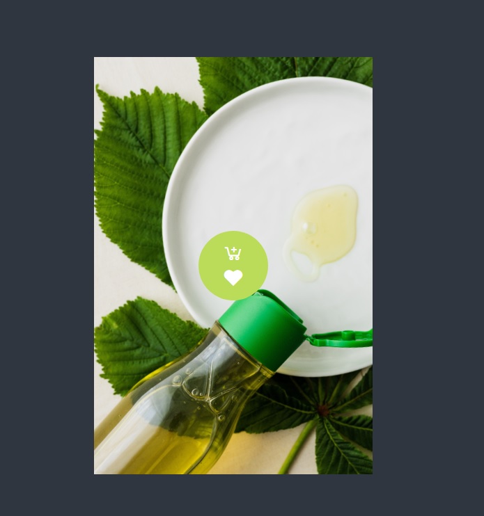
Live Preview
To download raw file Click Here
Web Development
Learn All in Tamil © Designed & Developed By Tutor Joes | Privacy Policy | Terms & Conditions