Animated Windows Spinner in CSS
Source Code
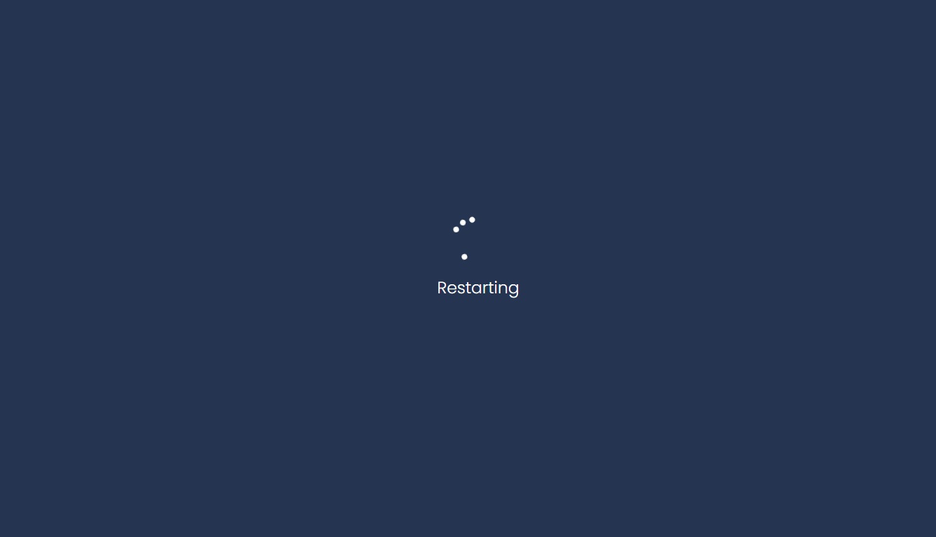
<!DOCTYPE html>
<html lang="en">
<head>
  <meta charset="UTF-8">
  <meta http-equiv="X-UA-Compatible" content="IE=edge">
  <meta name="viewport" content="width=device-width, initial-scale=1.0">
  <title>Document</title>
  <link rel="stylesheet" href="css/style.css">
</head>
<body>
  <div class="spinner">
      <div class="ball"></div>
      <div class="ball"></div>
      <div class="ball"></div>
      <div class="ball"></div>
      <div class="ball"></div>
  </div>
  <h3>Restarting</h3>
</body>
</html>
style.css
@import url('https://fonts.googleapis.com/css2?family=Poppins:wght@300;400;500;700&display=swap');

*{
  margin: 0;
  padding: 0;
  font-family: 'Poppins', sans-serif;
  box-sizing: border-box;

}
body{
  width: 100vw;
  height: 100vh;
  background-color: #182C61;
  display: flex;
  justify-content: center;
  align-items: center;
  flex-direction: column;
  animation: bgcolor 5s infinite linear;
}

@keyframes bgcolor {
  0%{
    background-color: #182C61;
  }
  25%{
    background-color:  #2C3A47;
  }
  50%{
    background-color: #2c3e50;
  }
  100%{
    background-color: #006266;
  }

}
h3{
  font-weight: 300;
  color:white;
  margin-top: 10px;
}
.spinner{
  height: 50px;
  width: 50px;
}

.spinner .ball{
  width: 38px;
  height: 38px;
  position: absolute;
  transform: rotate(225deg);
  opacity: 0;
  animation-name: rotate;
  animation-duration: 4s;
  animation-iteration-count: infinite;
}


.spinner .ball::after{
  content: '';
  position: absolute;
  width: 6px;
  height: 6px;
  background-color: #fff;
  border-radius: 50%;
}


@keyframes rotate {
  0%{
    opacity: 1;
    transform: rotate(225deg);
    animation-timing-function: ease-out;
  }
 7%{
    transform: rotate(345deg);
    animation-timing-function: linear;
  }
  30%{
    transform: rotate(455deg);
    animation-timing-function: ease-in-out;
  }

  39%{
    transform: rotate(690deg);
    opacity: 1;
    animation-timing-function: linear;
  }

  70%{
    transform: rotate(815deg);
    animation-timing-function: ease-out;
  }

  75%{
    transform: rotate(945deg);
  }

  76%{
    transform: rotate(945deg);
    opacity: 0;
  }
  100%{
    transform: rotate(945deg);
    opacity: 0;
  }
}


.spinner .ball:nth-child(2){
  animation-delay: 240ms;
}
.spinner .ball:nth-child(3){
  animation-delay: 480ms;
}

.spinner .ball:nth-child(4){
  animation-delay: 720ms;
}
.spinner .ball:nth-child(5){
  animation-delay: 960ms;
}
Output
Live Preview
To download raw file Click Here
Web Development
Learn All in Tamil © Designed & Developed By Tutor Joes | Privacy Policy | Terms & Conditions