Responsive Navbar Design Using Pure in CSS
Source Code
<!DOCTYPE html>
<html lang="en">
<head>
  <meta charset="UTF-8">
  <meta http-equiv="X-UA-Compatible" content="IE=edge">
  <meta name="viewport" content="width=device-width, initial-scale=1.0">
  <title>Tutor Joes</title>
  <link rel="stylesheet" href="css/style.css">
  <link rel="stylesheet" href="https://use.fontawesome.com/releases/v5.11.2/css/all.css">


</head>
<body>
  <nav>
    <input type="checkbox" id="check">
    <label for="check" class="checkbtn">
      <i class="fas fa-bars"></i>
    </label>
    <label class="logo">Tutor Joes</label>
    <ul>
      <li class="active">
        <a href="#">Home</a>
      </li>
      <li><a href="#">Product</a></li>
      <li><a href="#">Contact</a></li>
      <li><a href="#">Service</a></li>
      <li><a href="#">About</a></li>
    </ul>
  </nav>
  <section>
    <h1>Tutor Joes Software Solution</h1>
    <p>Lorem ipsum dolor sit amet consectetur adipisicing elit.Lorem ipsum dolor sit amet.<br>Perspiciatis ab sapiente vero, eum veritatis consequatur.</p>
  </section>
</body>
</html>
style.css
@import url('https://fonts.googleapis.com/css2?family=Poppins:wght@300;400;500;700&display=swap');

*{
  margin: 0;
  padding: 0;
  box-sizing: border-box;
  font-family: 'Poppins', sans-serif;
}
body{
  height: 100vh;
  width: 100vw;
}
nav{
  background-color: #c23616;
  height: 80px;
  width: 100vw;
  user-select: none;
}

section{
  width: 100vw;
  height: calc(100vh - 80px);
  background: linear-gradient(rgba(53, 59, 72,0.3),rgba(53, 59, 72,0.3)), url('../images/banner.jpg');
  background-size: cover;
  display: flex;
  justify-content: center;
  align-items: center;
  flex-direction: column;
  color:white;
}
section h1{
  color:#fbc531;
  font-size: 30px;
  font-weight: 500;
}

section p{
  font-size: 20px;
  text-align: center;
  padding: 10px 30px;
}

.logo{
  color:white;
  font-size: 25px;
  line-height: 80px;
  padding: 0 100px;
  text-transform: uppercase;
  letter-spacing: 1px;
}

nav ul{
  float: right;
  margin-right: 30px;
}

nav ul li{
  list-style: none;
  display: inline-block;
  line-height: 80px;
  min-width: 100px;
  text-align: center;
  border-top-right-radius:10px ;
  border-top-left-radius:10px ;
}
nav ul li:hover{
  background: #353b48;
}

nav ul li a{
  text-decoration: none;
  color:white;
  font-size: 16px;
  font-weight: 500;
  text-transform: uppercase;

}

#check{
display: none;
}
.checkbtn{
  color:white;
  font-size: 30px;
  float:right;
  line-height: 80px;
  cursor: pointer;
  display: none;
  margin-right: 10px;
}

li.active a{
  color:rgba(123, 237, 159,1.0);
}

@media (max-width:928px){
  .checkbtn{
    display: block;
  }
  ul{
    position: fixed;
    top:80px;
    left: 100%;
    width: 100%;
    height: 100vh;
    background-color: #333;
    transition: 0.3s;
  }

  nav ul li{
    display: block;
    border-top-right-radius:0px ;
    border-top-left-radius:0px;
    line-height: 50px;
  }

  #check:checked ~ ul{
    left: 0;
  }
  section h1{
    font-size: 20px;
  }
  section p{
    font-size: 15px;
  }
}
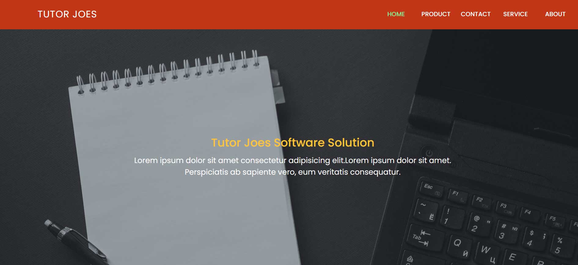
Output
Live Preview
To download raw file Click Here
Web Development
Learn All in Tamil © Designed & Developed By Tutor Joes | Privacy Policy | Terms & Conditions