Creating Responsive Navbar in HTML & CSS
Source Code
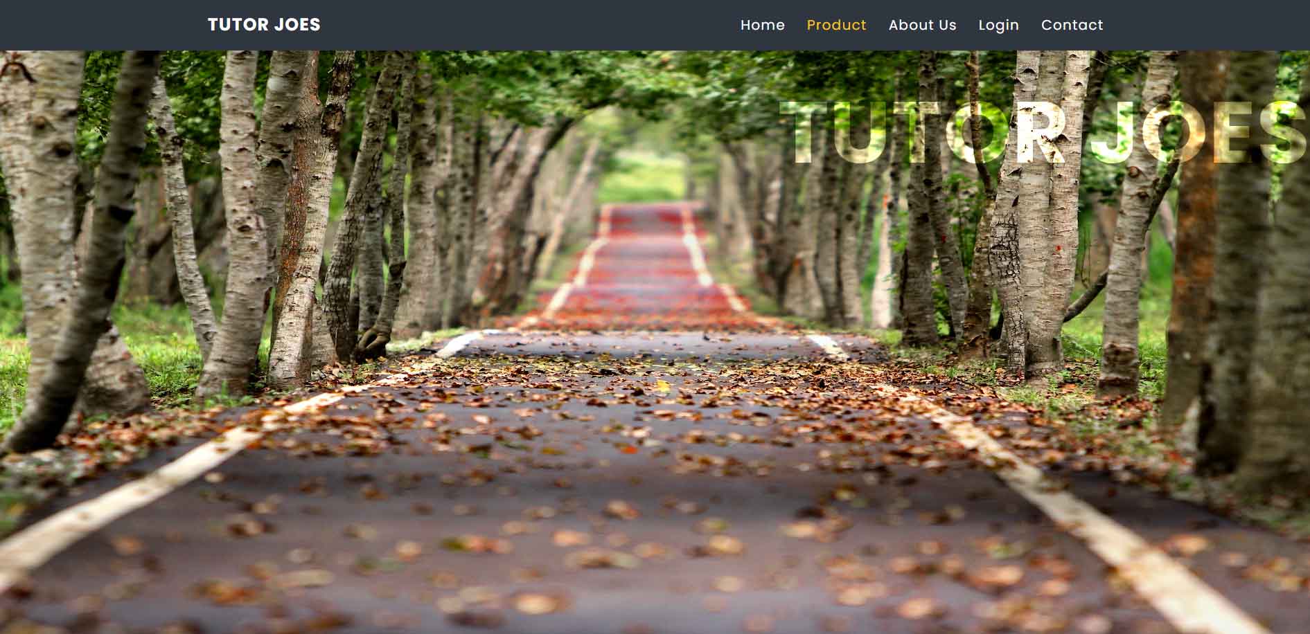
<!DOCTYPE html>
<html lang="en">
<head>
  <meta charset="UTF-8">
  <meta http-equiv="X-UA-Compatible" content="IE=edge">
  <meta name="viewport" content="width=device-width, initial-scale=1.0">
  <title>Document</title>
  <link rel="stylesheet" href="css/style.css">
</head>
<body>
    <header class="main-header">
        <div class="left-side">
          <div class="logo">
            Tutor Joes
          </div>
        </div>
        <div class="right-side">
            <ul class="right-links">
              <li><a href="#">Home</a></li>
              <li  class="active"><a href="#">Product</a></li>
              <li><a href="#">About Us</a></li>
              <li><a href="#">Login</a></li>
              <li><a href="#">Contact</a></li>
            </ul>
        </div>

        <button class="right-bar">
          <span class="bar"></span>
        </button>
    </header>
    <div class="mobile-nav">
      <ul class="right-links">
        <li><a href="#">Home</a></li>
        <li  class="active"><a href="#">Product</a></li>
        <li><a href="#">About Us</a></li>
        <li><a href="#">Login</a></li>
        <li><a href="#">Contact</a></li>
      </ul>
    </div>
    <div class="banner">
      <h1>Tutor Joes</h1>
    </div>
    <div class="section"></div>

  <script src="js/script.js"></script>
</body>
</html>
style.css
@import url('https://fonts.googleapis.com/css2?family=Poppins:wght@300;400;500;700&display=swap');

*{
padding: 0;
margin: 0;
box-sizing: border-box;
}
a{ text-decoration: none; }
ul li{ list-style: none; }

body{
  font-family: 'Poppins', sans-serif;

}

.main-header{
  display: flex;
  background: #2f3640;
  height: 60px;
  justify-content: space-around;
  align-items: center;
}

.logo{
  text-transform: uppercase;
  font-weight: bold;
  letter-spacing: 1px;
  color:white;
  font-size: 20px;
  transition: 0.5s ease-in-out;
  cursor: pointer;
}

.logo:hover{
color:#FFC312;
}

.right-links{
  display: flex;
  gap:25px;
}

.right-links li a{
  color:white;
  letter-spacing: 1px;
  transition: 0.5s;
}

.right-bar{
  display: none;
}
.active a{
  color:#FFC312 !important;
}

.right-bar{
 width: 35px;
height: 35px;
background:none;
border: none;
}

.right-bar::before,
.right-bar .bar,
.right-bar::after
{
  content: '';
  width: 100%;
  height: 3px;
  display: block;
  background-color: white;
  margin: 6px 0px;
  border-radius: 2px;
  transition:  0.5s;
}

.mobile-nav{
  background-color: #333;
  position: fixed;
  top: 60px;
  width: 100%;
  height: 100%;
  right: 100%;
  transition: 0.6s;
  z-index: 99;
  display: none;
}

.mobile-nav .right-links{
  display:flex;
  flex-direction: column;
  align-items: center;
  justify-content: center;
  gap: 20px;
  height: 100vh;
}


.right-bar.is-active .bar{
  opacity: 0;
}


.right-bar.is-active::before{
transform: rotate(-45deg) translate(-8px,7px);
}

.right-bar.is-active::after{
  transform: rotate(45deg) translate(-6px,-6px);
}

.mobile-nav.is-active{
  right: 0;
}

.banner{
  width: 100vw;
  background-image:url('../images/2.jpg');
  background-position: center;
  background-size: 100% 100%;
  height: calc(100vh - 60px);

  filter: contrast(1.2);
}


.banner h1{
  color: white;
  letter-spacing: 1px;
  text-transform: uppercase;
  padding: 20px;
  font-size: 100px;
  mix-blend-mode: overlay;
  text-align: right;
}
.section{
  width: 100vw;
  height: 100vh;
}

@media(max-width:992px) {
  .main-header .right-side{
    display: none;
  }
  .right-bar{
    display: block;
  }
  .mobile-nav{
    display: block;
  }
  .banner h1{
    font-size: 35px;
  }

  .banner{
    background-image:url('../images/3.jpg');
  }
}
script.js
window.onload=function(){
  const menu_btn=document.querySelector('.right-bar');
  const mobile_nav=document.querySelector('.mobile-nav');

  menu_btn.addEventListener('click',function(){
    menu_btn.classList.toggle('is-active');
    mobile_nav.classList.toggle('is-active');
  });
};
Output
Live Preview
To download raw file Click Here
Web Development
Learn All in Tamil © Designed & Developed By Tutor Joes | Privacy Policy | Terms & Conditions