Creating a Dynamic Tab Control in JavaScript
A dynamic tab control in JavaScript is a user interface element that allows you to create and manage tabs within a web page or application dynamically, meaning that you can add, remove, or modify tabs programmatically based on user interactions or other events. This feature is commonly used to organize and display content in a structured and user-friendly way, particularly when you have a lot of information or options to present.
Tabs
Tabs are typically displayed as clickable elements at the top or side of a content area. Each tab represents a section or category of content, and clicking on a tab switches the content displayed in the associated tab panel.
Tab Panels
Tab panels are the content containers that display the specific content associated with each tab. When a user clicks on a tab, the corresponding panel becomes visible, while others are hidden. This allows you to display different content without navigating to separate pages.
Dynamic Creation
The term "dynamic" in dynamic tab control refers to the ability to create tabs and their associated content programmatically. This means you can add or remove tabs and tab panels as needed, based on user actions or data changes. For example, you could dynamically generate tabs for each item in a list or create tabs based on user preferences.
Event Handling
JavaScript event handling is crucial for dynamic tab controls. You'll typically use event listeners to capture user interactions, such as clicking on a tab. When a tab is clicked, the associated content is displayed or hidden, and the appearance of the active tab changes to indicate the currently selected tab.
Content Switching
When a tab is selected, the content inside the corresponding tab panel is either shown or hidden. You may use CSS to control the visibility or apply transitions for a smoother user experience.
Customization
Dynamic tab controls can be highly customized to match your application's design and requirements. You can style the tabs and panels, add animations, and include additional features like close buttons on tabs, tooltips, or context menus.
Accessibility
It's important to ensure that your dynamic tab control is accessible to all users, including those who rely on screen readers or keyboard navigation. This typically involves using proper HTML structure, ARIA attributes, and managing focus correctly when navigating between tabs.
Persistence
Depending on your application's needs, you may also want to implement a way to persist the state of tabs so that when a user reloads the page, their selected tab is still active.
Source Code
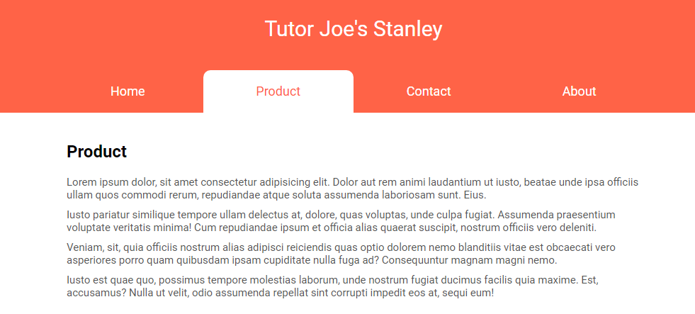
<!DOCTYPE html>
<html lang="en">
  <head>
    <meta charset="UTF-8" />
    <meta name="viewport" content="width=device-width, initial-scale=1.0" />
    <title>Document</title>
    <link rel="stylesheet" href="css/style.css" />
  </head>
  <body>
    <div class="container">
      <div class="title">Tutor Joe's Stanley</div>
      <div class="header">
        <div class="active">Home</div>
        <div>Product</div>
        <div>Contact</div>
        <div>About</div>
      </div>
      <div class="indicator">
        <div></div>
      </div>
      <div class="body">
        <div class="active">
          <h2>Home</h2>
          <p>Lorem ipsum dolor, sit amet consectetur adipisicing elit. Dolor aut rem animi laudantium ut iusto, beatae unde ipsa officiis ullam quos commodi rerum, repudiandae atque soluta assumenda laboriosam sunt. Eius.</p>
          <p>Iusto pariatur similique tempore ullam delectus at, dolore, quas voluptas, unde culpa fugiat. Assumenda praesentium voluptate veritatis minima! Cum repudiandae ipsum et officia alias quaerat suscipit, nostrum officiis vero deleniti.</p>
          <p>Veniam, sit, quia officiis nostrum alias adipisci reiciendis quas optio dolorem nemo blanditiis vitae est obcaecati vero asperiores porro quam quibusdam ipsam cupiditate nulla fuga ad? Consequuntur magnam magni nemo.</p>
          <p>Iusto est quae quo, possimus tempore molestias laborum, unde nostrum fugiat ducimus facilis quia maxime. Est, accusamus? Nulla ut velit, odio assumenda repellat sint corrupti impedit eos at, sequi eum!</p>
        </div>
        <div>
          <h2>Product</h2>
          <p>Lorem ipsum dolor, sit amet consectetur adipisicing elit. Dolor aut rem animi laudantium ut iusto, beatae unde ipsa officiis ullam quos commodi rerum, repudiandae atque soluta assumenda laboriosam sunt. Eius.</p>
          <p>Iusto pariatur similique tempore ullam delectus at, dolore, quas voluptas, unde culpa fugiat. Assumenda praesentium voluptate veritatis minima! Cum repudiandae ipsum et officia alias quaerat suscipit, nostrum officiis vero deleniti.</p>
          <p>Veniam, sit, quia officiis nostrum alias adipisci reiciendis quas optio dolorem nemo blanditiis vitae est obcaecati vero asperiores porro quam quibusdam ipsam cupiditate nulla fuga ad? Consequuntur magnam magni nemo.</p>
          <p>Iusto est quae quo, possimus tempore molestias laborum, unde nostrum fugiat ducimus facilis quia maxime. Est, accusamus? Nulla ut velit, odio assumenda repellat sint corrupti impedit eos at, sequi eum!</p>
        </div>
        <div>
          <h2>Contact</h2>
          <p>Lorem ipsum dolor, sit amet consectetur adipisicing elit. Dolor aut rem animi laudantium ut iusto, beatae unde ipsa officiis ullam quos commodi rerum, repudiandae atque soluta assumenda laboriosam sunt. Eius.</p>
          <p>Iusto pariatur similique tempore ullam delectus at, dolore, quas voluptas, unde culpa fugiat. Assumenda praesentium voluptate veritatis minima! Cum repudiandae ipsum et officia alias quaerat suscipit, nostrum officiis vero deleniti.</p>
          <p>Veniam, sit, quia officiis nostrum alias adipisci reiciendis quas optio dolorem nemo blanditiis vitae est obcaecati vero asperiores porro quam quibusdam ipsam cupiditate nulla fuga ad? Consequuntur magnam magni nemo.</p>
          <p>Iusto est quae quo, possimus tempore molestias laborum, unde nostrum fugiat ducimus facilis quia maxime. Est, accusamus? Nulla ut velit, odio assumenda repellat sint corrupti impedit eos at, sequi eum!</p>
        </div>
        <div>
          <h2>About</h2>
          <p>Lorem ipsum dolor, sit amet consectetur adipisicing elit. Dolor aut rem animi laudantium ut iusto, beatae unde ipsa officiis ullam quos commodi rerum, repudiandae atque soluta assumenda laboriosam sunt. Eius.</p>
          <p>Iusto pariatur similique tempore ullam delectus at, dolore, quas voluptas, unde culpa fugiat. Assumenda praesentium voluptate veritatis minima! Cum repudiandae ipsum et officia alias quaerat suscipit, nostrum officiis vero deleniti.</p>
          <p>Veniam, sit, quia officiis nostrum alias adipisci reiciendis quas optio dolorem nemo blanditiis vitae est obcaecati vero asperiores porro quam quibusdam ipsam cupiditate nulla fuga ad? Consequuntur magnam magni nemo.</p>
          <p>Iusto est quae quo, possimus tempore molestias laborum, unde nostrum fugiat ducimus facilis quia maxime. Est, accusamus? Nulla ut velit, odio assumenda repellat sint corrupti impedit eos at, sequi eum!</p>
        </div>
      </div>
    </div>
    <script src="js/script.js"></script>
  </body>
</html>
js/script.js
document.addEventListener("DOMContentLoaded", function () {
  let container = document.querySelector(".container");
  let header = document.querySelector(".header");
  let menuItem = container.querySelectorAll(".header > div");
  let tabBody = container.querySelector(".body");
  let tabBodyElements = container.querySelectorAll(".body > div");
  let indicator = container.querySelector(".indicator > div");

  menuItem.forEach((tab, index) => {
    tab.addEventListener("click", function () {
      header.querySelector(".active").classList.remove("active");
      tab.classList.add("active");
      indicator.style.left = `${index * 25}%`;

      tabBody.querySelector(".active").classList.remove("active");
      tabBodyElements[index].classList.add("active");
    });
  });
});
Event Listener: The code starts by adding an event listener to the DOMContentLoaded event. This means that the JavaScript code will run once the HTML document has been fully loaded and parsed.
Element Selection: Within the event listener function, various DOM elements are selected using querySelector and querySelectorAll methods. These selections are based on CSS class names, and the selected elements are stored in variables for later use.
- container: Represents an element with the class "container."
- header: Represents an element with the class "header."
- menuItem: Represents a collection of <div> elements within the "header" element.
- tabBody: Represents an element with the class "body."
- tabBodyElements: Represents a collection of <div> elements within the "body" element.
- indicator: Represents an element within an element with the class "indicator," which contains a single <div> element.
Event Handling: Next, the code sets up event listeners on each of the "menuItem" elements. It uses a forEach loop to iterate through each menu item (tab) and attaches a "click" event listener to them. When a menu item is clicked, this event listener will execute the provided callback function.
- Removes the "active" class from the currently active tab in the "header."
- Adds the "active" class to the clicked tab.
- Updates the position of an indicator element (probably used for highlighting the active tab).
- Performs the same steps for the corresponding content tab in the "body."
Functionality: This code is designed to create a simple tabbed interface. When a menu item (tab) is clicked, it sets the clicked tab as "active," updates the indicator's position, and shows the corresponding content in the "body" section while hiding the previously active content. The tabs are assumed to be evenly spaced, as indicated by indicator.style.left = ${index * 25}%;, where 25% is used to move the indicator by 25% of its container's width for each tab.
Finally, you can add some CSS styles to enhance the look and feel of the button and container. you can adjust the CSS styles as desired to match the design of your website.
css/style.css
@import url("https://fonts.googleapis.com/css2?family=Roboto:wght@300;400;500;700;900&display=swap");

* {
  margin: 0;
  padding: 0;
  box-sizing: border-box;
  font-family: "Roboto", sans-serif;
}

.container {
  position: relative;
  width: 100%;
}

.title {
  text-align: center;
  padding: 50px 20px 100px;
  font-size: 30px;
  background-color: tomato;
  color: #fff;
}

.container .header,
.container .indicator,
.container .body {
  margin: 0 auto;
  max-width: 850px;
  width: 100%;
}

.container .header {
  position: relative;
  width: 100%;
  height: 60px;
  display: flex;
  align-items: center;
  margin-top: -60px;
  z-index: 2;
}

.container .header > div {
  width: 25%;
  text-align: center;
  padding: 15px 0px;
  color: #fff;
  font-size: 18px;
  cursor: pointer;
  user-select: none;
  transition: color 300ms ease-in-out;
}

.container .header > div.active {
  color: tomato;
}

.container .indicator {
  position: relative;
  height: 60px;
  margin-top: -60px;
}

.container .indicator > div {
  position: absolute;
  left: 0%;
  width: 25%;
  height: 100%;
  background-color: #fff;
  border-radius: 10px 10px 0px 0px;
  transition: all 300ms ease-in-out;
}

.container .body {
  position: relative;
}

.container .body > div {
  position: absolute;
  width: 100%;
  padding: 20px;
  top: -100vh;
  opacity: 0;
}
.container .body > div > * {
  margin: 10px 0px;
}

.container .body > div > h2 {
  margin: 20px 0px;
  font-weight: 600;
}
.container .body > div > p {
  color: #555;
  font-size: 15px;
}

.container .body > div.active {
  top: 0px;
  opacity: 1;
  transition: top 0ms ease-in-out 0ms, opacity 500ms ease-in-out 0ms;
}
Output
Live Preview
Creating a dynamic tab control in JavaScript often involves manipulating the Document Object Model (DOM) to add or remove elements and apply styles. There are also many JavaScript libraries and frameworks available that can simplify the process of creating dynamic tab controls, such as jQuery UI, Bootstrap, or custom solutions using Vanilla JavaScript.
Overall, a dynamic tab control in JavaScript is a versatile UI element that enhances user experience by organizing and presenting content in a user-friendly and interactive manner.
List of Programs
JavaScript Arrays & Methods Examples
JS Practical Project
Learn All in Tamil © Designed & Developed By Tutor Joes | Privacy Policy | Terms & Conditions