Grid System
Bootstrap's grid system allows up to 12 columns across the page.If you do not want to use all 12 column individually, you can group the columns together to create wider columns.
Bootstrap's grid system is responsive, and the columns will re-arrange depending on the screen size
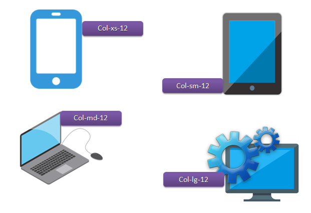
The Bootstrap grid system has four classes
- lg screens equal to or greater than 1200px wide
- md screens equal to or greater than 992px wide
- sm screens equal to or greater than 768px wide
- xs screens less than 768px wide

Source Code
<!DOCTYPE html>
<html lang="en">

<head>
    <meta charset="UTF-8">
    <meta http-equiv="X-UA-Compatible" content="IE=edge">
    <meta name="viewport" content="width=device-width, initial-scale=1.0">
    <title>Tutor Joes</title>
    <link rel="stylesheet" href="https://maxcdn.bootstrapcdn.com/bootstrap/3.4.1/css/bootstrap.min.css">
    <!--<link rel="stylesheet" href="css/bootstrap.min.css">-->
</head>

<body>
    <div class="container-fluid">
        <h3>Grid System</h3>
        <div class="row">
            <div class="col-md-12 well">Box-12</div>
            <div class="col-md-6 well">Box-1</div>
            <div class="col-md-6 well">Box-2</div>
            <div class="col-md-4 well">Box-3</div>
            <div class="col-md-4 well">Box-4</div>
            <div class="col-md-4 well">Box-5</div>
        </div>
    </div>
	<script src="https://ajax.googleapis.com/ajax/libs/jquery/3.5.1/jquery.min.js"></script>
	<script src="https://maxcdn.bootstrapcdn.com/bootstrap/3.4.1/js/bootstrap.min.js"></script>
    <!--<script src="js/jquery.min.js"></script>-->
    <!--<script src="js/bootstrap.min.js"></script>-->
</body>

</html>
Bootstrap Tutorial
Learn All in Tamil © Designed & Developed By Tutor Joes | Privacy Policy | Terms & Conditions